Fitzsimons Fishmongers
Designed by Rachel Kerr at CI Studio
Creative Director: Mel O'Rourke
Photography: Tony Matthews
Website: Naoise Ó Conchubhair
Categories: Identity
Industry: Commercial
Website: fitzsimonsfish.com/
Fitzsimons is a small family fishmongers, tucked away in the heart of Crumlin. They had a loyal following, but needed to increase visibility and broaden their customer base, by appealing to a wider demographic of families and younger customers.
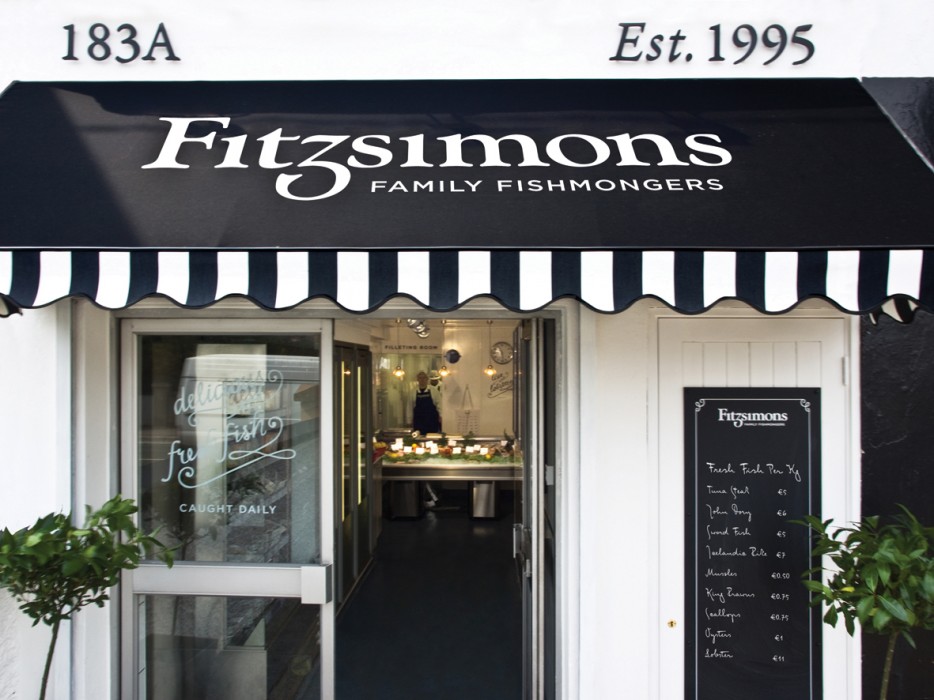
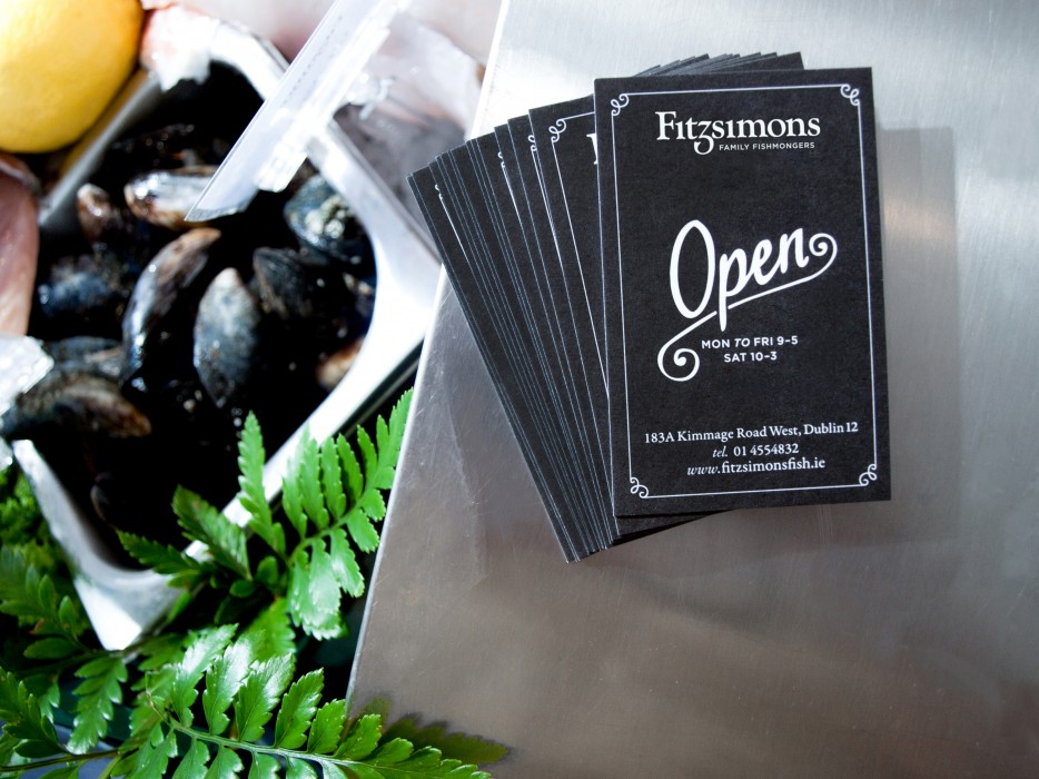
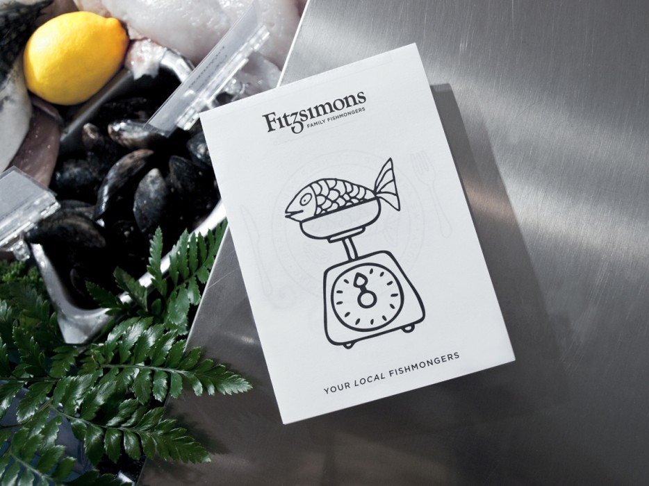
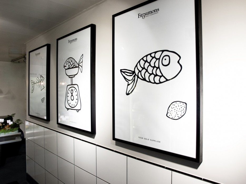
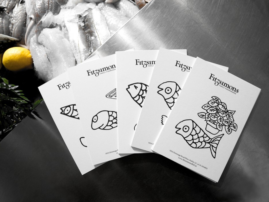
They needed to reposition their business through their brand. A traditional brand mark with a nod to a fish tail was created. This was paired with playful fish illustrations and wry copy, to create a memorable brand. The brand execution was in black and white, to reference the time old tradition, of wrapping fish in newsprint. This monochromatic scheme worked hard to deliver print items within a tight budget.
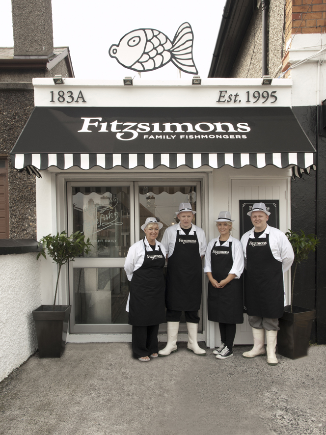
The result was the creation of brand, with a traditional, friendly yet sophisticated feel to appeal to new customers, yet not alienate the existing customer base. The brand was brought to life through a retrofit of the store exterior and interior, signage, environmental graphics, livery, promotional material, packaging and the website.
