Fierce Mild - Keep Your Character
2024
Designed by Eimear O'Sullivan, Molly Devlin and Trevor Nolan at The Public House
Categories: Identity / Packaging
Industry: Commercial
Tags: Illustration / Typography / Food and drink / Craft
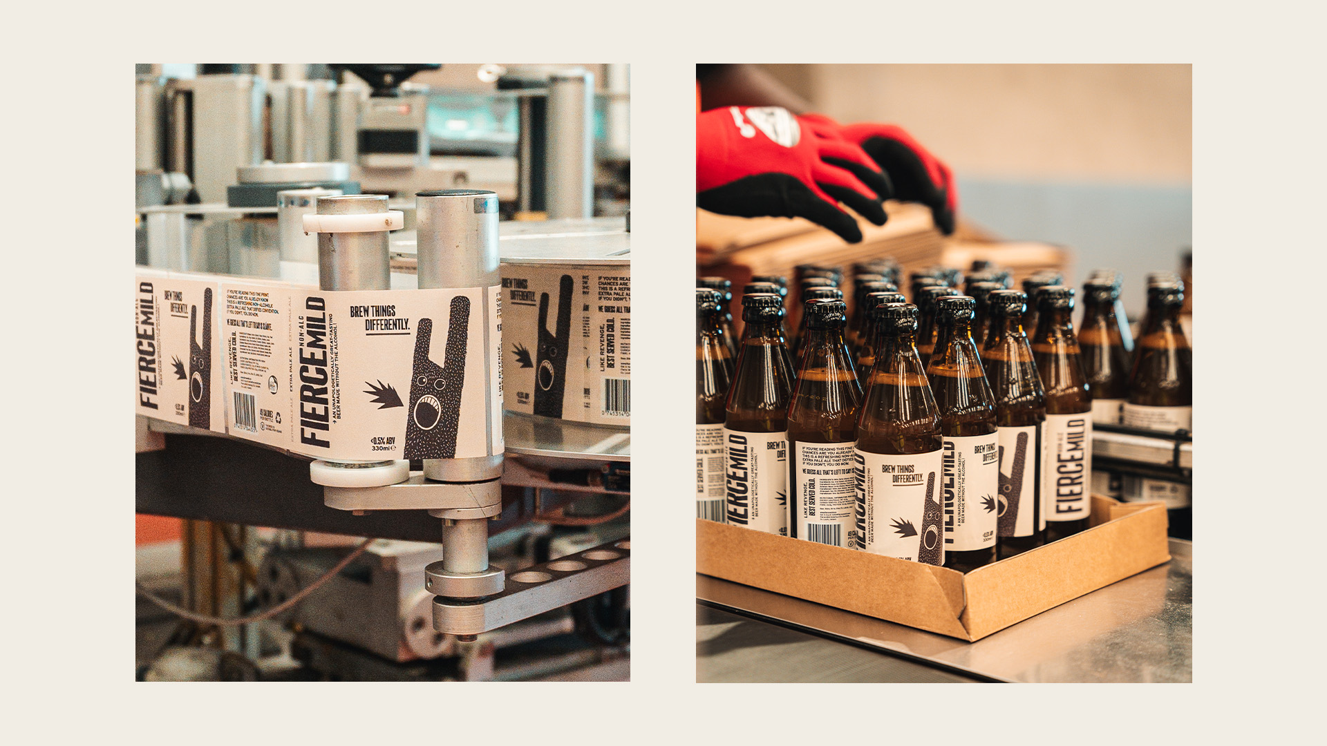
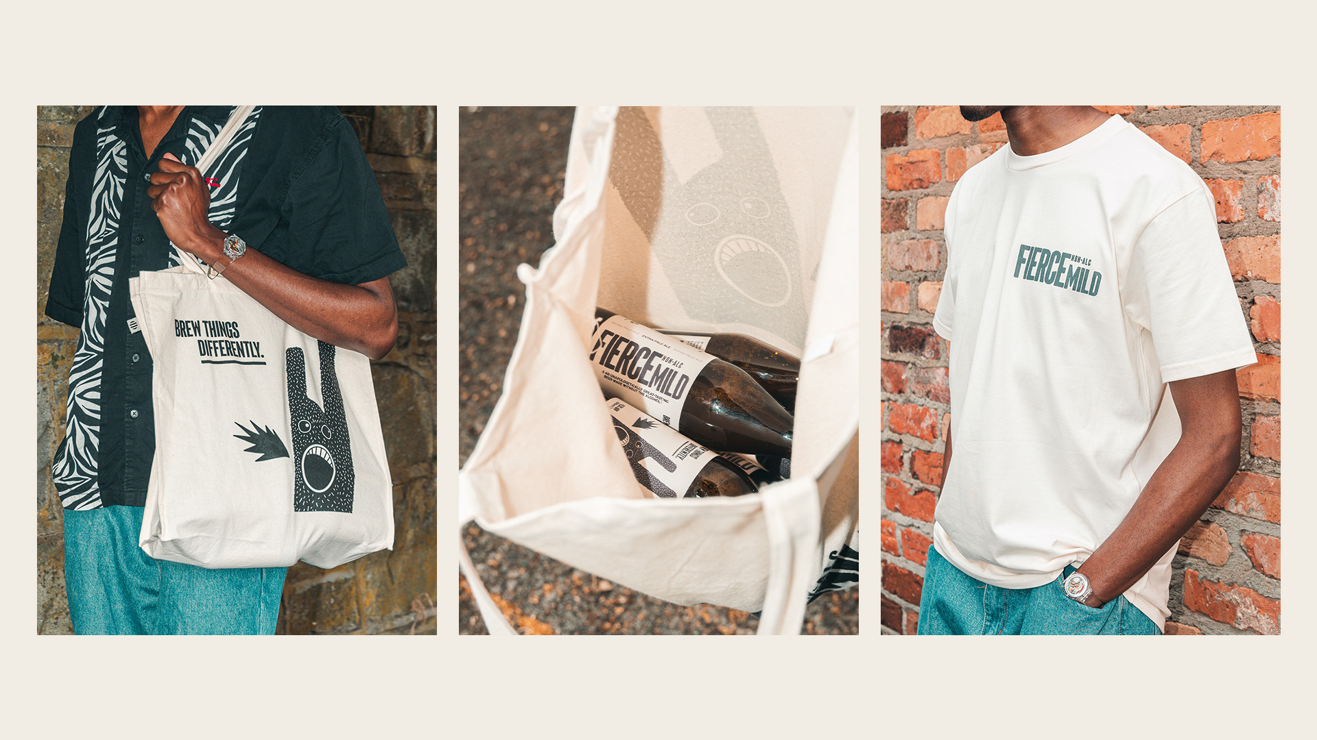
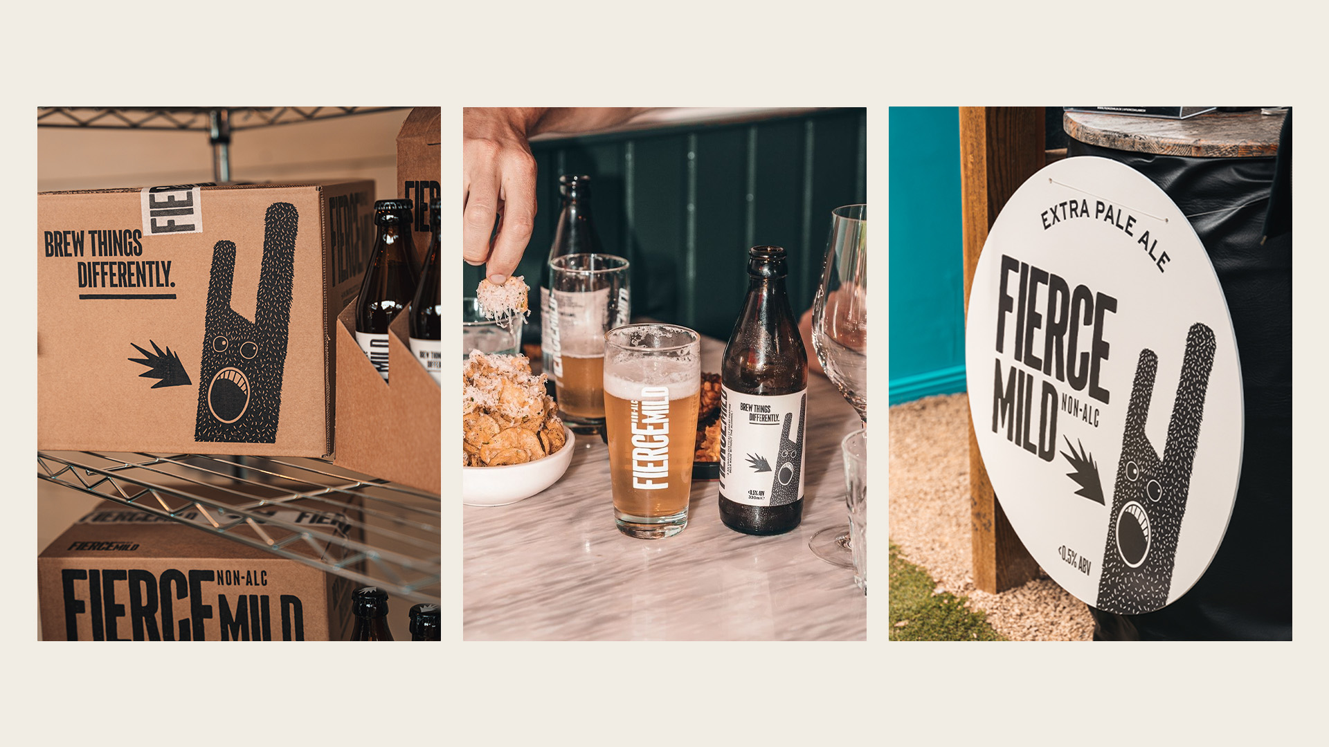
Too many non-alcoholic beers have a bit of a confidence issue. They start as traditional beer and are stripped of their alcohol, a bit of their taste and their identity. Not the case with Fierce Mild. Our team were tasked with creating a unique visual identity and packaging for this new product that was rooted in the brand positioning ‘keep your character’. Our team worked across brand strategy and naming; tone of voice and messaging; logo and brand mark; and illustration and pack design— all done under the one roof and on a modest budget.
Working with an existing font as a base, we meticulosity hand painted a logo mark that felt gritty yet passionately crafted— just like the product itself. With a positioning all about character, we jumped at the chance to craft a brand mascot to embody the juxtaposition of the Fierce Mild ideal and act as a strong visual cue to reinforce brand recognition. Part cuddly, part spiky, and blowing a flame with an expression that made one feel just a little uncomfortable, this character was our touch of madness that felt distinctly Fierce Mild.
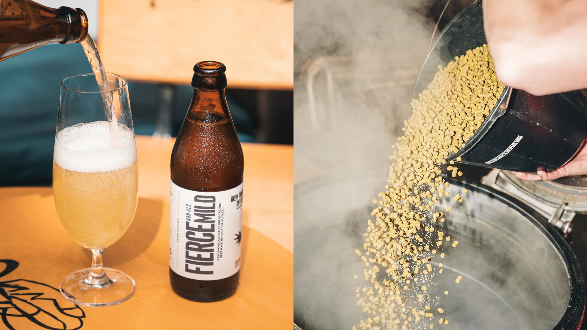
The bottles and cans were designed with with a reductive approach— a minimalist colour palette with plenty of clean negative space reinforcing the idea of good-tasting and natural liquid inside, while going against the colourful approach that was leading the charge in the ‘craft’ category. We chose a nostalgic brown glass with a distinctive shape for our bottle, finishing with a black metal cap where we applied a one-colour print of our flame for added detail, building another strong asset for the brand.
.jpg)