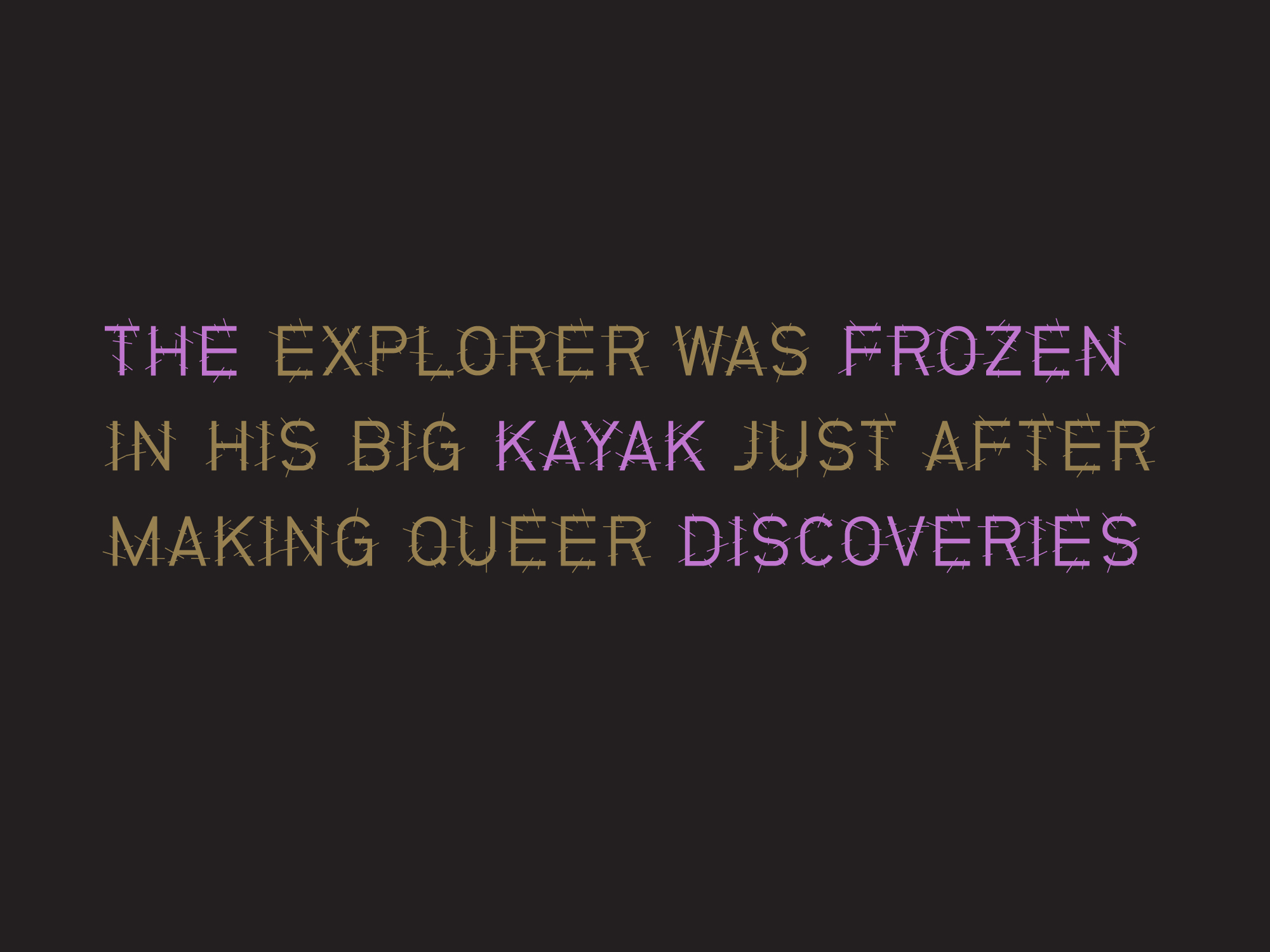
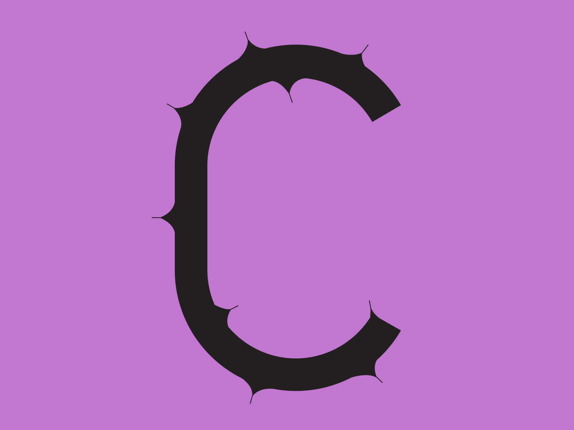
Ermacora Display Fonts
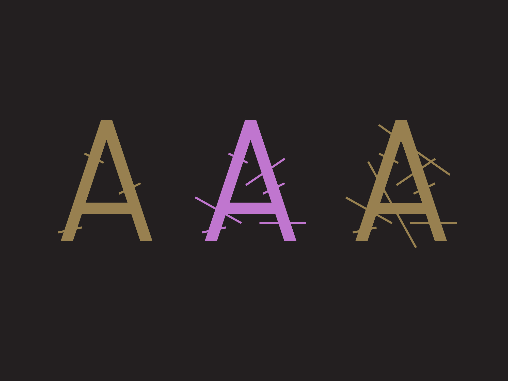
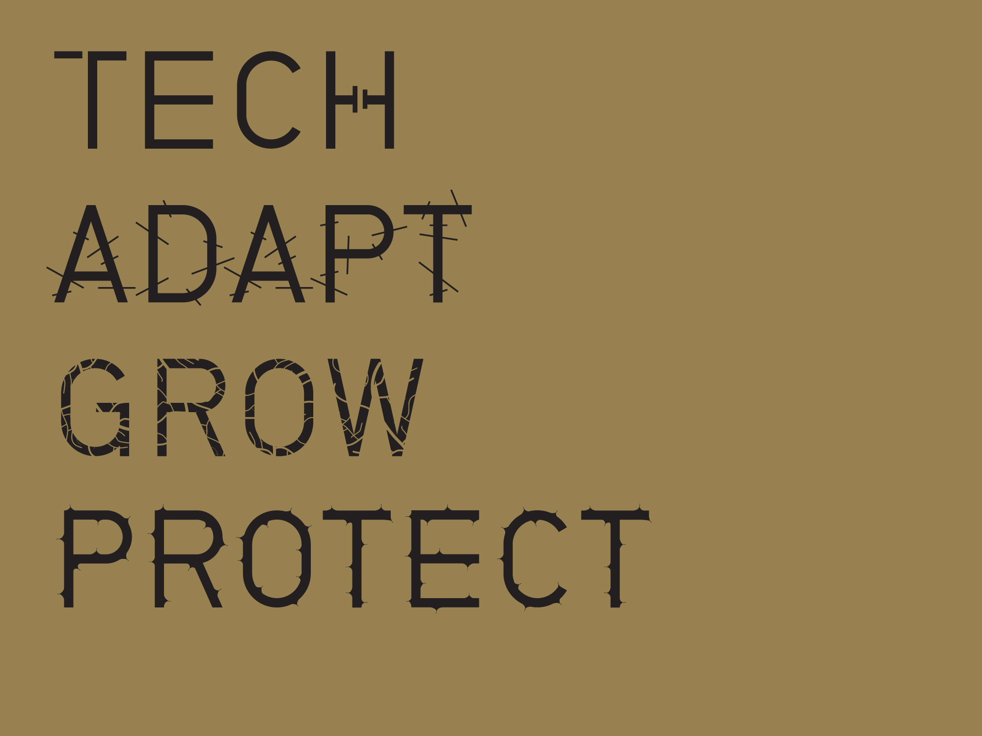
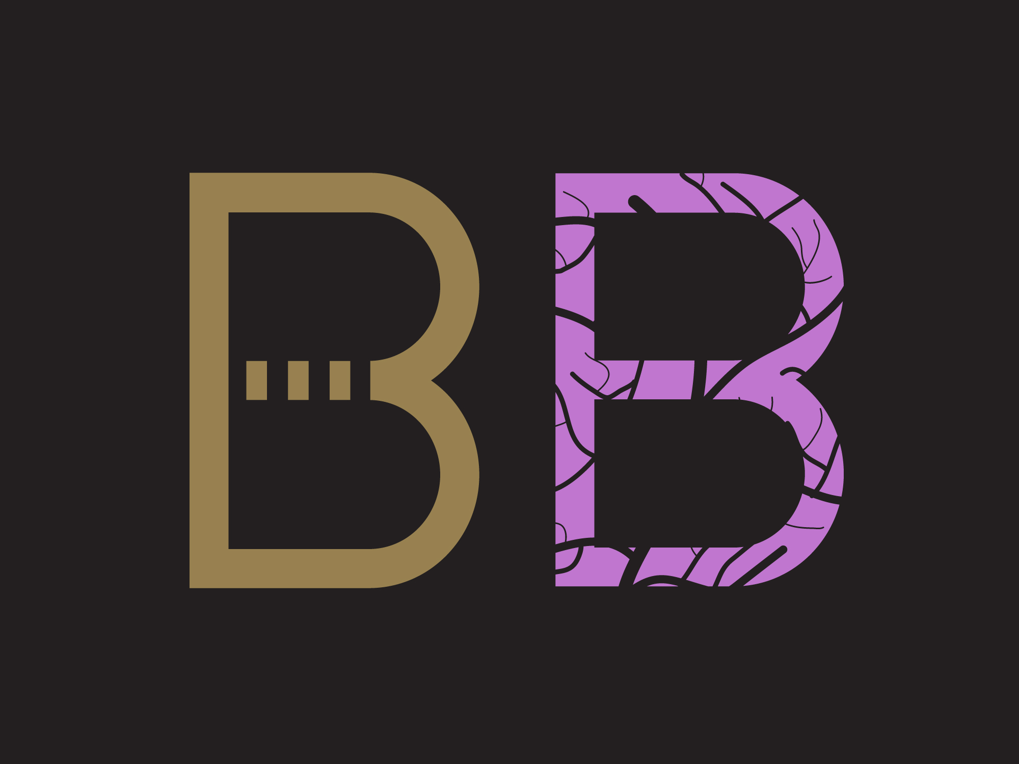
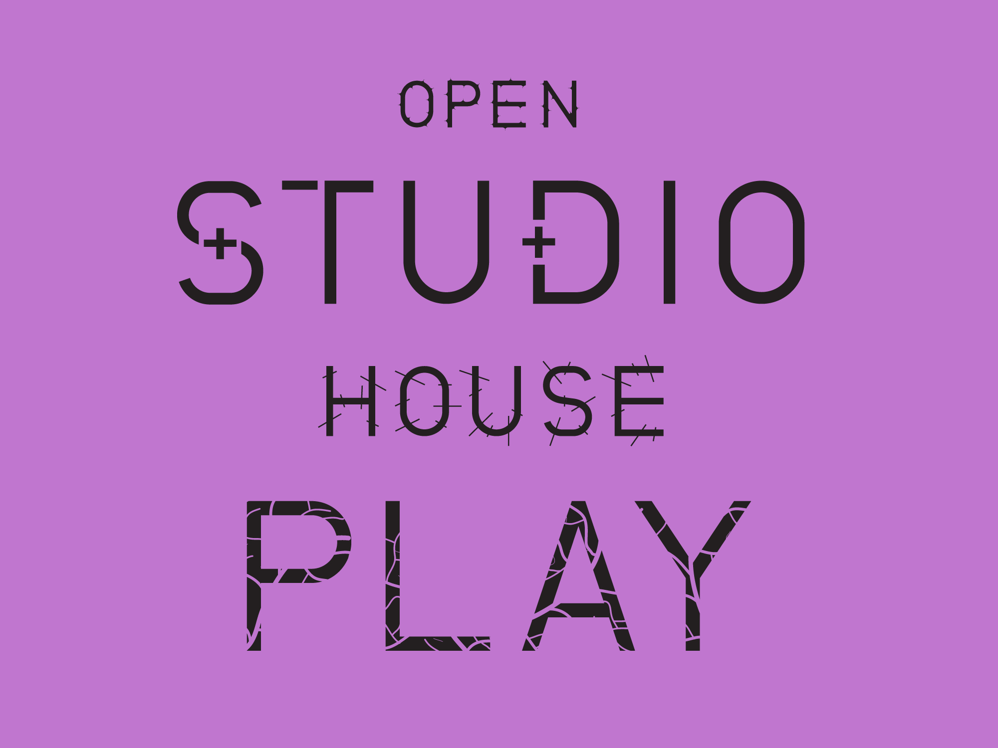
Danish-Italian urban, technology and futurist focused, Ermacora prioritise social impact design, open source thinking and the circular economy. As part of our design toolkit for the upcoming Ermacora identity we have developed four display typefaces, each with three separate weights. The typefaces use NB Grotesk Std Regular as a base, which we have manipulated to align with the creative direction of biomimicry. The typefaces ‘tech’, ‘adapt’, ‘grow’ and ‘protect’ increase in intensity depending on the context for which they are being used, the weight always remains consistent.
