Dublin City Nib
Designed by Thomas Foley at Atelier David Smith and Thomas Foley
Categories: Typeface
Industry: Cultural
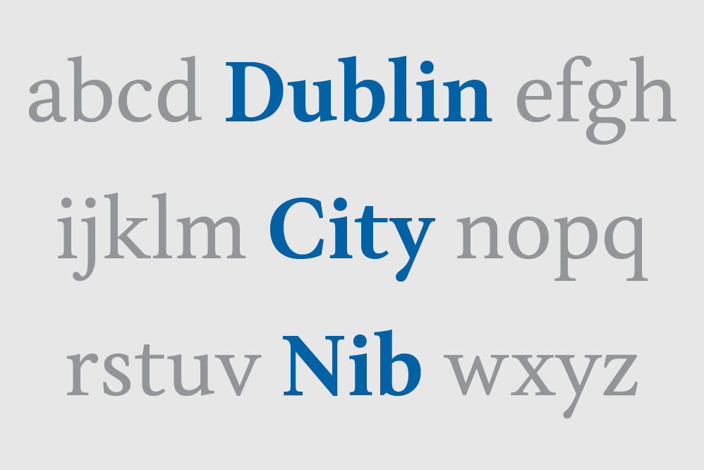
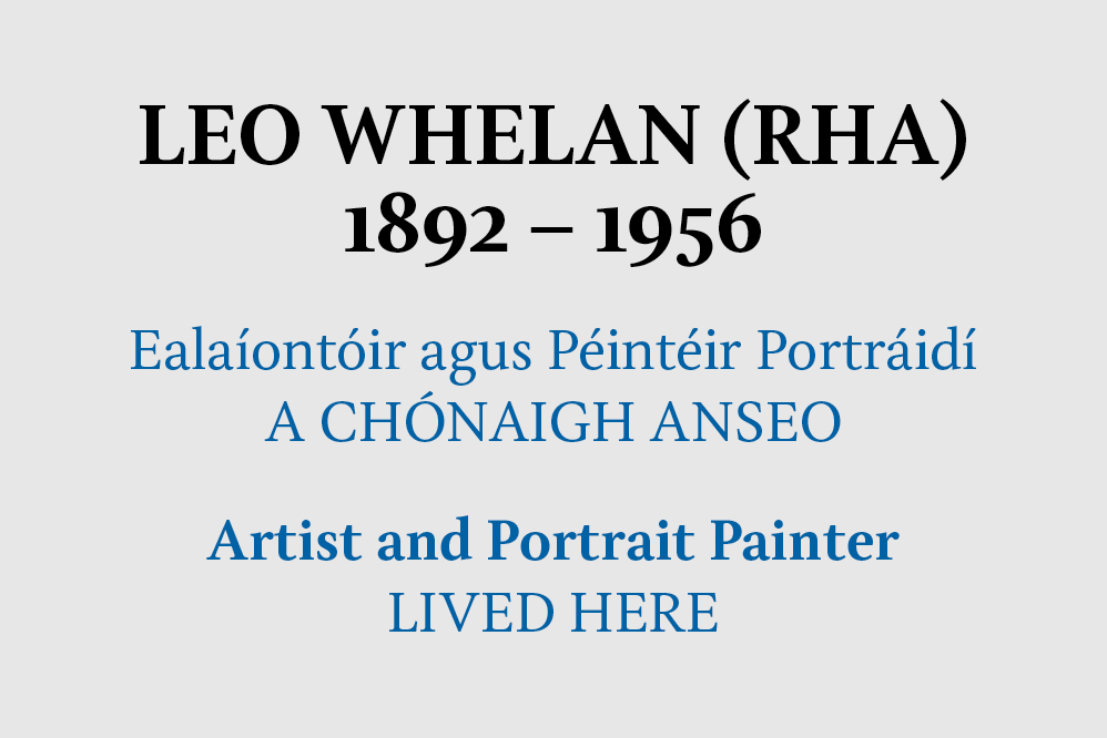
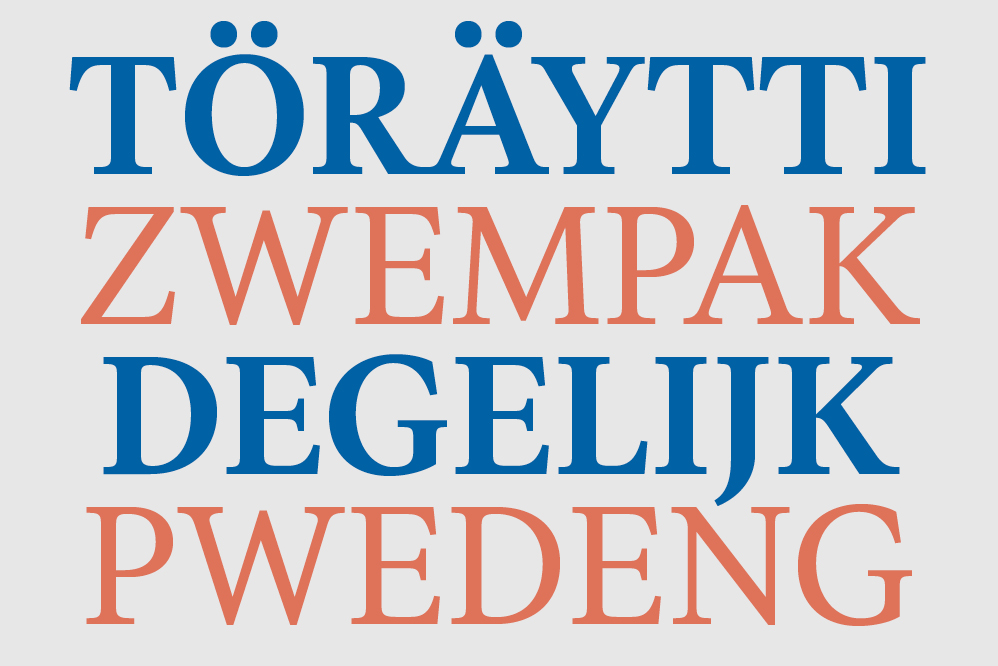
Dublin City Nib is a font designed for use on heritage plaques in Dublin City and is derived from Tom Foley's MA typeface, Nib. It was commissioned by Atelier David Smith on behalf of Dublin City Council.
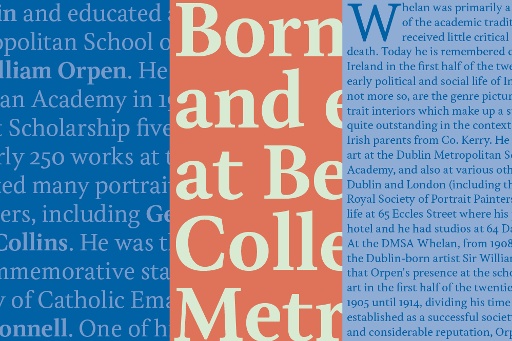
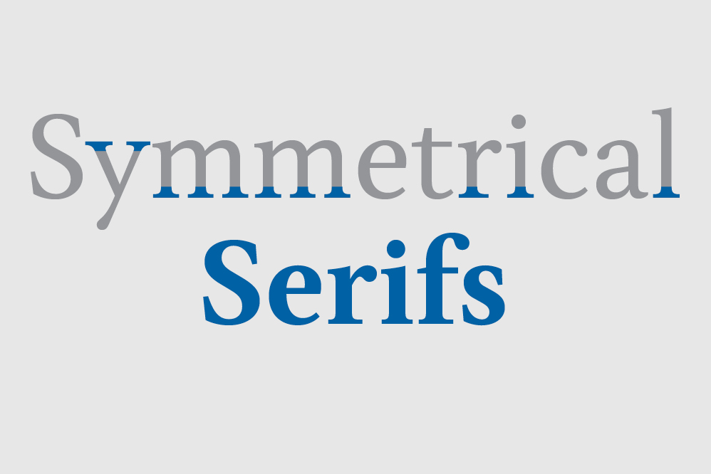
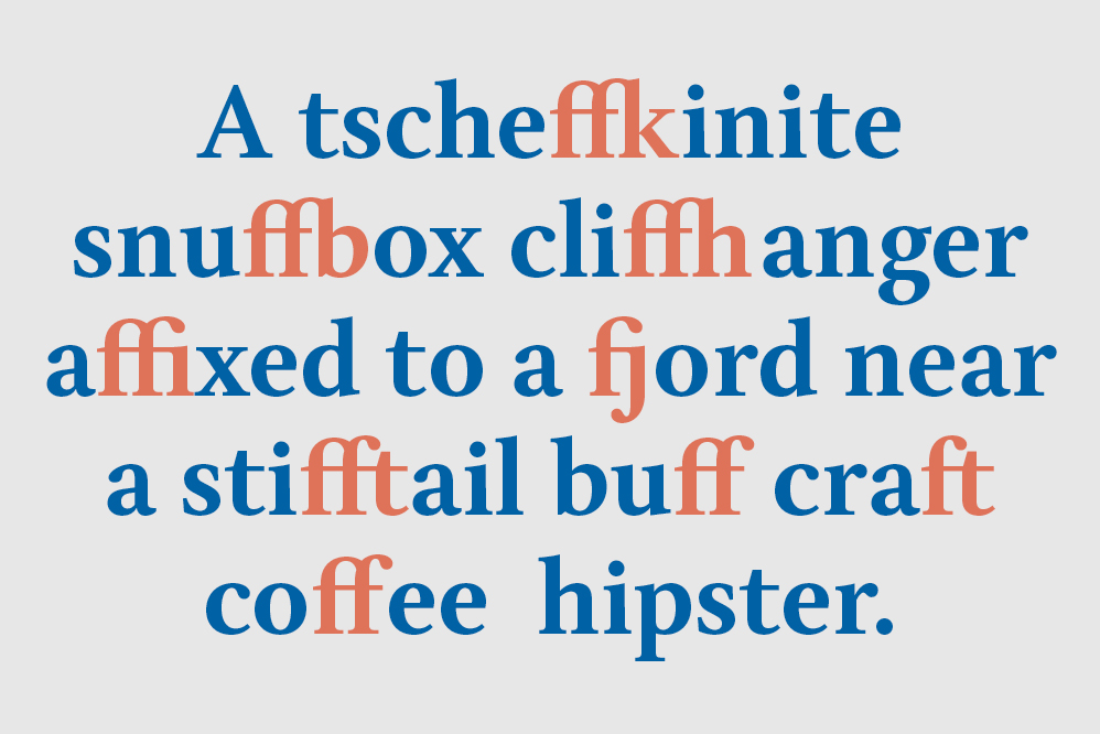
Dublin City Nib can be classified as a transitional serif, characterised by its moderate contrast, symmetrical bracketed serifs, straight diagonals and bulbous terminals.
From a functional perspective, the features of Dublin City Nib are designed to improve the rendering of letter shapes when using low quality production techniques, such as sandblasting onto a hard substrate. This can be seen specifically in the shaping of the terminals, serifs, straight stems and the moderated contrast.
Aesthetically, the features of Dublin City Nib are designed to bring a slightly sober feel to the typeface, which gives the design more longevity and allow it to carry the varied nature of content it may encounter during use.
Dublin City Nib comes in Regular and Bold, and supports a Western European character set.
