Donnelly Rebrand
2013
Designed by Kelly Mackenzie at White Bear Studio
Designer: Mali Read
Designer: Jamie Quantrill
Project Manager: Esme Rees
Photography: Amber Locke
Categories: Identity / Packaging
Industry: Commercial
Tags: Photography / Illustration
Website: donnellyfreshfoods.ie
Fresh fruit and veg brand Donnelly came to us looking to launch a new range of salad that offered a convenient solution to healthy eating without compromising on quality. Their previous packaging was lacking a brand story and message, which is where we stepped in.
Our challenge was to create a brand that captured the deliciousness of fresh Irish produce, whilst maintaining the Donnelly family heritage. We wanted to create a future-facing brand that remained authentic, honest and true to their core brand values. We set out to ensure the high quality of the product was reflected in the branding and packaging.
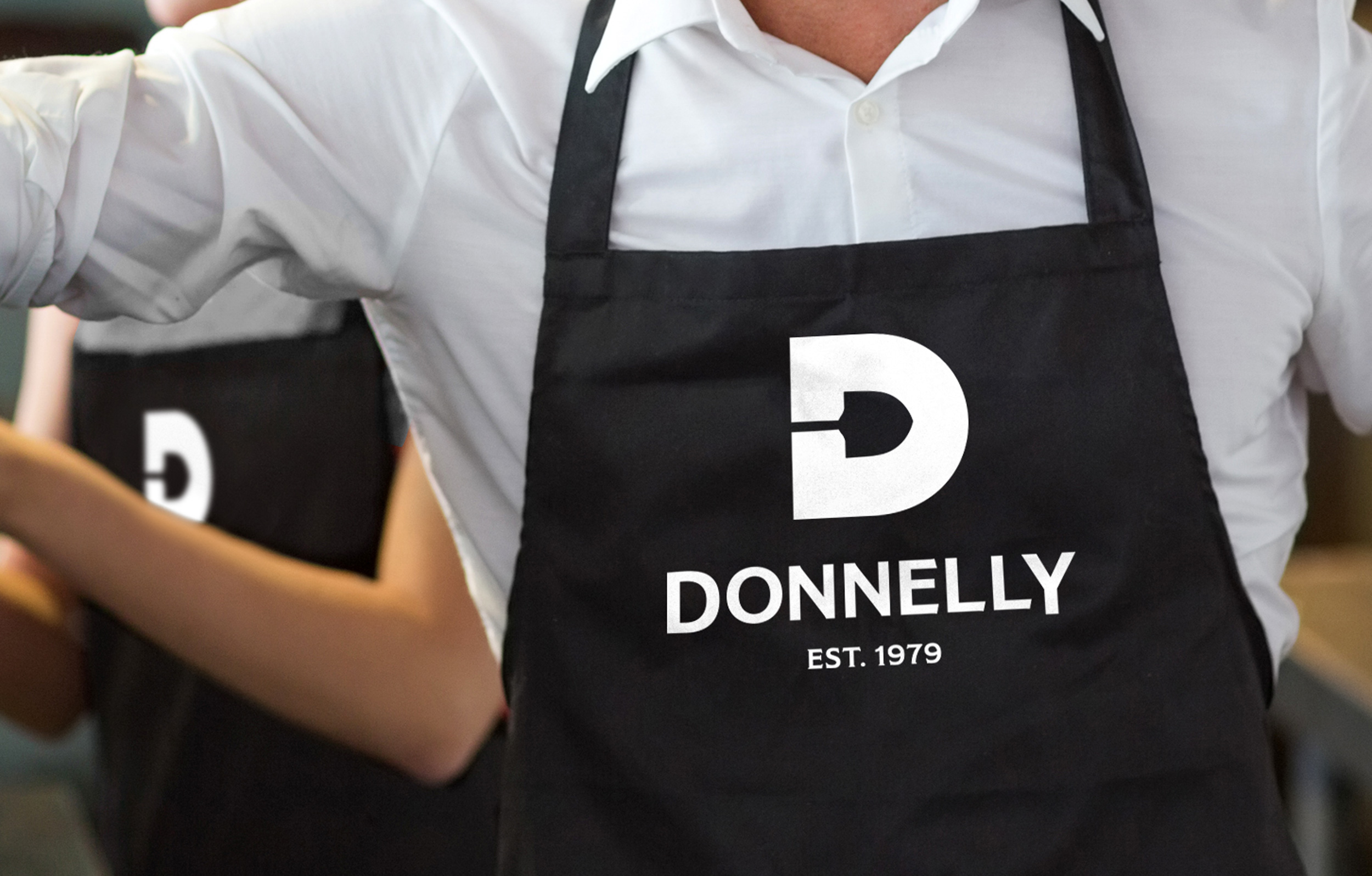
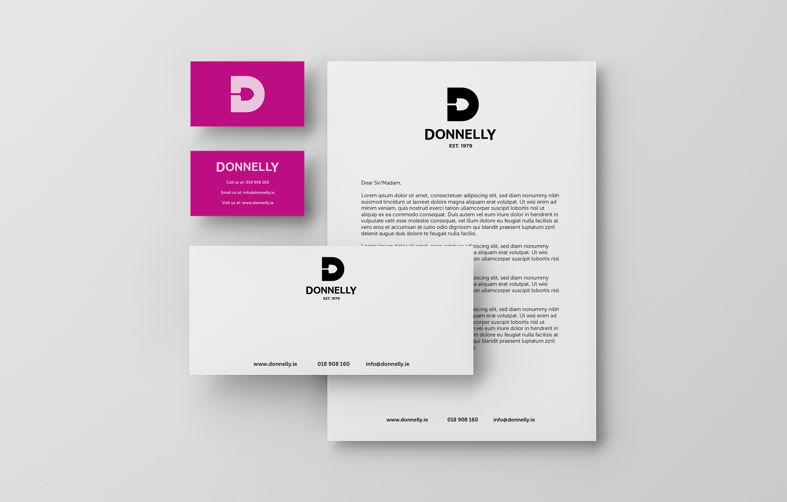
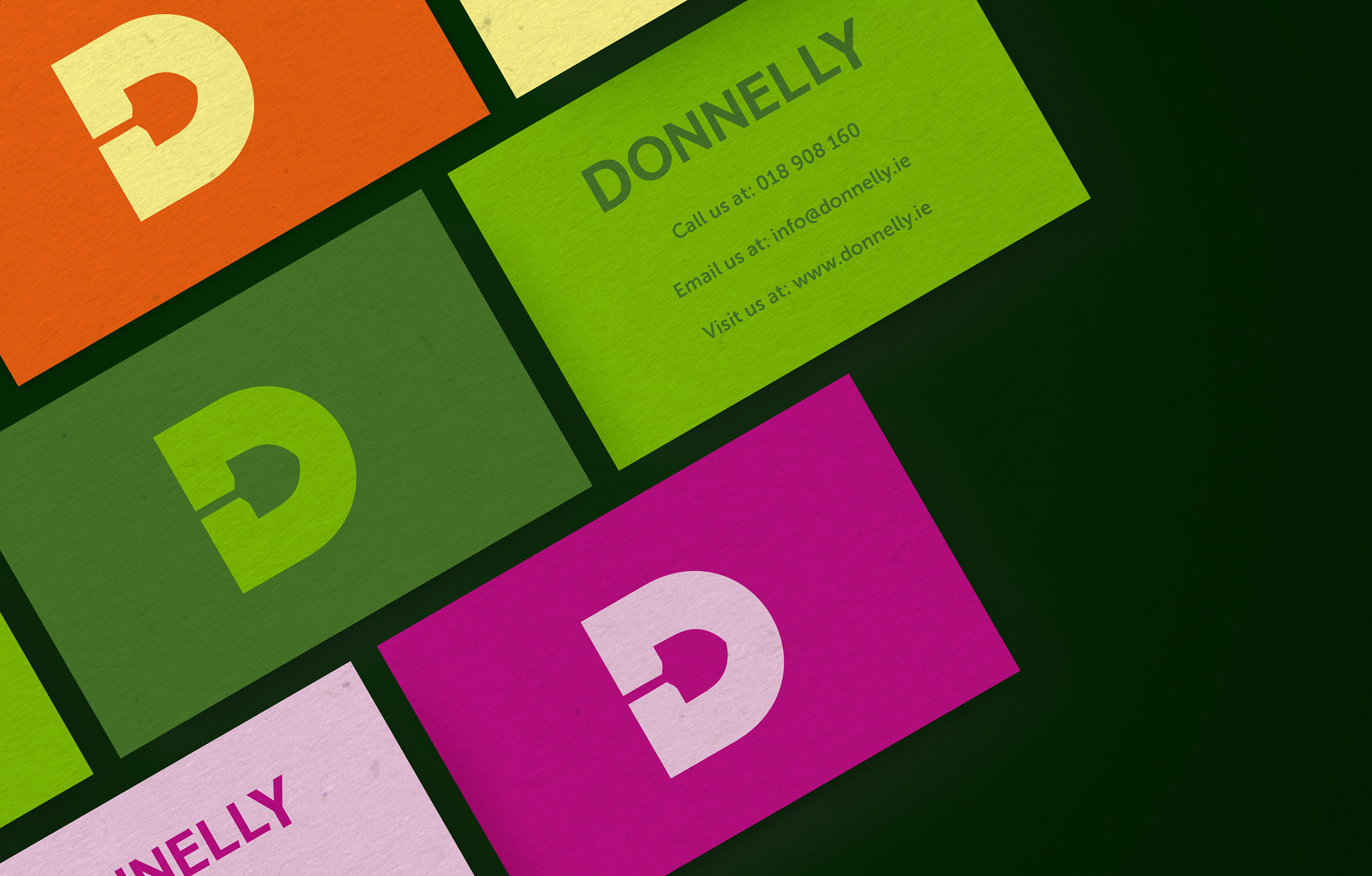
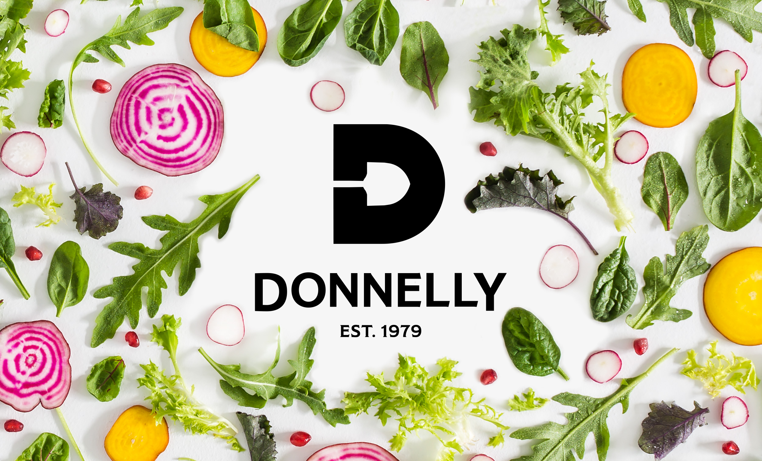
The logo creates the negative space illustration of a spade at the centre of the D, playing homage to the farming history of the brand. The accompanying logotype is reminiscent of Irish fruit and veg stall signage with a modern flourish.
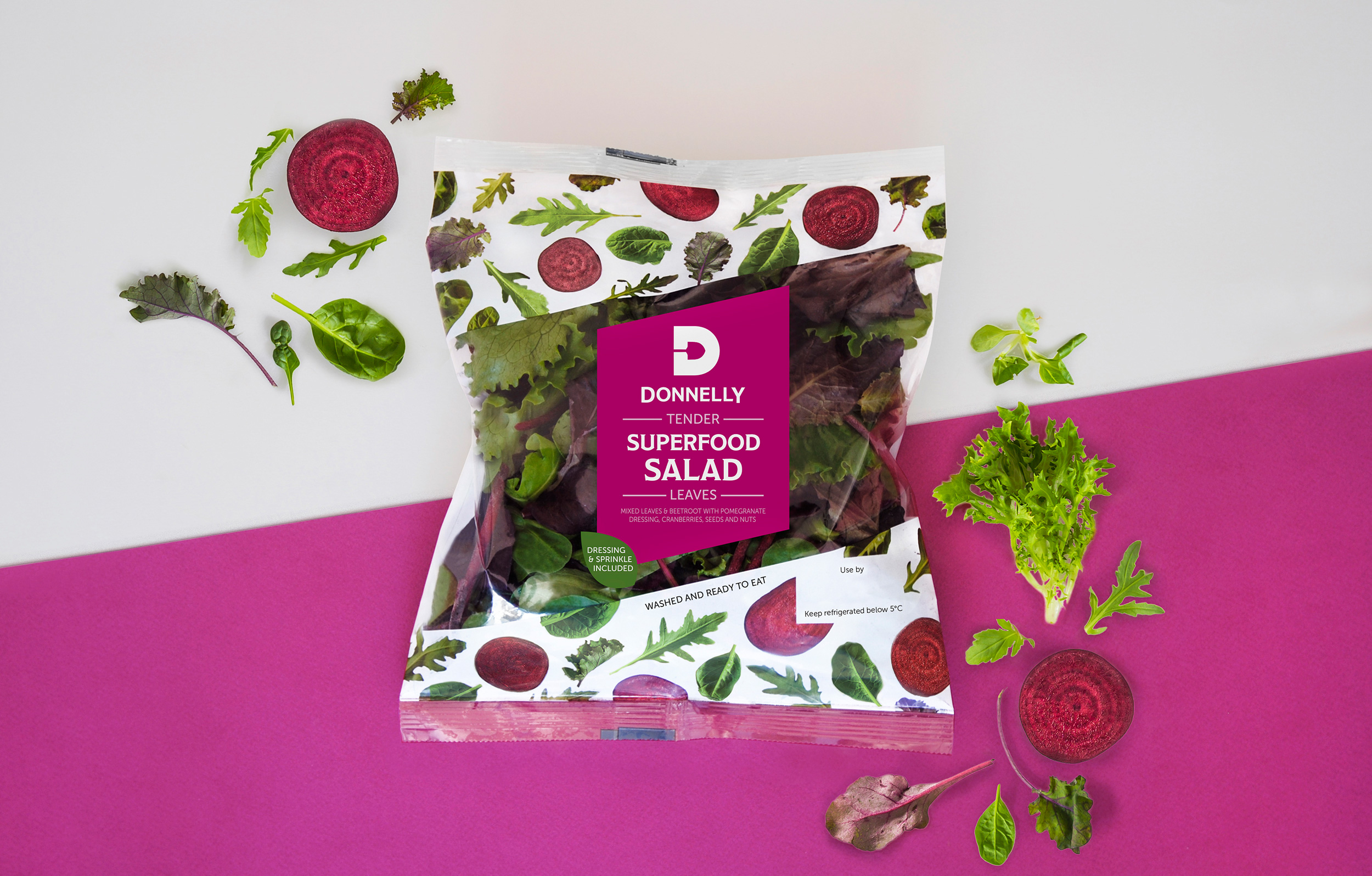
The packaging centres around the freshness of the product. We integrated the leaves into the design to reinforce the message of natural, fresh salad whilst also illustrating the flavour options. Partnering with photographer Amber Locke, we developed patterns of leaves that covered the packaging and brand world to highlight the quality of the product. We did the shoot in natural light to emphasise the freshness of Donnelly's produce. We loved the fact these beautiful leaves became art pieces in their own right.
The colours from each shoot were then used to inspire the flavour themes, creating appetising and enticing labels.
