Discover The Story Of Rail
2021
Designed by Stacie Heffernan, Colin Byrne and Viktorija Cumikova at TOTEM
Categories: Website / Identity / Signage / Livery
Industry: Charitable
Tags: Icons / Rebrand / Website / Signage / Branding / Identity / Travel and Tourism / Web design
Website: wsvrailway.ie/
Waterford Suir Valley Railway (WSVR) was founded in the year 2000 with the aim of preserving a historical stretch of Waterford’s railway line, dating back to 1872. Having reached the 20 years in business milestone, the board of directors determined that a refresh of their brand identity was needed. TOTEM were brought on board to capture the heritage and character of the railway and align it with WSVR’s future vision. Our aim was to capture, connect and communicate the old-world wonder of rail and bring to life the joyful, authentic and friendly experience of the railway today.
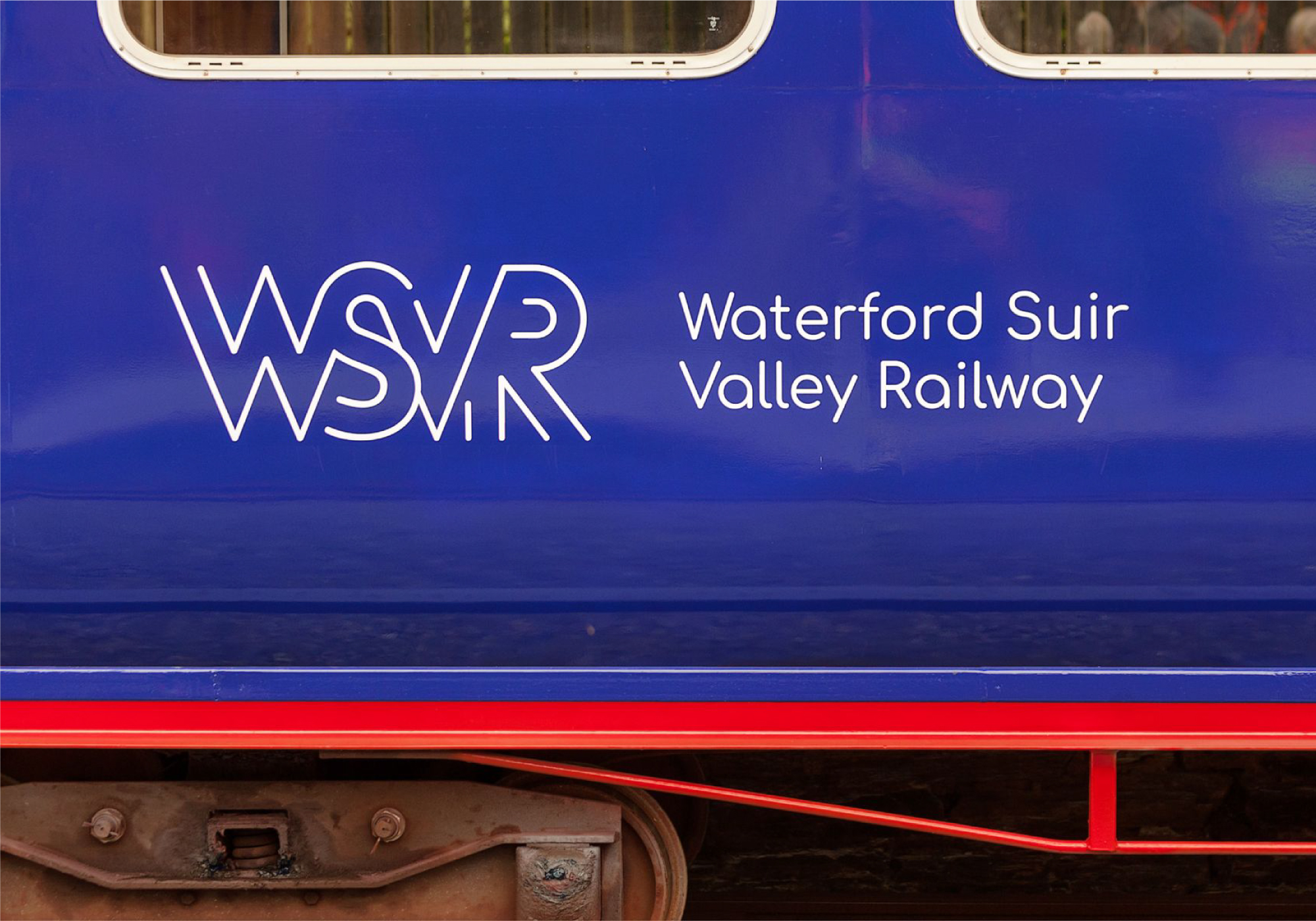
A new brand identity was created drawing inspiration from vintage railway badges, tickets and emblems which influenced our monogram concept. The WSVR letters were crafted using parallel lines representing both the tracks and journey of the railway. This sleek, modern design brings the brand forward while acknowledging its heritage and positions WSVR as a leader in the South East’s tourism industry.
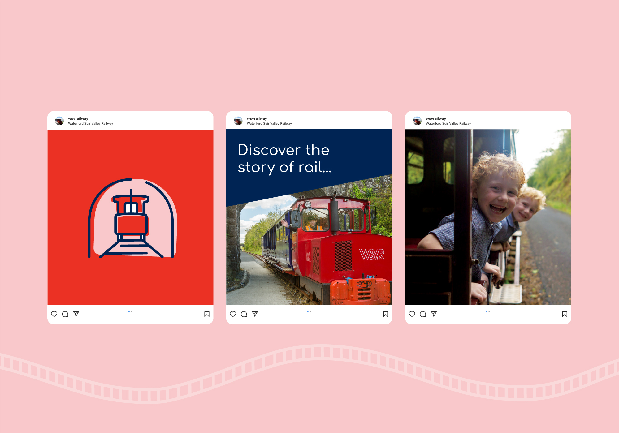
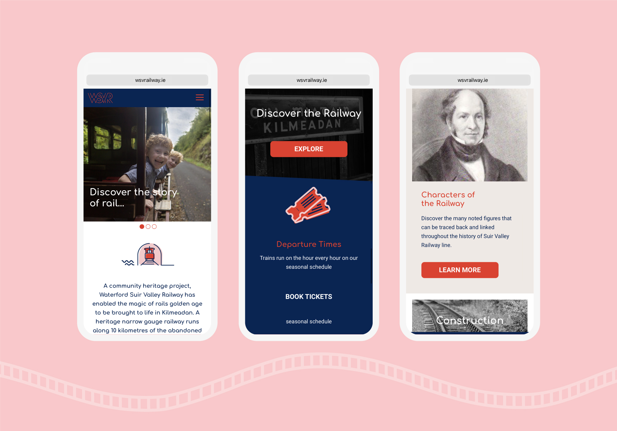
The new identity was rolled out across print and digital applications along with environmental elements on site at the railway station. A new website was designed with the user experience in mind, enabling visitors to get information and easily book tickets.
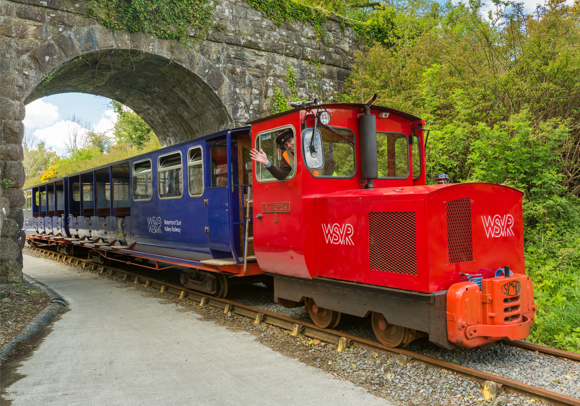
A primary colour palette of bright red and rich navy blue helped make the website distinctive and the train livery quite striking.
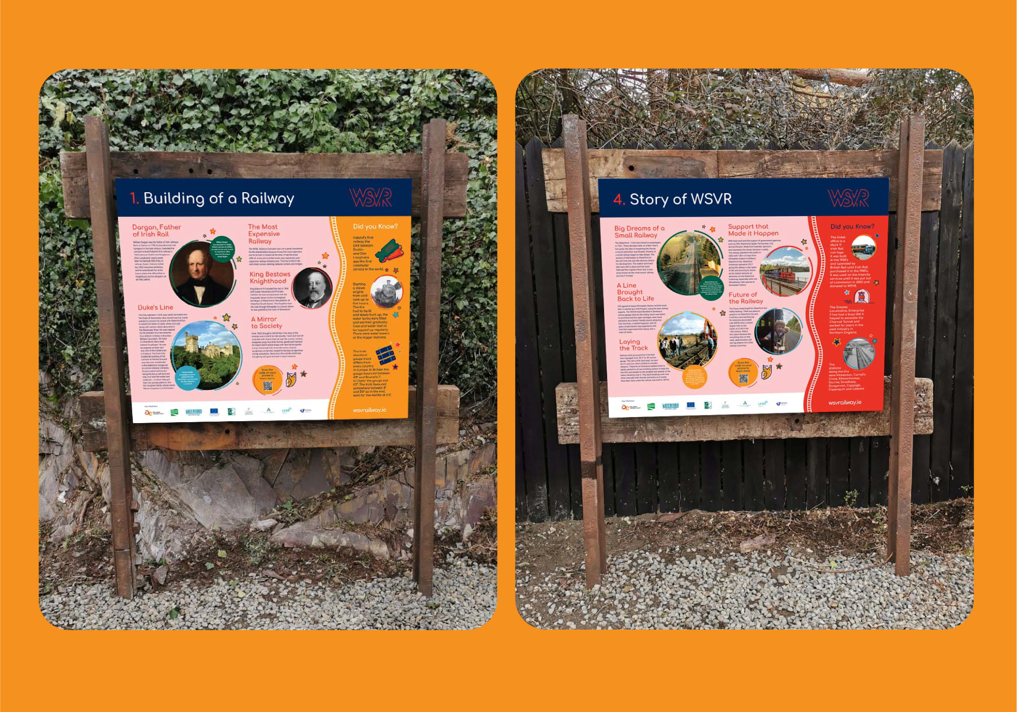
Storyboard signs were created using up-cycled material from the railway – metal rail track and wooden sleepers were used to create the storyboard frames. These signs are used at various points around the station to help tell the story of rail. QR codes on each storyboard provide a direct link to a dedicated web page that continues the story in more detail for the enthusiasts.
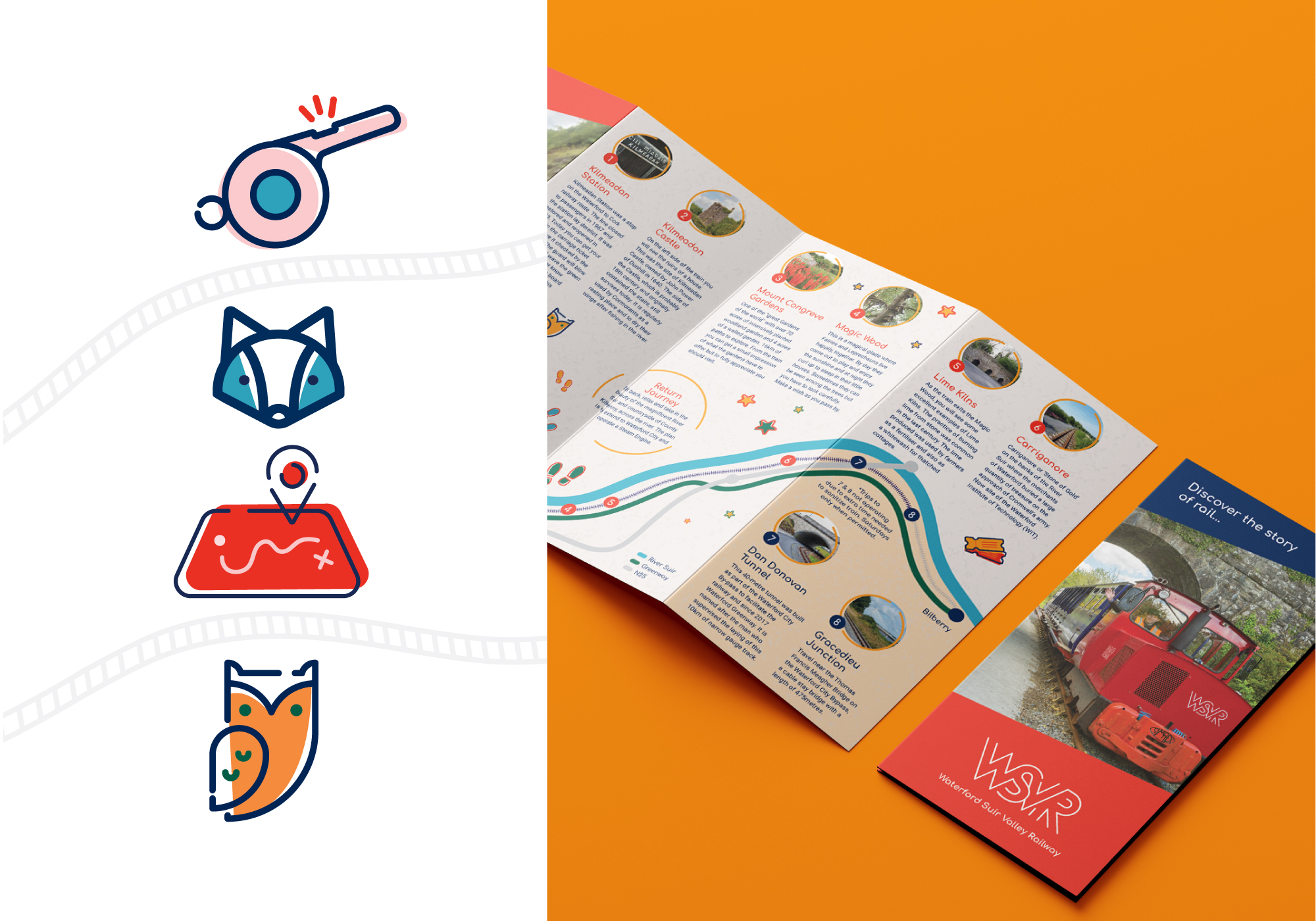
To support the identity, a suite of new playful icons were created, extending the visual language across each touchpoint.
