Davy Brand Refresh
Designed by Mary Doherty, Kim Robinson, Alessandra Ravida and Paula McEntee at Red Dog
Creative Director: Paula McEntee
Designer: Marcus McCabe
Illustration: Project Twins
3D Modelling: Emberlight
Iconography: Forma
Categories: Identity
Industry: Corporate
In 2018, Davy Group undertook a company-wide culture and brand review. Working with Teneo UK, they conducted an extensive programme of qualitative research to inform the refreshed brand positioning and strategy… "It's personal to us".
In tandem with Teneo UK, Davy commissioned Red Dog to bring this new positioning to life.
We met with Davy staff from all areas of the business, running a series of working sessions to assess the current identity and guidelines to answer the question: 'what's working and what needs further consideration?' to inform the design brief.
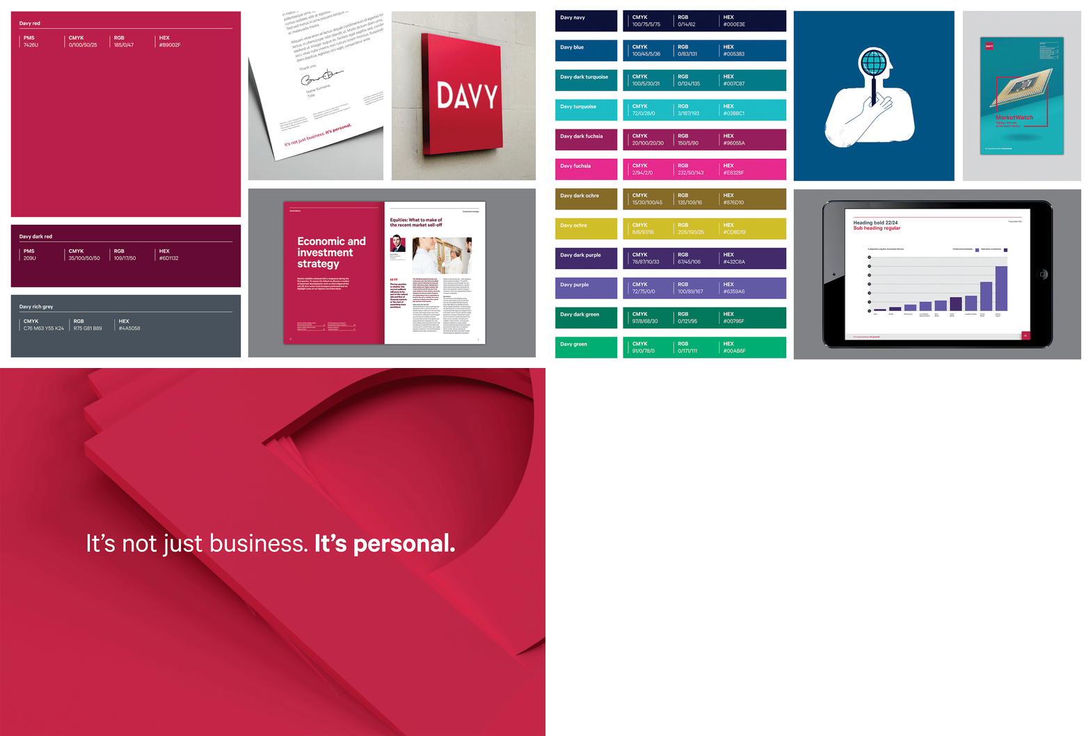
This brief allowed us to focus on driving simplicity, clarity and consistency across the organisation moving to a monolithic brand approach and a more considered colour palette which the Davy team can really own.
We refreshed the Davy brand mark to reflect the more friendly and approachable positioning and retained one single brand typeface, while discarding the use of caps to speak in a softer tone.
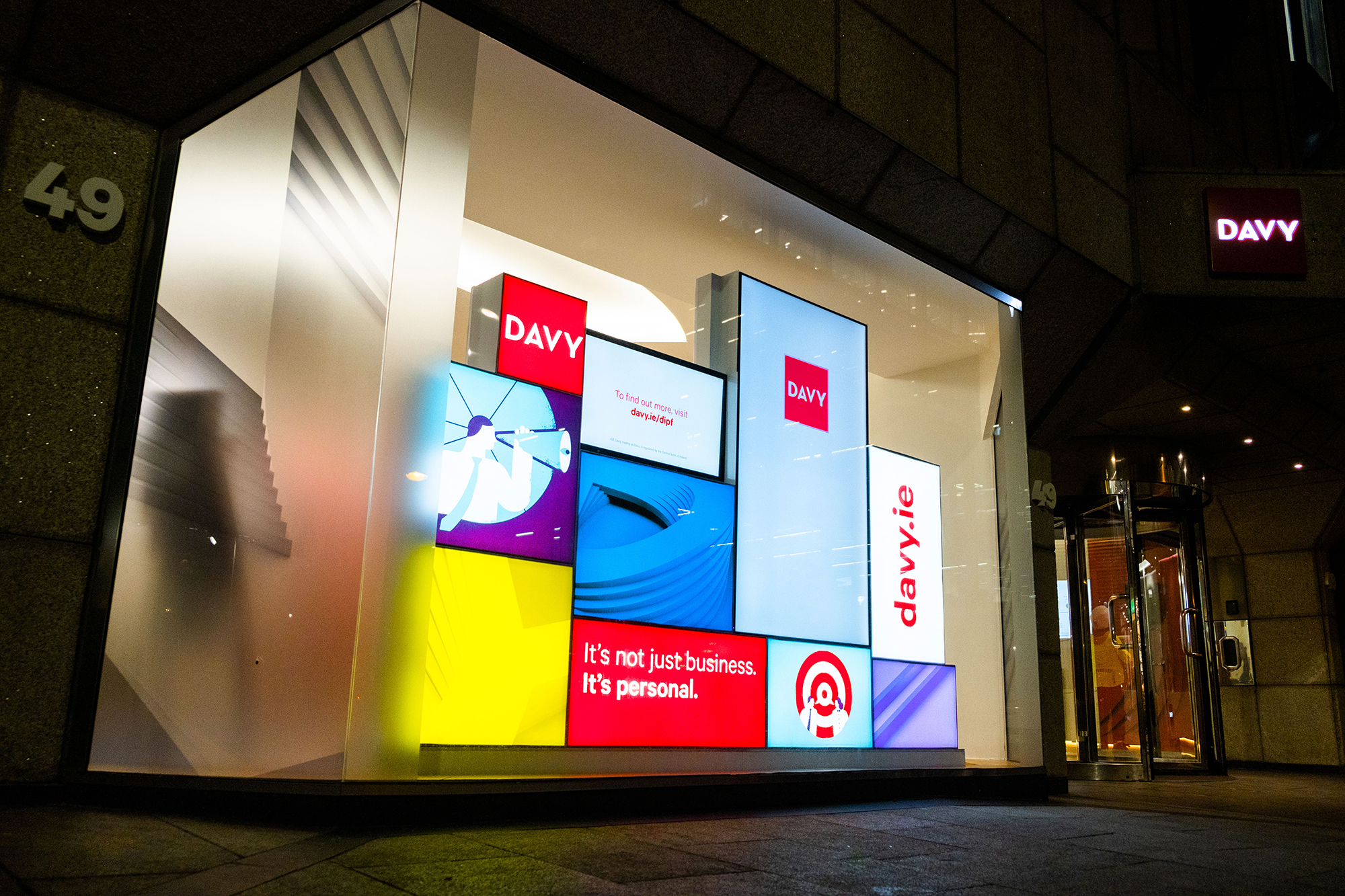
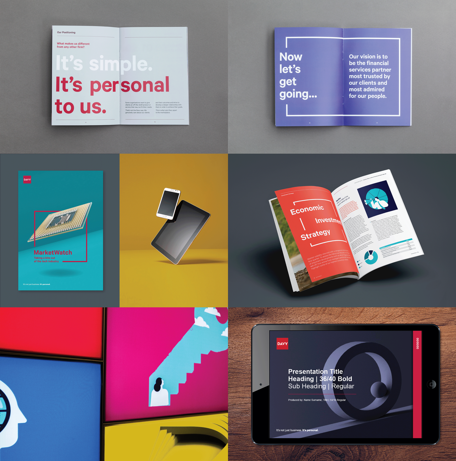
We expanded on the asset bank, bringing photographic portraiture, still life photography, illustration, abstract backgrounds and bespoke iconography into the toolkit. This ensures the team have a wealth of assets to cover the broad spectrum of both external and internal material, while also aligning these assets to the relevant stages of the Davy customer journey.
We developed a thorough set of Brand Guidelines and tested the visual language across a range of roll-out items and templates. We also supported the Marketing Team with the on-boarding process of the new brand company-wide with an internal launch and follow-up support.


