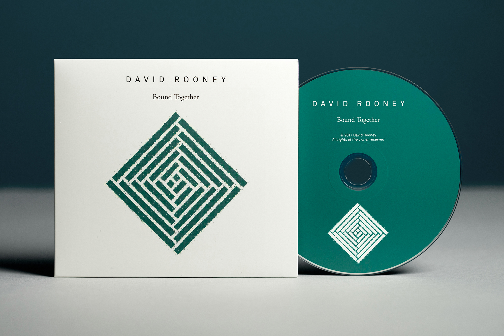
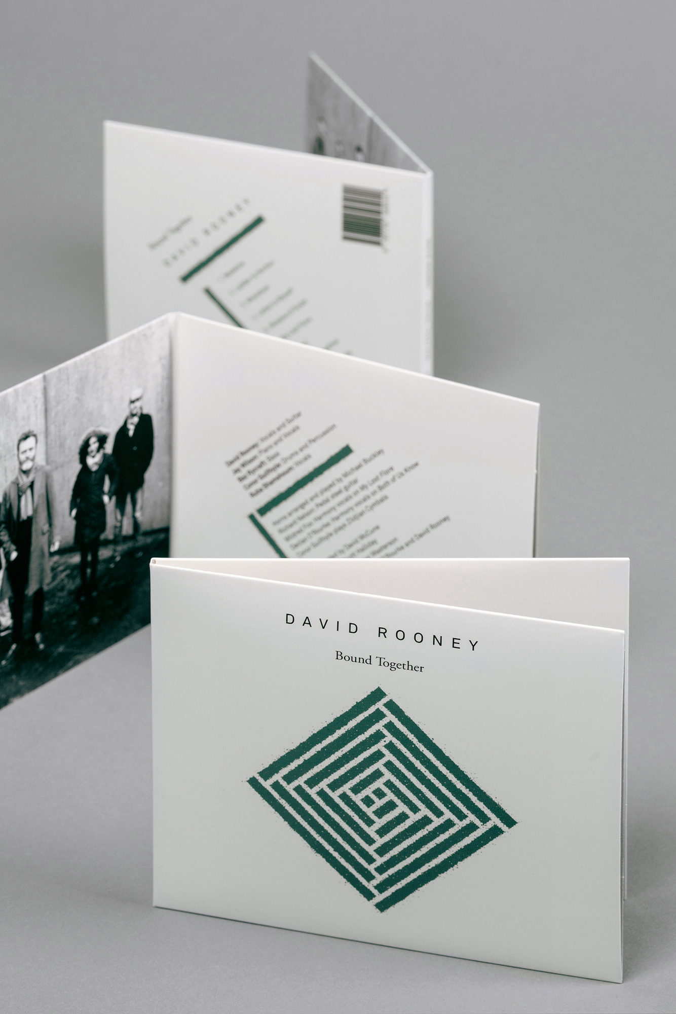
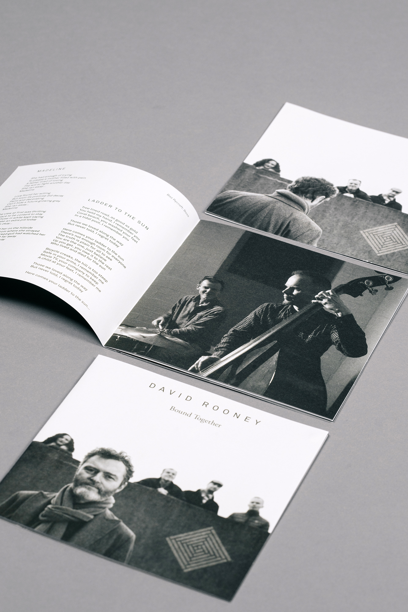
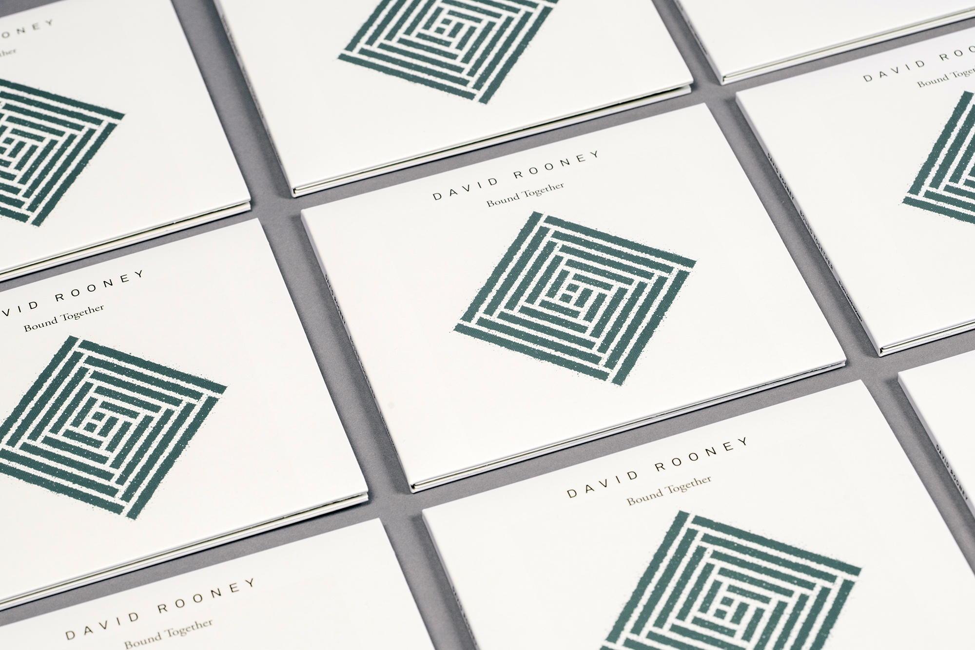
David Rooney, ‘Bound Together’, album on CD.
2011
Designed by Conor Clarke at Design Factory
Illustration: David Rooney
Photography: Jaro Waldeck, Conor Clarke
Songs & Lyrics: David Rooney
Printing & Packaging Production: Crystal Media
Categories: Packaging
Industry: Cultural
Tags: Typography / Illustration
Digipak for CD, inner booklet and disc onbody label were designed for Irish illustrator and artist David Rooney’s debut album ‘Bound Together’, released in March 2017.
The musicians on the album came together through a series of happy coincidences and were ‘bound together’ through the experience of recording and performing the songs on the album. ‘Bound Together’ is a track on the album, but has different origins and meanings for the artist.
Early on in the concept development for the cover art, David and I agreed that a symbol would be preferable to the usual default ‘band photo’ on the album cover — both as a highly distinctive visual device that would work across a range of analogue and digital platforms at large and very small sizes — but also as an opportunity to showcase David’s illustration skills. We we’re also looking for a symbol that was inherently made up of ‘bound together’ elements and we opted to look at the St. Brigid’s Cross, a small hand-crafted cross made from reeds or rushes, which is put up in Irish houses on 1st February to mark the beginning of Spring. They have a distinct design with a woven square centre and four radials. Similar to many Irish religious-cultural traditions, they are a mix of Christian and Pagan, with St. Brigid’s feast day coinciding with the Celtic feast of Imbolc (a Cross Quarter Day, midpoint between the Winter Solstice and the Spring Equinox) and the design seeming to blend the Christian cross with Celtic themes.
We had no interest in the overtly Celtic or Christian aspects of the symbol — moreover David was intrigued by the woven centre square, which has Pagan origins rooted in community and togetherness, symbolising protection from outside hazards and danger. David created a pencil sketch of the central square motif and I responded with a more graphic treatment, which David finally rendered in his signature ‘scraperboard’ technique. The symbol was deconstructed throughout the design to form a grid for the typographic information on the digipak and booklet.


