Critico
2024
Designed by David Pakenham and Seán O'Beacháin at So Studio
Creative Strategy: Karen O'Neill
Naming & Copy: Michael Mesbur
Categories: Identity
Industry: Corporate
Critico is born from a unique vision: the fusion of two industry leaders, PageOne and BP Multipage, now working together as one. This collaboration delivers customers a broader range of critical communications solutions with an elevated standard of quality and service—24 hours a day, 365 days a year.
This transformation is more than a name change; it marks a bold step forward, aligning the brand with the diverse, cutting-edge technologies and services it now offers. We were tasked with crafting a brand identity that captures this innovative proposition.
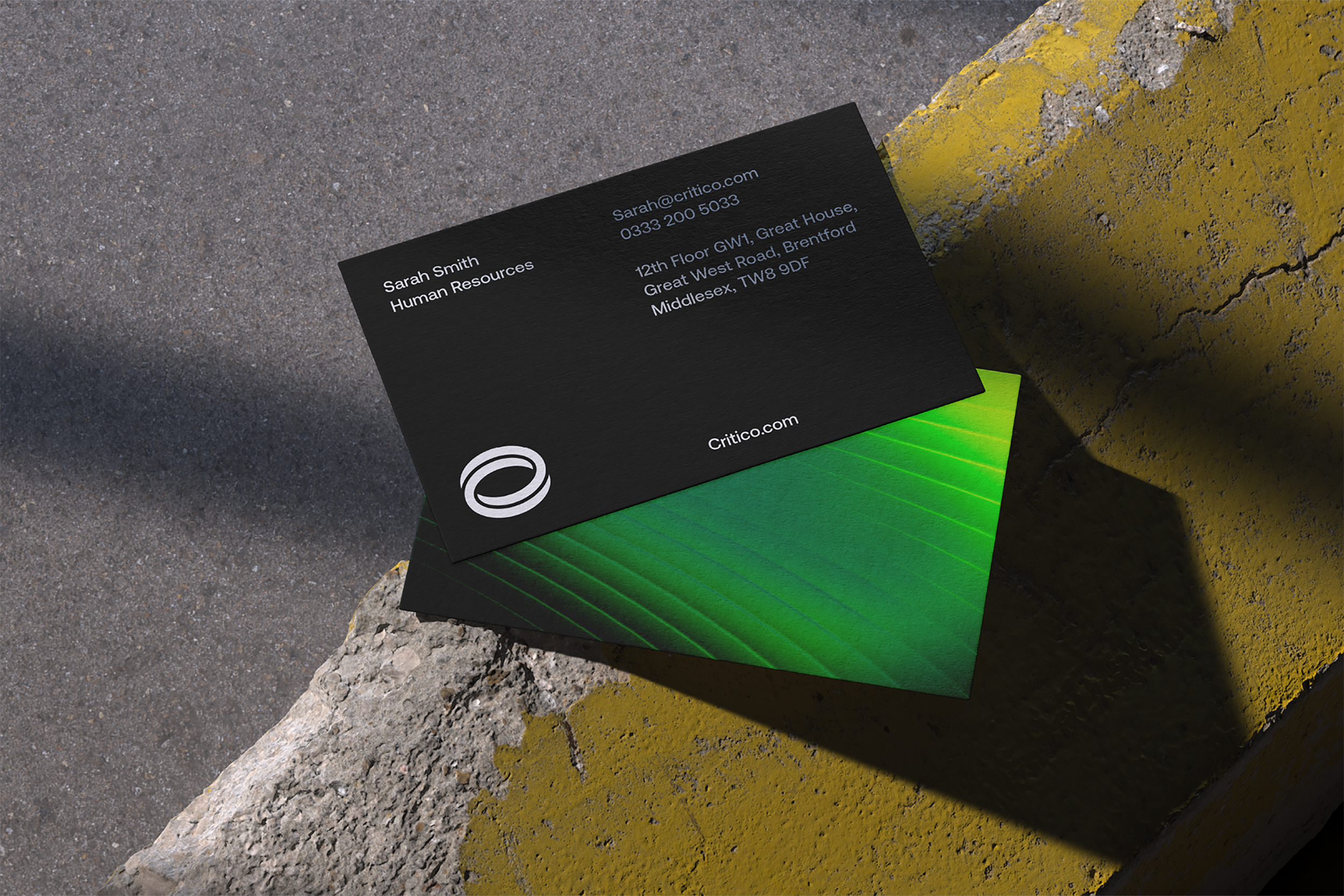
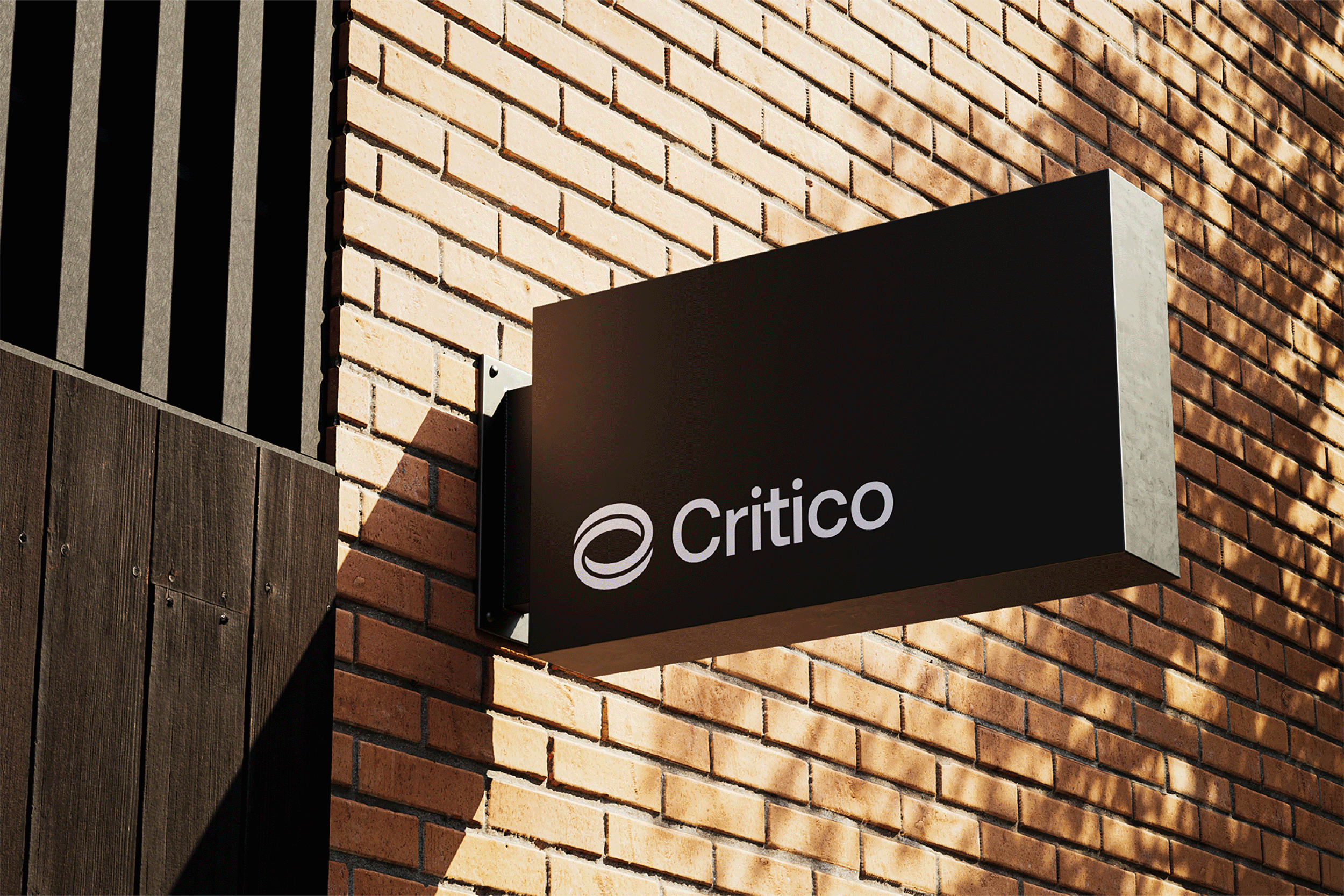
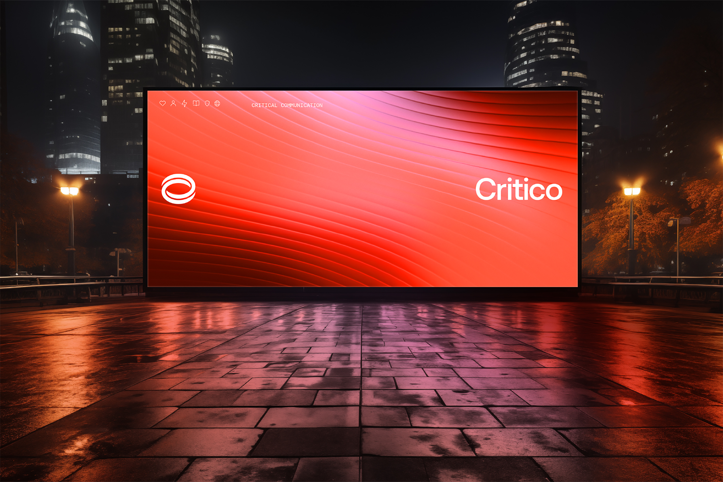
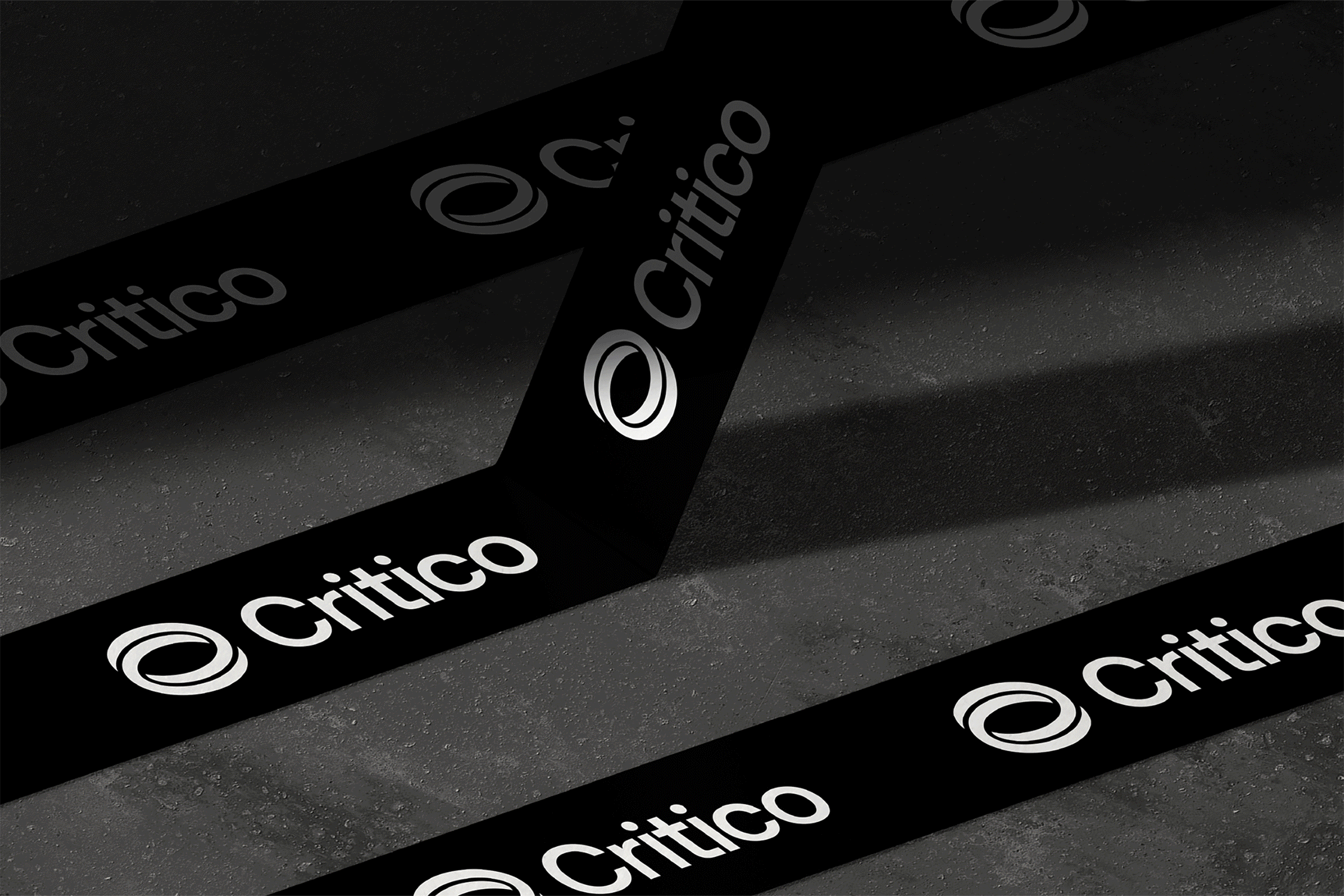
The new logomark features a pair of interlocking C’s, symbolising the union of "Critical" and "Communications" in the name Critico. It embodies connectivity, reliability, and cohesion.
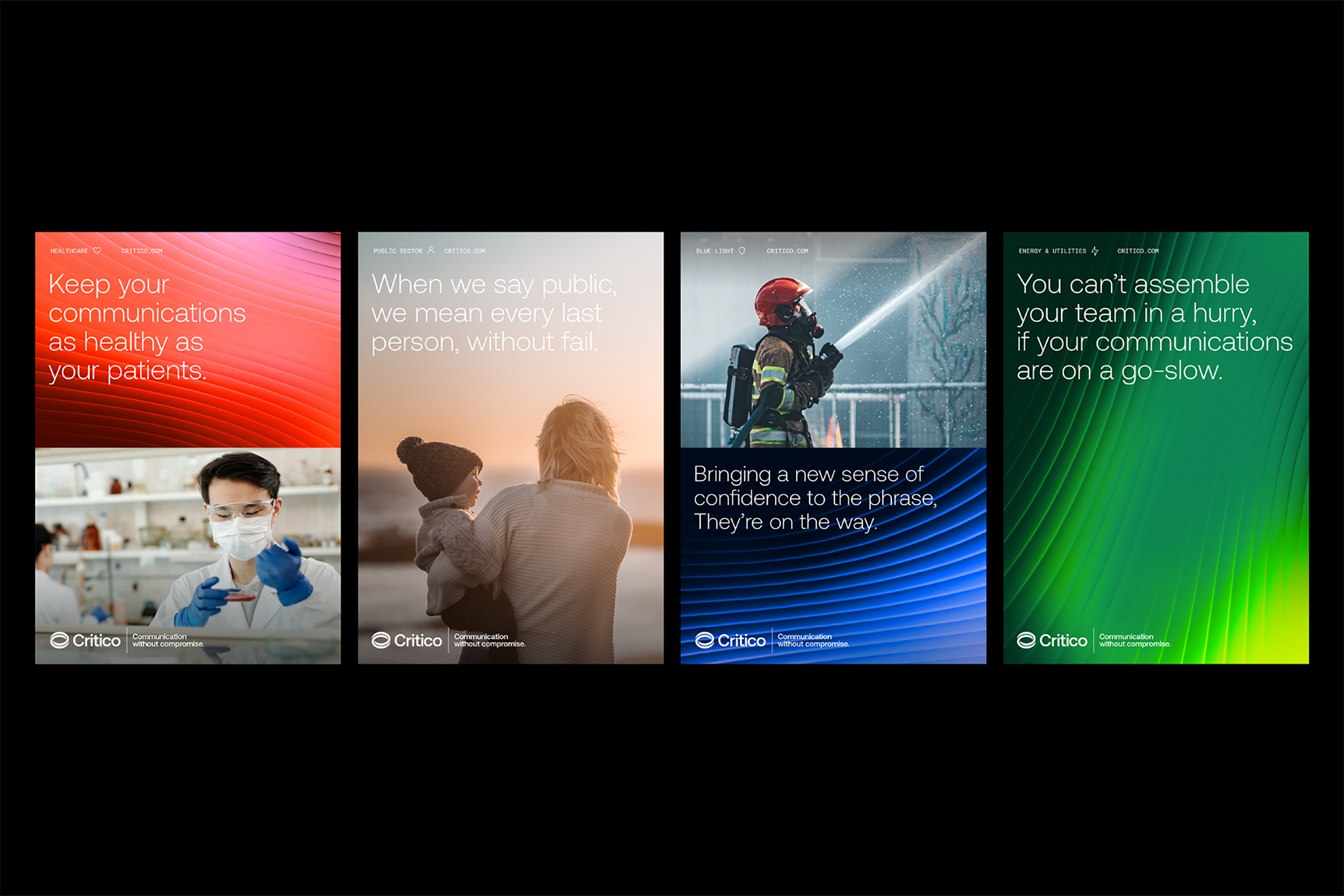
Critico operates across six distinct sectors, each represented by its own unique colour palette, icon, and pattern. These abstract patterns reflect the fluid and dynamic nature of communication. Motion is seamlessly woven into the identity system, reinforcing the brand's forward-thinking and innovative ethos.