Comhairle na nÓg Rebrand
Designed by Susan Carberry, Mary Doherty and David Stanley at Red Dog
Animation: Tom Fagan
Illustration: Charly Tudor
Categories: Website / Identity
Industry: Corporate
Website: comhairlenanog.ie/
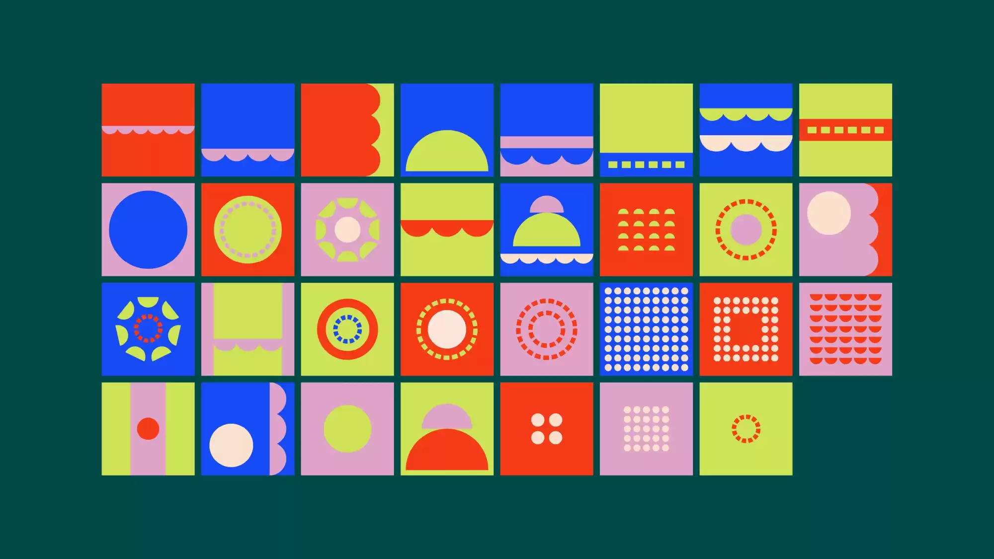
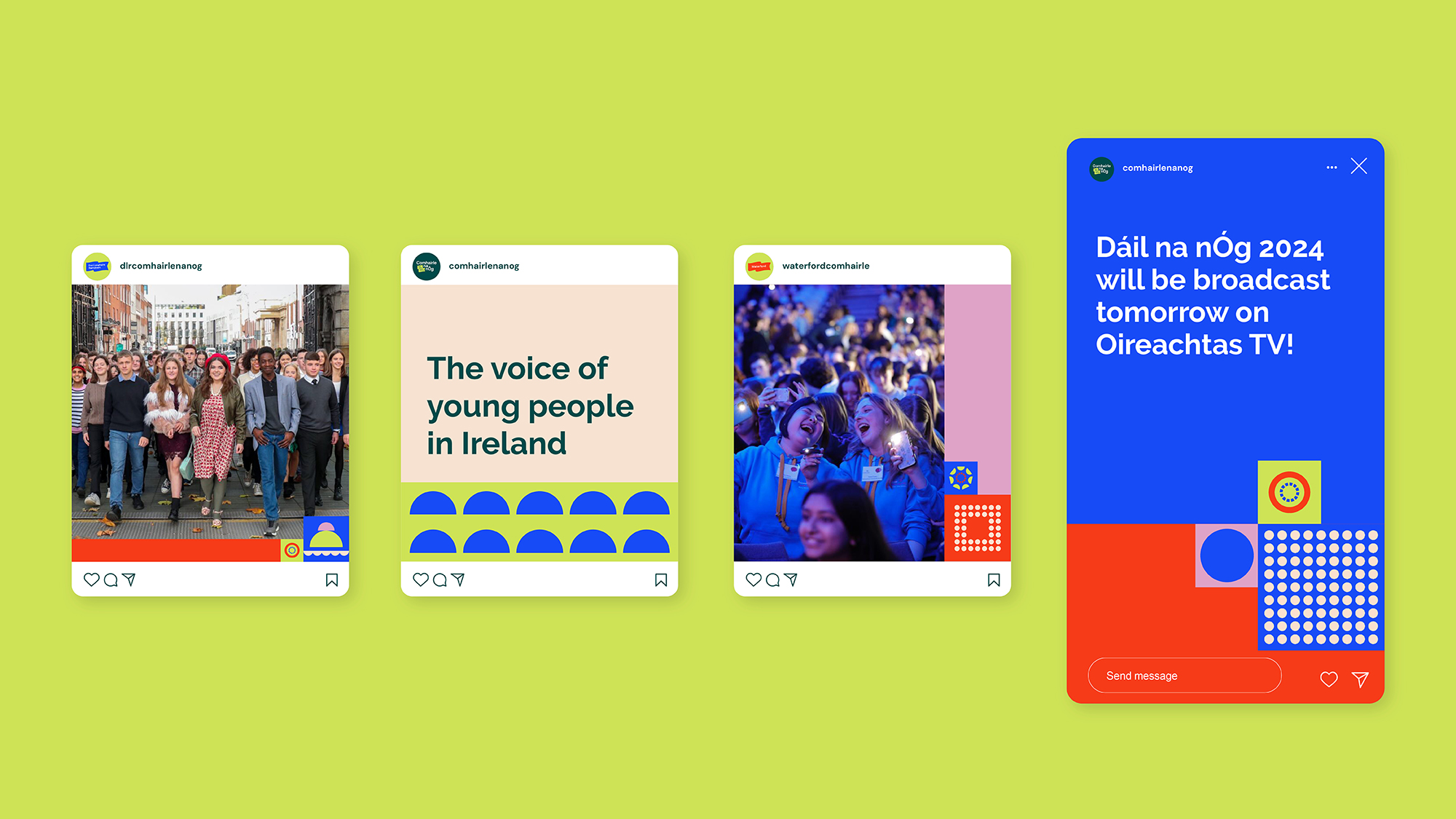
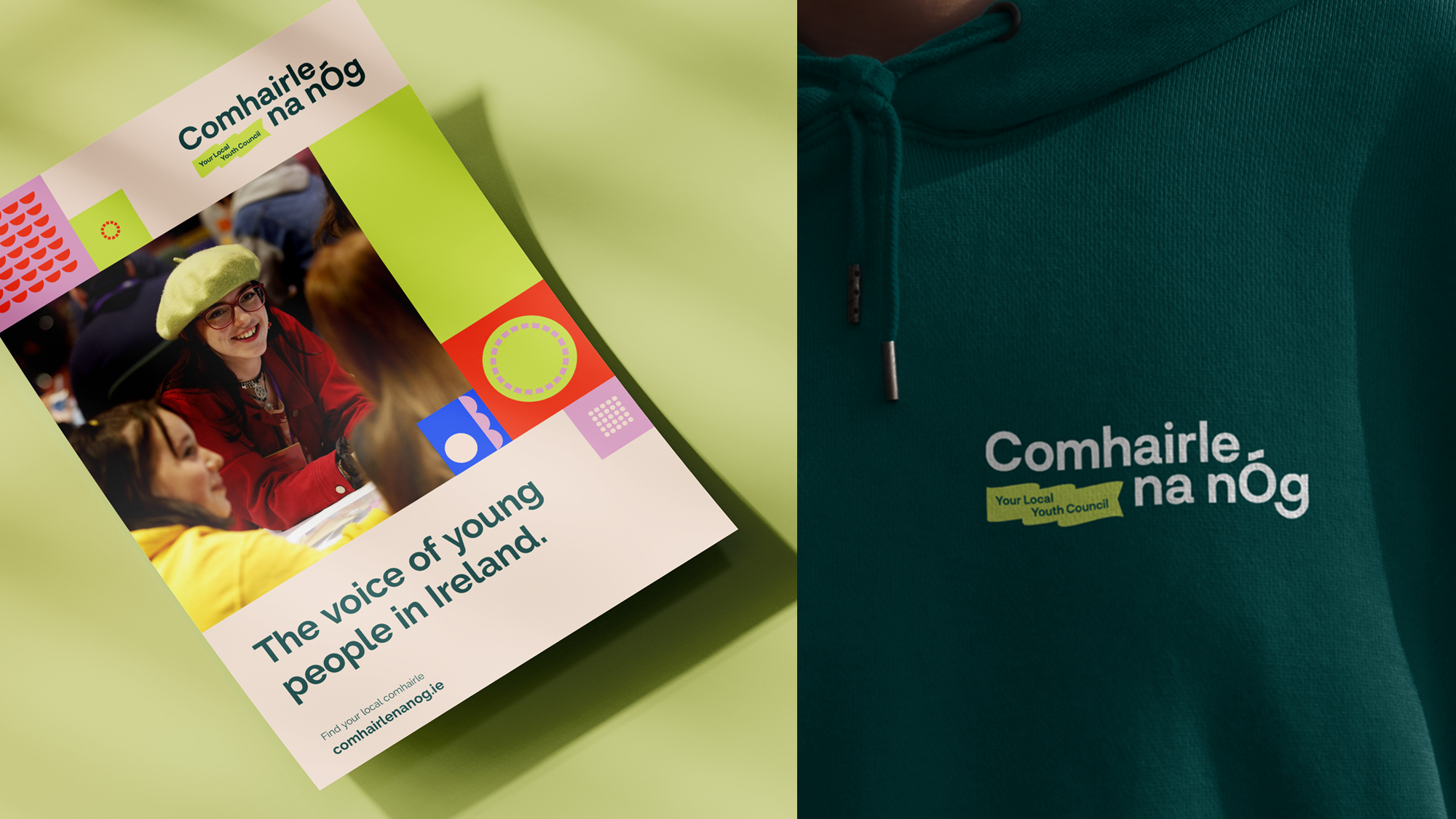
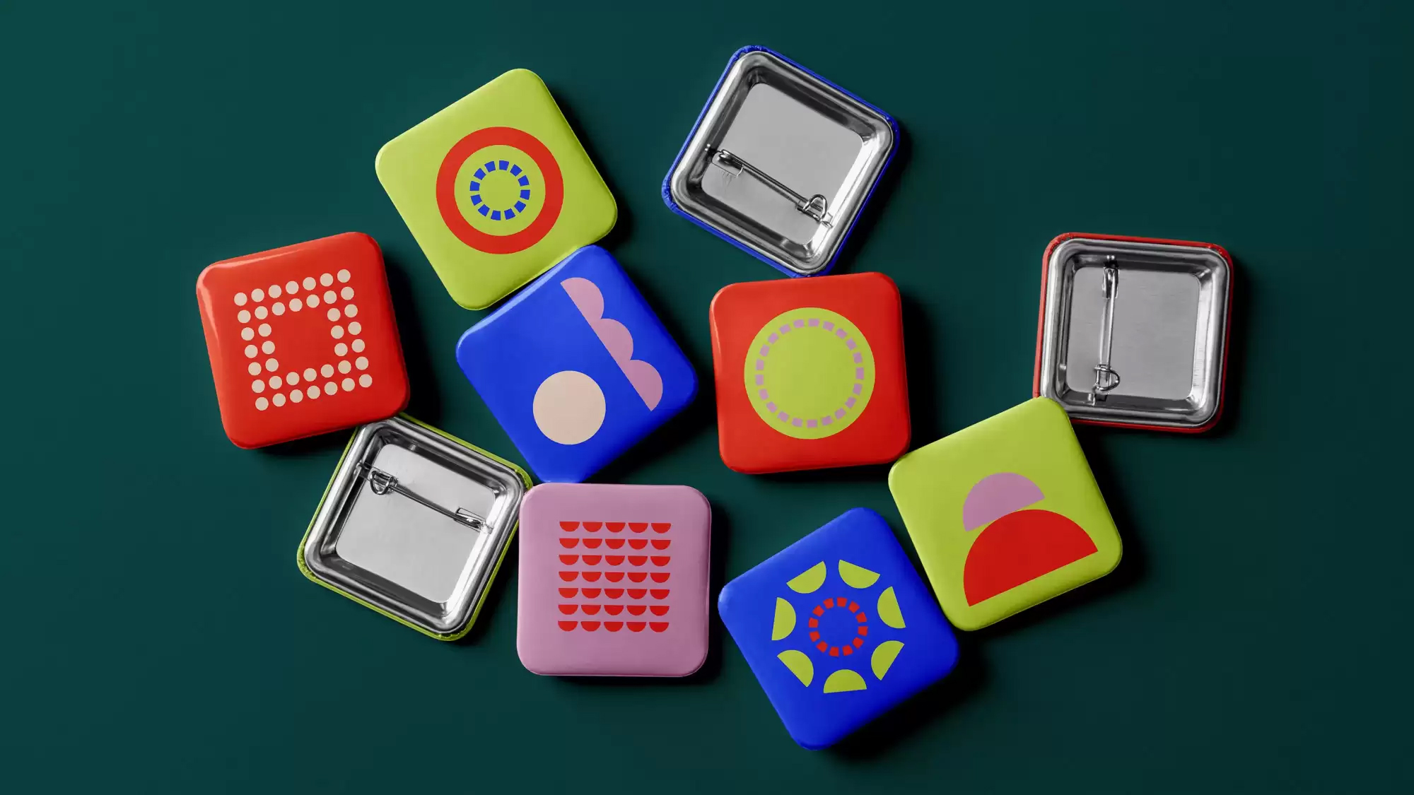
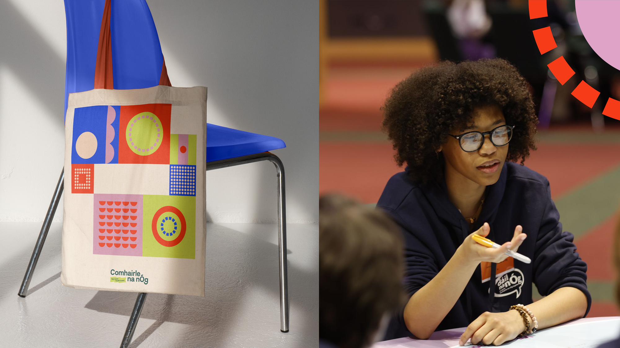
Made up of 31 different Comhairle, each with a voice as important as the next. This new brand identity celebrates individuality and locality, whilst also being truly united and supportive. The tone is confident and inclusive - creating the feeling of being part of something bigger.
The logo uses a bold and youthful typeface with the tagline housed in a flag that signifies togetherness, representation and pride. The custom fada on the nÓg is inspired by the flag movement and the customised ‘g’ with the smiling descender represents inclusivity and voice. Focusing on the unique traits of each local comhairle across Ireland we created a suite of graphic tiles which take inspiration from their size, location, population or unique local landscapes (mountains, coast lines, rivers, hills). These graphic elements allow us to create different formations when stacked together and can be intentionally arranged at various scales to introduce visual diversity. The result is an abstract, flexible toolkit, which celebrates collaboration, diversity and togetherness. We get to see the full potential of this system in action across the various applications, specifically across digital. To allow members create their own communication pieces we chose an open source, accessible font and created a suite of editable templates. The youthful and energetic identity and eclectic visual language captures perfectly the essence, values and personality of Comhairle na nÓg.t