Cló Draoíchta
Designed by Brenda Dermody and Clare Bell at Technological University Dublin
Production editor, Designer: Bartek Janczak
Designer: Kayley Kemple
Designer: Joey Barnes
Designer: Hugh Dang
Designer: Jodie Byrne
Designer: Megan McDonnell
Designer: Finan Callaghan
Designer: Gary Price
Designer: Marianna Mooney
Designer: Lily Gaertner
Designer: Laura-Ann Ryan
Designer: Declan Beehan
Designer: Murray Aston
Designer: Stephen Sheehan
Designer: Darragh Mitchell
Categories: Editorial / Exhibition
Industry: Cultural / Education
Tags: Typography
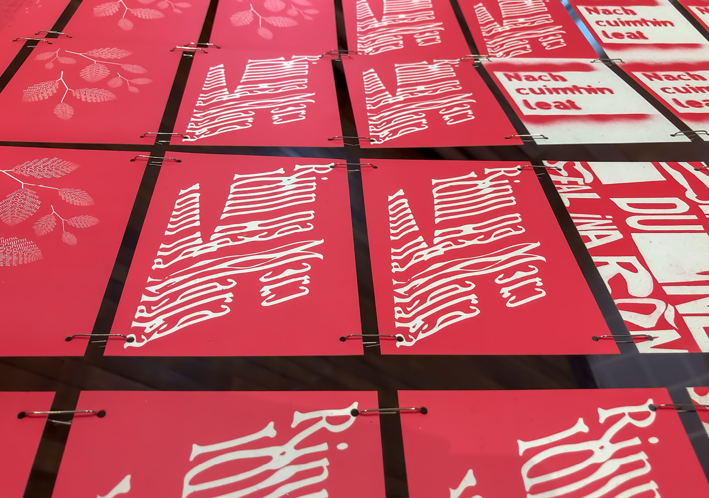
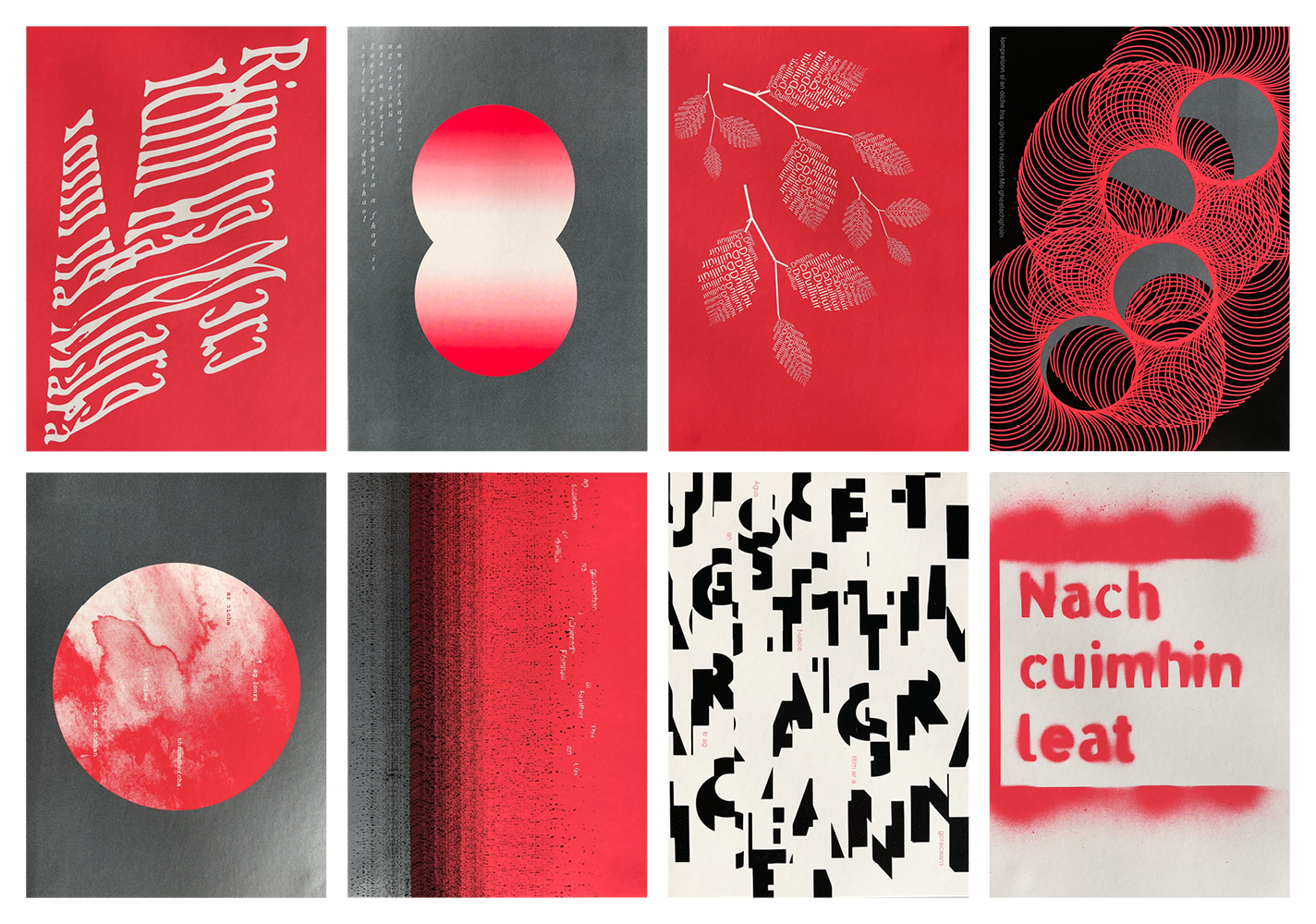
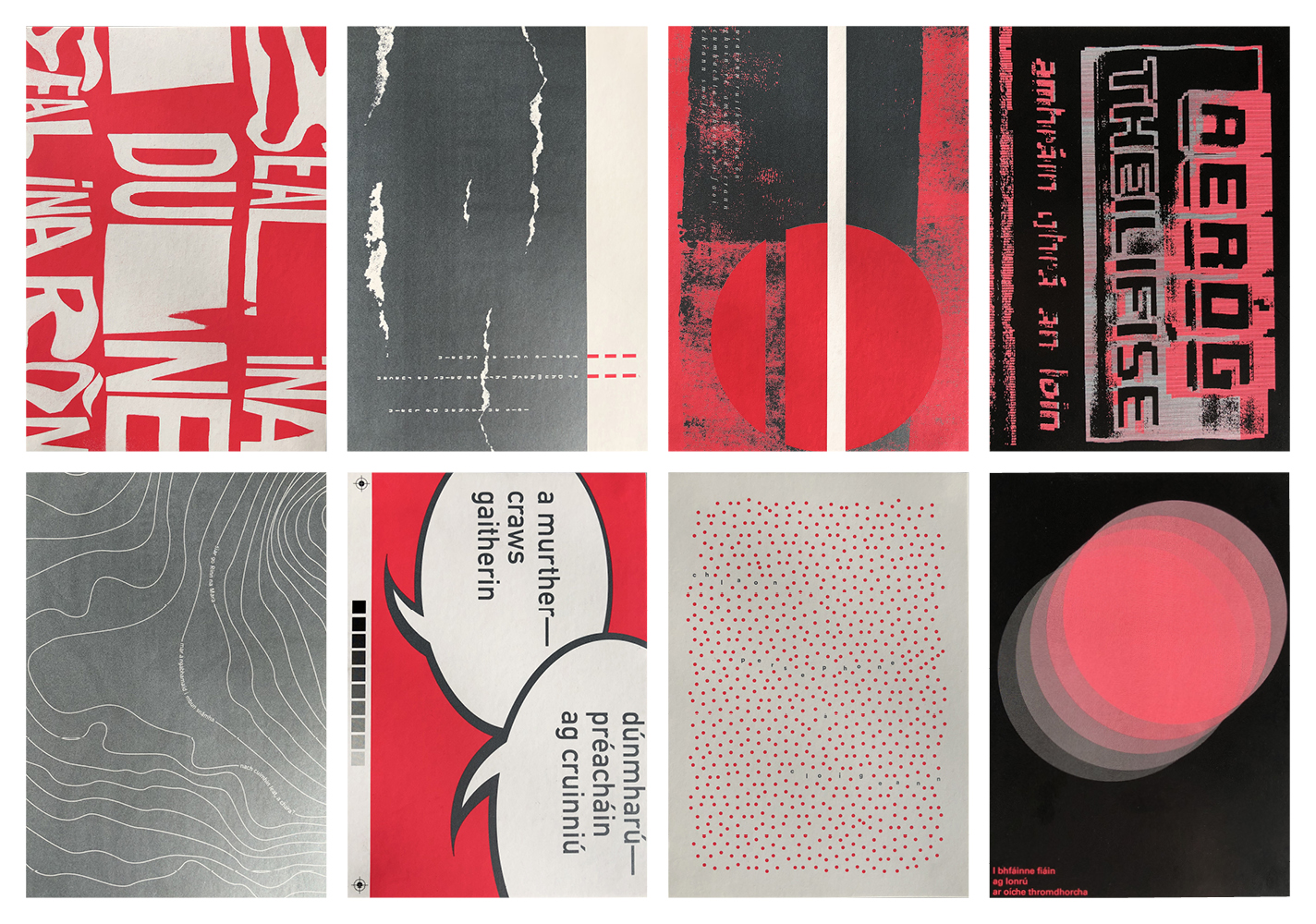
As part of the IMRAM Irish Language Literature Festival Programme, current students on the BA (Hons) Visual Communication course at the Dublin School of Creative Arts, DIT produced an exhibition of Irish language poetry, typographically interpreted, under the tutelage of Clare Bell and Brenda Dermody. Included were the works of poets Rory Gorman, John McDonald and Caitríona NíChleirchin. Sixteen typographic interpretations were selected and printed onto postcards.
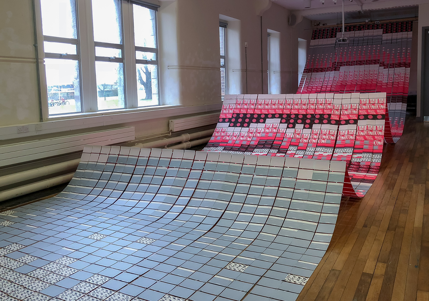
Underwater themes emerged in many of the poems, visual references were made to the sea-bed and corals through the use of flourescent pink ink. Recurring allusions to mythical sea creatures such as selkies were made throughout the poems and provided a sense of being caught between two worlds, in a moment of transition and transformation. The installation attempted to capture this through the movement of wave shapes. References to the moon and tides also surfaced which was referenced through the use of silver, metallic inks. Four and half thousand postcards were used in the creation of the installation and students customised over six thousand paperclips to thread the waves together.
The cards were printed by Plus Print, Dublin on 275gsm Artika Postcard one-sided stock in Pantone fluorescent pink 812 U, Pantone silver 10262 U and Pantone black U. Our thanks to Liam Carson, IMRAM and Ciaran Smith, Plus Print.


