Clinch Rebrand
2022
Designed by Charly Tudor, David Stanley, Elena Stevant and Paula McEntee at Red Dog
Illustration: Steve Doogan
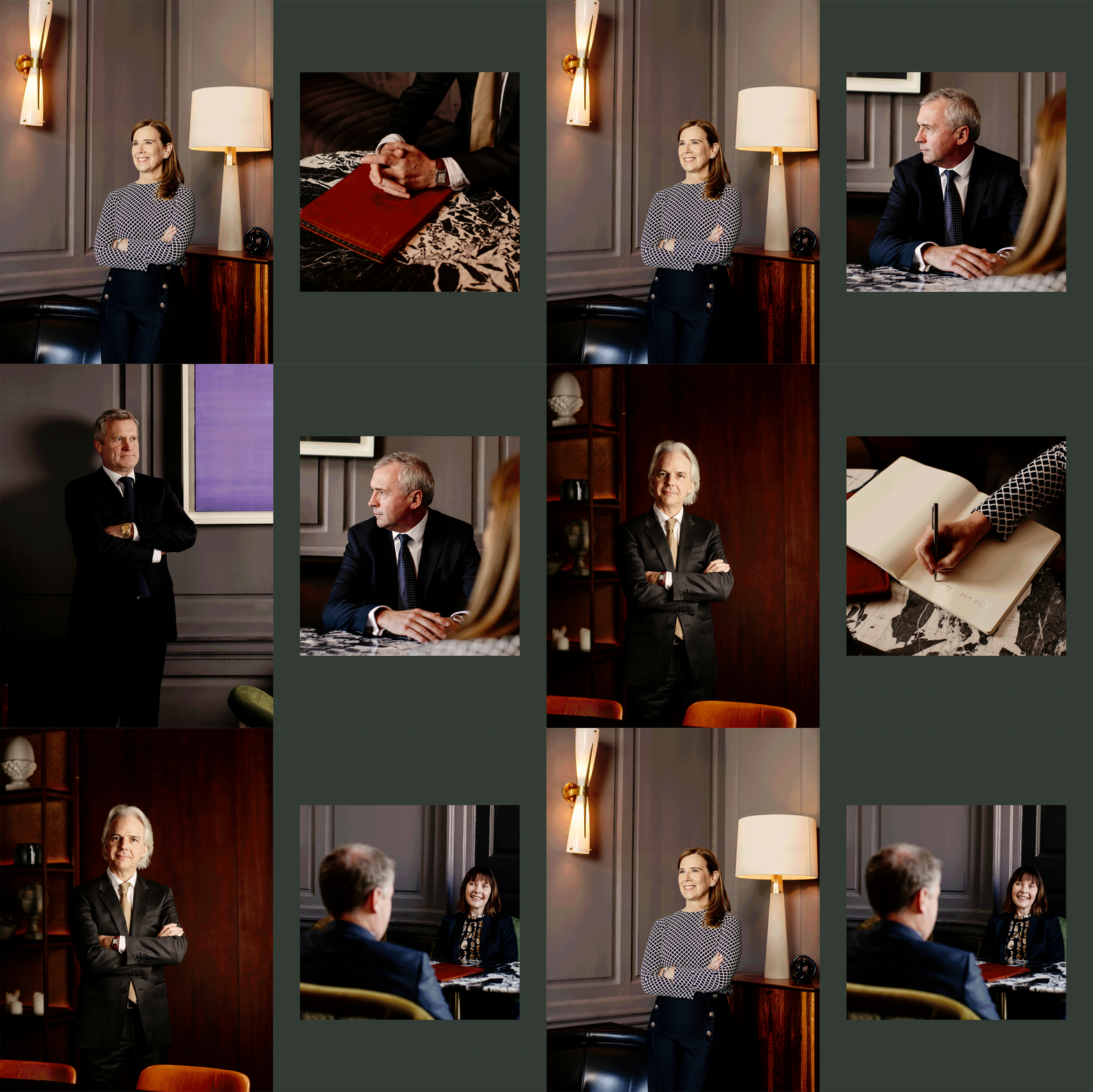
Photography: Al Higgins
Categories: Website / Identity
Industry: Corporate
Tags: Illustration / Photography / Typography / Art direction
Website: clinch.ie/
Clinch Wealth Management team had always communicated their brand on a one-to-one basis while keeping its public image quite discreet. It had built its business on discretion and commitment to client service, offering a very personal service with tailor-made financial advice. As part of a change in this approach to relationship-building, we were tasked with helping Clinch reveal its personality in a new brand that respected – and elevated – its well-earned reputation.
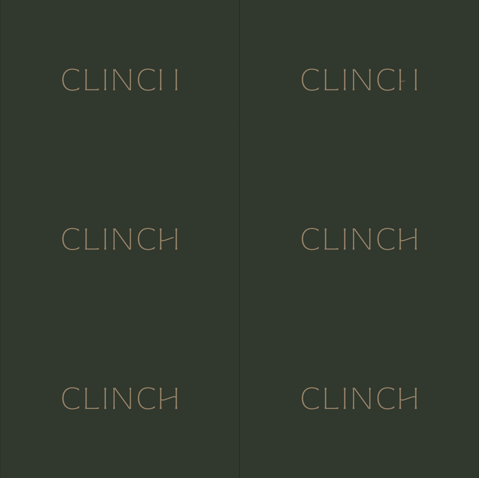
Drawing inspiration from modern Irish art – specifically Patrick Scott, the logo suite is made up of a fine and elegant logotype that feels modern and premium. The customised detail on the ‘H’ shows a unique flourish which is echoed across the visual language. The monogram represents quality, it’s a mark of expertise, giving the brand a unique and recognisable symbol.
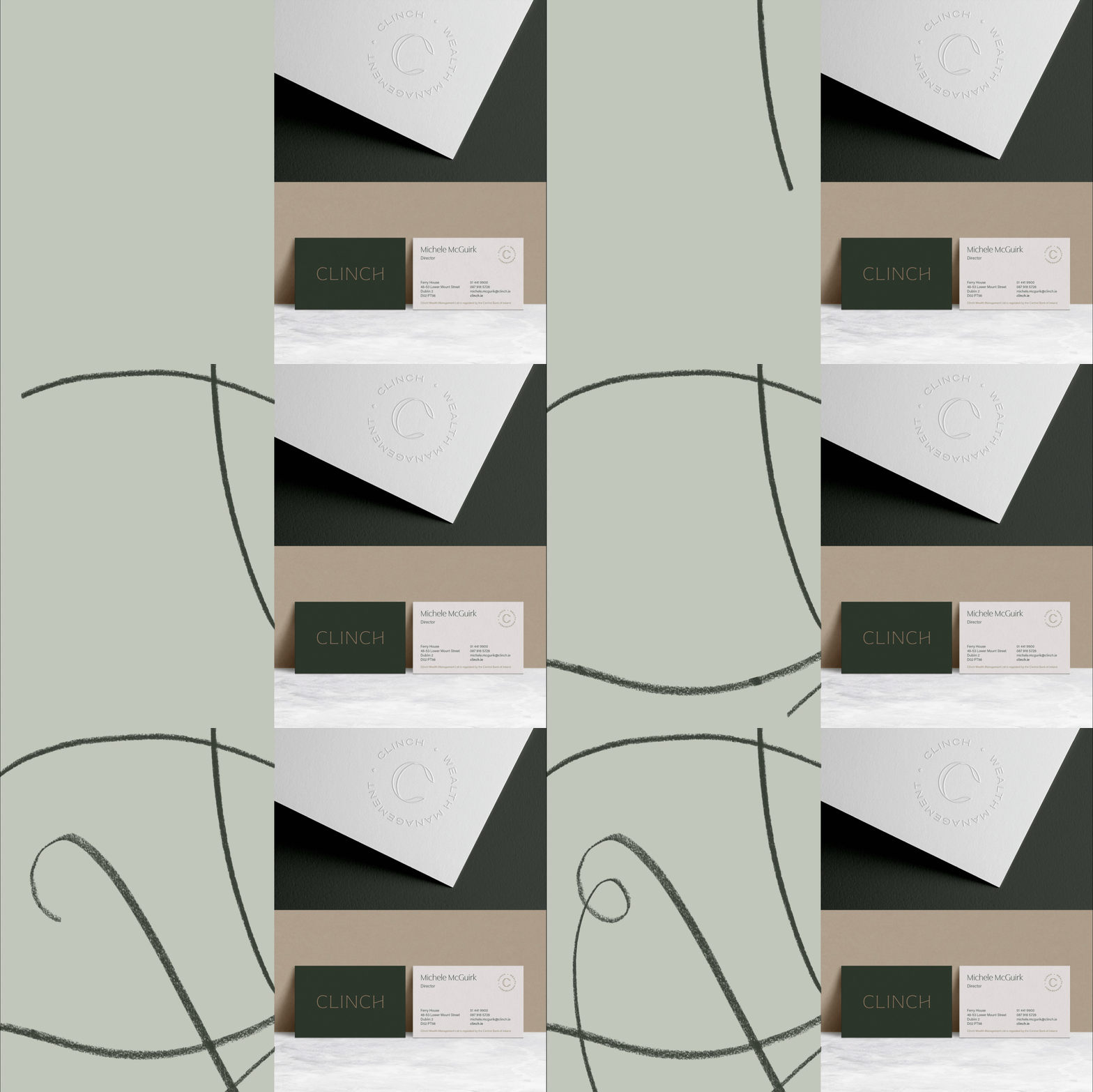
We commissioned illustrator Steve Doogan to create a suite of curvaceous line drawings in charcoal to complement the visual language. Inspired by modern art, the drawings have been applied across marketing collateral to give a consistent, personal and sophisticated brand impression.
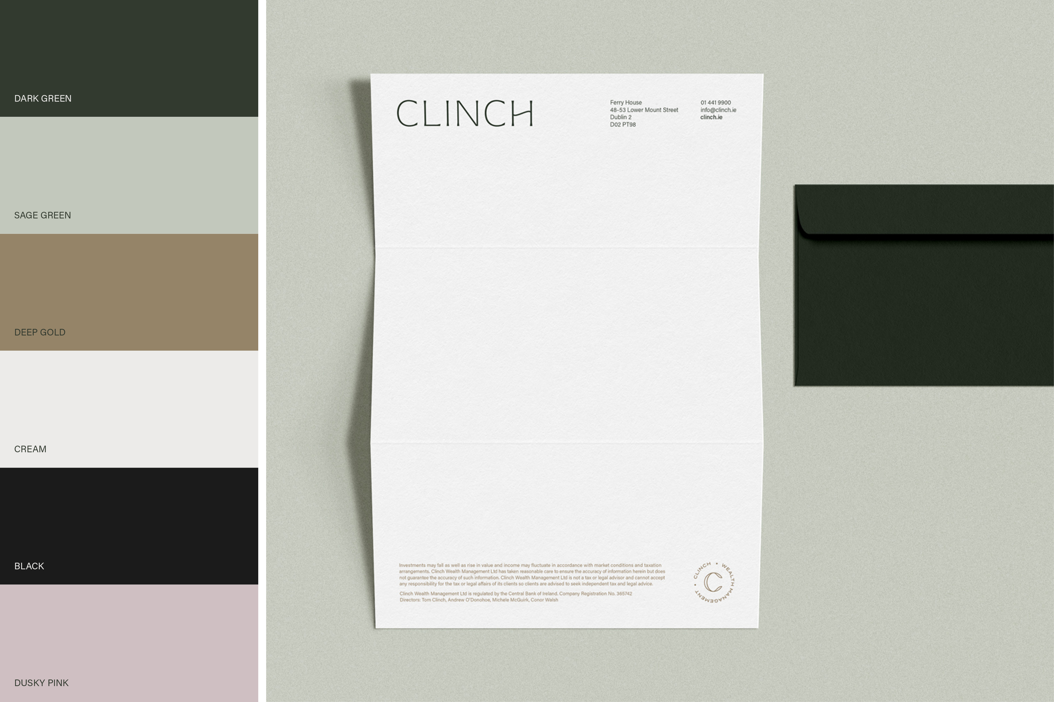
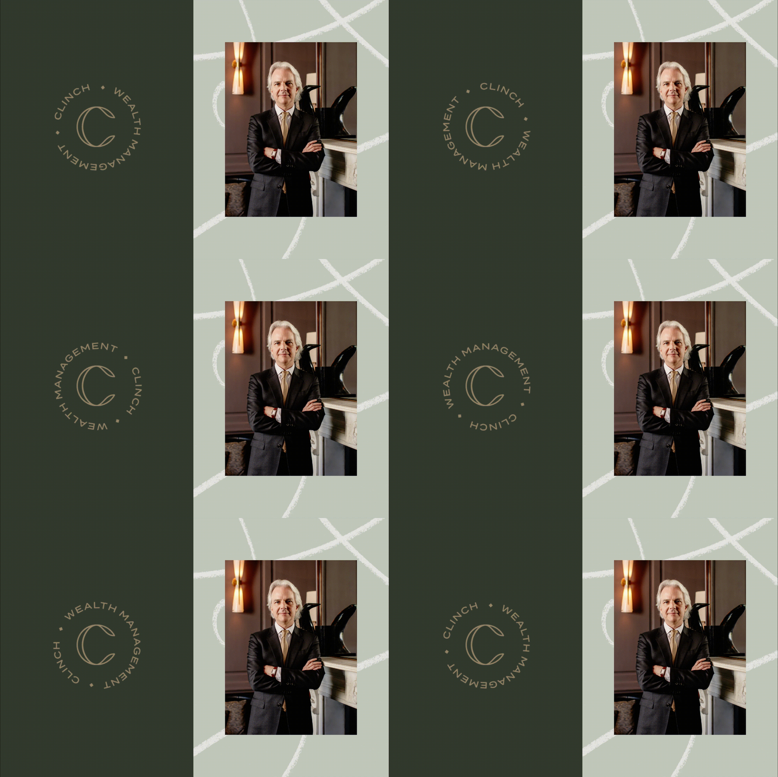
The colour palette feels rich and luxurious with the deep green, black and gold while, elsewhere, there are highlights of light grey, dusky pink, and a light sage green to add softness. Elsewhere, rich sepia tones are evident in a suite of photography that we developed with Al Higgins to showcase the Clinch team in a relaxed, elegant and warm environment bringing their personality to the fore.
