CI Notebook
Designed by Rachel Kerr, Conor Flood and Philip Mitton at CI Studio
Creative Director: Mel O'Rourke
Photography: Bridget Butler
Printer: Plus Print
Categories: Promotional / Print
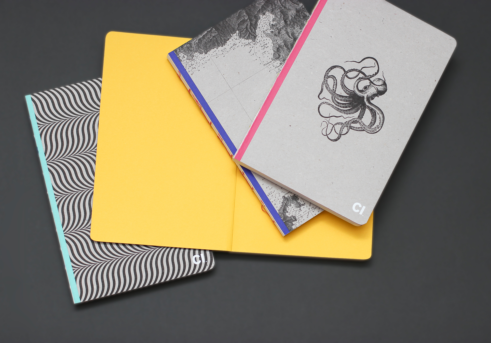
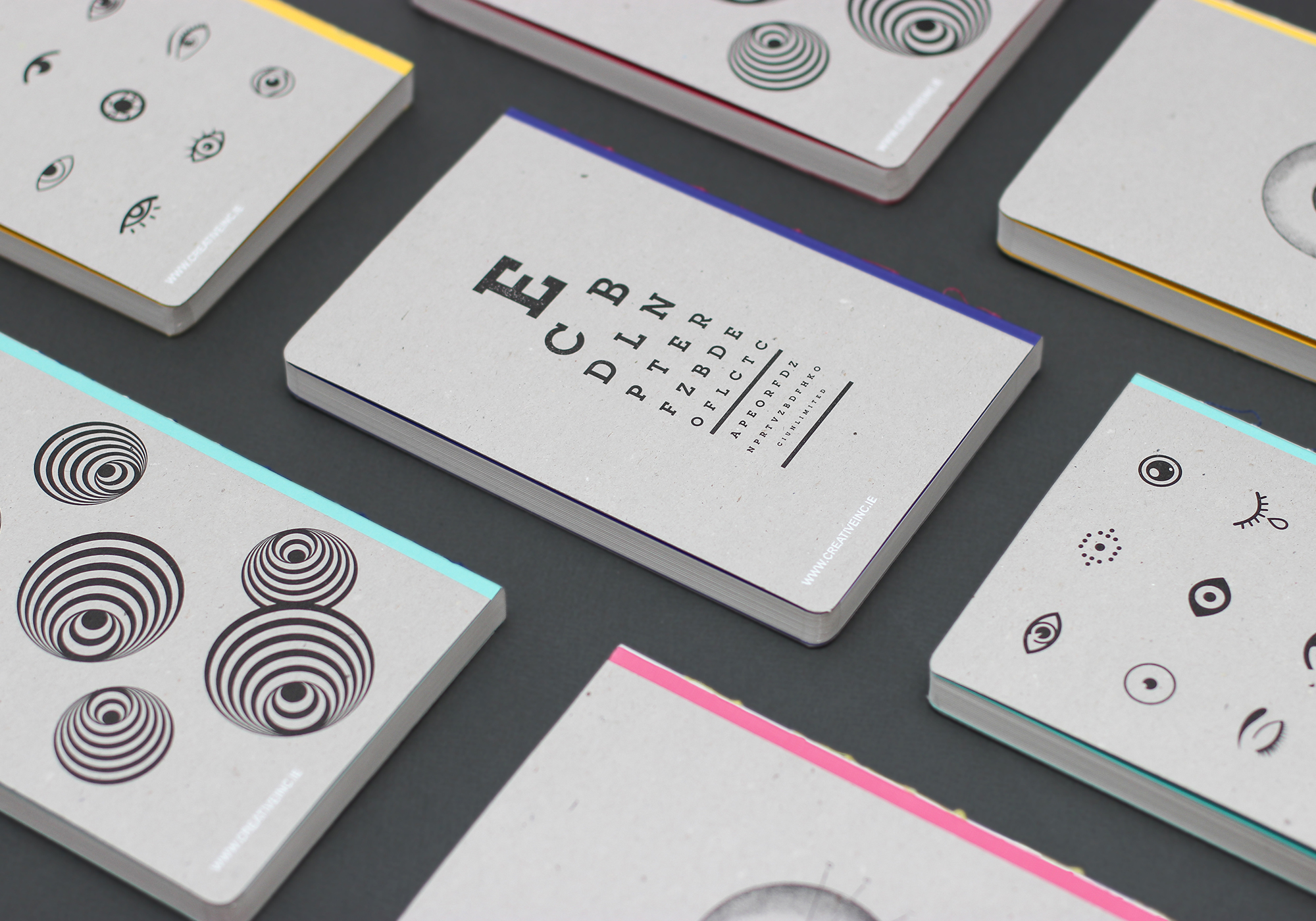
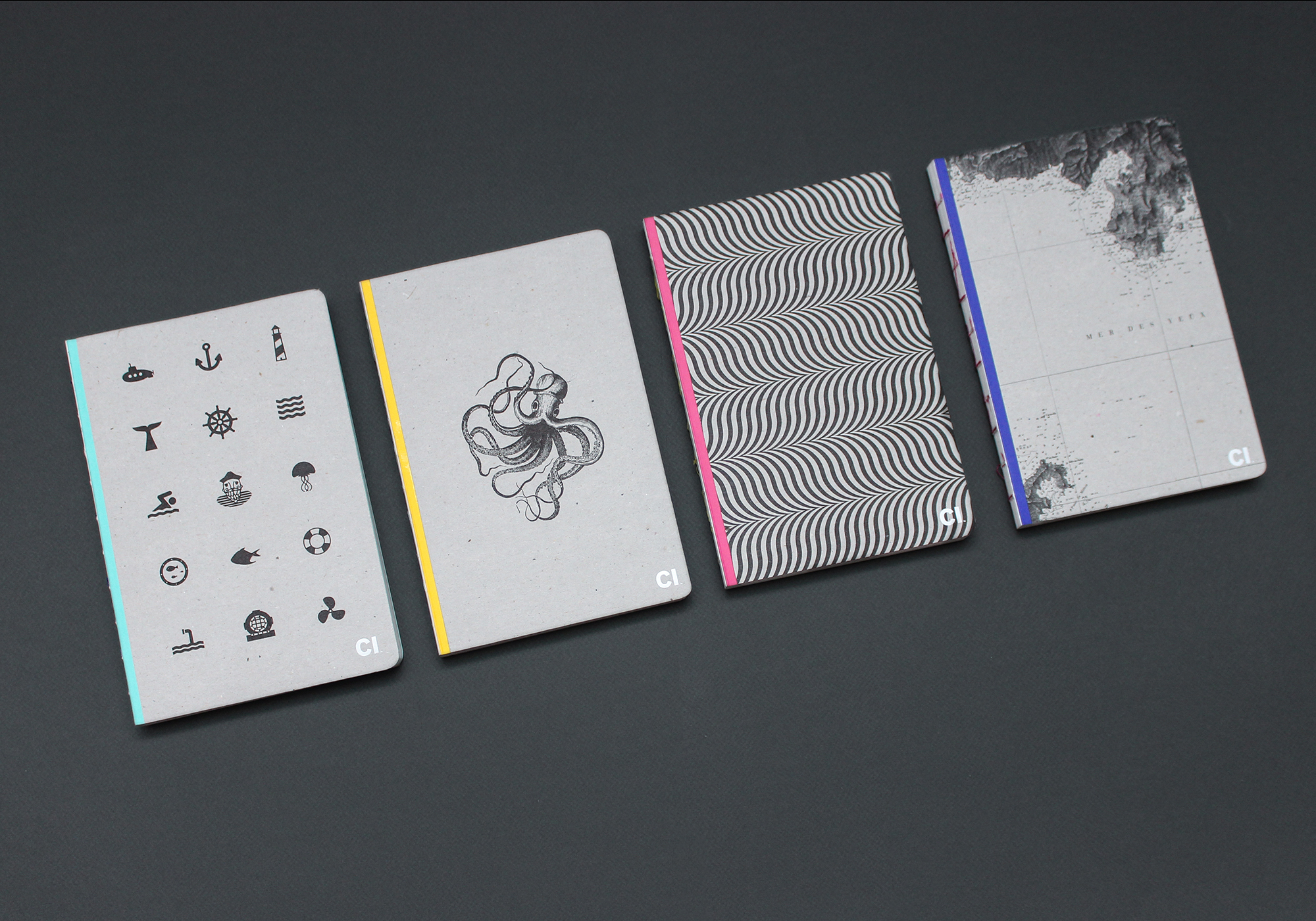
When designing our own notebooks, the most important aspect for us was functionality. We use notebooks all the time for jotting down ideas and the notebook itself needed to be not just aesthetically pleasing but a dream to use with pen and ink…pages that lay flat, paper which absorbed ink correctly, etc. The concept for the design came from the studio name. More recently, Creative Inc has been denoted as just CI and, as a play on words and for our own amusement, we decided to visually represent this through illustration of the words ‘sea’ and ‘eye’ on the front and back covers. With a total of four notebooks, we used a combination of photographic, graphic and illustrative executions to best show off the disciplines the studio works in on a daily basis.
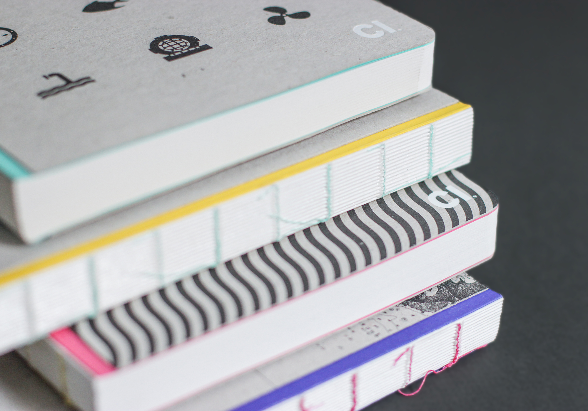
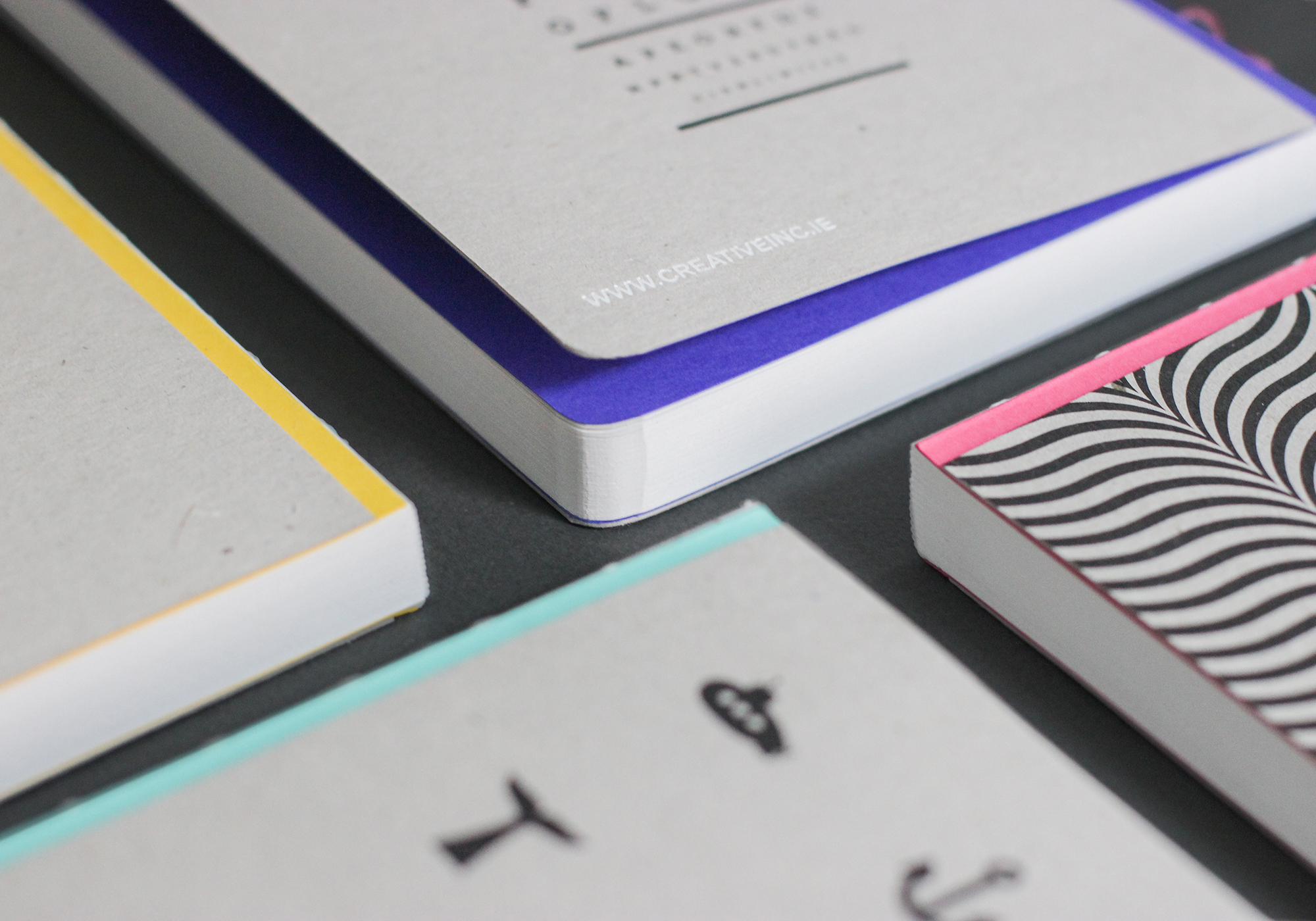
As the notebook is often used for initial sketches or generating ideas rather than finished solutions, a single colour printed on a recycled board was chosen for it's raw appeal. An open bind format, brightly coloured end papers and contrasting stitching in multiple combinations added a unique distinction from conventional notebooks. Other finishing techniques such as PUR binding allowed for flat opening and rounded corners gave it a typical notebook finish.
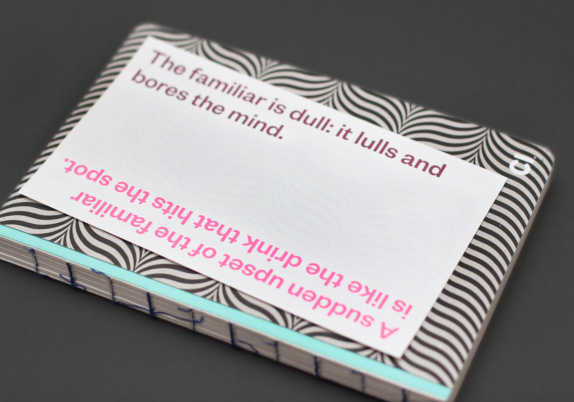
As an added element of distinction, we printed a studio mantra written on the studio boardroom wall onto bible paper which is placed on the cover and shrink-wrapped allowing some show through to the design underneath.
