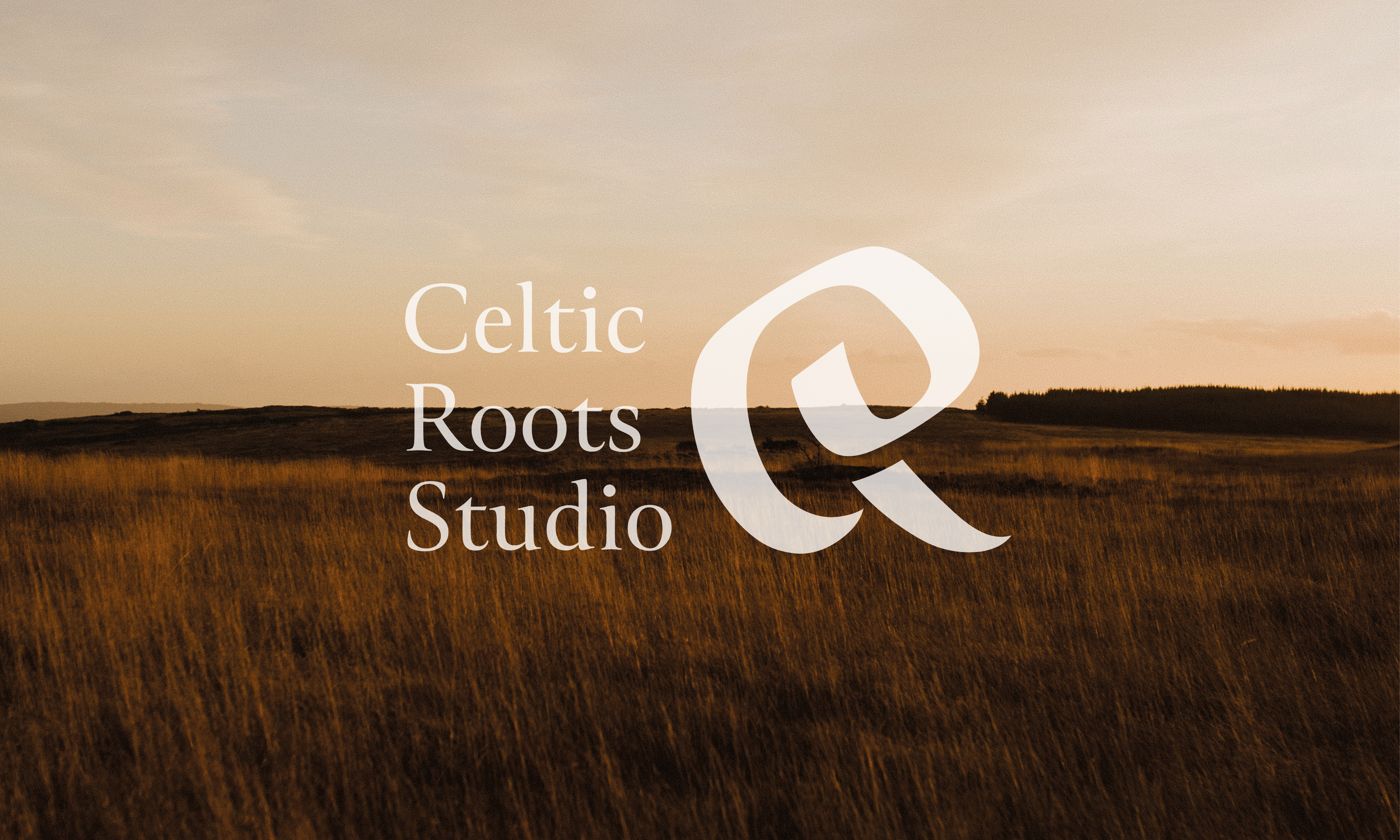
Celtic Roots Studio
2024
Designed by Lisa Dooley at The Factory
Categories: Printed Publication / Print / Identity / Packaging / Signage
Industry: Commercial
Tags: Photography / Typography / Art direction / Icons / Craft
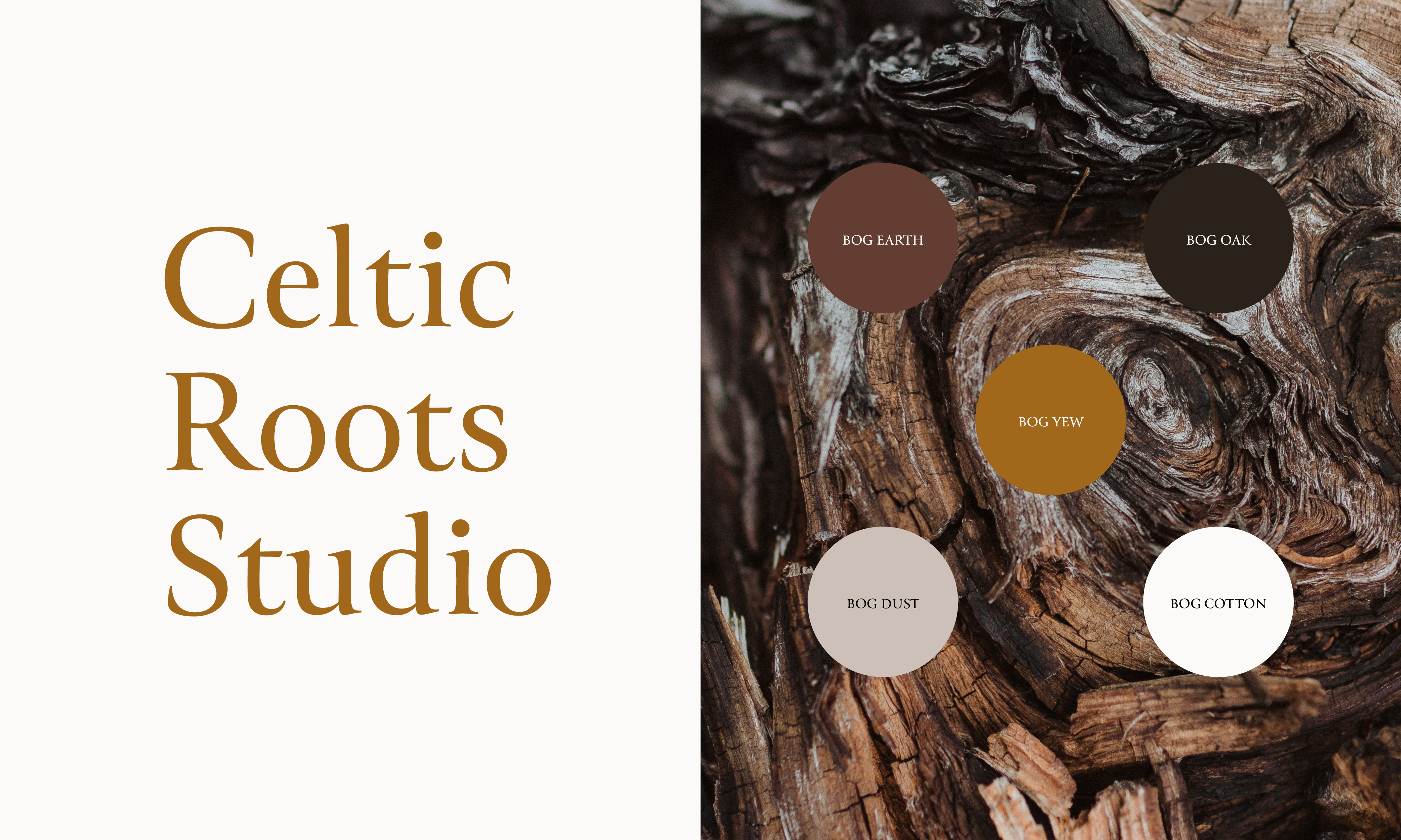
The task for Celtic Roots Studio, led by sculptor Helen Connelly, was to refresh the brand to better embody the maker's values and the unique qualities of her Irish bog wood sculptures. A key challenge was to tell the story of the land and the sustainable sourcing of materials, ensuring the rebrand communicated both the natural beauty and heritage behind the craft. Additionally, sustainable packaging and print collateral were prioritised to reduce environmental impact, reflecting the studio’s commitment to eco-conscious practices.
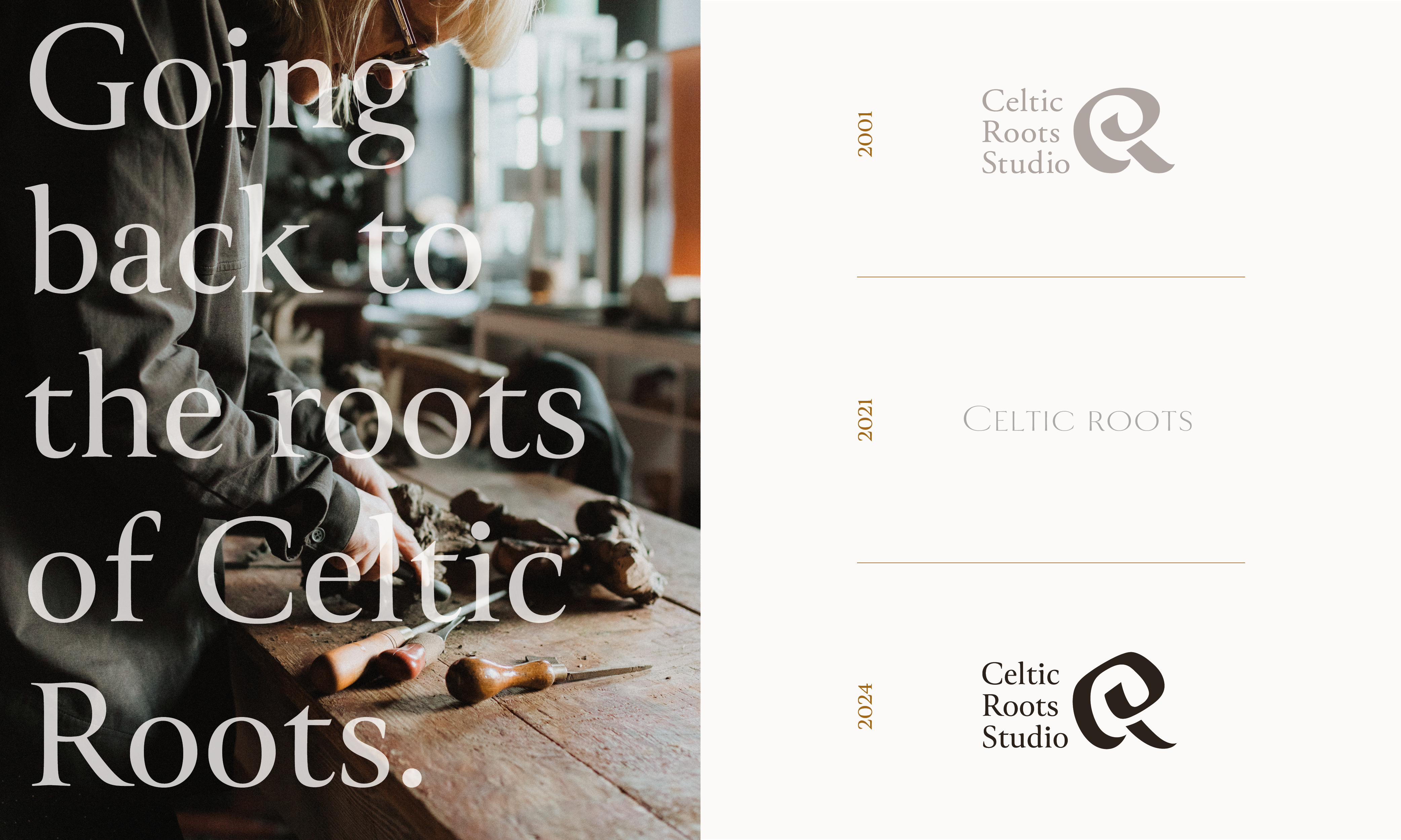
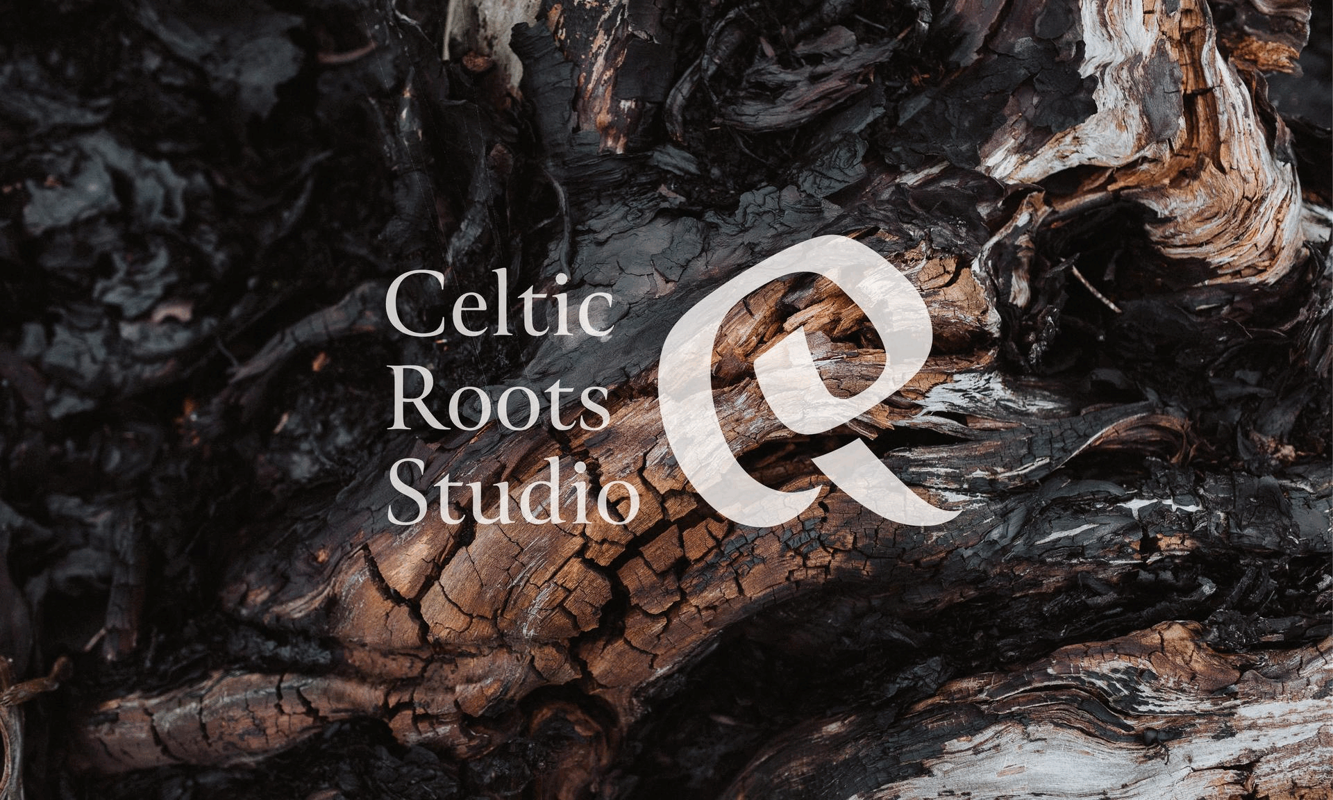
After exploring the visual history of the brand, we returned to the inaugural logo concept, which incorporated a C and R in one motif, subtly nodding to Celtic iconography. It was felt however, that this original mark did not fit the brand stylistically. The logo mark was redrawn by hand, giving it a more humanistic, sculptural, and contemporary feel. The result feels both bold and feminine, echoing the tone of the makers aesthetic. The logotype was updated for a more elegant typeface, giving a balanced appearance. This subtle difference allows the visual identity to recapture its recognisable image, while sitting more harmoniously with Helen’s work.
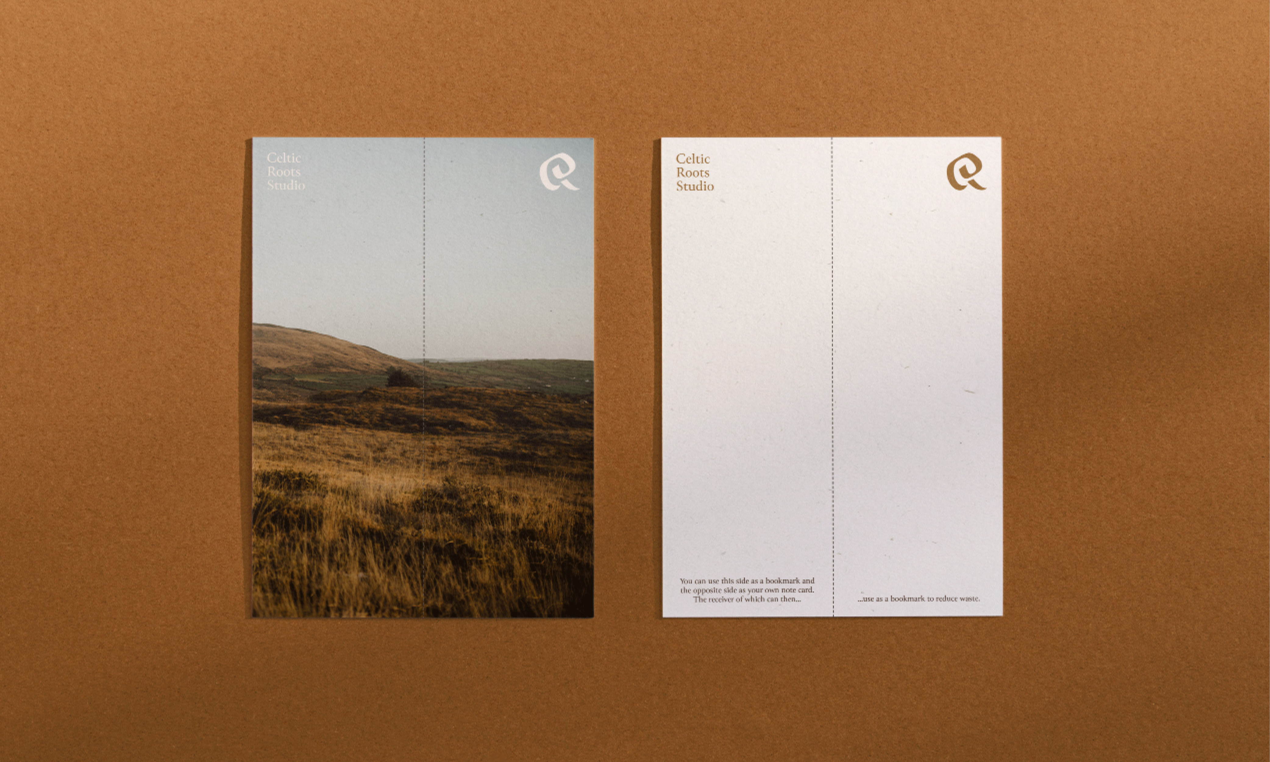
Great consideration was given to the packaging sustainability credentials. Recycled materials were used and dimensions were chosen to reduce resource consumption and waste. For example, the thank-you cards were consciously designed so they can be reused as a bookmark both by the gift giver and gift receiver. This provides potential for a second-life, reducing waste. Another example of conscious design-thinking relates to the box tags, which were designed at 64mm x 64mm so they divide evenly into a 450mm x 320mm SRA3 print sheet, resulting in a zero-waste production process. This was possible as it was created without bleeding artwork to the edge, meaning that there was no need to trim the paper.
It was also important to encourage packaging reuse where possible. Helen only sources dead-stock boxes, and reuses where possible. A reused packaging sticker was designed and is applied to all reused packaging so receivers understand the environmental consideration. Icons were also developed to tell the sustainability story of the studio, adding value to each piece.