Cellar 22 – Brand Identity
2023
Designed by Philip Mitton at CI Studio
Illustration: Philip Mitton, Cath Buckley
Creative Direction: Mel O'Rourke
Signage: Artisan
Printing & Framing: The Copper House
Categories: Identity / Print / Signage / Social Media
Industry: Commercial
Tags: Illustration / Typography / Food and drink / Restaurant / Social / Hotel
Tasked with reimagining the three establishments within 22 Stephen’s Green, a townhouse, a restaurant and a basement wine bar, Cellar 22 is the first of these to open its doors.
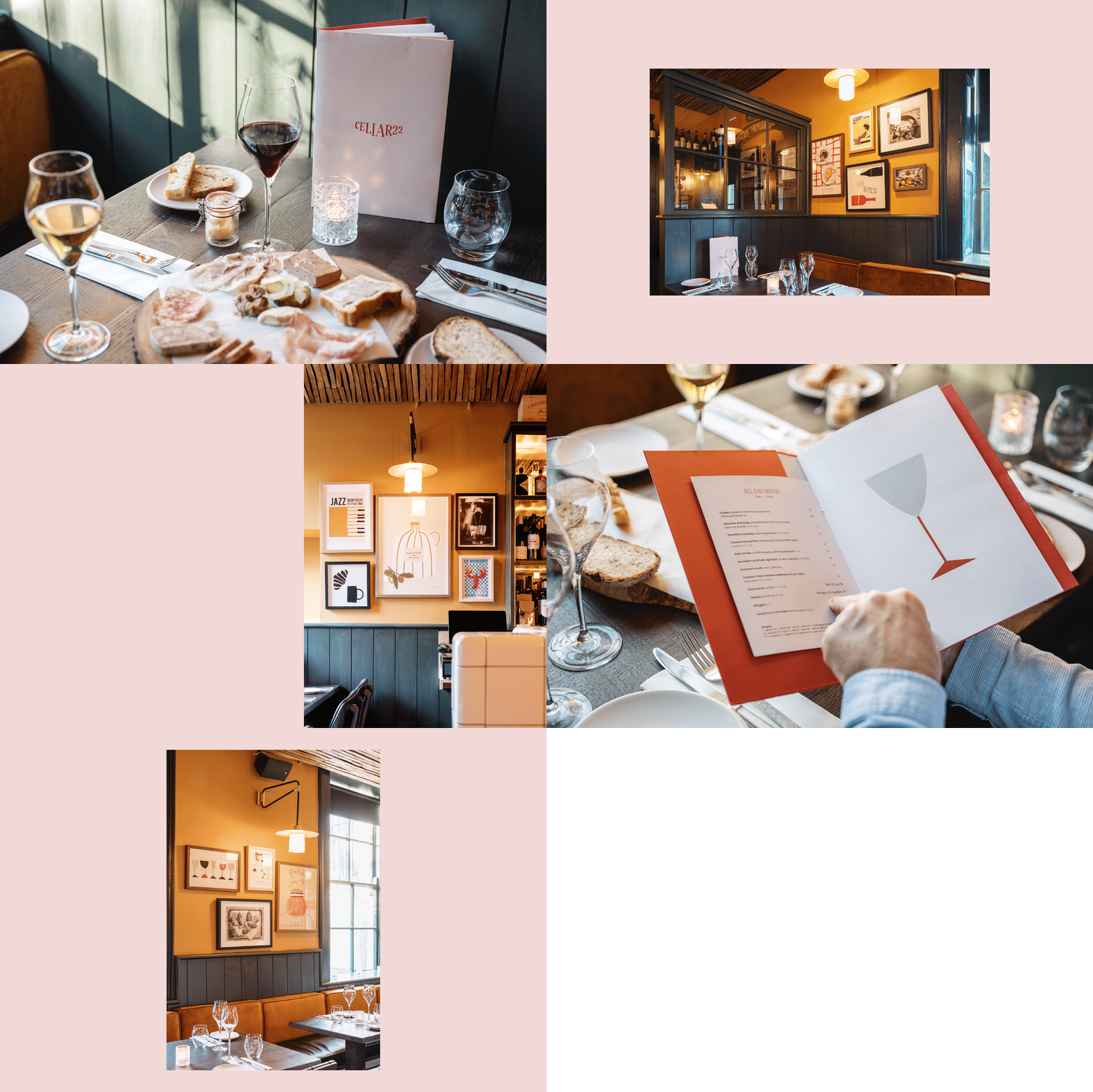
This revamped space was to become an all-day wine and charcuterie bar with a cosy, relaxed brasserie feel, a place to take the weight off your feet while out shopping on nearby Grafton Street. The food on offer features small, delicious plates with a selection of mains curated by head chef Chris Maguire.
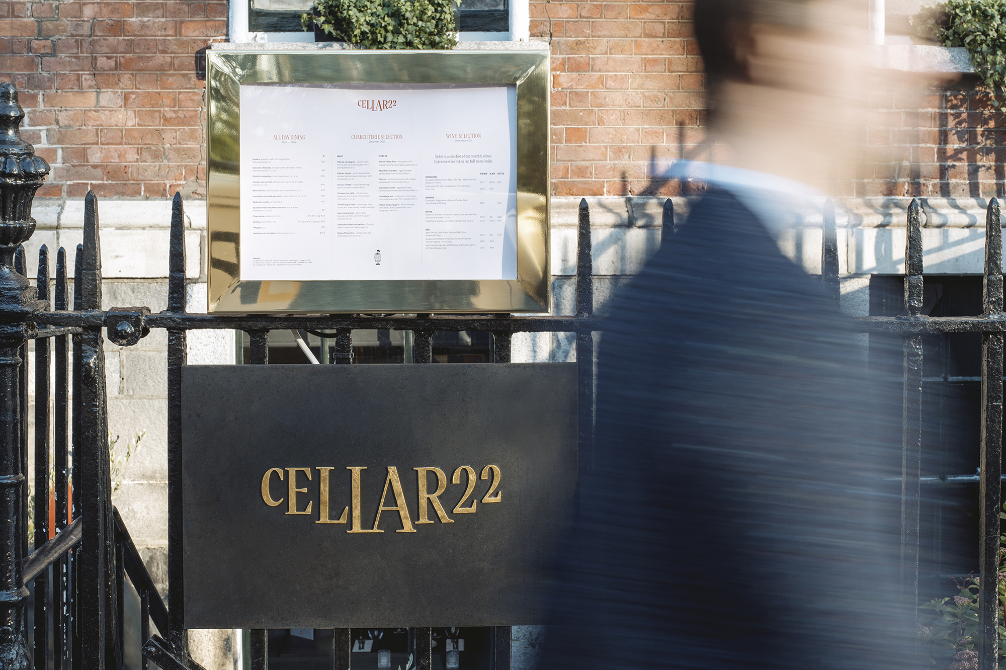
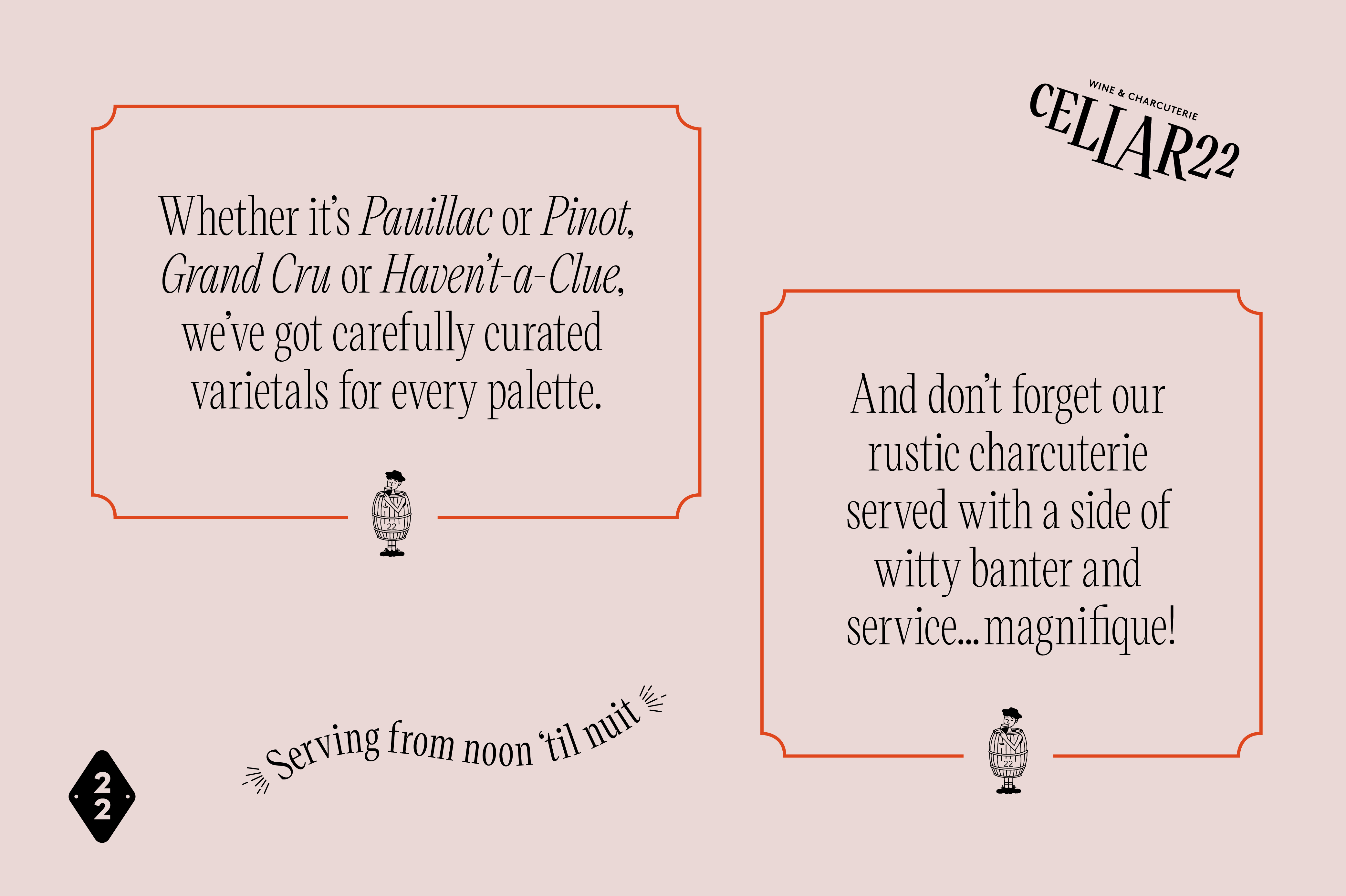
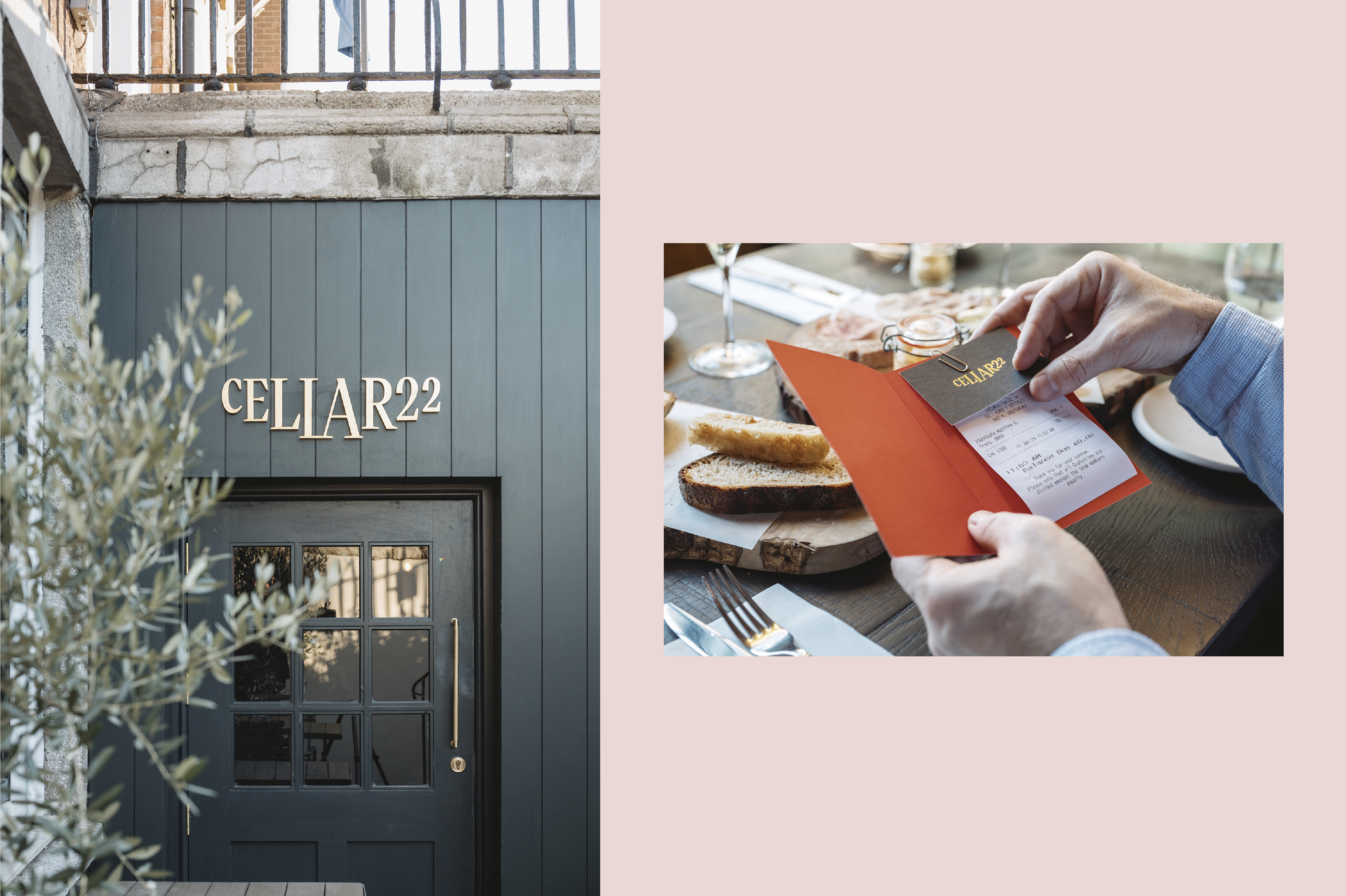
The logo is designed with a nod to the stairs leading down to the basement while crudely etched illustrations and a playful tone of voice work throughout items like menus and wall prints to bring a sense of character and charm to the space. Our hand-drawn sommelier, Claude, features across selected items. The palette of pinks, reds and burgundies complement the many wines on offer and work in tandem with the rustic and eclectic interiors.


