Building Change
2023
Designed by Stephen Ledwidge, Áine McGee, David Stanley, Susan Carberry and Elena Stevant at Red Dog
Categories: Identity
Industry: Education
Tags: Architecture
Website: buildingchange.ie
Building Change is a collaborative effort of all six architecture schools in the Republic of Ireland. Together, they are committed to providing education in climate-ready architecture to their students, in doing so addressing the implications of Government policy on climate change and housing. The programme aims to equip the next generation of architects with the knowledge and skills necessary to create a collaborative and sustainable future through architecture, emphasising design that promotes sustainable building practices and reuse. By working together, they believe they can achieve greater impact and help to drive positive change towards a more sustainable built environment. Building Change represents the discipline of architecture playing its part of a National cross-disciplinary/cross-sector effort to respond to climate change and the housing crisis. Building Change is radically revising education and fundamentally redefining the student learning process – strengthening, building – changing how we teach design to prepare graduates for the future.
The key design considerations were simplicity and clarity, how this identity will sit with identities of 6 universities, the brand’s carbon footprint and accessibility.
The key target audiences are students (current and prospective), academic staff, and management, guidance councillors, professional bodies, architecture practitioners, industry, government/policy, citizen experts/community.
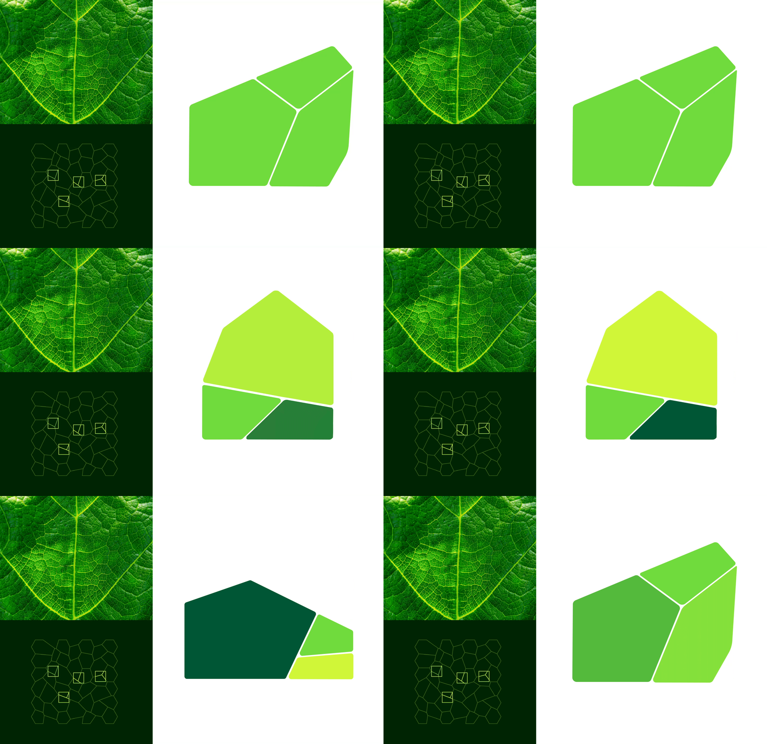
The design concept is based on the idea of biomimicry; this is the emulation of the models, systems, and elements of nature for the purpose of solving complex human problems. 'Biomimicry' is derived from Ancient Greek meaning life and imitation. From this starting point, we looked at voronoi patterns that appear everywhere in nature – including the veins of a leaf, cracked mud, giraffe skin and foamy bubbles. The pattern represents an adaptable, and ever changing approach that is designed using nature based systems. These strong, adaptable, resilient structures are frequently adopted in architecture, therefore ultimately we took the voronoi pattern as the inspiration for the brand identity.
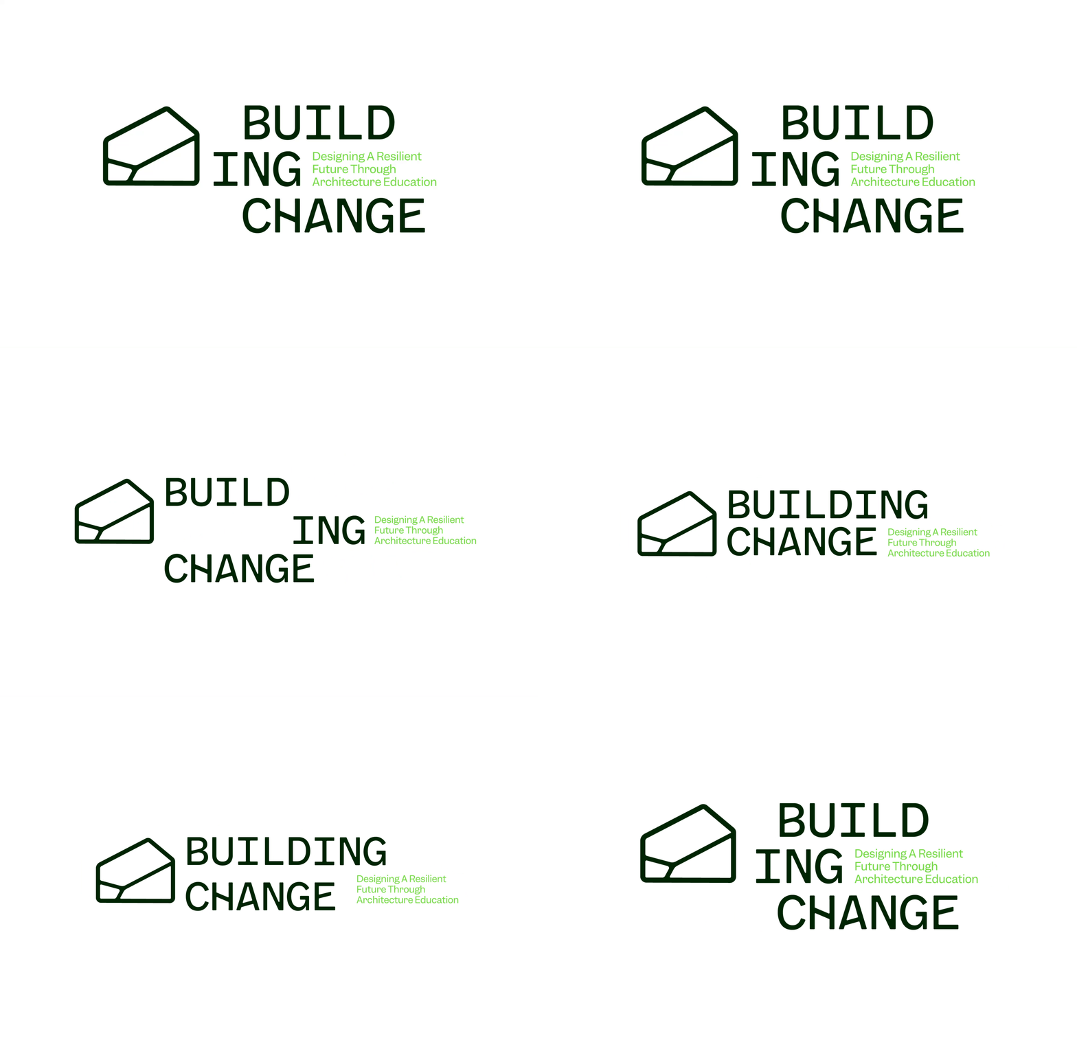
For the logo we created an adaptable symbol that changes and reconfigures, just as voronoi patterns do in nature. Similarly with the logotype, we wanted to visually link the voronoi pattern through bespoke letters – the crossbar on the B, H, A and E have been given slight angles to complement the symbol and allude to the pattern. The relationship between the symbol and the logotype is flexible allowing for ease of application across all touch points.
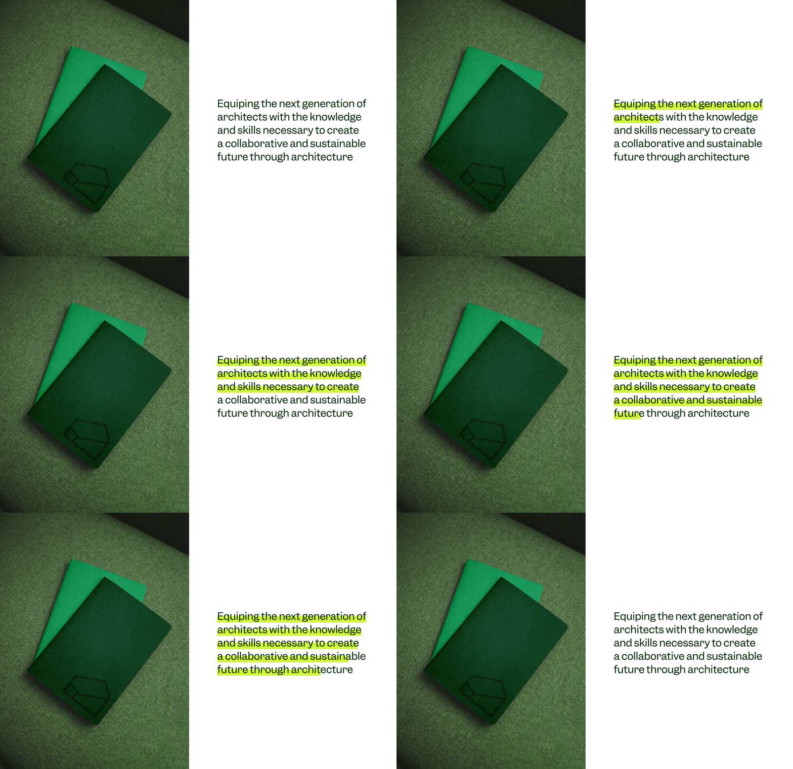
The colour palette leads with a series of greens; a subtle reference to kelp, but also Irishness. It’s a bright, vibrant palette that speaks to sustainability. A system of infinite graphic patterns have been created to add visual interest, brand recognition, house imagery and house/divide text. A bold text underline known as the highlight device may be used on headlines or to pull out/highlight text, and this subtle nod to the act of learning in an academic setting.
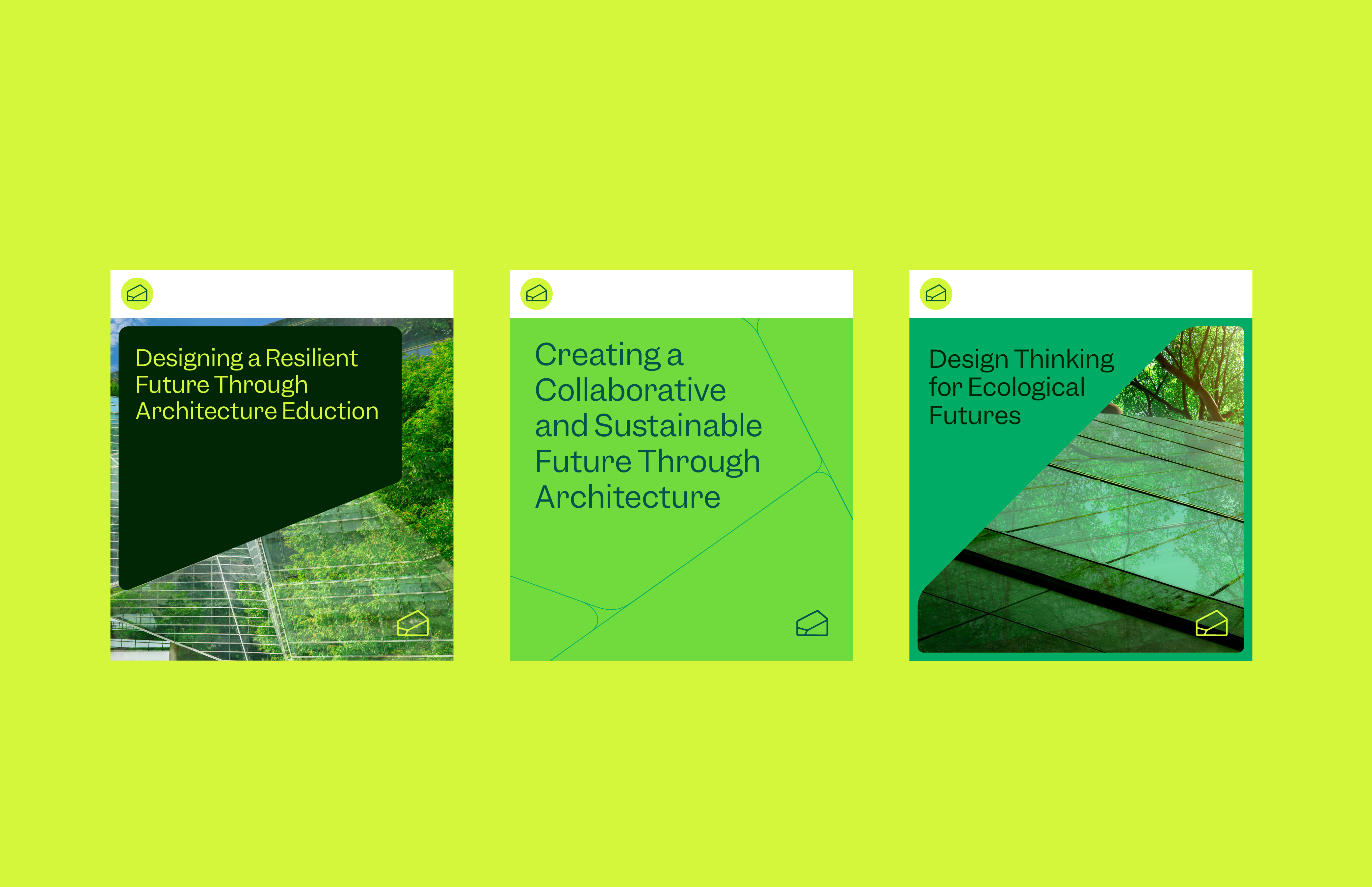
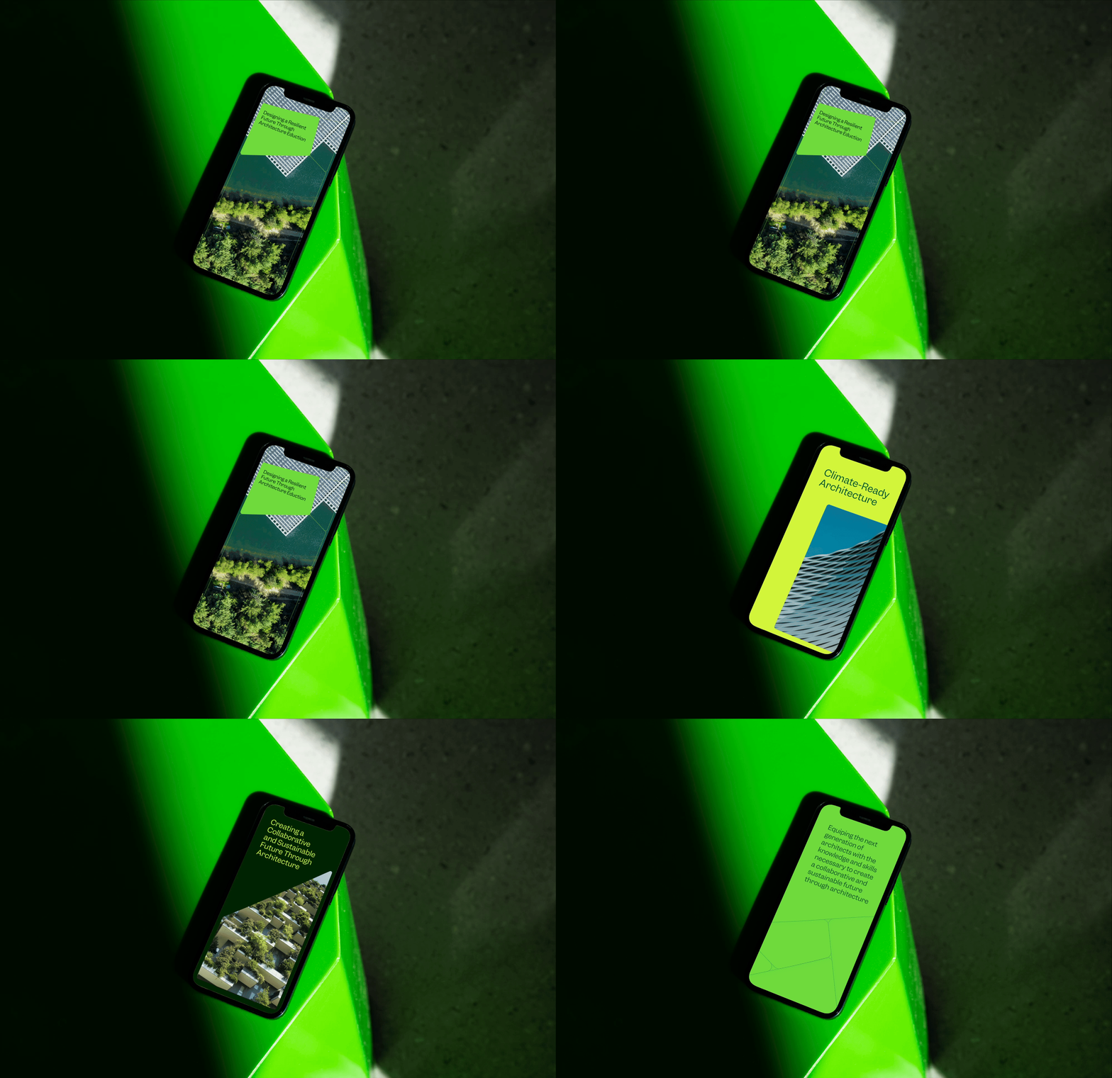
This brand is designed to be digital-first with dynamic animated applications and rollout across website design, digital brand guidelines, presentation templates and social media templates.

