Boann Solstice Single Pot Still Whiskey
Designed by David Walsh at Greenhouse
Illustration: David Walsh
Categories: Identity / Packaging
Industry: Commercial
Tags: Illustration / Typography / Food and drink
Distilled on the Winter Solstice of 2019 and bottled on the Winter Solstice of 2022, Boann Distillery’s first aged Pot Still Irish Whiskey was the first to flow in Drogheda in over 160 years.
Having the distillery located near Newgrange, this link to the shortest day of the year is very tangible as it also coincides with shining new light into the world of distilling. To celebrate this landmark achievement, Boann Distillery set about sharing this with friends and colleagues. As a token of their appreciation in helping them get to this point they organised a party where each guest was gifted a bottle of this groundbreaking whiskey.
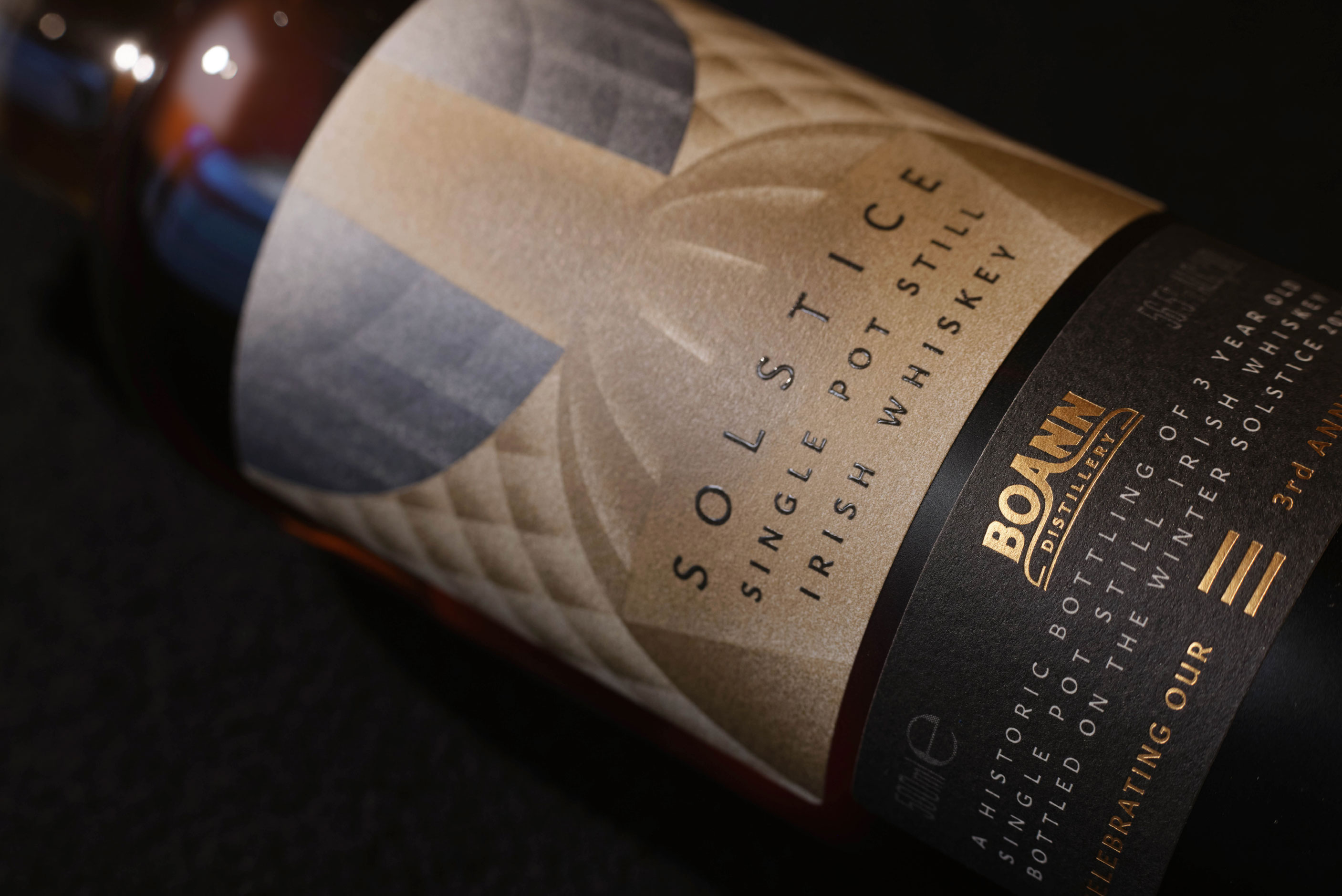
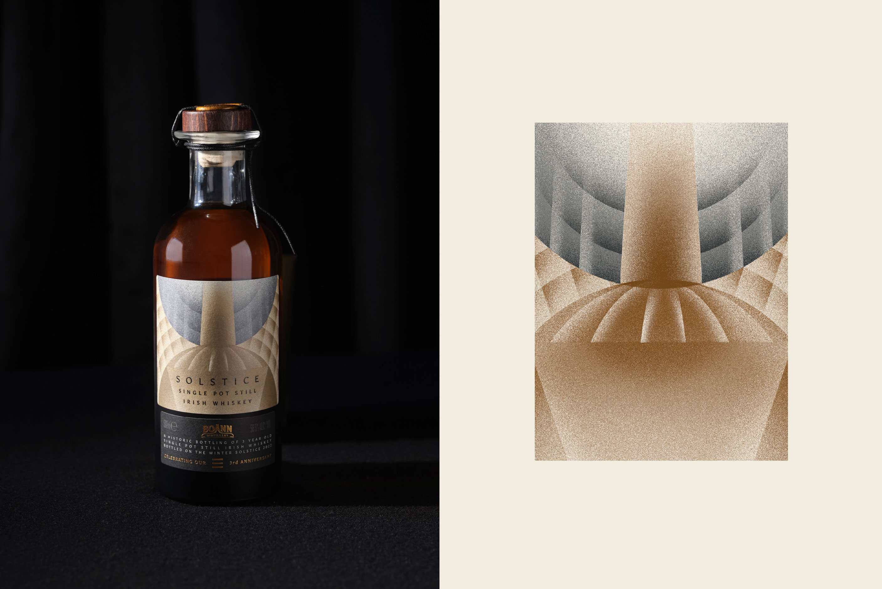
The design itself visually interprets the move from darkness to light and celebrates the passing of time. An illustration was created in-house that featured the sun and the moon. Shafts of light play and overlap these shapes to define the profile of their third copper pot still. This was then printed with 4 spot metallics (2 silver and 2 gold) using HD flexo plates to ensure that the detail and the tone of the illustration was retained. Something we worked very closely with the printer on.
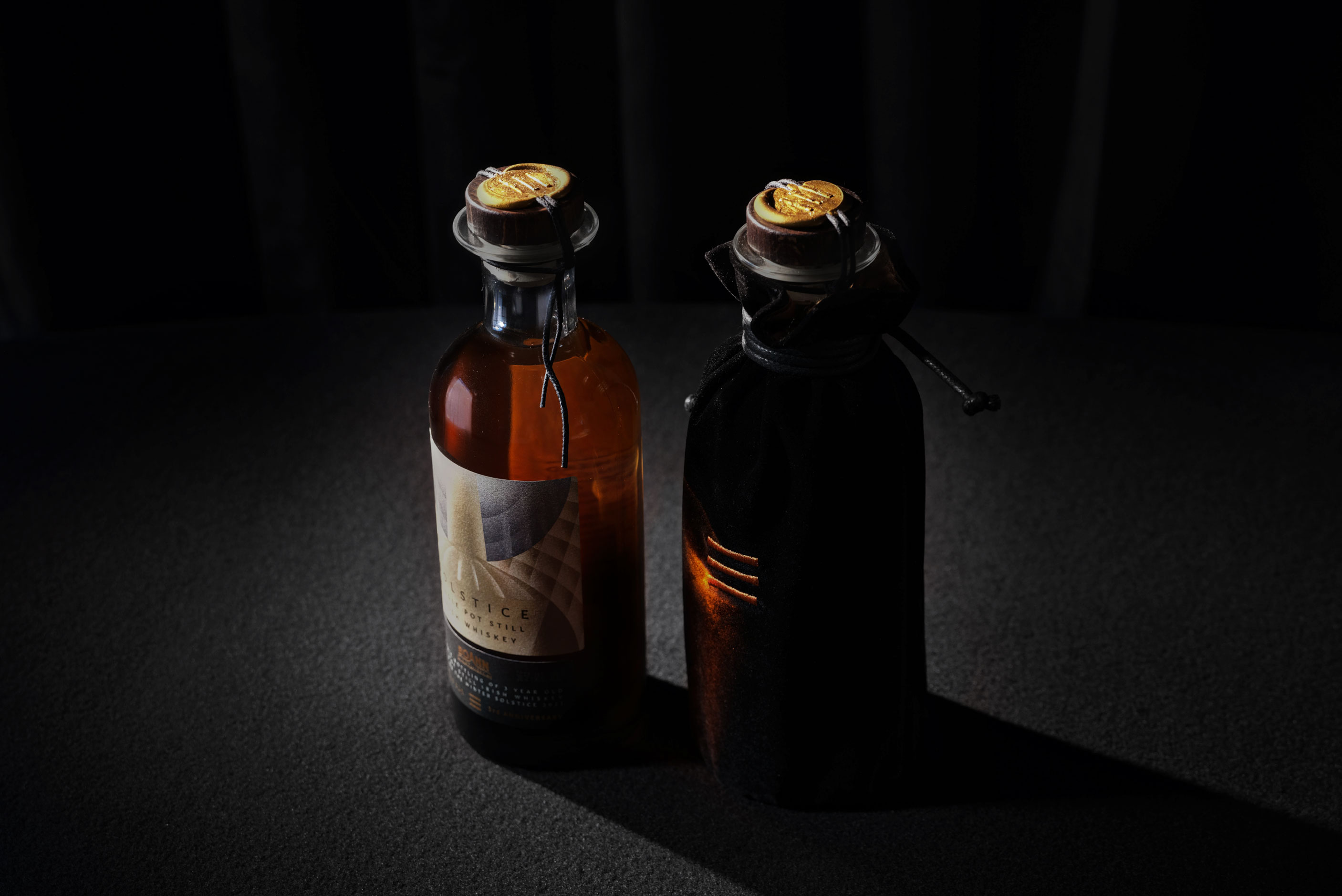
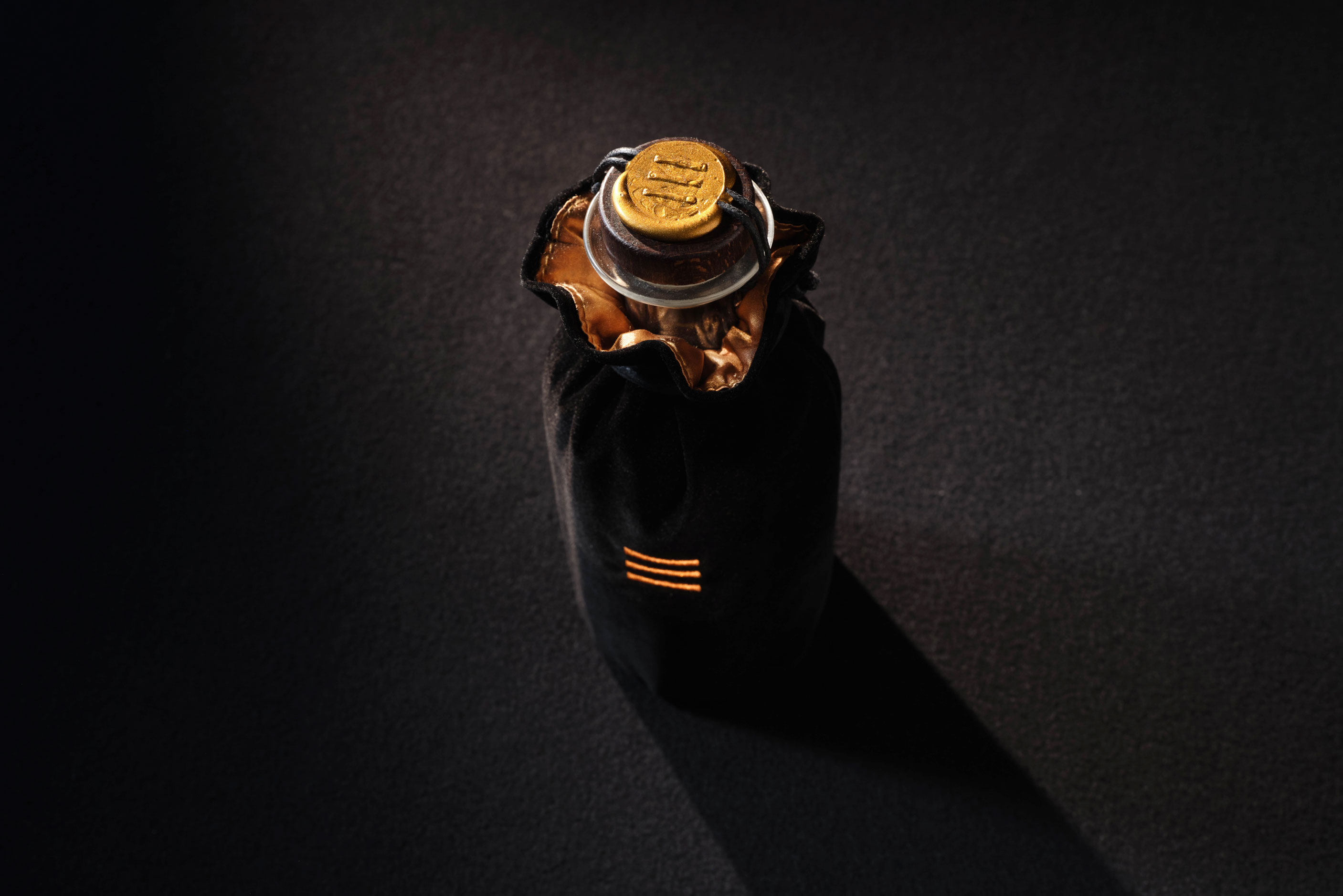
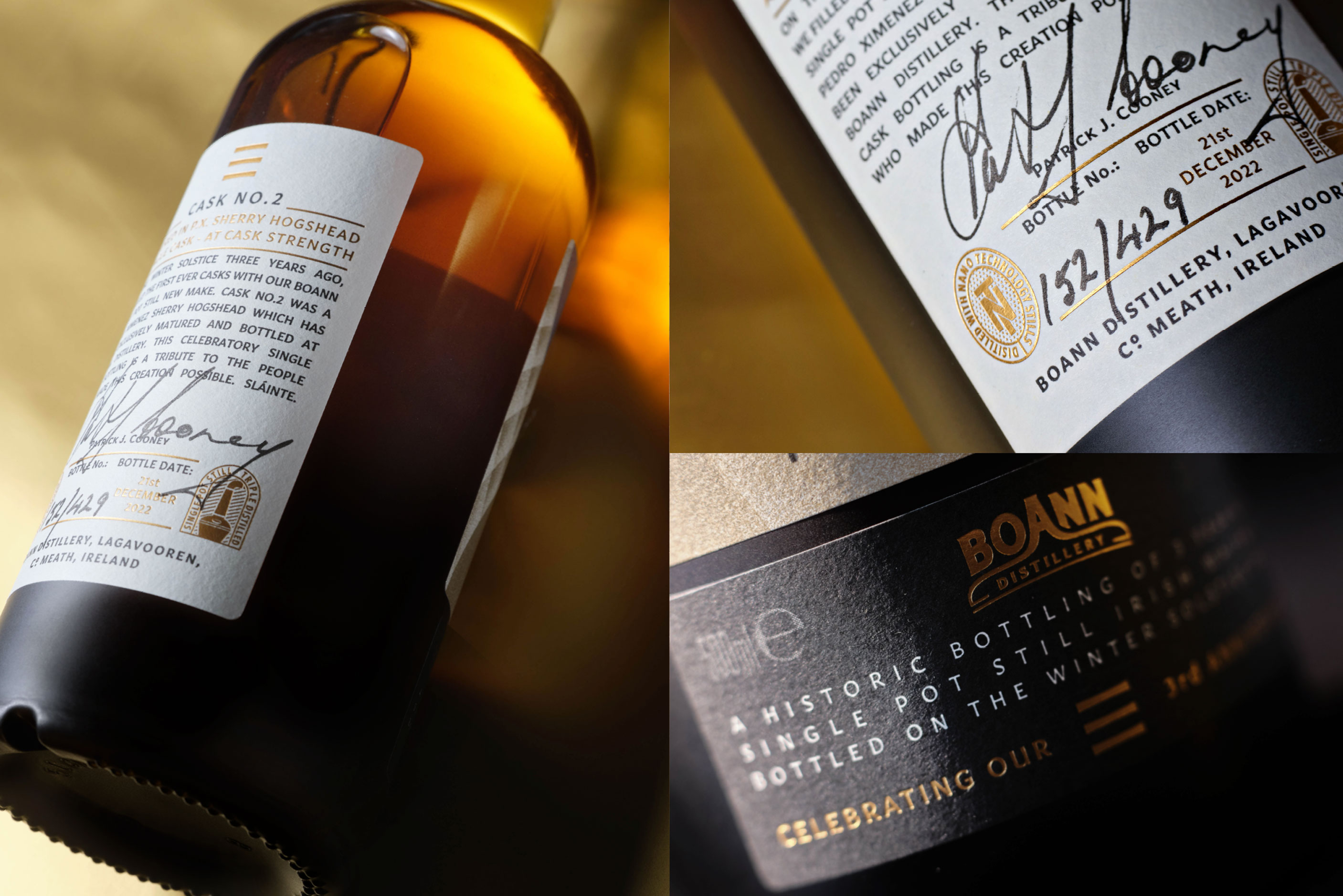
A visual representation of the 3 years of maturation was a motif consisting of 3 horizontal bars. The horizontal bars came to represent not only the 3 years of ageing but also stepping stones of their journey that would also lead into the future. This motif became an evocative design piece that was used on the hand-applied wax seal as well as other aspects of the packaging.
Hand filled, hand labeled, hand sealed with cord & wax and hand signed & numbered, the bottle was placed in a black velvet bag only to be revealed on the night, further emphasising the darkness to light concept. Lined with gold velvet, the 3 bar motif was then embroidered in the same gold tone.
The bottle received a matte black to clear vignette starting at the base and moving upwards. This brought the concept a step further to show the whiskey itself also making the transition from dark to light.
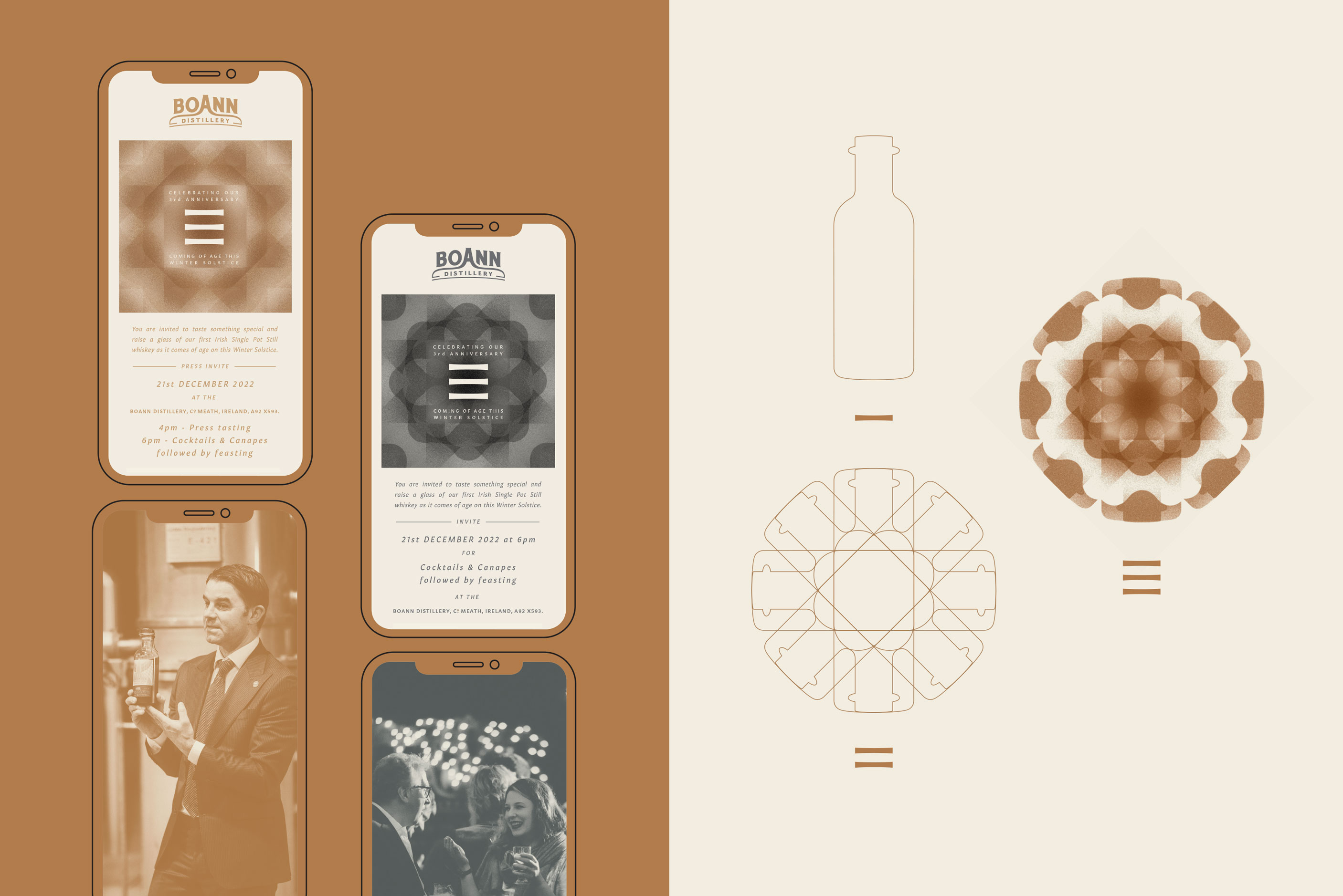
For the night itself an Evite was requested. Here we developed upon the sun and moon theme to generate 2 Evites - one for press tasting, the another for friends and colleagues. Two patterns were developed using the bottle profile to ensure every touch point related to the gift. The 3 bar motif was then used as an overarching identity for this celebration.
