Black Oak Advisory – A Distinctive Wordmark Rooted in Strength and Empathy
2024
Designed by Lorna Ryan McKeon (Freelance)
Photography: Amayo Photography
Photography: Al Higgins
Web Development: Avenir
Categories: Identity
Industry: Corporate
Website: blackoakadvisory.ie
A Distinctive Identity for a Distinctive Voice
Introduction
Aoife Lavan approached me with a powerful name and a vision: to make financial advice accessible, empowering, and compassionate. Together, we uncovered the deeper story behind her brand and brought it to life.
The name Black Oak Advisory draws inspiration from Grace O’Malley, the legendary Pirate Queen of Mayo, and her father, Dubh Dara—a symbol of strength and resilience that deeply resonated with Aoife. Guided by the ethos “With Grace and Fire,” we set out to create a bold, human-centred identity that reflected her vision, her values, and her commitment to delivering financial clarity with warmth and professionalism.
Beyond just a visual identity, this was a purpose-led transformation—where strategy guided design. The process reignited Aoife’s passion and brought her to a place beyond her expectations, equipping her with the confidence to move forward with clarity and impact.
Identity Design
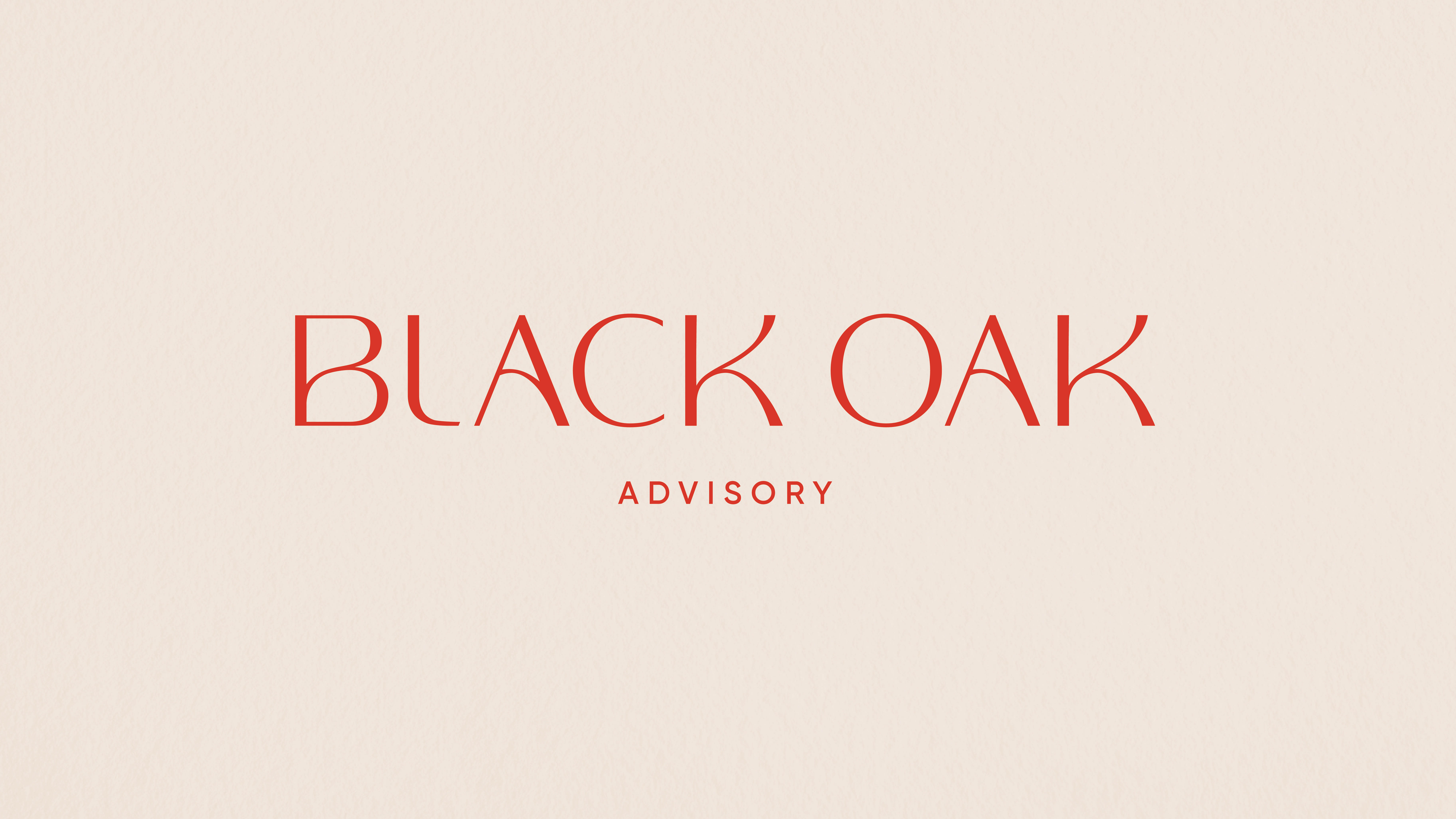
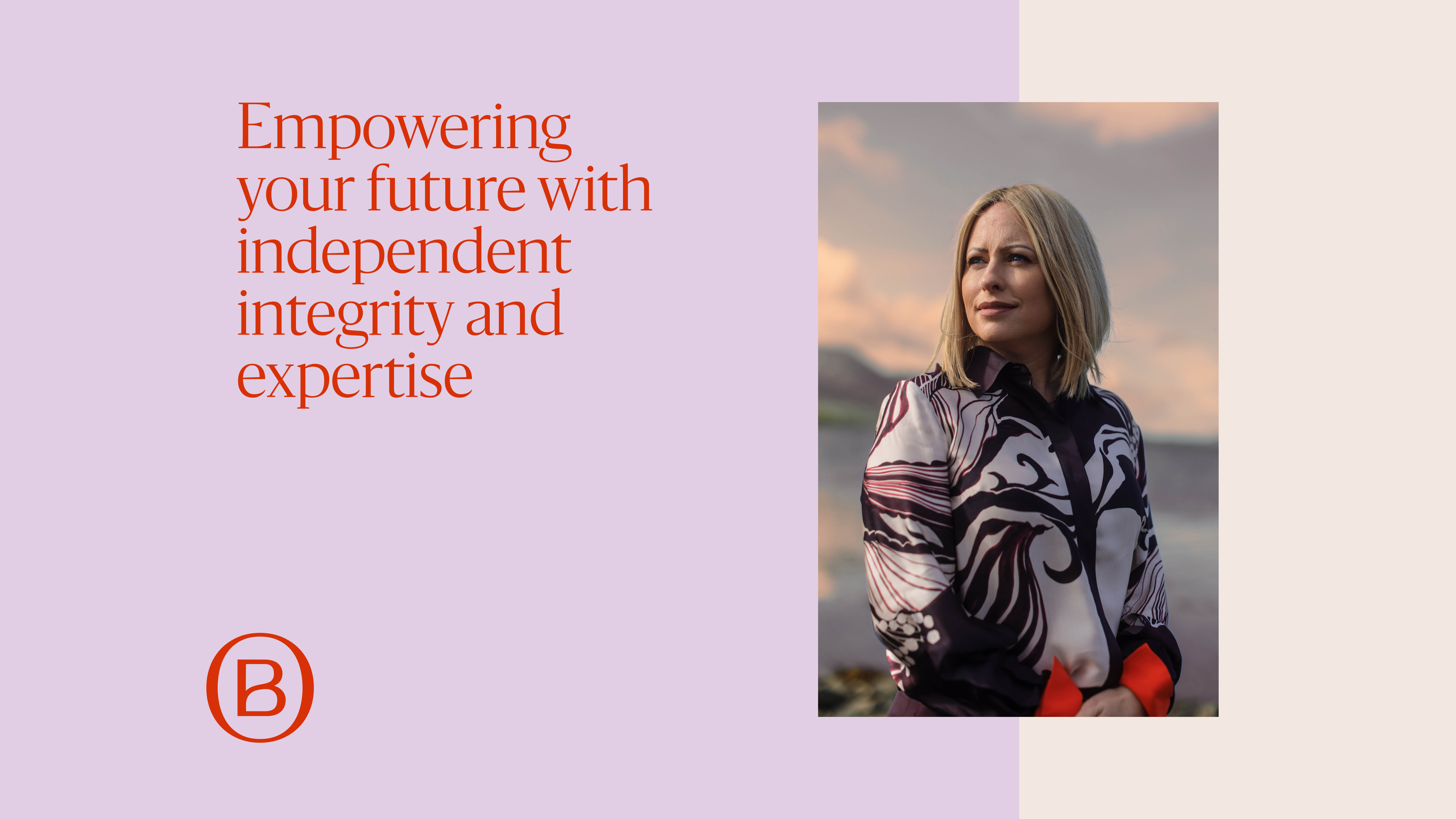
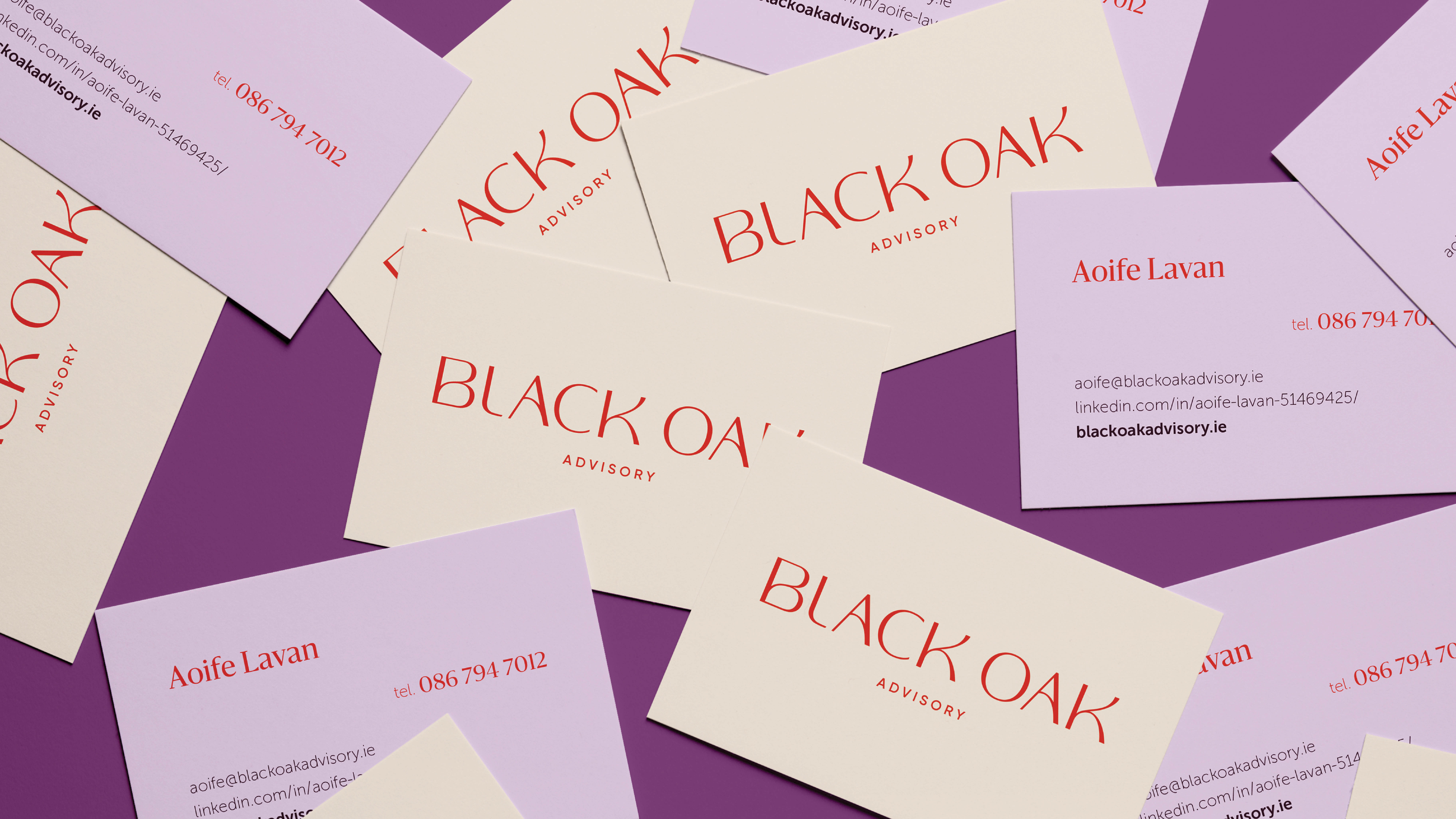
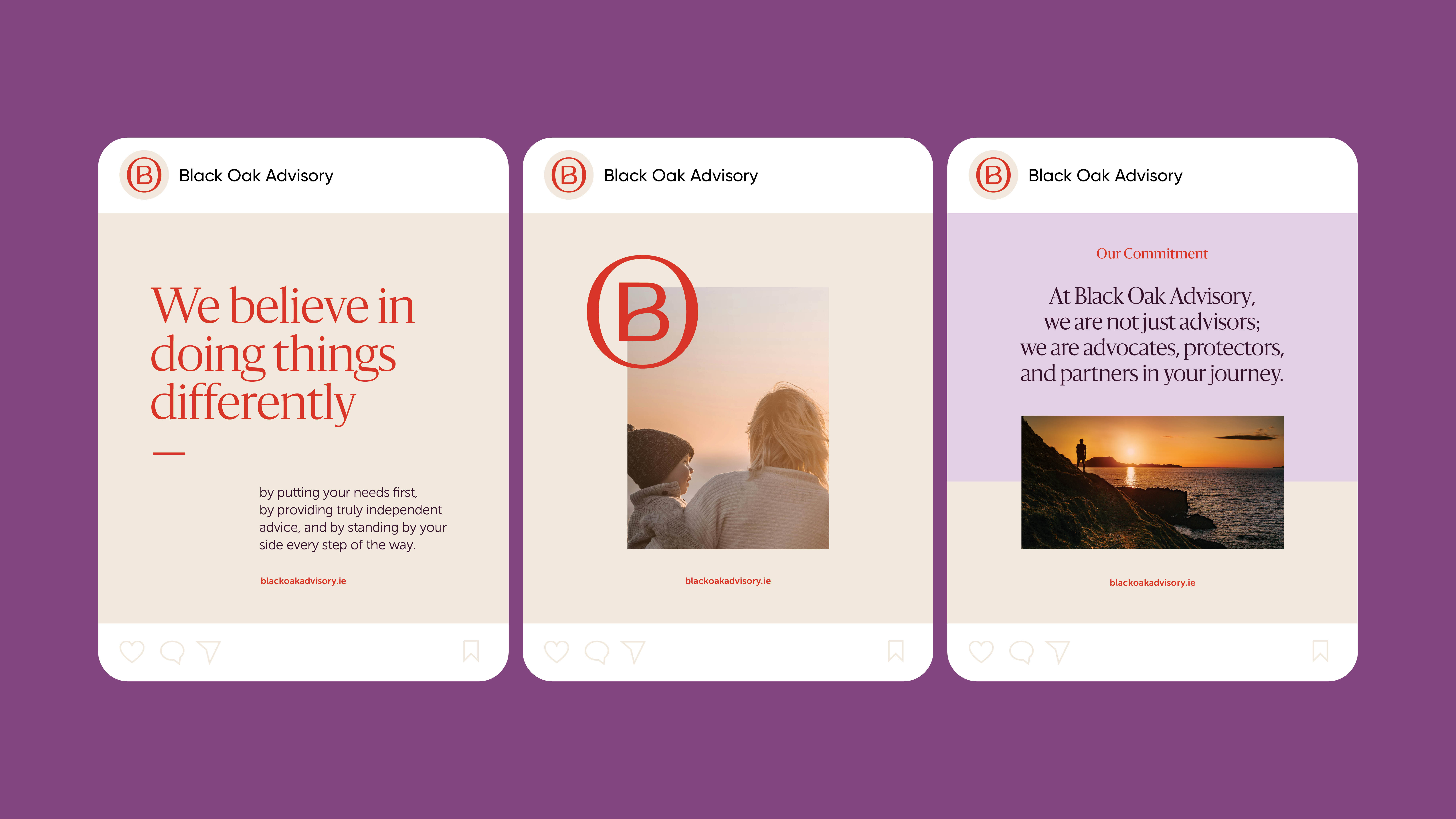
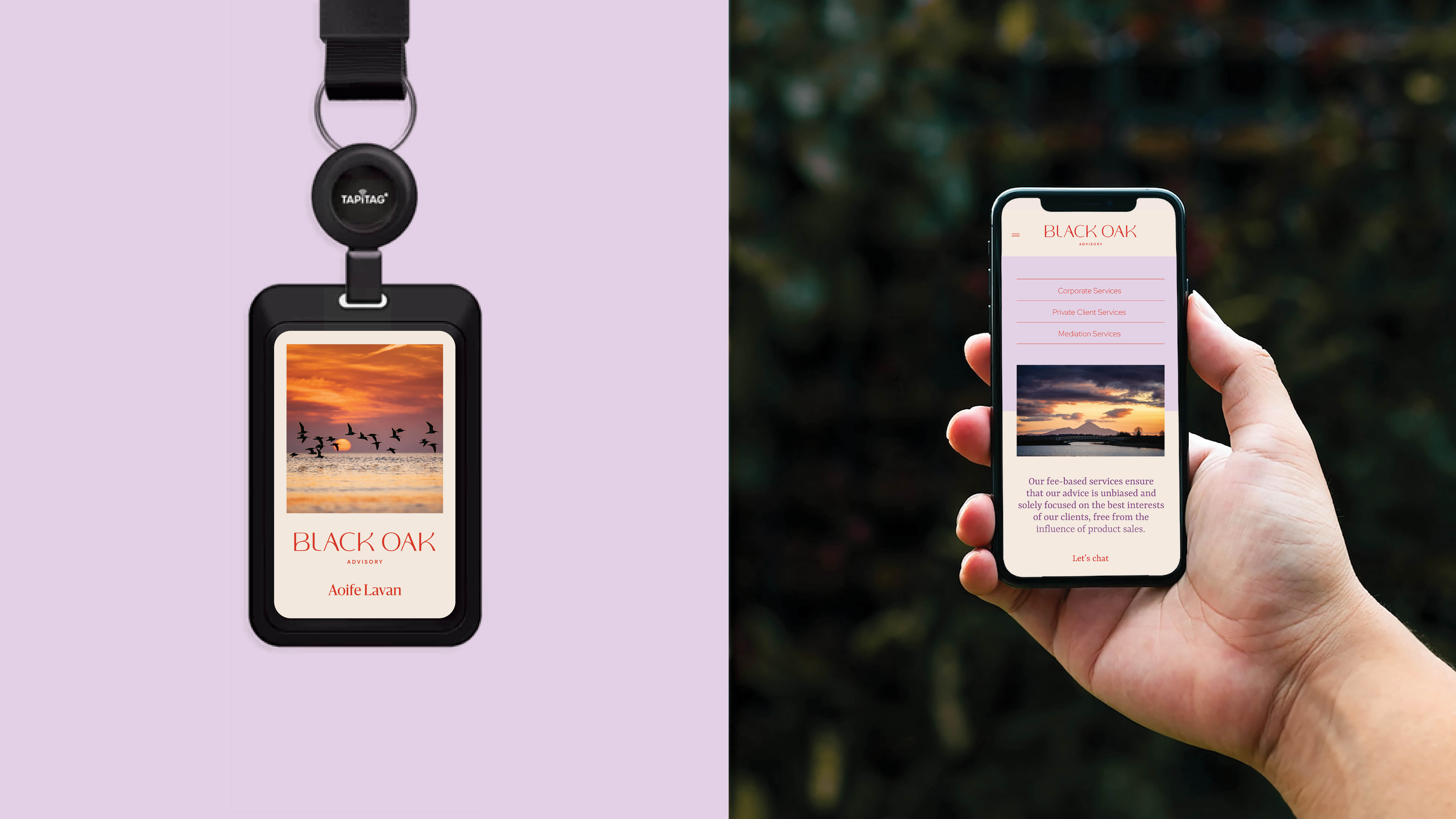
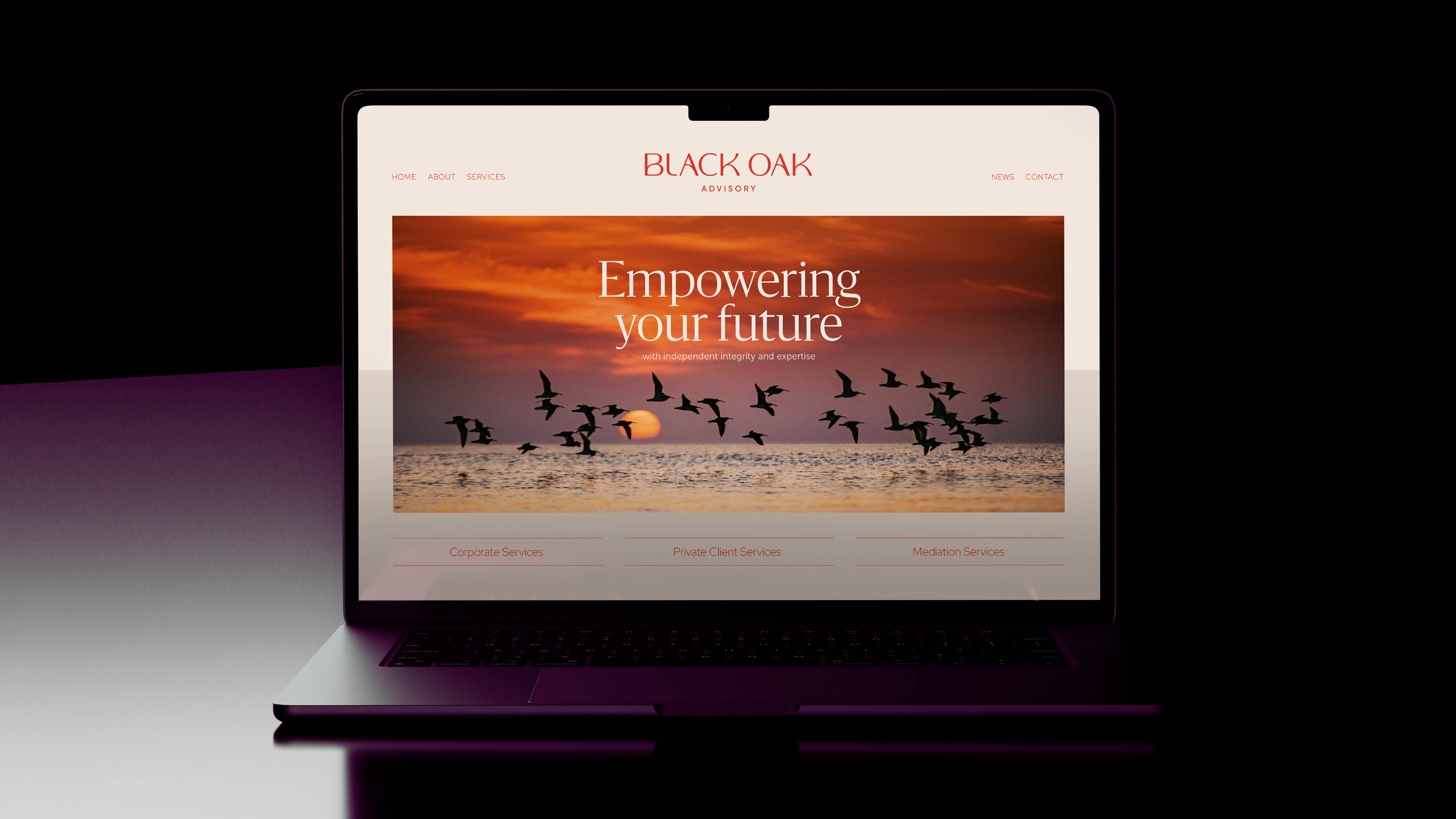
- At the heart of the brand is a custom wordmark, designed to feel clean, bold, and timeless, with softened curves to introduce approachability. The typography maintains a refined confidence, ensuring legibility and impact across all applications.A monogram version reinforces brand recognition, taking the initials of her wordmark—her bespoke B, framed by the O, forming a natural, intuitive solution. This serves as a visual anchor, offering a flexible shorthand for various touchpoints.The colour palette, inspired by the dramatic sunsets of the West of Ireland, blends deep oranges and mauves—a balance of resilience and reassurance. This choice differentiates Black Oak Advisory from conventional financial brands while reinforcing its core values.A clear, adaptable design system ensures consistency across digital and print applications, with detailed brand guidelines to maintain integrity as the business grows.
Strategy & Storytelling
This brand identity is more than just aesthetics—it is deeply rooted in storytelling. Every design decision was led by the strategy, ensuring the brand’s purpose and personality translated into every communication piece.
From the language to the layout, each element was crafted to guide the audience with ease, reinforcing Black Oak Advisory’s message at every touchpoint. The identity system is designed to engage, build trust, and showcase value, ensuring that Aoife’s voice is heard with distinction.
Execution & Brand Experience
- The identity system extends across multiple applications:Stationery & Presentation Templates: Designed to convey professionalism with a modern edge.Digital & Social Assets: Flexible, scalable graphics that ensure a cohesive brand presence online.Website Design: A seamless user experience, designed in collaboration with Avenir, translating the brand’s values into an intuitive digital space.Photography Direction: A collaboration with Al Higgins and Amayo Photography ensured that visual storytelling matched the brand ethos, capturing Aoife’s authenticity and presence.
Impact
This project was more than just a rebrand—it was a strategic shift that empowered Aoife to step fully into her brand. Through a purpose-led design process, Black Oak Advisory now stands as a trusted leader in financial services, its identity reflecting its strength, clarity, and human-first approach.
For me, this project was about more than design—it was about crafting an identity that embodies resilience, clarity, and confidence, allowing Aoife to step into her brand with both grace and fire.