Ben's Best Blnz
Designed by Jack Collins at Pentagram
Partner in Charge: Eddie Opara
Designer: Raoul Gottschling
Designer: Ruben Gjiselhart
Project Manager: Dana Reginiano
Website Development: Jacob Macdonald
Categories: Identity / Packaging
Industry: Commercial
Tags: Typography / Food and drink / Retail / Art
Website: bensbest.com/
Started by Ben Cohen (co-founder of Ben & Jerry’s), Ben’s Best Blnz or B3 is a cannabis company with the mission “to sell Great Pot and use the power of our business to Right the Wrongs of the War on Drugs.” The designers worked directly with Ben to design the brand identity system for this new and socially focused business and activated it across a wide array of products, packaging, merchandise and other brand applications.
Black people have borne the brunt of the war on drugs, being arrested at 4x the rate of White people despite using cannabis at the same rate. Ben’s Best Blnz advocates for the decarceration of those convicted of nonviolent cannabis crimes and the descheduling of marijuana as a Schedule 1 substance. B3 invests 100% of its profits back into the black cannabis community and groups advocating for criminal justice reform. Wherever possible, the B3 brand reflects this approach, prioritizing work with Black-owned vendors and partners.
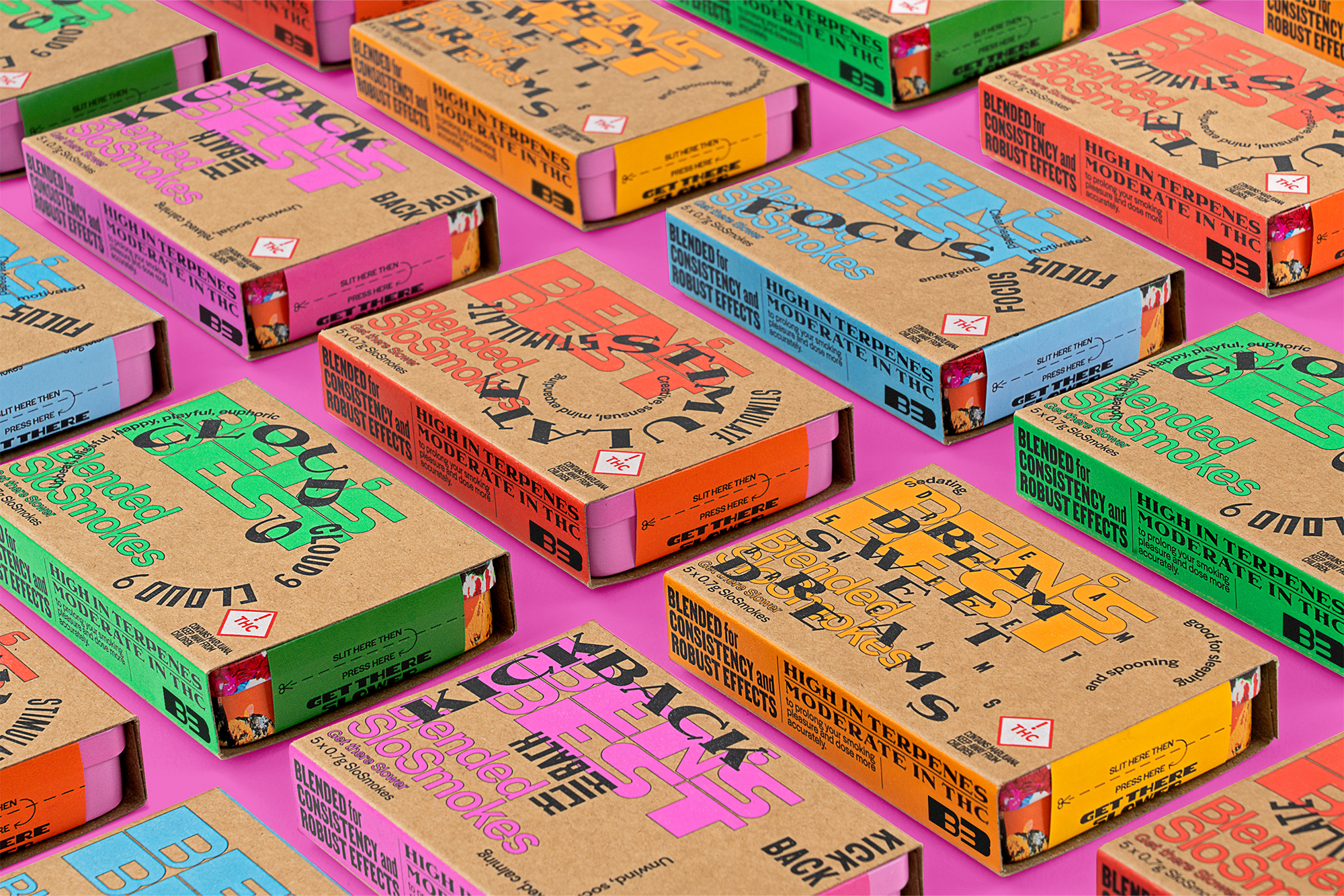
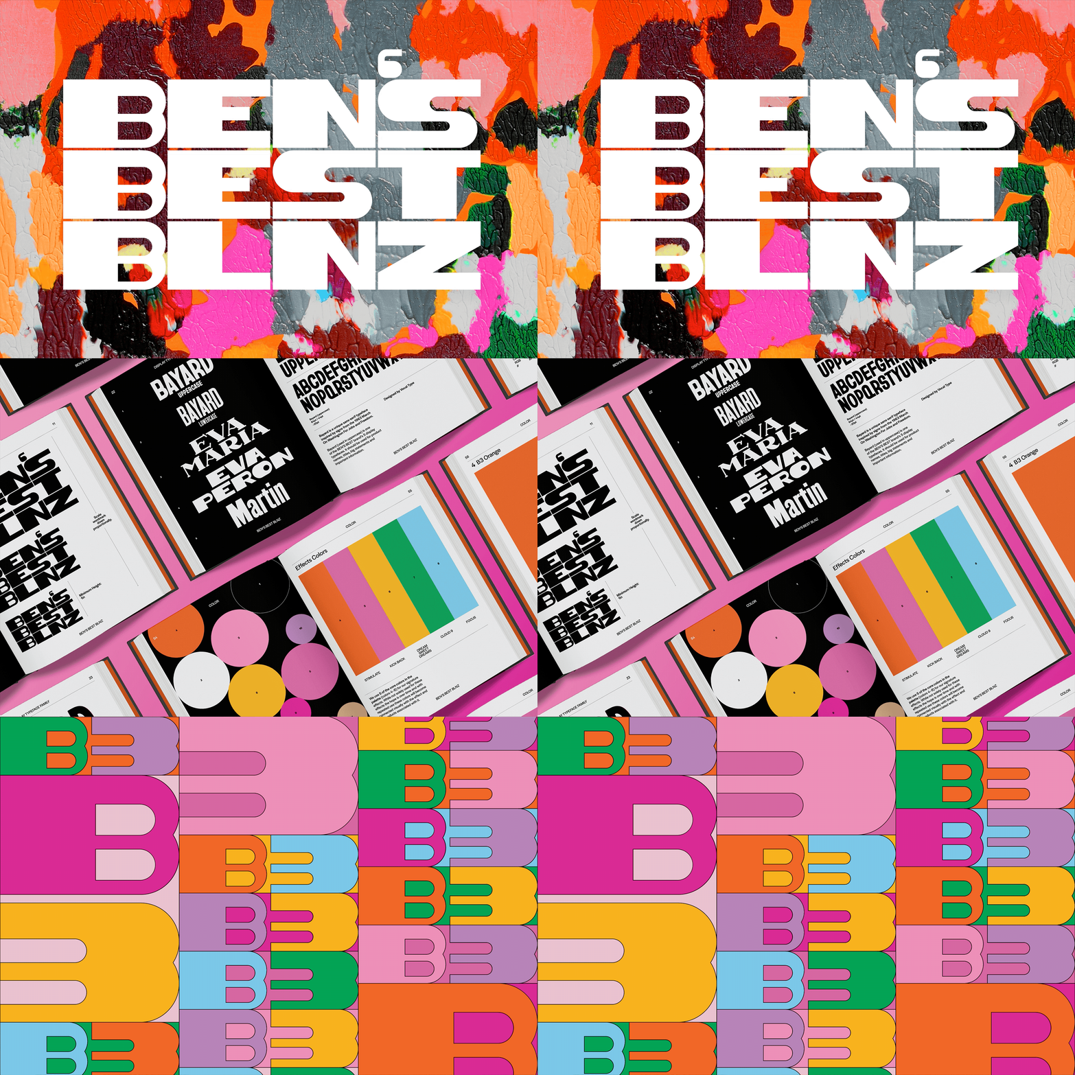
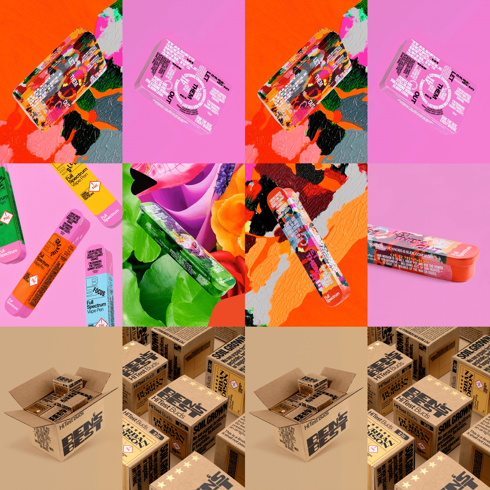
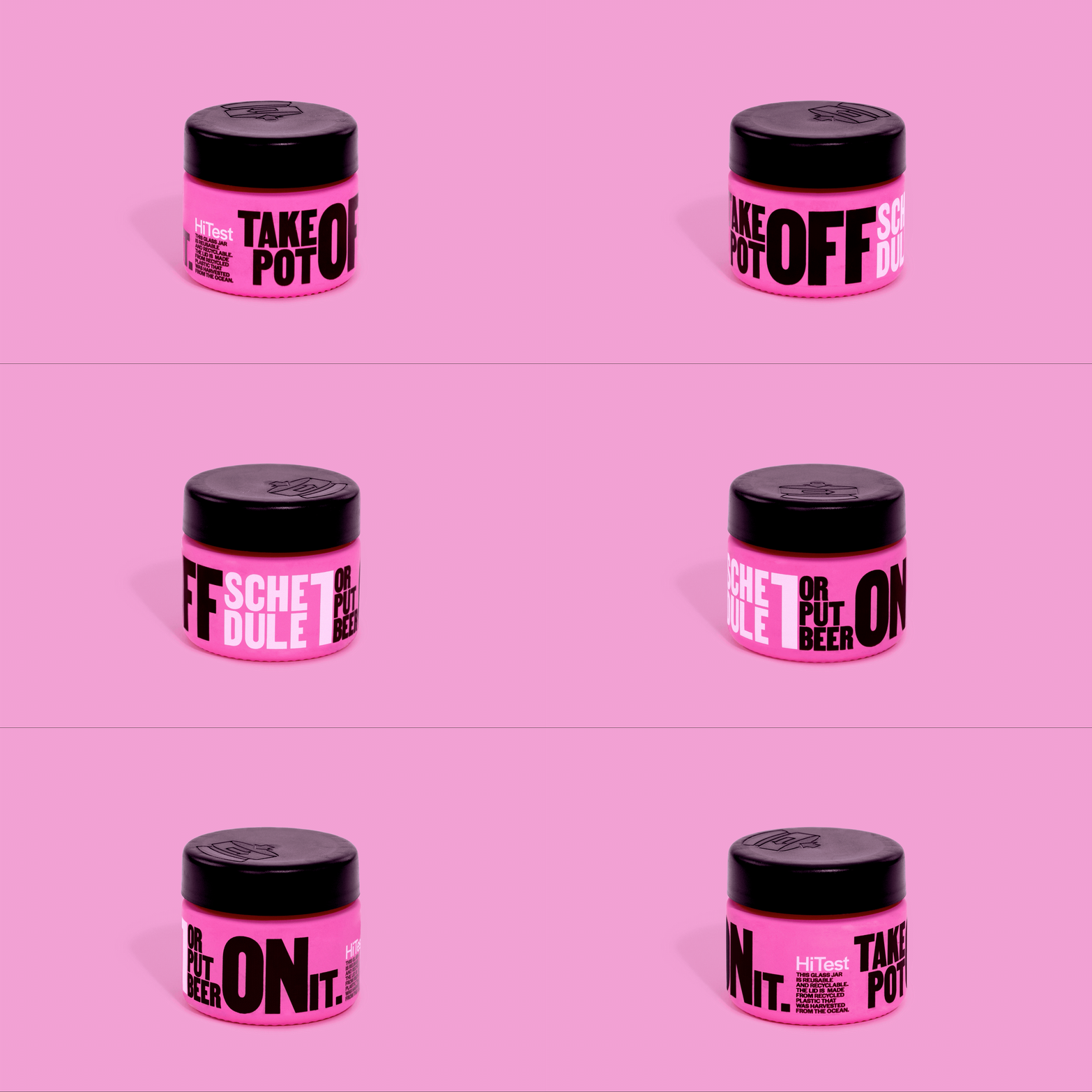
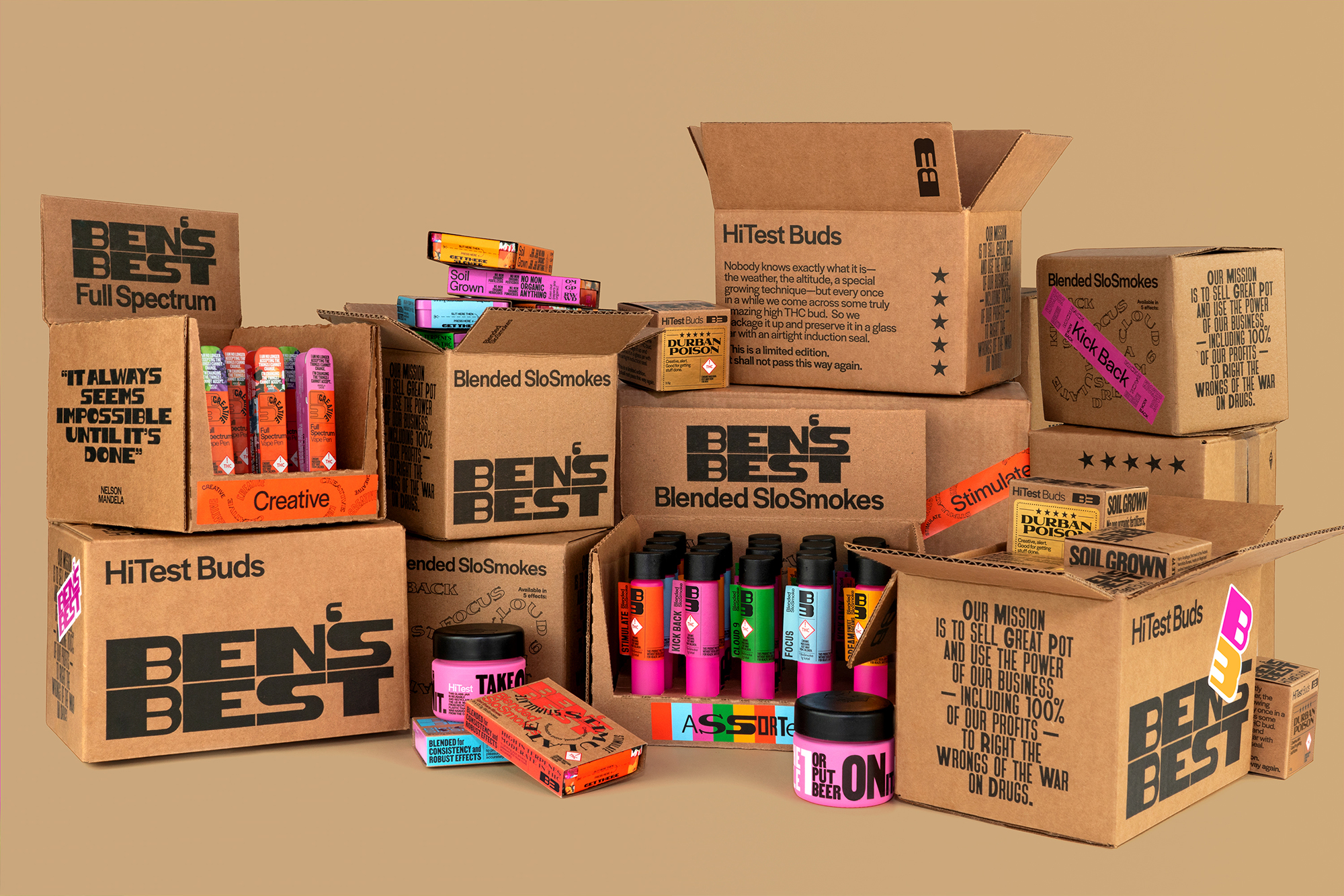
The visual language of the Ben’s Best identity is driven by expressive typography, rooted in historical context. The brand mark and typographic system use multiple typefaces from Vocal Type Foundry, each highlighting a piece of history from a specific underrepresented race, ethnicity, or gender—from the Women’s Suffrage Movement in Argentina to the Civil Rights Movement in America. The products and their packaging proudly feature these typefaces and are adorned in a medley of the words of black leaders, and calls to action to decarcerate and deschedule cannabis. Every element of the packaging is completely immersed in typography – the intent being the tins and jars used to contain the product become precious objects themselves that can be reviewed, explored and engaged with over time.
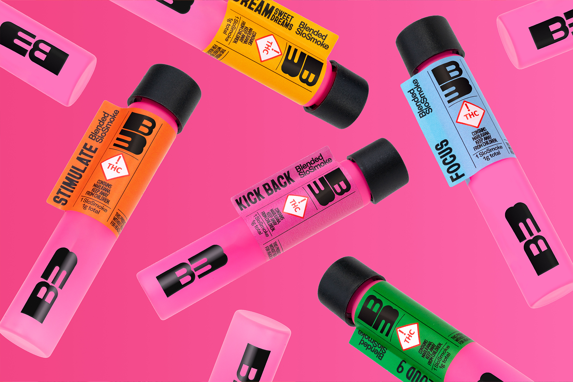
The brand packaging also prominently features the work of Black artists and designers, launching with 2 commissioned art pieces – one from Brooklyn based multimedia artist Dana Robinson and a second from Pentagram’s Eddie Opara. From the commissioned pieces, the design team extracted a varied range of contemporary colours which form the brand palette. Colour is used generously and purposefully throughout the brand system, enlivening text driven content in print and online and driving the branding of individual effects and product lines. The design team worked closely with the B3 team and vendors on each packaging element across the array of offerings. From exterior elements like sleeves and tin artwork to pamphlets and multifold inserts inside each container no element of packaging was left untouched or unconsidered. The brand system extends out from packaging to digital spaces such as the company website and social media along with further merchandise (t-shirts, hats and poster designs all sold in support of the brand mission).
