Bart’s Irish Whiskey
2021
Designed by Sinéad McAleer at Slater Design
Categories: Print / Identity / Packaging
Industry: Commercial
Tags: Typography / Food and drink / Whiskey / Packaging / Storytelling
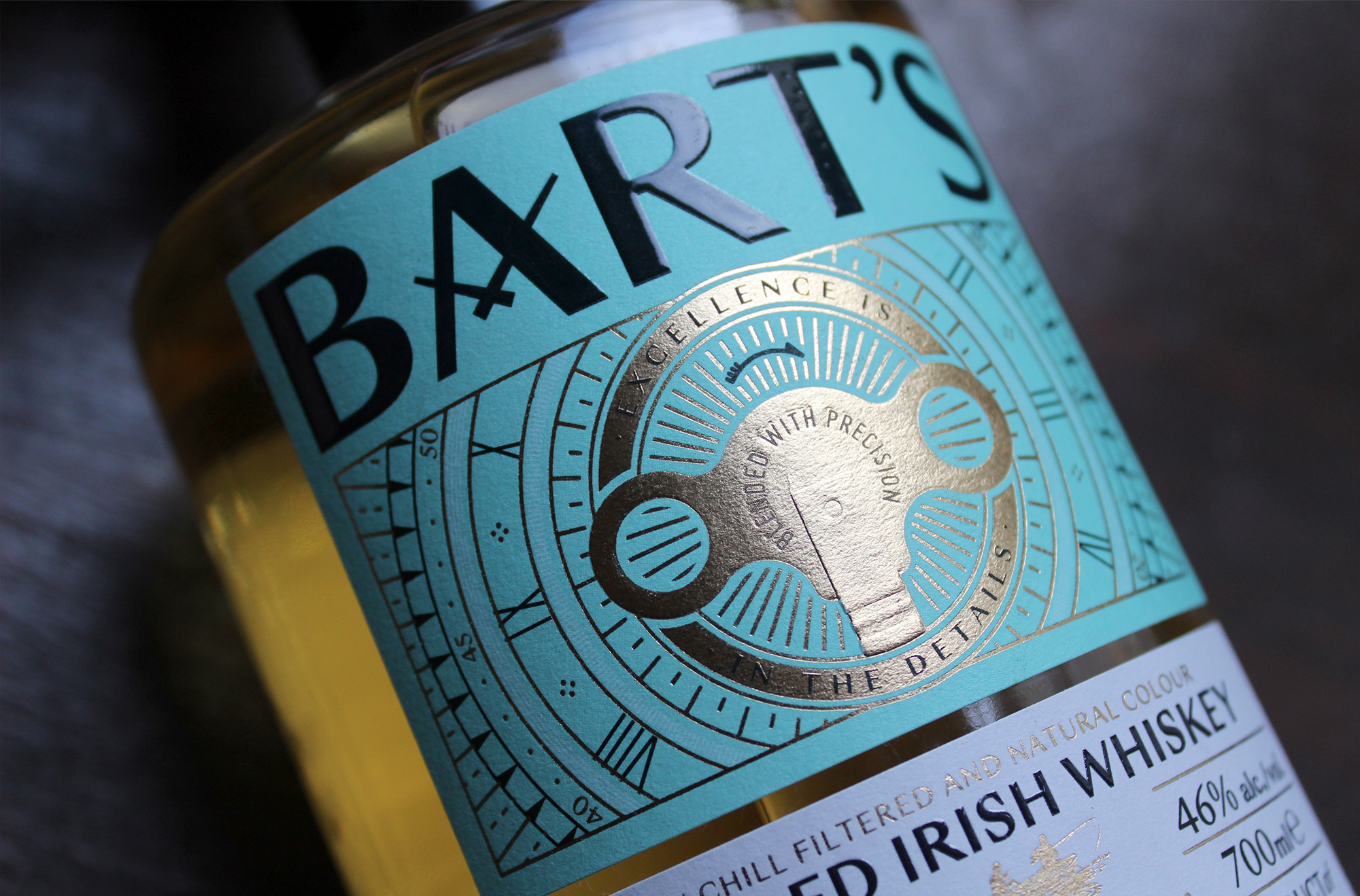
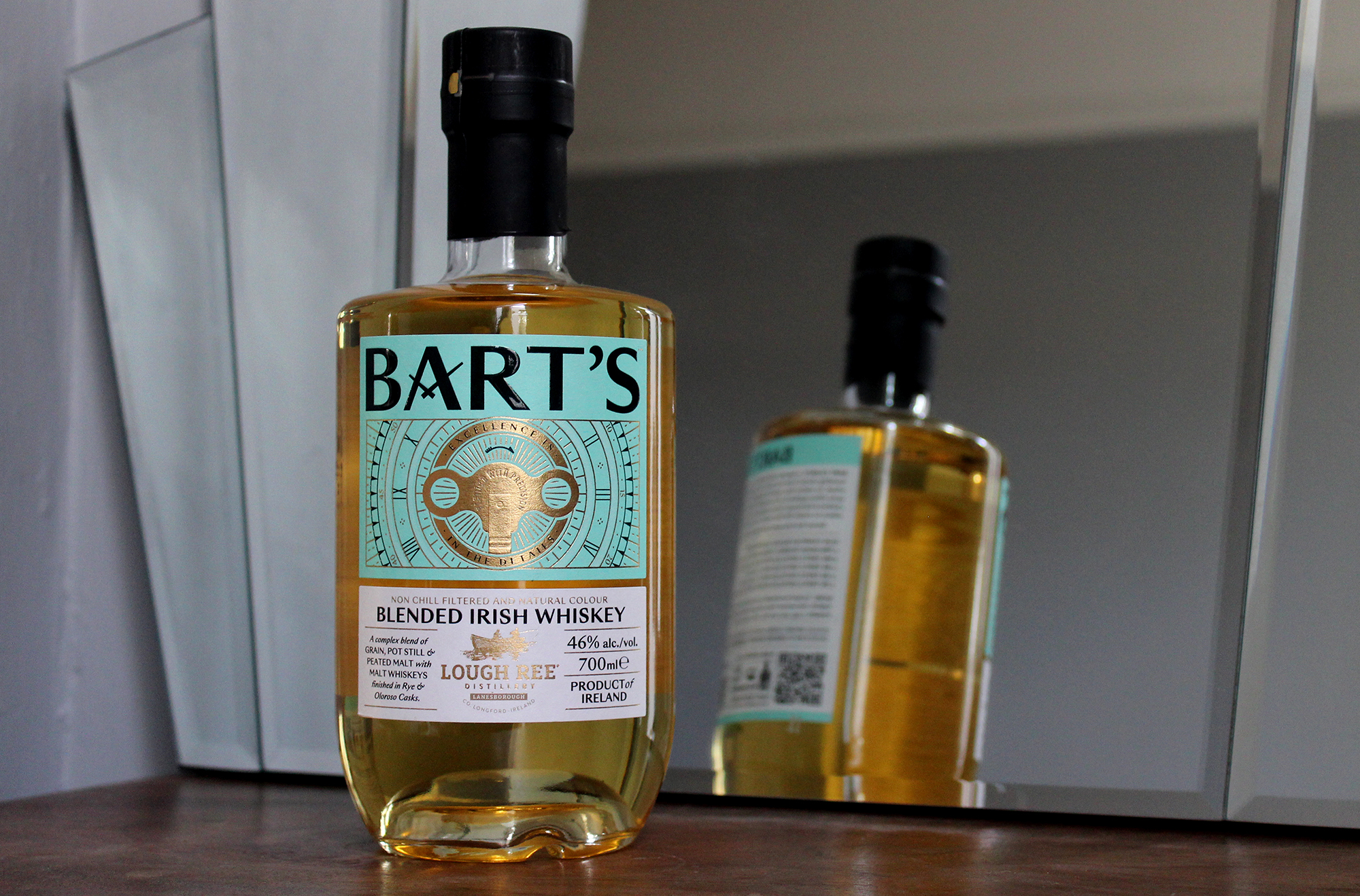
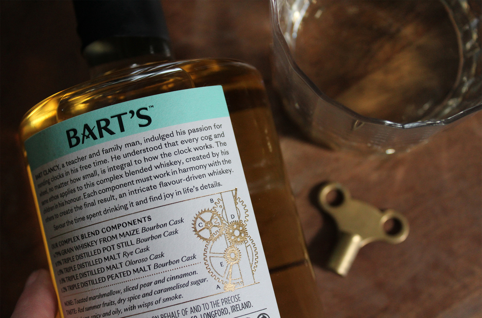
Bart’s is a complex blended whiskey, made by three siblings in tribute to their late father, Bart Clancy. By all accounts, Bart was an extraordinary person. A teacher and family man, who indulged his passion for mending clocks in his free time. He understood that every cog and wheel is integral to how the clock works, an ethos that his children, Sheila, Michael and Peter, have brought to this whiskey, fine tuning a mix of five different whiskeys to create the blend. We worked with the client to craft the brand narrative around the duality between Bart's resolute attention to detail in his work, and his children's obsession with the detail of their whiskey. We used the line 'Excellence is in the Details' to express this idea on the front of pack.
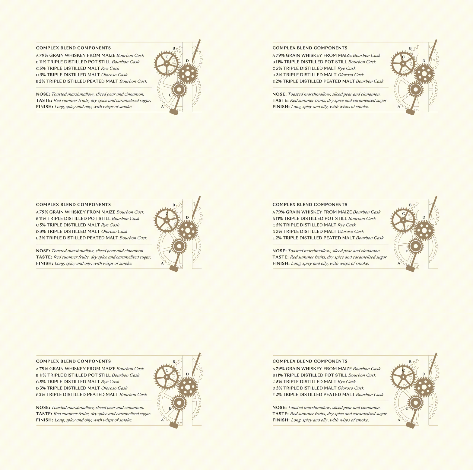
On delving deeper into Bart’s world, we encountered all manner of horological inspiration for the graphic execution, in particular the clock winding key featured on the front of pack. The key is a symbol of the complexity of the blend. It is rendered on pack in a triple level emboss. The words ‘Blended with Precision' appear to be engraved in to the butterfly portion of the key. The ‘A’ in the word mark contains clock hands reading 10.10 - the time considered most aesthetically appealing for display on watches and clocks. Transparency was hugely important to Lough Ree Distillery, the complex blend components are listed in full detail on the back of pack, illustrated by a gold foiled diagram based on the inner workings of a clock.
The bottle chosen for the whiskey is not just a distinctive shape with its tapered bottom, but 40% lighter than other bottles in this category, lowering its carbon footprint.


