Barneombudet
2020
Designed by Evan McGuinness at Bielke+Yang
Graphic Design: Martin Yang
Photography: Hinda Fahre
Illustration: Elliot Kruszynski
Type design: Bobby Tannam
Categories: Identity
Industry: Civic
Tags: Illustration / Typeface / Branding / Identity / Rights
Website: barneombudet.no
Who will speak for those who are too young to vote? Barneombudet, The Ombudsperson for Children, is the official Norwegian advocate for children and young people's rights. Since its foundation in 1981, there have been five different Ombudspeople, with each one adding and removing certain elements from the Barneombudet identity. When they came to us their main need was an identity system that could last for many years and be a more consistent voice regardless of who is Ombudsperson in the future.
The previous symbol, a bear sitting and waving within a shield, was considered too closely associated with smaller children, and something that teenagers and young people didn’t identify with. This was an issue for Barneombudet, as they help a wide spectrum of children from the ages of 0–18. We wanted the new logo to be abstract enough so it isn’t associated with only one aspect of the work that Barneombudet does, but can be read in several different ways depending on the viewer or how we choose to animate it. This way it can say a lot when it needs to, but be more discreet when appropriate.
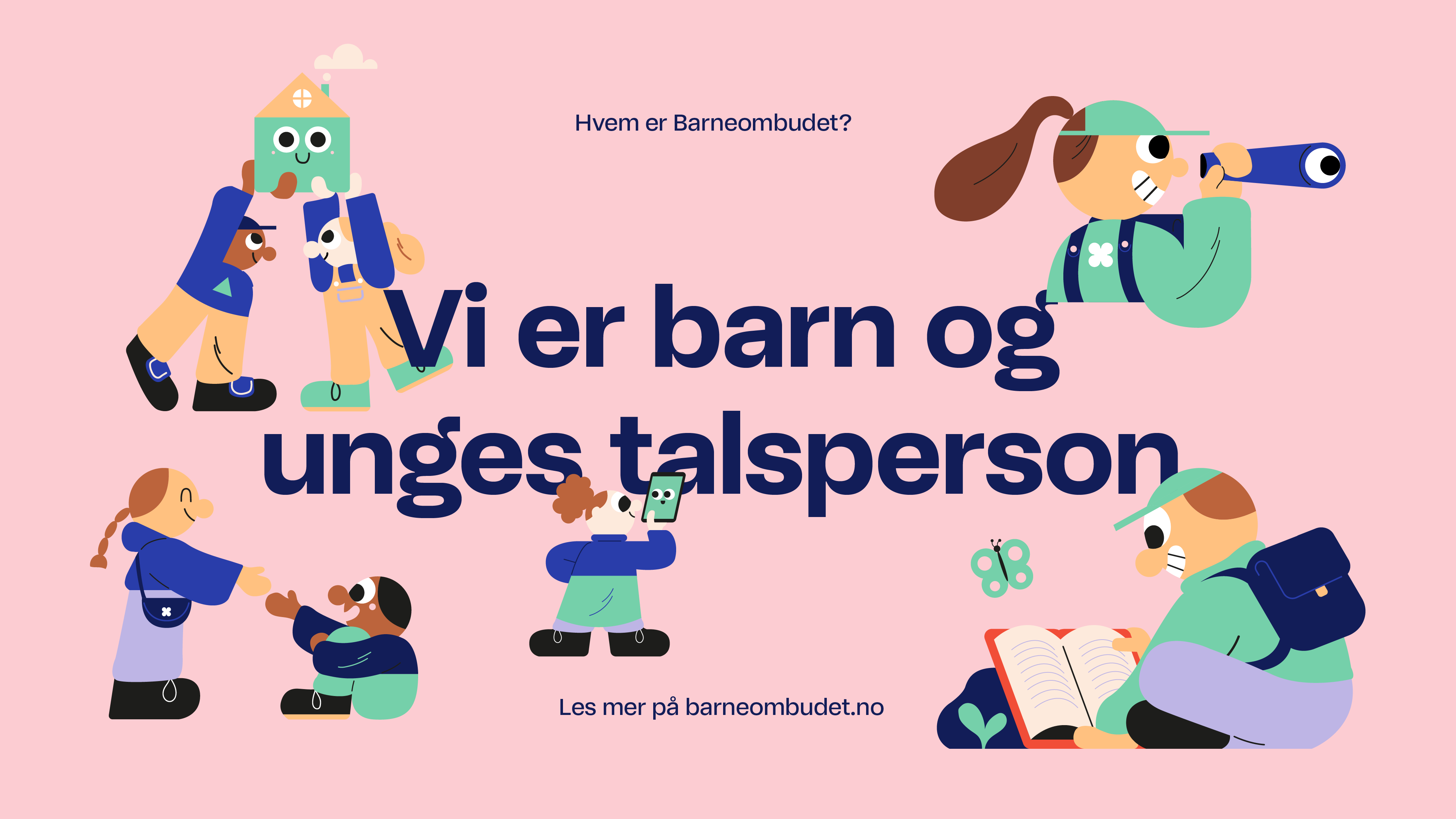
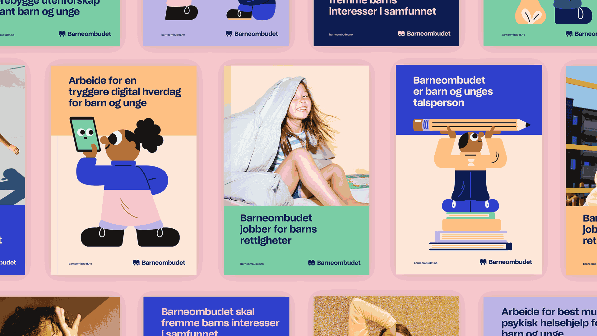
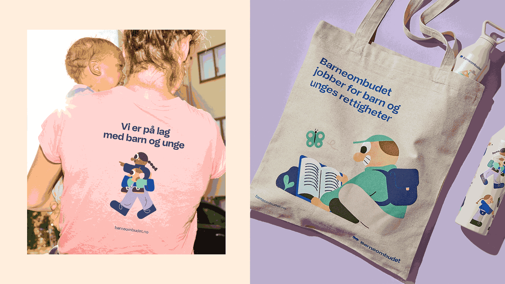
Barneombudet communicates via many channels and with a broad audience. The use of illustration provides them with a very flexible tool that they can use in any scenario to immediately add identity and make what they are communicating recognizable as Barneombudet.
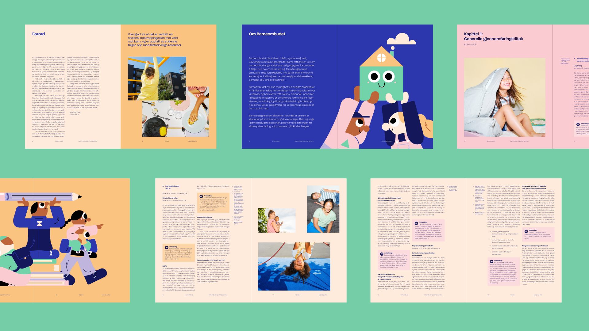
The photography needed to match the energy of the rest of the identity while adding that human aspect that reflected the children and families of Norway today. There is something refreshingly down to earth about the photography, capturing little moments that each child or parent can see themselves in. The imagery gave us the flexibility when dealing with some of the more difficult topics that are a big part of the work Barneombudet does when helping children and young people.
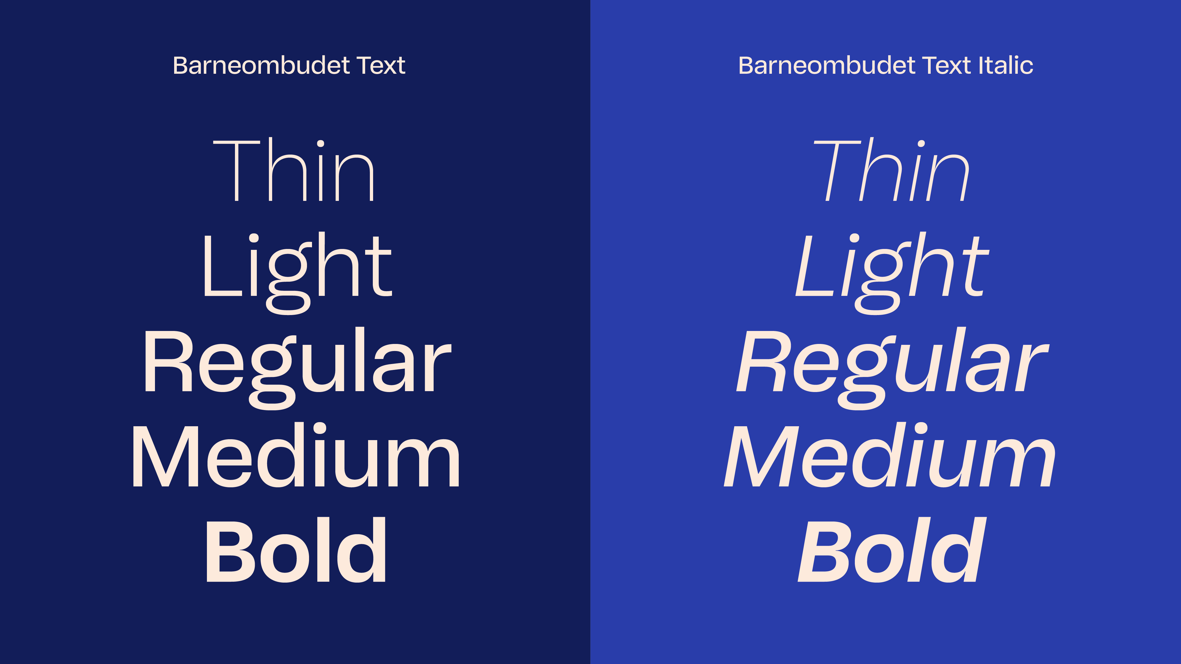
We also developed a custom typeface with type designer Bobby Tannam that was drawn with the understanding that all children are unique and have different needs. As Barneombudet’s services are widely available for all children, we wanted to ensure a high level of legibility and readability.
The typeface is rich and has a lot of options for variations with a playful display weight, and an accessible text weight family, inspired by typography created to make it easier for people that experience reading difficulties to understand. Together with an extensive character set, the typeface allows Barneombudet to write in all the official Norwegian written languages – Bokmål, Nynorsk, and three different Saami languages.
Together with a new identity, we launched their new website that lets young people find out how to get support. Also, the site allows grown-ups to learn more about Barneombudet’s official work. Active usage of photos and illustrations is used to tone up or down the playfulness, and thus the identity toolbox allows for a broad spectrum of variations – suited to balance both the formal and informal settings Barneombudet operates in.
Children and young people have this boundless energy and enthusiasm which the identity represents now for Barneombudet. These groups can see themselves more in the identity, making the wealth of information and support that Barneombudet offers more accessible to them and in turn making Barneombudet’s job in helping children and young people easier.
