Ballinger
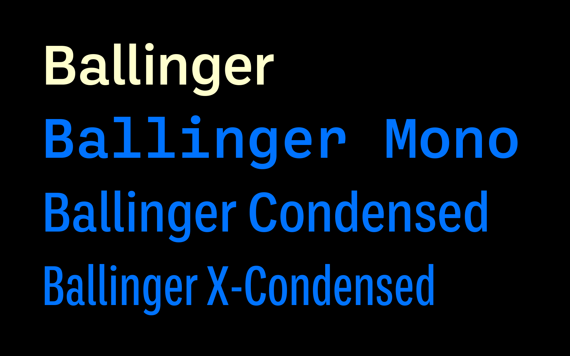
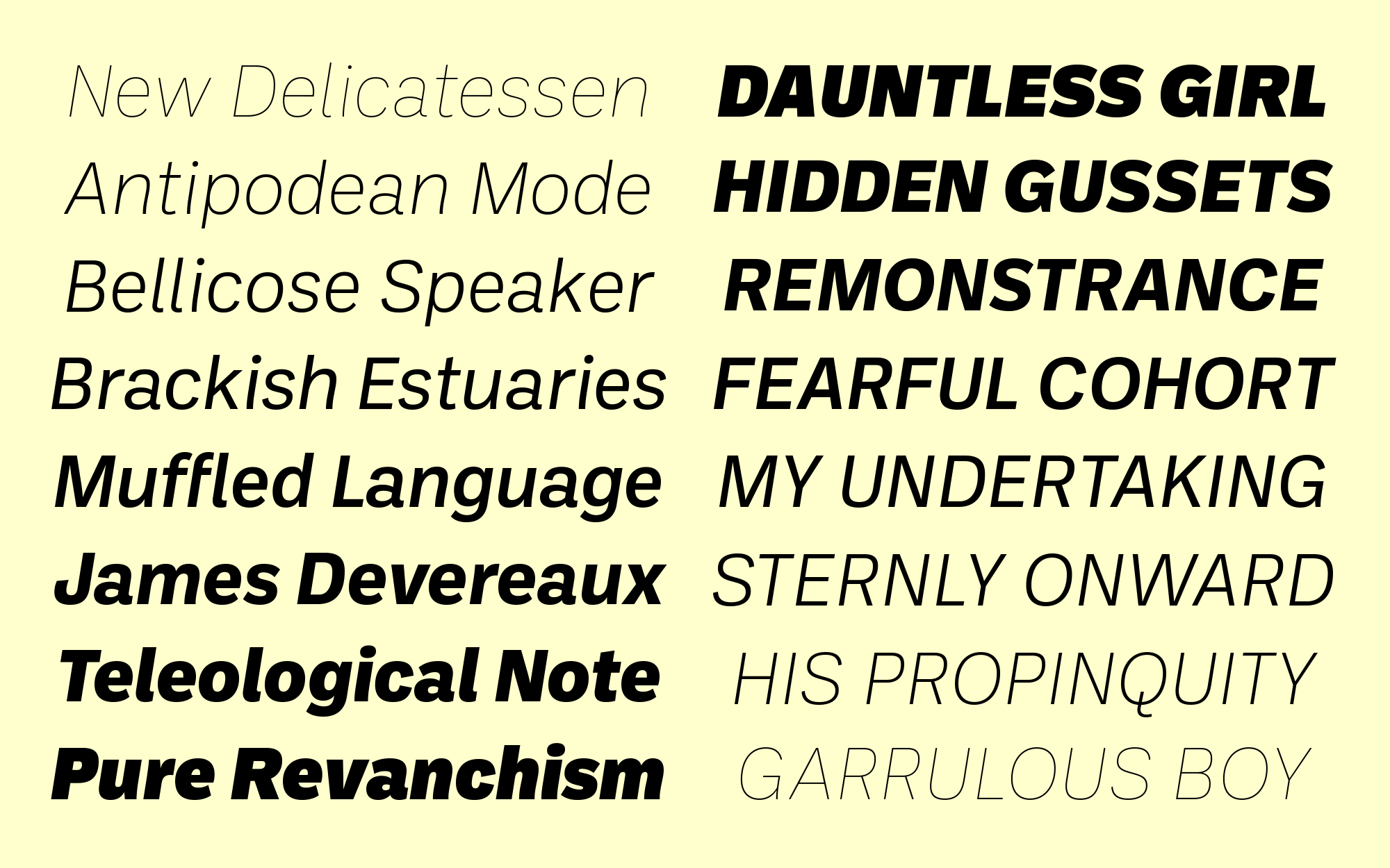
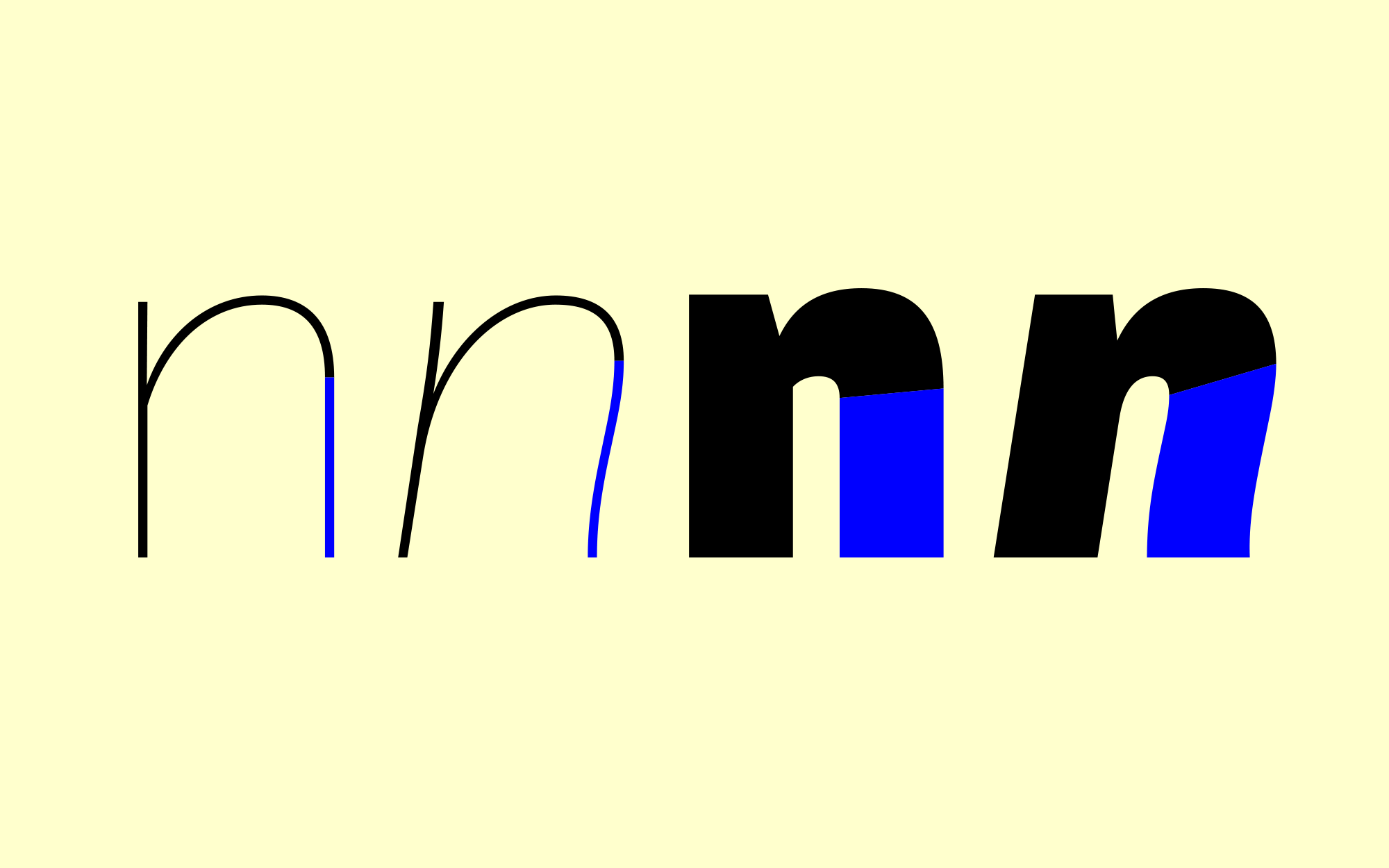
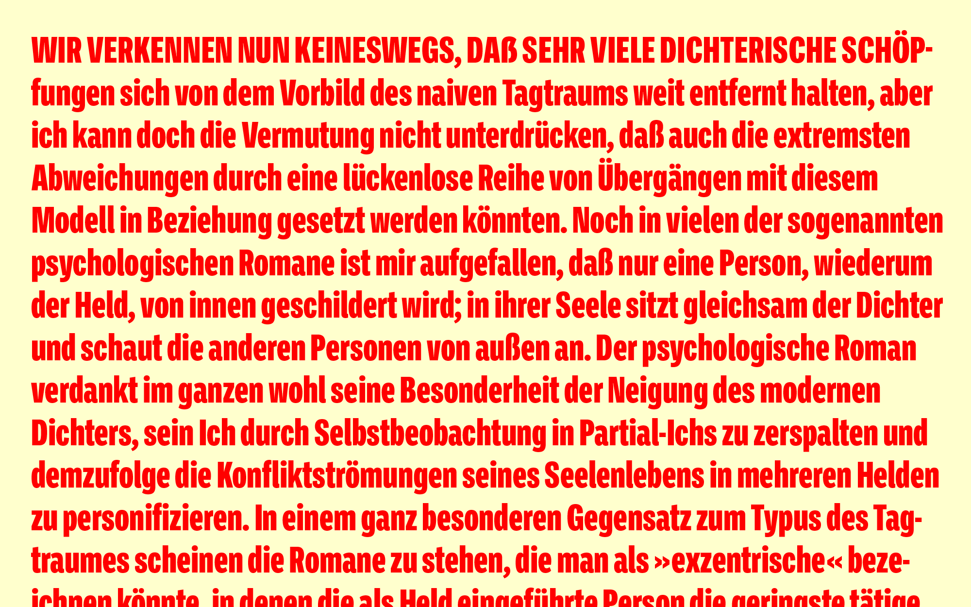
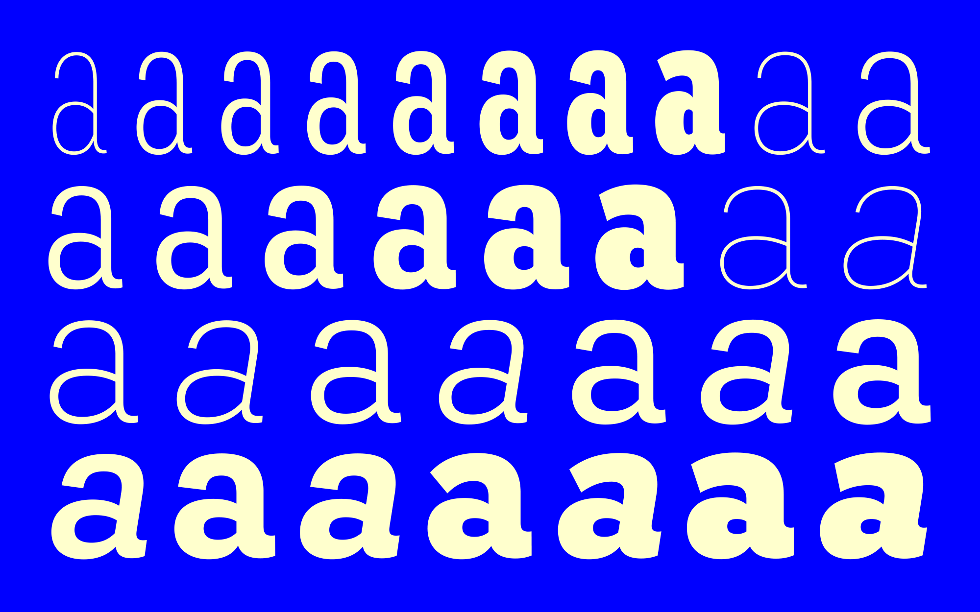
Ballinger began life as a single-weight proprietary typeface called baasic, designed for Dublin-based design office aad. baasic was intended as a plain, hardworking grotesque: a simple tool for clear communication. We’ve developed it into a fully-featured eight-weight family with matching italics, as well as monospaced, condensed, and extra-condensed companions: 40 styles in all. Sources include early 20th century jobbing sanses like Morris Benton’s News Gothic and Candia, a 70s-era typewriter face Josef Müller-Brockmann designed for Olivetti, which had unusually deep junctures that added energy to letters like m and n. The family takes its name from Raymond A. Ballinger, the great mid-century American designer, author of ‘Lettering Art in Modern Use,’ and champion of elegance and readability. Ballinger has large counters and a generous x-height. Letters like a, e, and s open out gradually as they move from Thin to Black to maintain ample apertures, even in the darkest weights. Semi-oldstyle figures are available, as well as case-sensitive punctuation and delimiters. Italics incorporate subtle ogee curves to lend warmth and energy to the page or screen.
