Ardfort 1708 Irish Whiskey
2024
Designed by David Walsh at Greenhouse
Illustration & Typography: David Walsh
Creative Direction: Richie Ryan
Naming: Greenhouse
Categories: Packaging
Industry: Commercial
Tags: Illustration / Typography / Food and drink / Retail
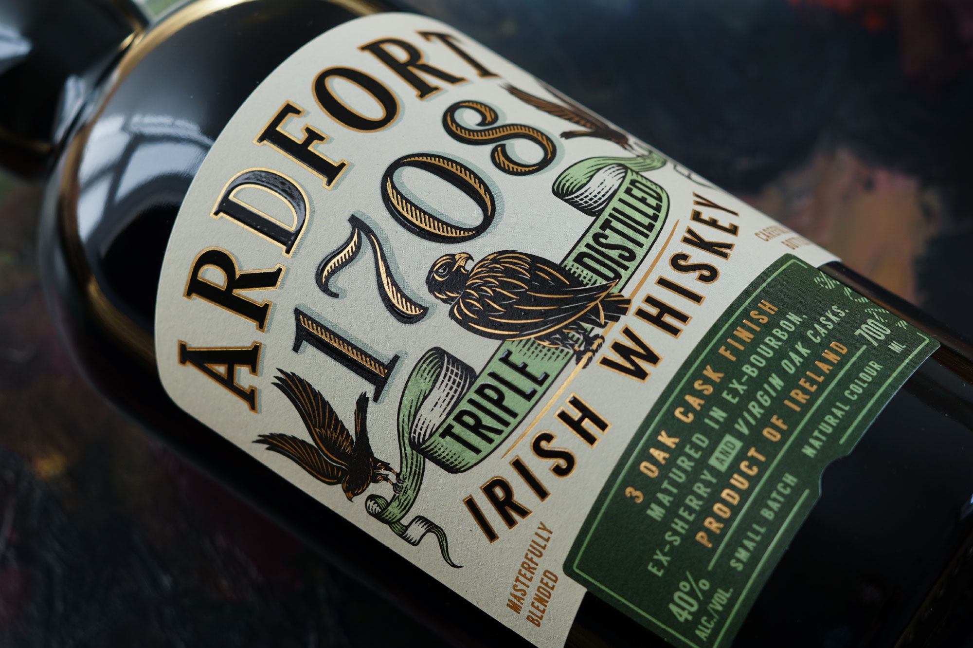
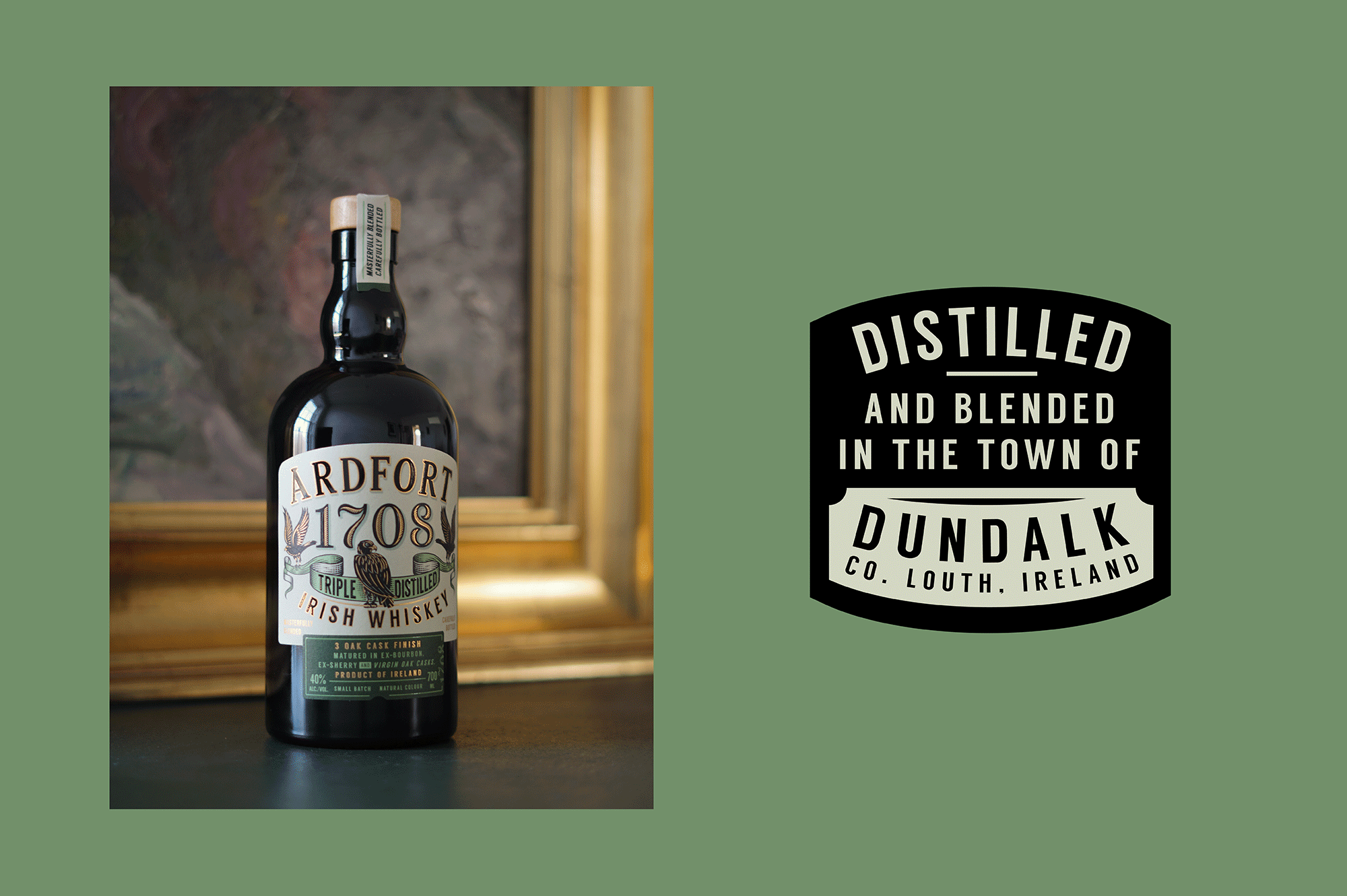
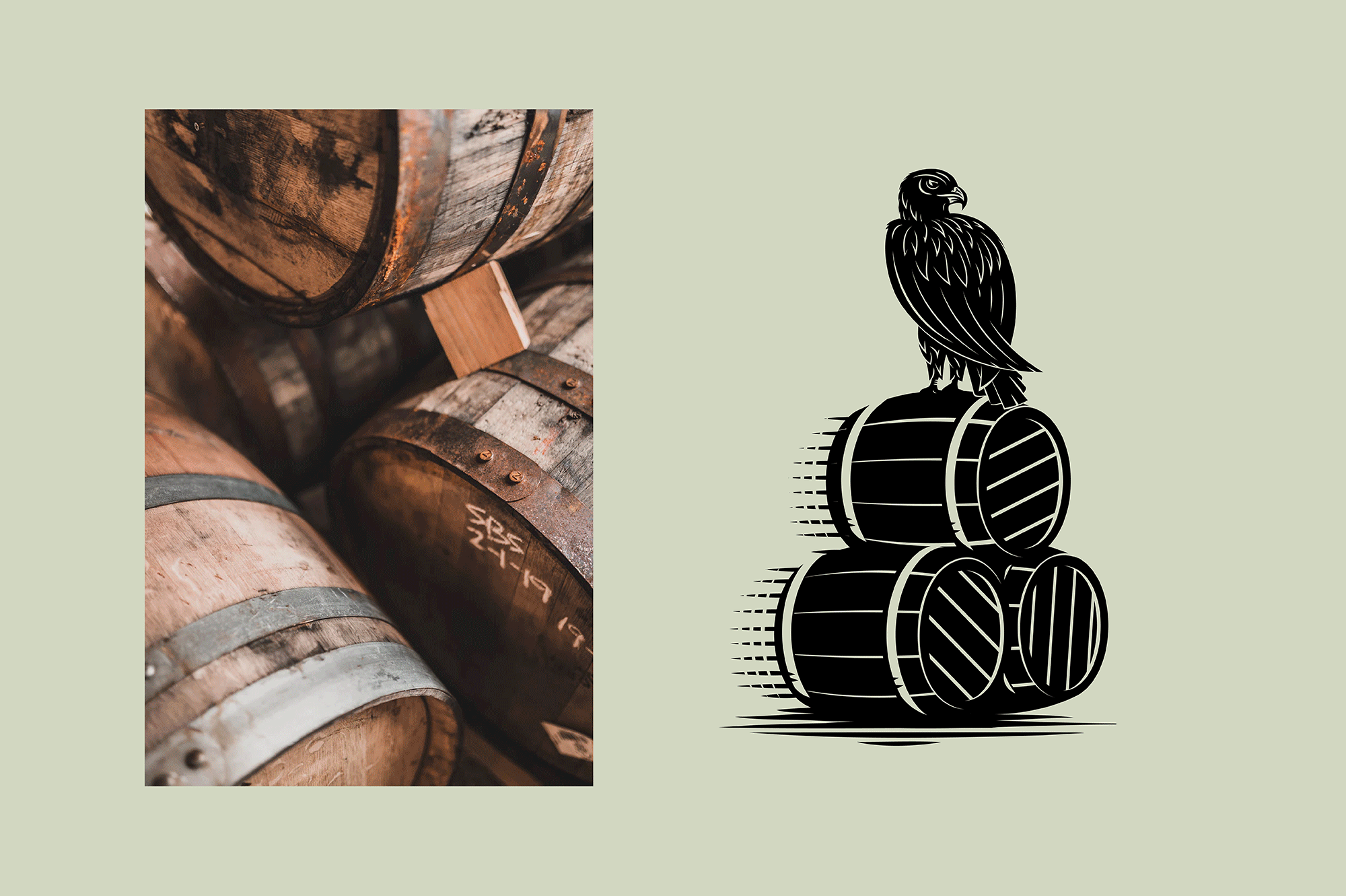
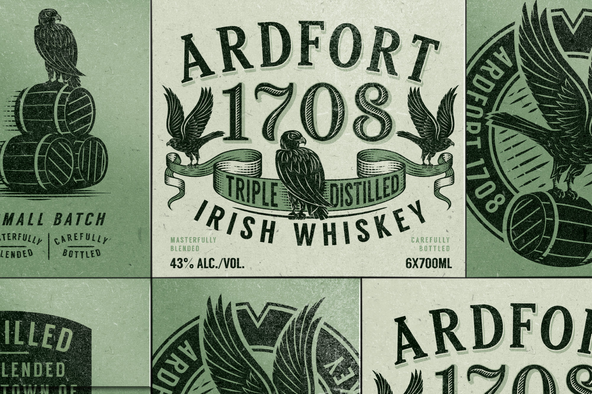
Propositioned for the export market, Ardfort 1708 pays homage to the land it was created in. Distilled, bottled and blended in Dundalk, Co. Louth, a county which once had the highest amount of distilleries than any other county in Ireland. The name Ardfort is influenced by the fort that was situated high above the town when it was an early settlement, while the year 1708 was the year the first distillery fired its stills in this very town. Further research revealed the town’s crest depicts three Martlet birds, something we wanted to carry through to the label and develop mascots for the brand.
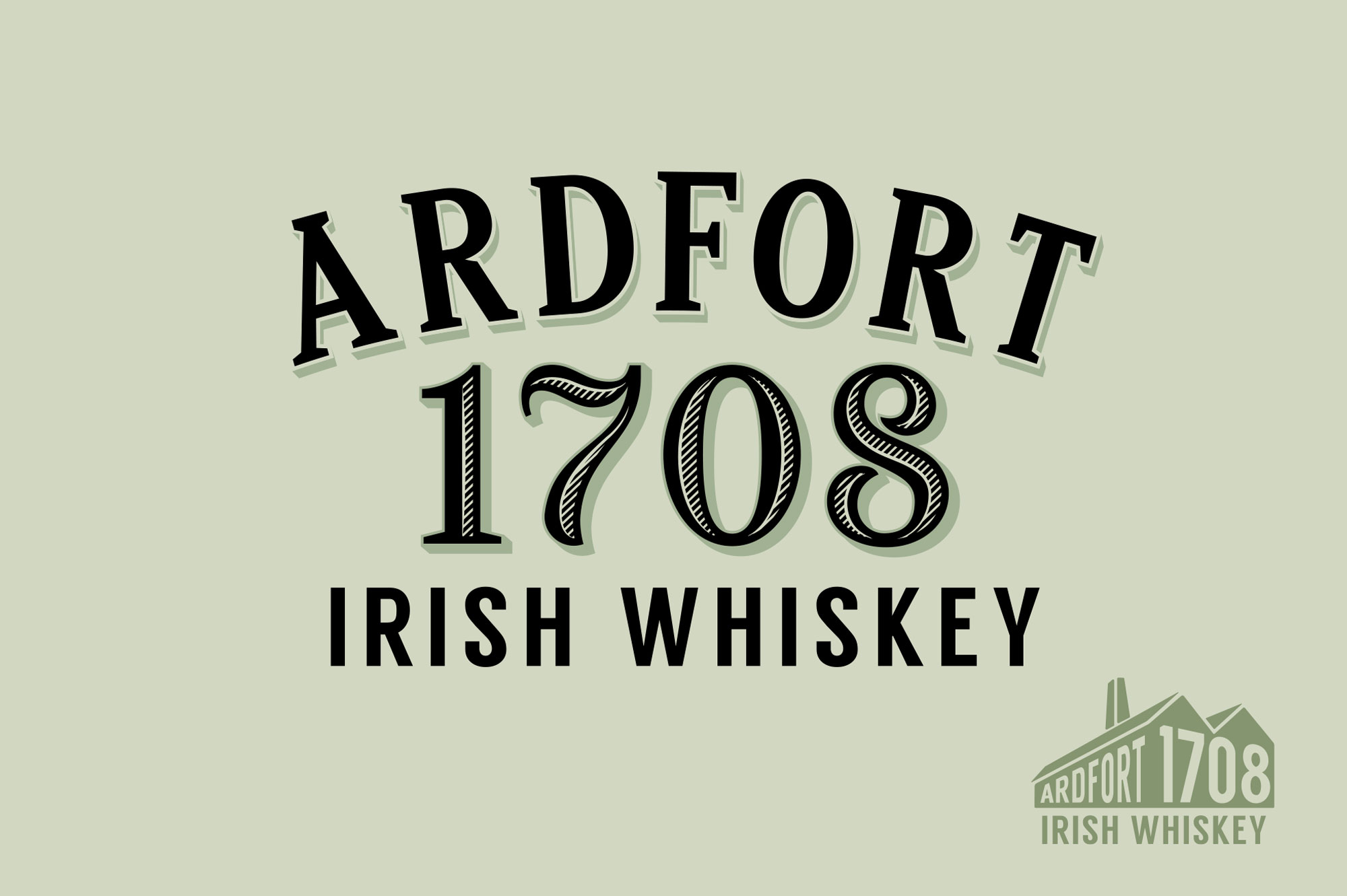
The styling of the typography and numbers was influenced by the art of sign painting with font styling and embellishments reminiscent of this high-time for distilling in Co. Louth. Gold foil, drop shading and the use of a raised varnish pull the lettering off the uncoated stock in an almost ‘painted on’ aesthetic that could have been seen over doorways of local taverns or the detailed numbering on houses. Two Martlets are giving the task of carrying the Triple Distilled banner while the third stands proud and on guard. These mythical birds are giving a bird-of-prey like appearance with large beaks and wings worthy of any coat of arms.
These three featured characters become ambassadors for the brands story and interact with all the key USPs giving the brand more talk-ability when working off pack.
The use of the black bottle compliments the label colours and was a deliberate decision for point of difference on shelf while also fitting with the personality of the brand.