aperee
2012
Designed by Deirdre Corcoran, Kieran Rigby, Mark Quirke and Therese McGuinness at Chapter.
Categories: Identity
Industry: Corporate
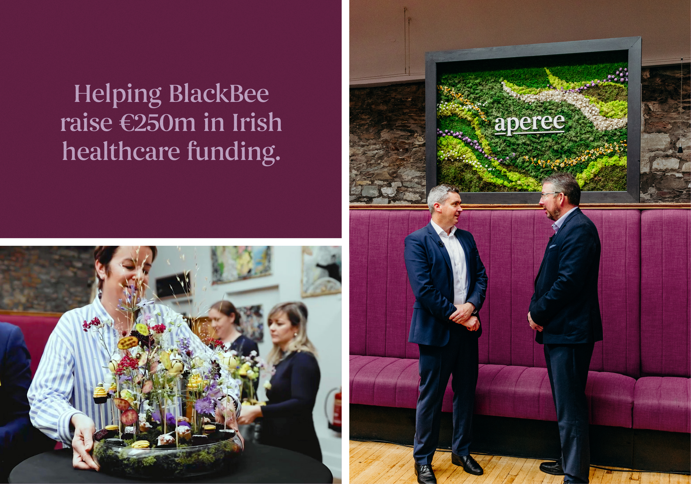
BlackBee is a progressive company within the financial industry. They came to us with plans to create an innovation fund where you can invest in healthcare infrastructure through a regulated vehicle, offering unique proximity to their investment.
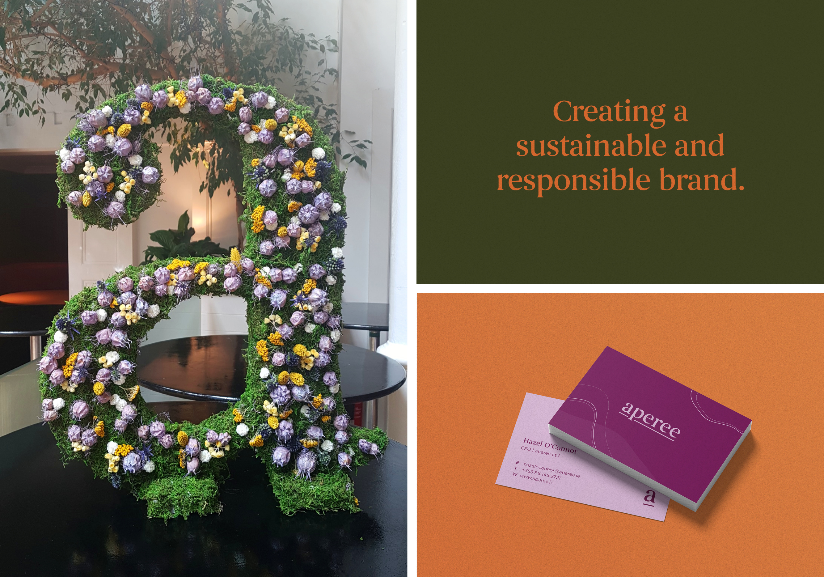
Impressed by the integrity and bravery of the BlackBee team, we were delighted to come on board as their creative partner. The challenge was to create a sub-brand that truly reflected the ingenuity of what BlackBee was doing in a very complex industry.
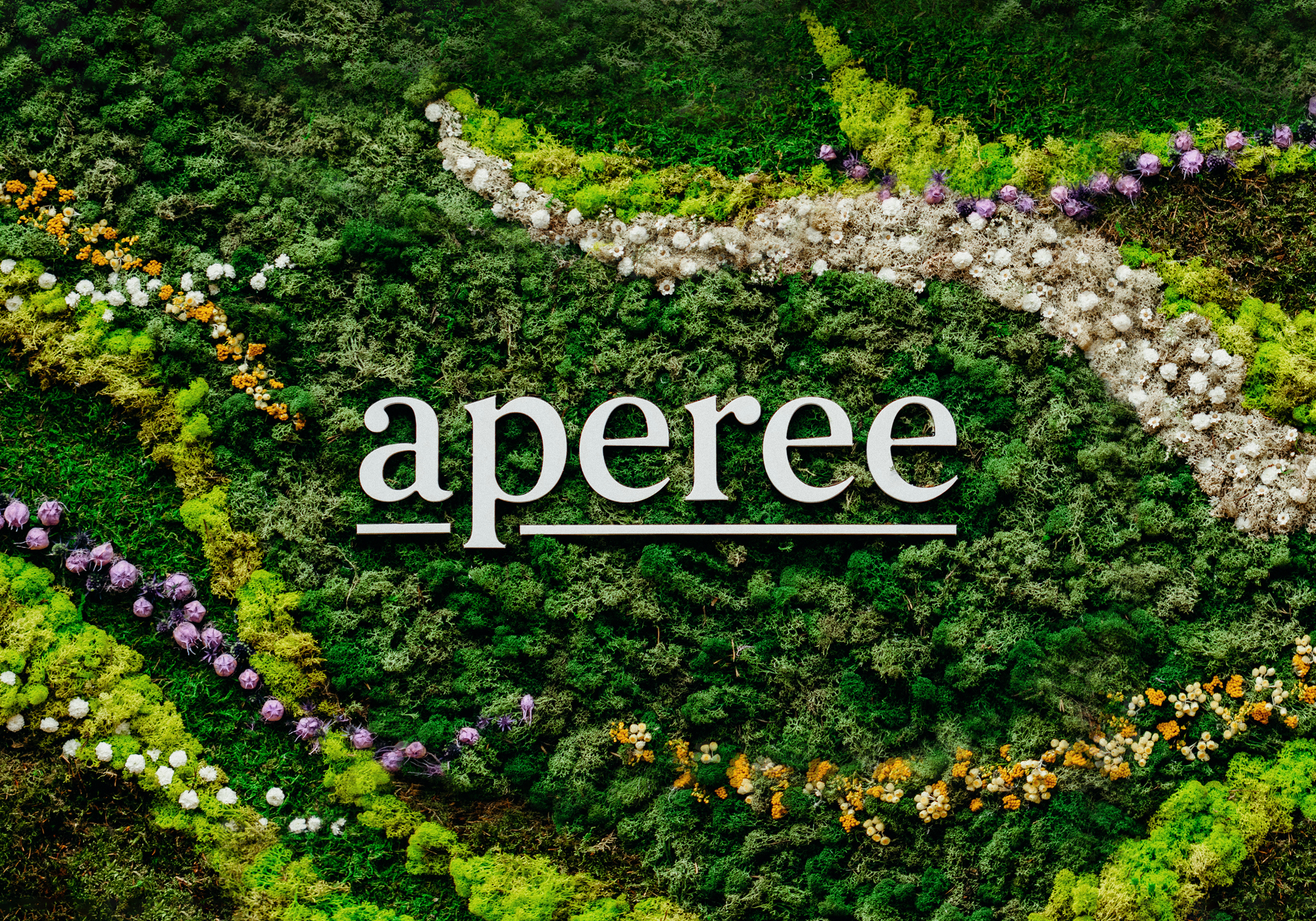
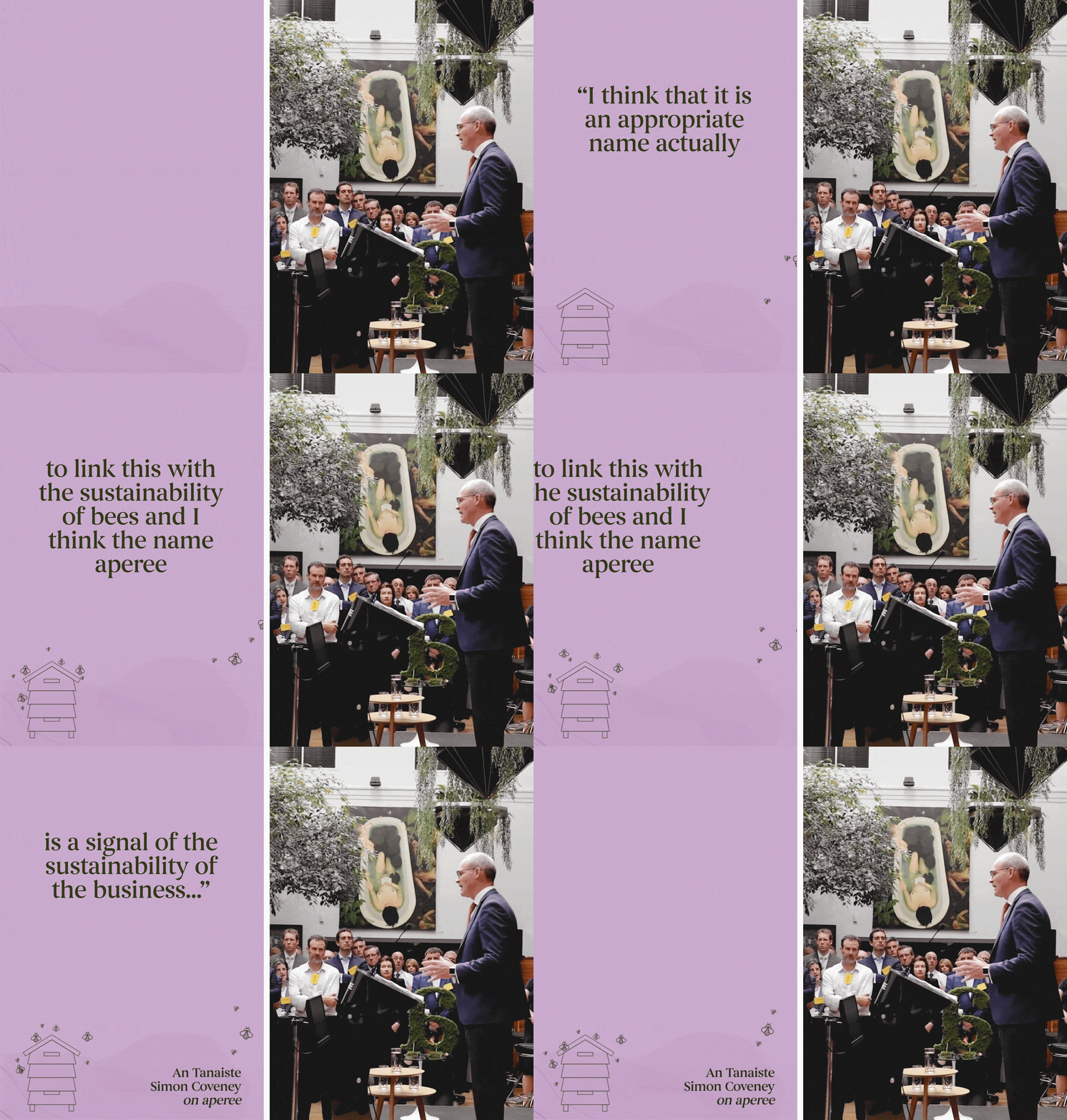
First, we worked to articulate BlackBee’s core brand purpose, work from which the tagline “Pollinating investments with great ideas” stemmed. We then created the sub-brand brand aperee. The aperee brand name (pronounced a-pur-y) is inspired by the Latin ‘apiary’, meaning a collection of beehives cared for by a beekeeper. Beekeepers are custodians, tasked with the conservation and stewardship of precious hives – it is really a matter of ethical responsibility. These same ethical values of conservation, sustainability and stewardship are very much present in BlackBee’s vision for aperee. aperee needed to convey a message about life, not just care, and so the ‘Art of living’ tagline was born.


