221+ CervicalCheck Patient Support Group
2013
Designed by Una Healy at Una Healy Design
Categories: Identity
Industry: Charitable
Website: 221plus.ie
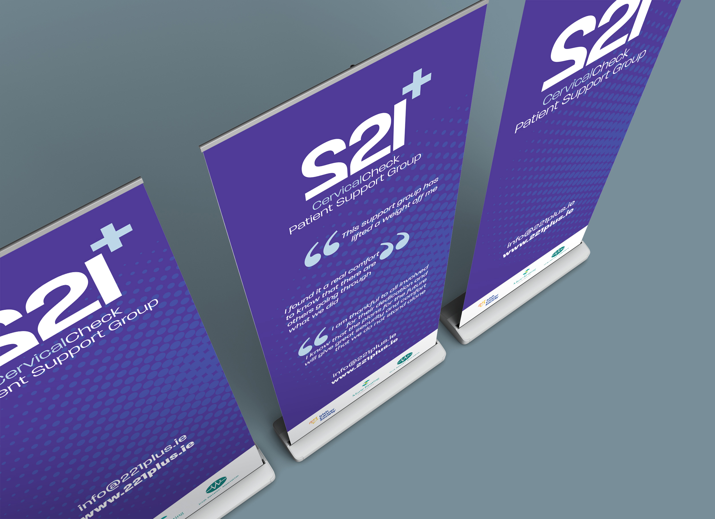
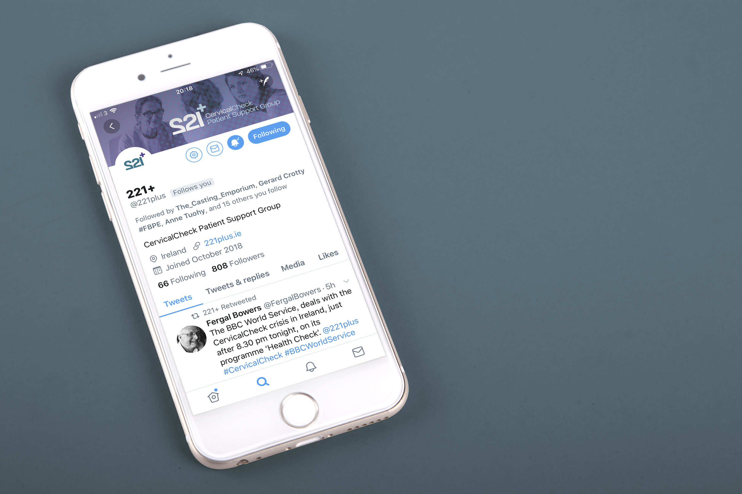
Following the recent CervicalCheck scandal, a support organisation was set up to provide structured support for the women and families whose lives are permanently affected by this shocking situation. The Marie Keating Foundation, The Cancer Society of Ireland and the Irish Patient’s Association established this organisation. The organisation needed to become a recognisable brand - strong, inclusive, supportive and memorable.
When this organisation was set up, there were 221 women directly affected by the CervicalCheck negligence. This number is a stark reminder of how many womens’ lives have been directly and irreversibly damaged. There could be no sugar coating the name of this organisation. There could be no forgetting the damage done to these 221 women. The name 221+ was chosen for this purpose. In years to come, people will not vaguely remember that some women were affected. They will know that there were 221 casualties of this negligence. The words are direct, strong and powerful.
This logo is designed to be:
Inclusive
221 is the number of women who have been affected by this scandal. None of these women are alone in their plight. They are with 220 other women in the same shocking situation. The plus sign indicates the families of these women; the families who have been directly affected and are also in need of support. It is also a symbol of positivity.
Expansive
The plus sign also portrays the women who may not have been accounted for in the past and possibly those who have not yet been diagnosed.
Powerful
221 + is a constant reminder to the public, politicians and medical professions of how many women and families have been affected by this scandal.
Supportive
The 2s, with the initial digit reversed, form the shape of the uterus and cervix. This shows the physicality of the issue and where medical intervention will be required.
Warm
The 2s, equally importantly, form the shape of the heart, symbolising empathy, support and love.
The overall sense of this branding is direct, powerful, emotive, and memorable. The extent of this scandal should never be forgotten.
Additional branding graphic elements:
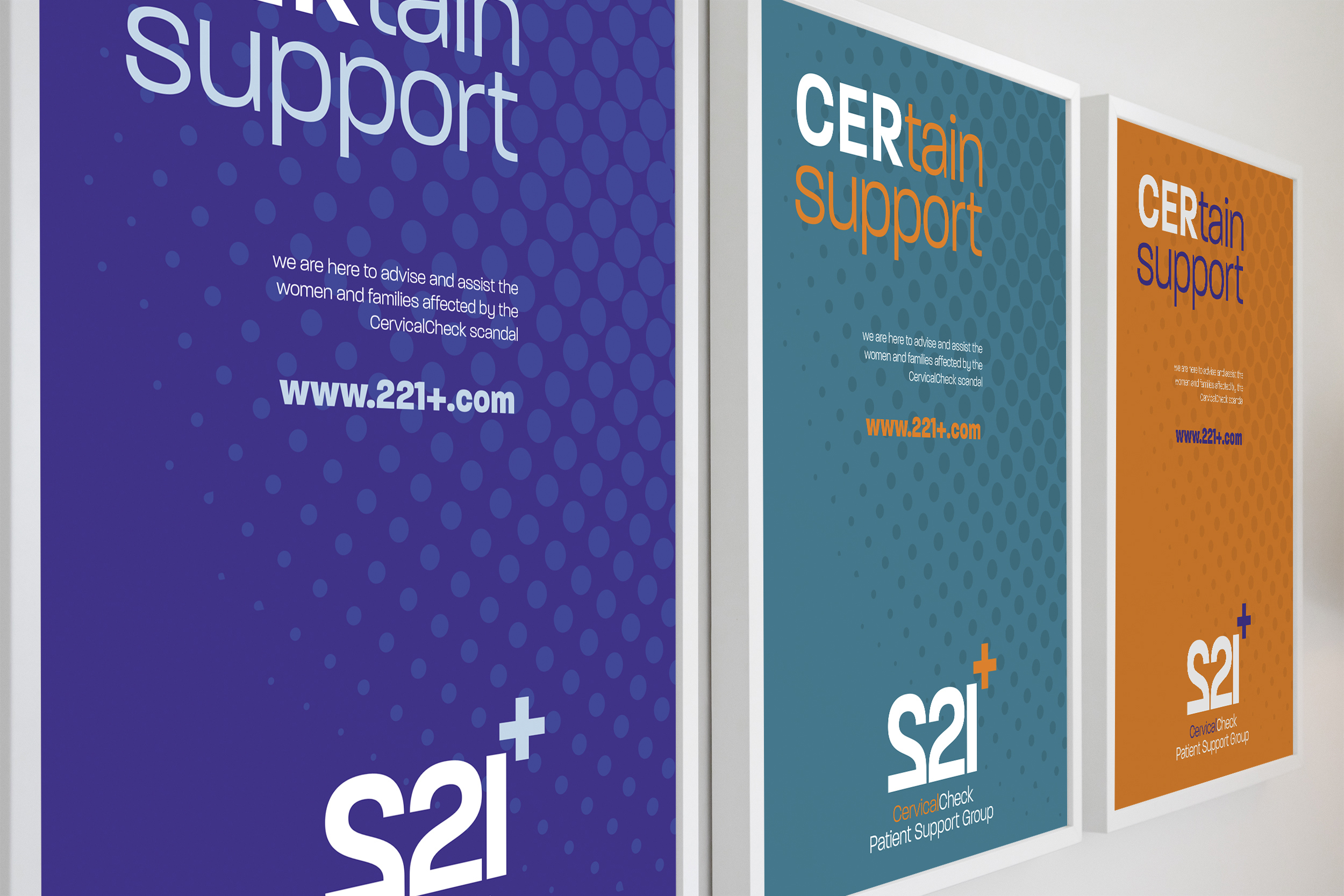
Supporting graphics use a circular dotted background element - showing people coming together to form a larger and unified entity. On a subliminal level these dots represent the cellular nature of cancer.


