As graphic designers we’re taught that the fundamentals of brand identity are logos, colour palettes, graphic systems and guidelines. As we learn more about it we covet images of bold and simple graphic icons painted 8ft high on the side of a container, or skilfully positioned and scaled on the side of a delivery truck. We obsess over the layout and production of wide ranging guidelines for global conglomerates. We bemoan the slide in standards as logos become ugly, fluid, garish. And we fight tooth and nail to maintain our place as the guardians of sense, taste and standards for all things brand. If this all sounds about right then what I'm about to say will piss you right off.
The greatest brand identity of the 21st century has at its core a 14 year old girl throwing unconventional shapes in a blunt bob wig. What? You heard me. For those of you who have no idea what i’m talking about, it’s time to get your head out of the latest brand guideline re-issue and enter the new millennium. I’m talking about Australian pop-artist Sia. The lead vocalist of zero-7 in the late 90’s she then went on to write for some of the worlds biggest pop artists including Beyonce, Rihanna and Britney. Since 2013 however she’s been building an unconventional but incredibly effective and potent brand. Through her music, yes, but also with what is to all intents and purposes a brand identity.
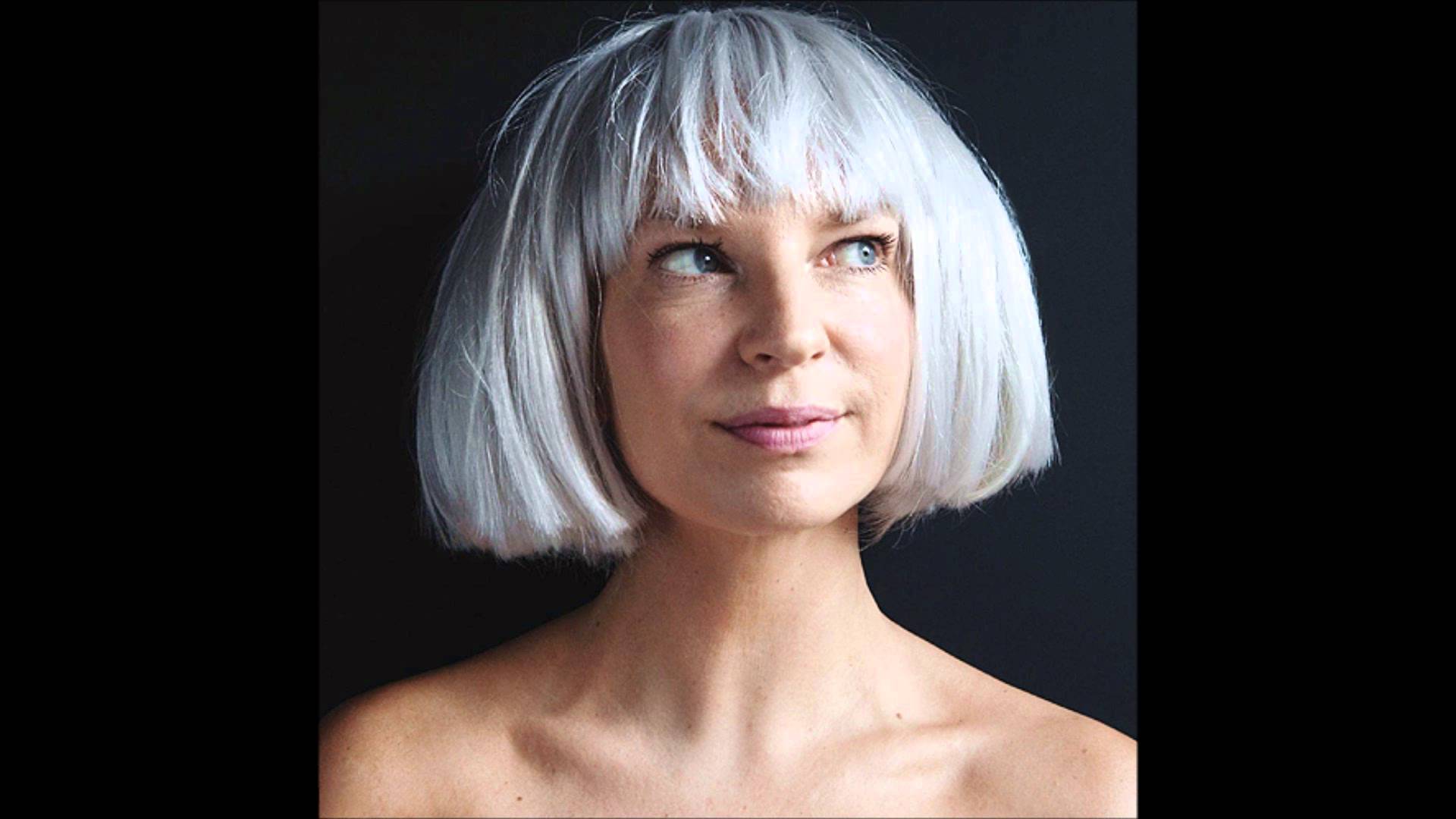
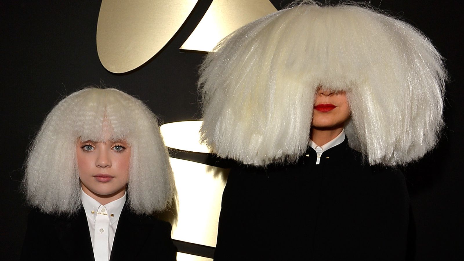
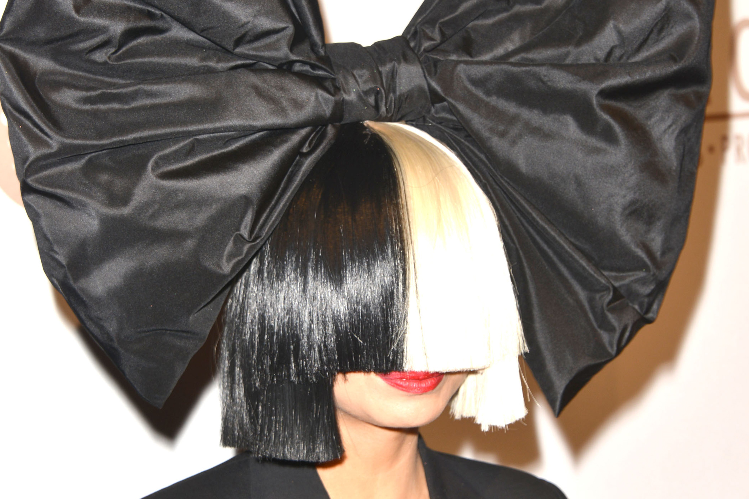
You may think i’m being a bit flippant or obtuse in order to make a point. I’m not. I’ve had a growing obsession with how Sia has built her brand for a couple of years now. Initially noticing her smart use of a particular and recognisable hairstyle as an identifier for both her own identity [not being comfortable as ‘the face’ of her music] and her musical output. When I first saw her video for chandelier, the iconic recognisable hairstyle worn by a young girl who interprets the track with some explosive and original choreography, I thought it was an interesting development of the brand but ultimately maybe a bit cute, the young dancer an emotive gimmick. However much as Nike’s brand was brought to life and given depth through its creative relationship with Wieden + Kennedy, Maddie Zieglers unique physical and creative skills have transformed the blunt fringe from an almost static icon into a living, breathing avatar.
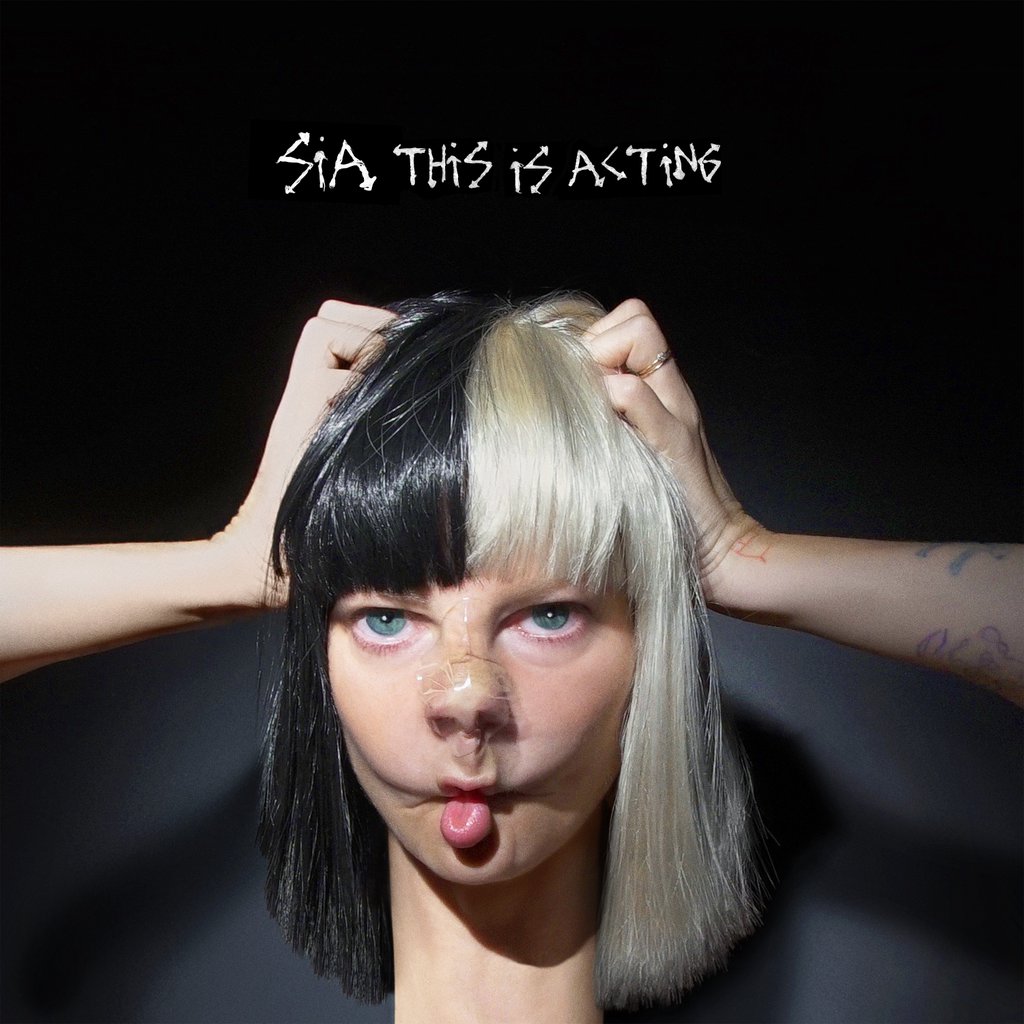
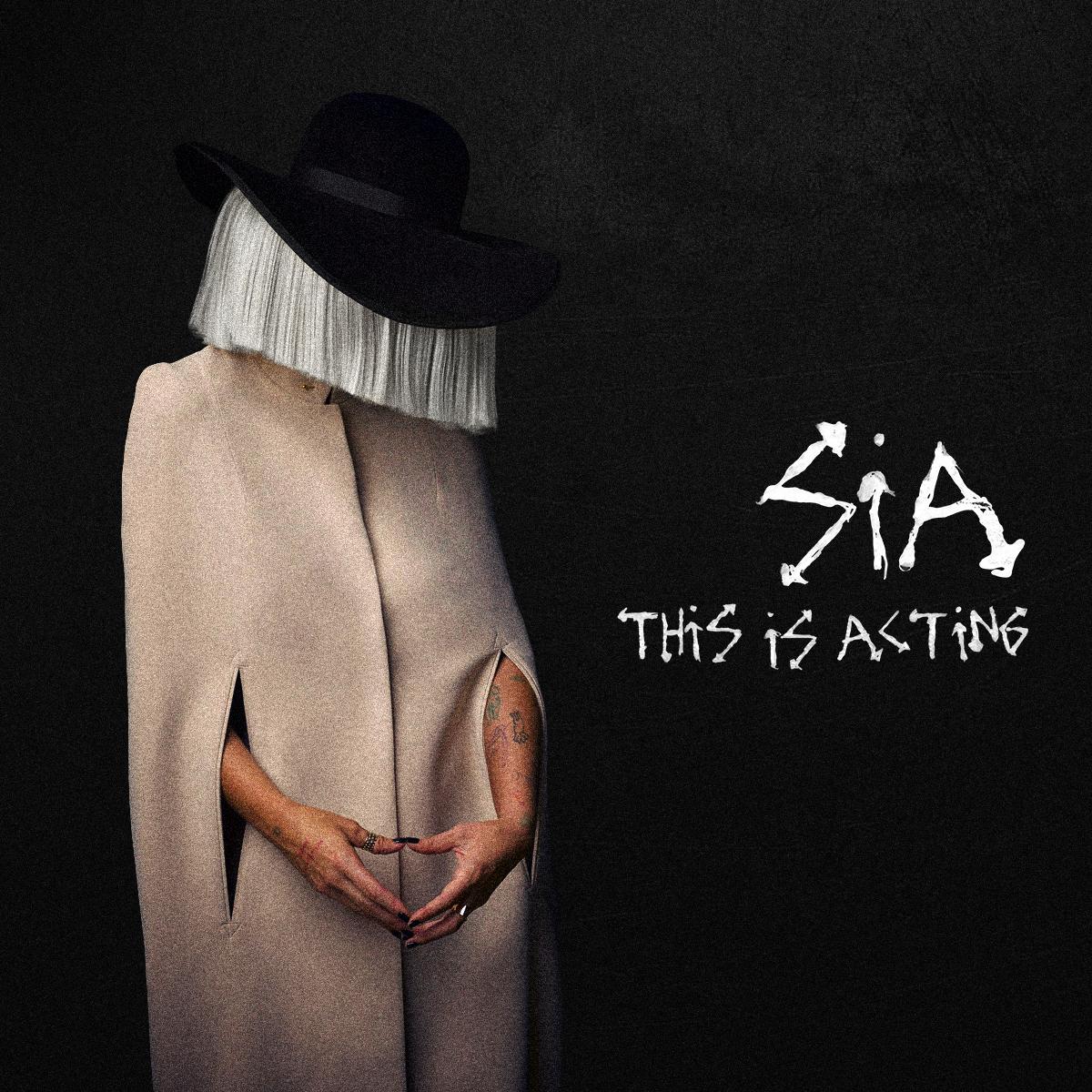
Sia’s avatar, originally just the hair and now supercharged with the choreography and attitude of Maddie Ziegler, achieves all the standard requirements of a successful brand identity and then much.much.more. Highly recognisable, distinct, unique [in so many more ways than any logo can ever be]. A fitting visual framework for her inherent values, attitude, world view and messaging that goes way beyond tone of voice and pre-defined systems and becomes a dynamic, evolving conversation that takes her way beyond the standard playing field of branding. It’s brand not as safety net but as trampoline. It moves past the role of joining the dots between her output and strikes out to weave it directly into hearts and minds.
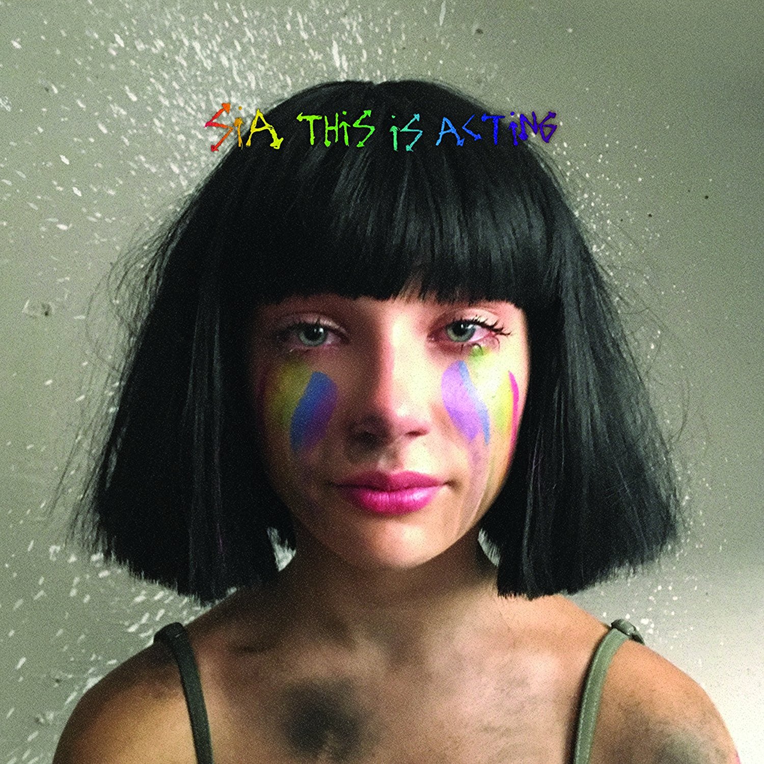
Brands aren’t just logos. They haven’t been for a very long time. They’re not even just a consistent language system - colours, grids, tone of voice. Brands are avatars for extending the behaviours, attitudes and actions of those that activate them. To spill out into the world and connect with people. To undertake ongoing and evolving conversations about things that matter to those people and to be part of their lives on their terms. Don’t get me wrong, I love classy, crisp mid-century modernist brands but they’re from another time, with a completely different set of circumstances, objectives, limitations and possibilities. If we want what we do to be as vital, dynamic and exciting now as super graphic logos on shipping containers were 50 years ago we have to update our frames of reference and embrace the situations, opportunities and challenges we face now. Now excuse me while I finish my application to Sia INC for an internship.
