There are a handful of designers who have a longstanding relationship or association with one organisation or group. Vignelli’s work for Knoll or Peter Saville and New Order usually come to mind but Stephen Averill’s work for U2 spans nearly 40 years and is arguably far more prolific when you consider the group's album sales. Here Averill talks to Eamon Spelman about his work and where it all started and explains why, after more than 40 years in the industry, he is still leaving things open…
“I had a notion that graphic design was what I wanted to do from about the age of 12.”
That 'notion' took Stephen Averill to a one-year course at Dun Laoghaire Tech (now Institute of Art Design & Technology) and, from there, to work in a Dublin print firm, before enrolling for a few weeks as an unofficial student on a print course in Bolton Street. There he met Phil Walsh, then a senior creative in Arks Advertising, who suggested he apply for a job as junior designer. This was in the early 1970s - for the next 20 years, Averill worked in the advertising industry with a number of companies, including Kenny's, until he was asked to become creative director for the Helme Partnership.
As well as a career in advertising, Stephen had one in music with The Radiators from Space, Ireland’s first punk band. They received some measure of recognition from the UK music press and were the first Irish punk band to get a single into the Irish Top 20. “To an emerging U2, that was quite an interesting thing”, explains Averill – so much so, that Adam Clayton sought an introduction through Stephen’s brother. “The initial conversations were not about design at all. They were about how a band could succeed or get on with what they were doing. It was almost an afterthought…I did the first poster, then the first single cover and then went on and did the whole thing. Initially, I said to them, ‘I just want to get to a point where I can do the album cover’.”
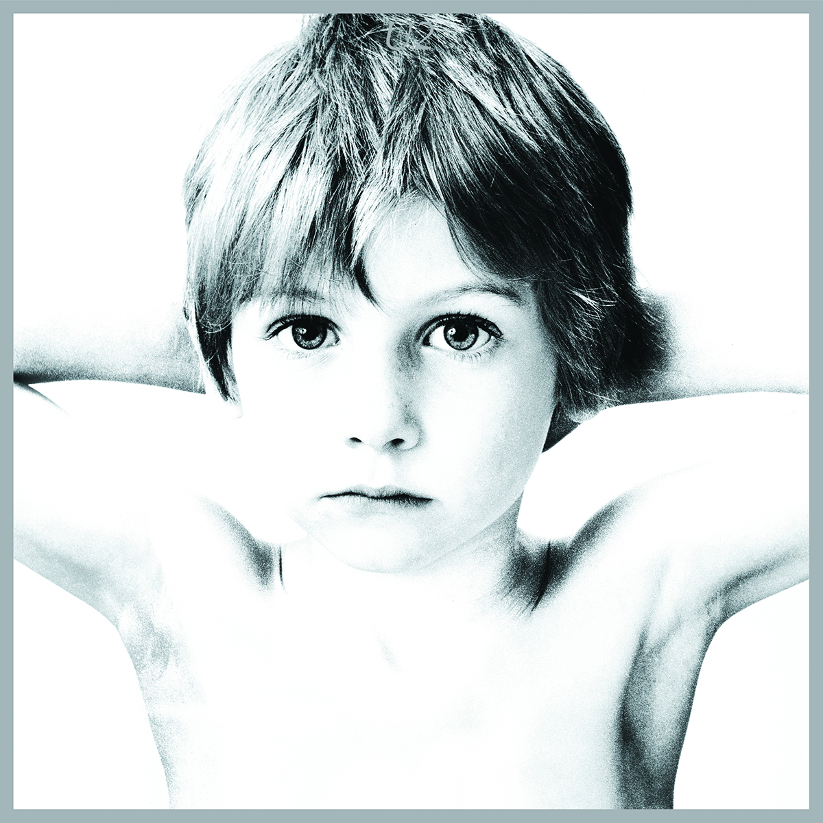
That album was Boy. There had been a number of different ideas for the cover but, when Stephen saw the contact sheet of images taken by Hugo McGuinness of a young Peter Rowen, “within five minutes, I said, 'That's the album cover. We've got to use it. That's so evocative of what you're trying to say as a band. It’s about youthfulness and a certain naivety.' So I really pushed for that image to be used and, at that stage, they were kind of willing to follow my lead.”
Averill then got a set of decent prints. “I wanted to keep it simple and have it on a white background. I just wanted to use that silver border around the outside, to contain it within that work. I knew that an album called Boy just summed that up so well you didn't need anything else. It says U2 in the (boy’s) hair but it's not immediately apparent. The cover was quite different and it really pushed the limits of what you could do for a new band. It's just a picture and was quite radical. I’m still surprised we got away with it.”
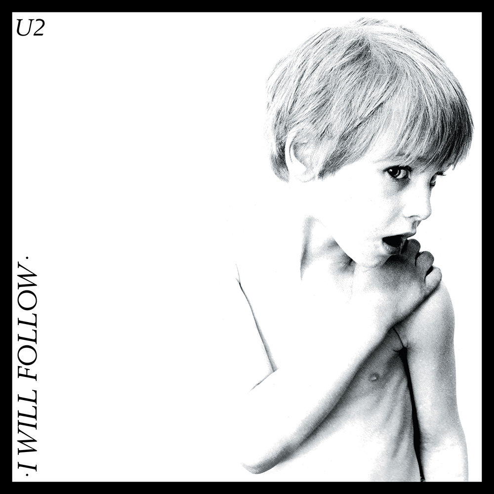
When the album was released in America, it had a different cover. It used an image that Stephen had designed for a gig in London’s Marquee - an image of the group stretched. At the time, he had no idea what the art department in the record company had done: “They had never come back to me for it because they were trying their best to rest control.”
Right from the start, artistic control was something that was very important to U2 - “Paul McGuinness (U2’s manager) was very adamant on that from the very beginning.” When they submitted the master tapes of a new album to Island Records, they would send over the album artwork as well. Stephen understood and valued the support. “I have always said that for a lot of this great design - I don't use the words 'great design' for myself - you have to have an outlet that makes sense for you. In that way, I think of Neville Brody with The Face, Vaughan Oliver with 4AD. You have to have a client who's on your side and working with you. U2 was that for us.”
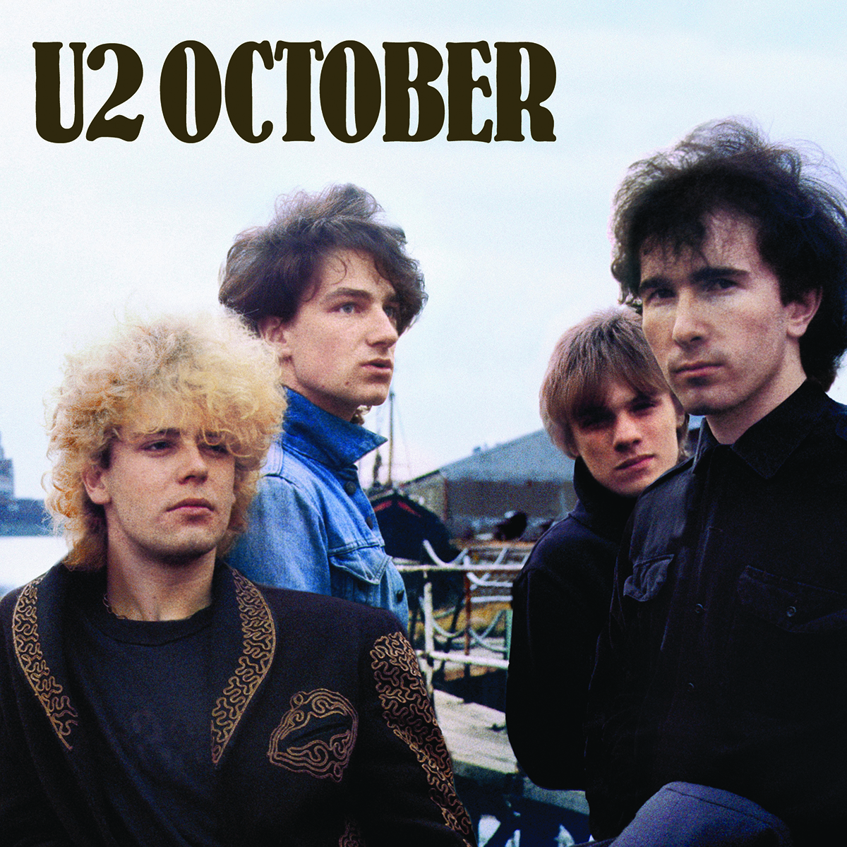
From the October album onwards, he art-directed shoots, looked at locations and managed all design elements. He says, “In so many ways, October, the second album, looks like what a first album should look like. It's got a picture of the band, it's got the title of the album, the name of the band and the track listing on the front, all pretty big. When the cover went to Island, they came back within a couple of days and said, ‘We don't like this’. They were saying, ‘How can you be working with some kid from Dublin?’…they were trying to change everything and were quite dismissive but, eventually, they came around and said, ‘Well, we think you were right in what you did’. But that was the attitude.
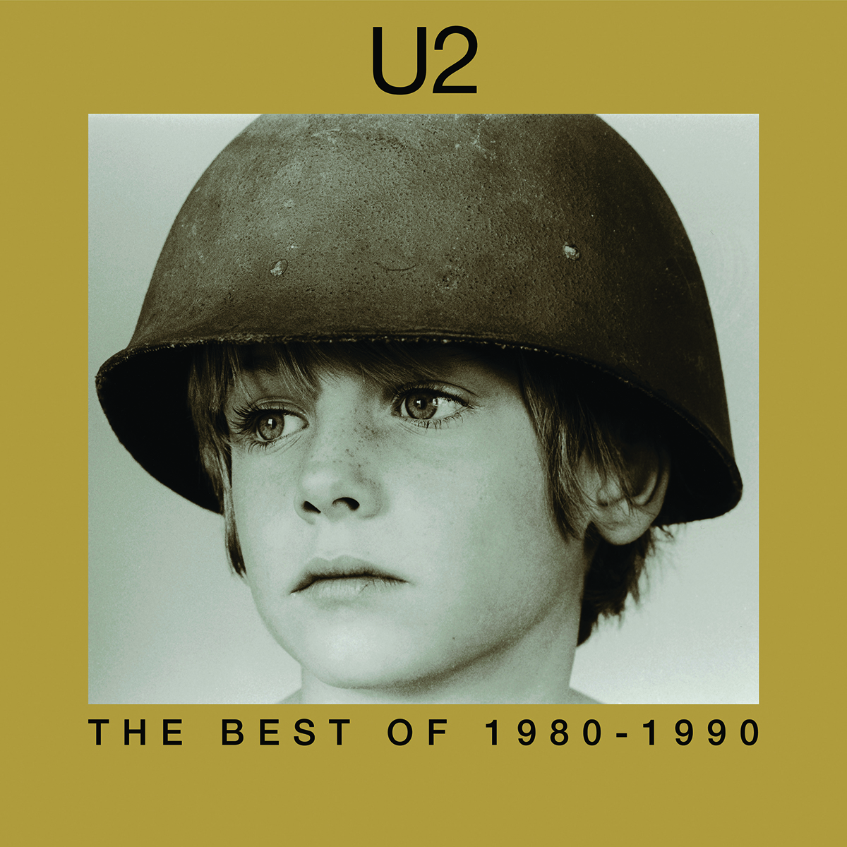
The following album, War, bookends Boy, visually speaking. Initially, there was no intention of using Peter again. There were conversations about working with Magnum photographer Don McCullin but there was some concern that an image from a specific war might define what war is. Instead, for Stephen, documentary footage of a boy being rounded up by the Nazis in the Warsaw ghetto became a source of inspiration. “You could see, within that split-second, the terror in his face that he was experiencing, without there being any violence or shooting. It was just that frightening experience of being rounded up by soldiers. I said that's what I would like to try to capture and the band said, 'Why don't you use Peter again?’
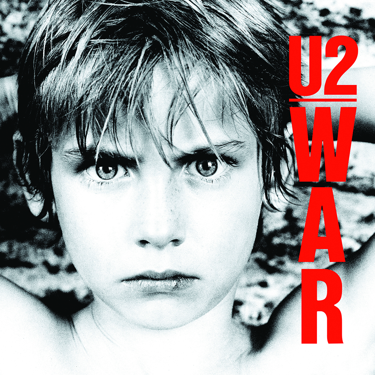
“We went out to an army surplus store and bought a gas mask and a helmet -which is actually a helmet liner -and various other things and we tried a number of options. I even got a white flag made up.”
The photographer Ian Finlay spent an afternoon shooting with Peter, using the props, and ended with the tight crop of the face for the cover. Other images from the shoot were later used for the Best Of album in 1998.
Around that time, photographer Anton Corbijn came on board, initially to shoot the group for the inner sleeve of War. “It was quite weird because I had to brief Anton on the phone and then send him sketches of what I wanted. The first time we met was in Dublin, when he came over with those pictures to show the band and we formed a good working relationship. Anton is not the kind of photographer - like other photographers I work with - where I art direct them; you don't art direct Anton in the strictest sense. He knows what he wants.”
Corbijn went on to shoot the cover for The Unforgettable Fire the following year. “There was a slight controversy about that because there's the book by Simon Marsden called In Ruins and the cover of his book and the cover of Unforgettable Fire are the same castle. After the album’s release, Marsden sued the record company but later the matter was settled amicably.

In 1986, Corbijn was in America with a film location scout for the band’s next album, to capture the cinematic feel Stephen was looking for. “When we got to the States, the band, myself and Anton selected a number of locations and a route map. We flew to Reno, picked up a coach and just drove back down to Los Angeles. What I really liked about it was it was all guys together, there was no delineation. We were all on the coach together. We would get up very early in the morning because Anton was trying to capture the early morning light or early evening light. Quite often, we didn't have anywhere to stay so we would find a motel.”
The album’s eventual title, The Joshua Tree, came from that trip and, as the group’s popularity grew, there was a conscious decision on Stephen’s part to develop a visual strategy that would extend beyond the album cover to the accompanying singles and tour merchandise.
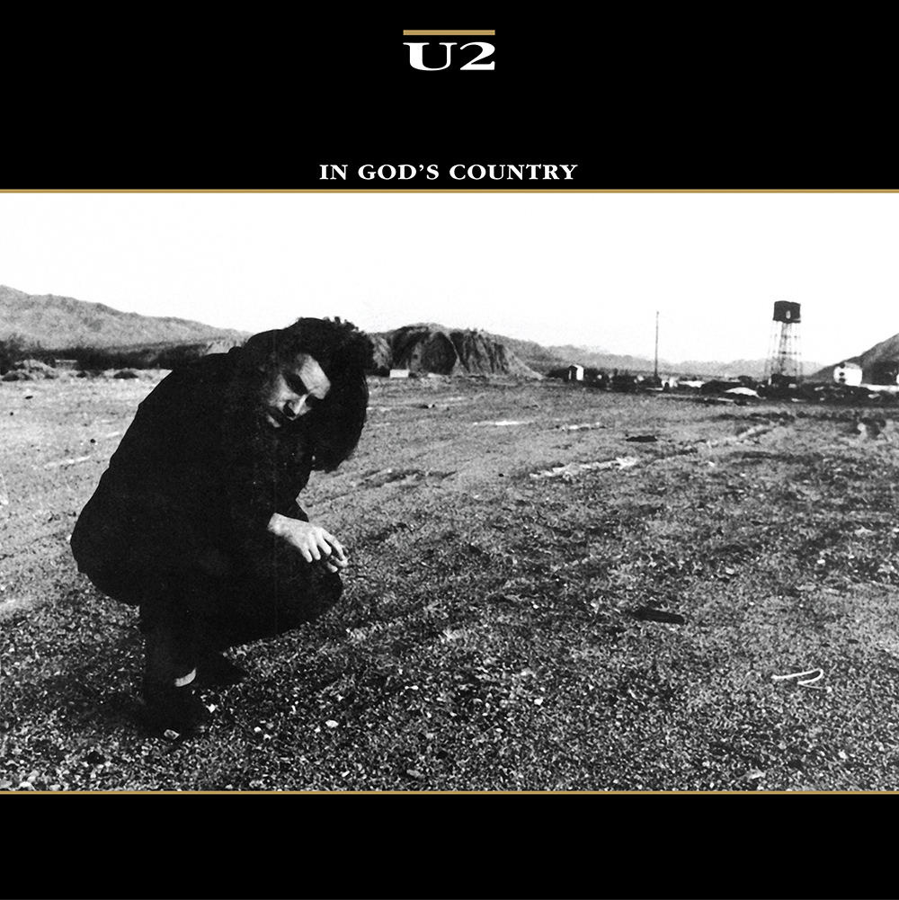
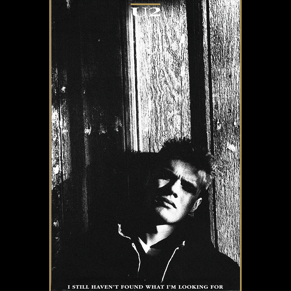
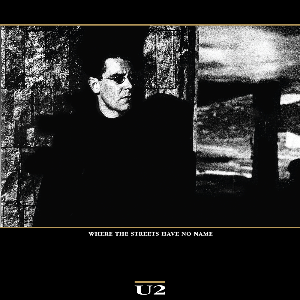
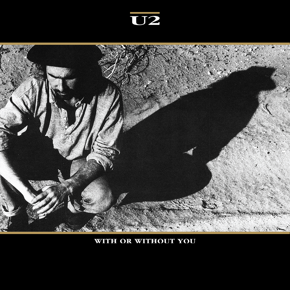
The process of design often started with visits to the studio to listen to the early stages of the album. A dialogue would begin around ‘what do you want to do?’ and ‘where do you want to go?’. From these conversations, ideas would form because, as Stephen says, “I don't always have to hear the music but I do have to talk to the band. It's an ongoing dialogue. The U2 album we hear in the beginning and the record that’s released sound so very far apart that we are in a constant flux as well graphically. We have a few ideas that go with what we hear then but, as we hear more, we have to refine the graphics to go along with it.”
After The Joshua Tree, the band felt that people were calling them glum, serious and pompous. In response, “they started to send themselves up and send rock and roll up as well.” Achtung Baby brought about a “sonic shift”, with elements of dance music. “We knew that, musically, this was going to be a lot different so the cover had to be a lot different,” Stephen explains.
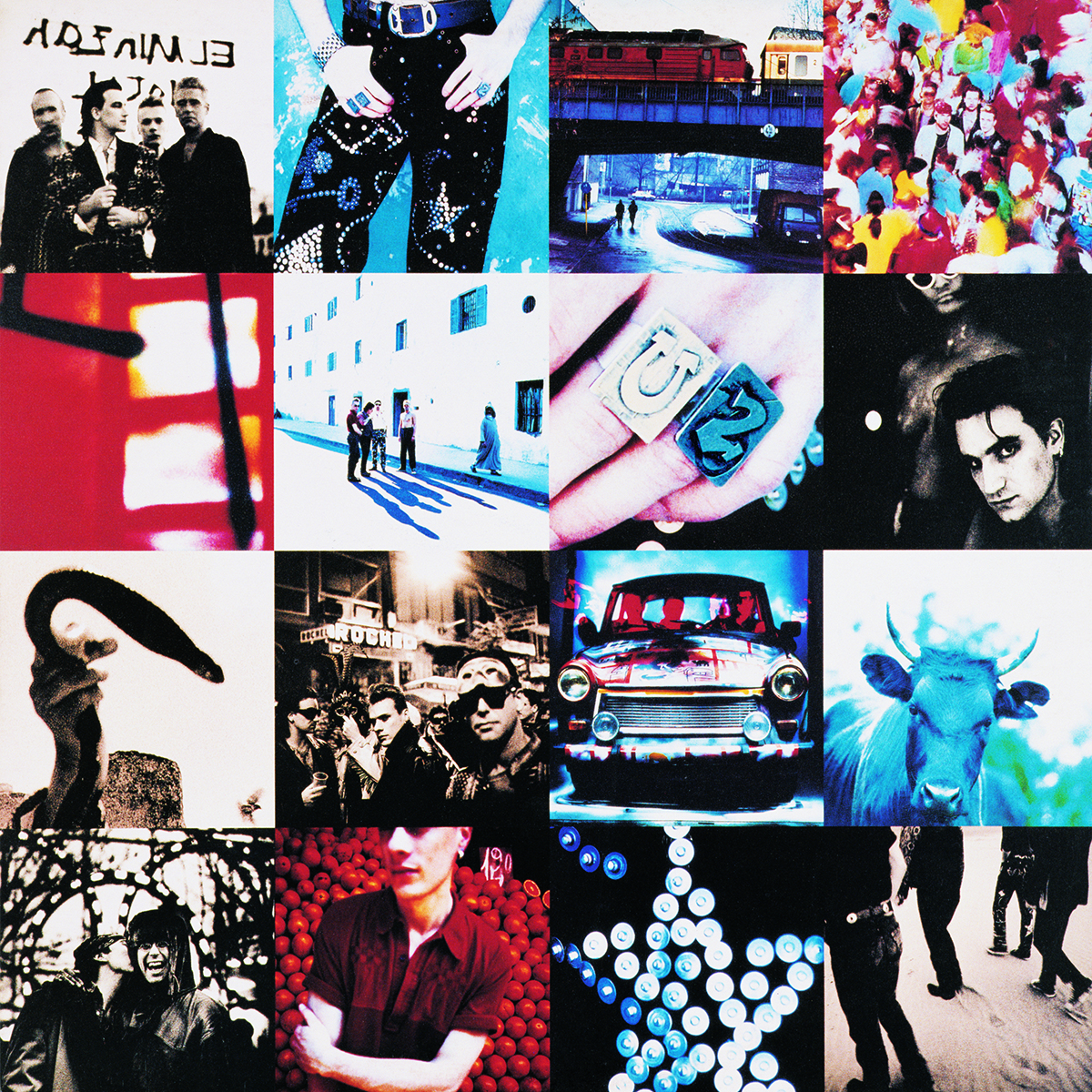
One other major change during this period was that Stephen brought in Shaughn McGrath to work with him on U2 projects. “I’ve always felt when I brought somebody in, I need that person to contribute their ideas.” Initially, they started working on the single-image approach for the next album, as had been done previously, but the group were against it. Anton, who had photographed the band in Berlin, Santa Cruz and Morocco, was against the initial idea of the multi-image cover but, as Stephen says, “We sat down with this massive amount of photography, absolutely wonderful photography. It seemed wrong to dismiss a lot of it because we initially wanted one picture on the cover. We worked out the system and started to define the cover by what we were doing. We had to balance the pictures out, in terms of colour and the band. We began to move these images around, as I wanted to use some abstract images and certain things like the rings, the guy with the snake, the crescent moon and all these kinds of things. So it was quite an interesting process for us.”
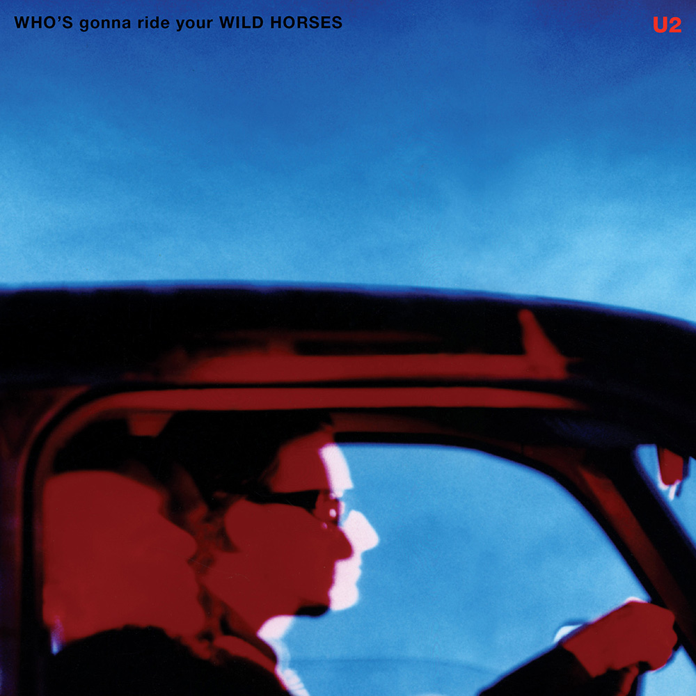
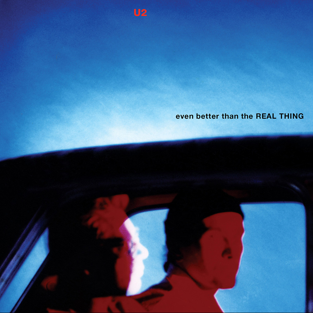
As fans would expect, U2 are always keen to push things forward but are clear about who they are. Stephen says, “Bono is the most vocal about what he wants. Edge is very considered. Larry is slightly subjective but knows what he likes. Adam is like Edge, a little bit more thoughtful. If we'd gone following Edge's or Bono's direction, we would have a totally different cover. They have to agree on it as a band and that's how you arrive at what you are doing. For the Pop album cover, Shaughn and I designed 75 different sleeves for the first meeting. We had designed covers that were maybe more suited to a more outright dance orientated band like Underworld than U2. They put them out on the table and very quickly they would pick out some. Then five covers would emerge and the rest would all be put to one side, as they knew then they weren't right.”
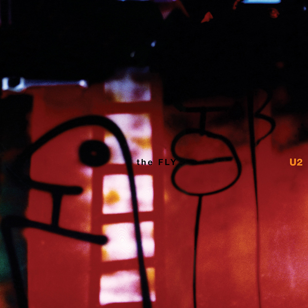
Even with a U2 project, a finished sleeve is the one that everyone involved can agree on.
In the last few years, things have changed: Paul McGuinness retired in 2013 and the management team are now based in Los Angeles. Once, it was seven people, including the band, on a shoot; now, record company, PR and management are all present to give their opinion. Speaking about the last shoot Stephen attended, he says “There was a creative director (Jefferson Hack) that Bono had brought in and we were all asked for opinions. I thought, this is confusing, especially in a photographic session. How can the band concentrate when there are so many opinions coming from here and there?”
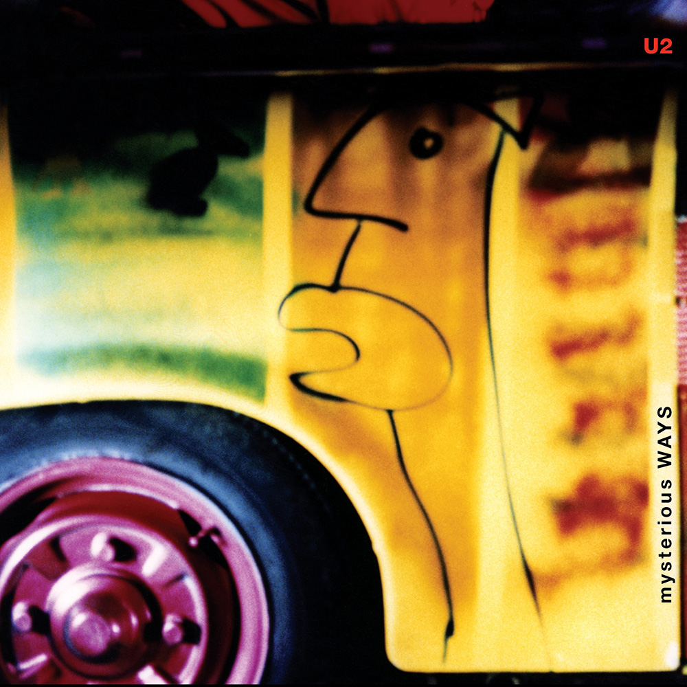
His last full project with them was 2008’s album, No Line on the Horizon. For that, Bono had the image (Boden Sea from Hiroshi Sugimoto) and the title from the start. Sugimoto permitted them to use his image for the cover but he didn’t want any typography on it – a difficult problem, solved by the addition of a plastic sleeve overlay, which seems to reflect the era of special packaging where music is placed together with other promotional material. With Songs of Innocence, Shaughn took over on the project – “He had always been very heavily involved in every way. We were fifty/fifty for a long time on ideas and where we were going but, on this cover, he took the lead.”
While Stephen retired from AMP Visual late last year, it doesn’t mean he will not be involved with U2 anymore. “If they want me to get involved in the future, that's fine; if they don't want me to get involved, that's equally fine.”
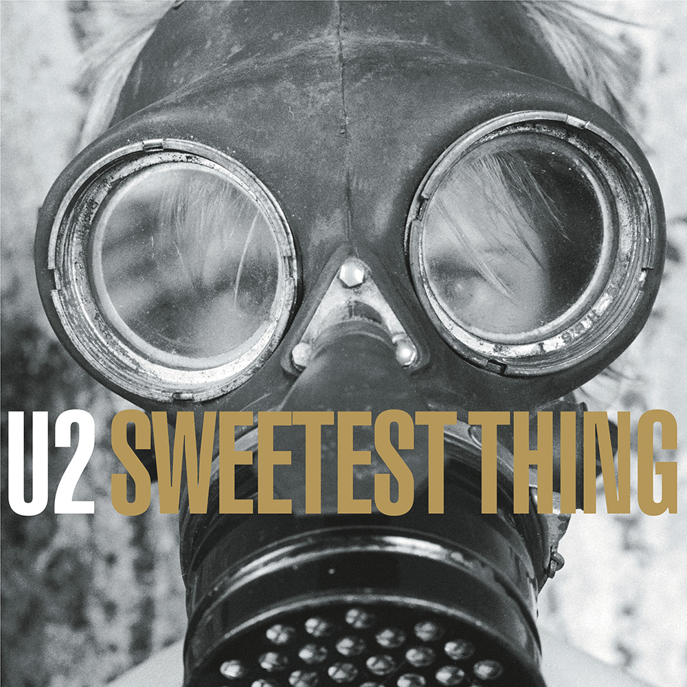
Reflecting on his career, Stephen says he “enjoyed going to work every day because everyday was a different challenge”. And in the process of enjoying his work, he learned a few things. The first: “Creatives are never great at chasing money but I became better at it. It's very hard to concentrate on the creative side of things and also the financial side but you have to – that's the only way you can survive. There were times when there was no money coming in. You couldn’t pay yourself but you've got to pay the staff. So you just have to go with what's there and just try to do good work.” The second: “The respect for the designer and what they do has changed. Up until the early half of the 1990s, we did board based artwork with overlays. We produced flat boards with overlays for colours etc on them and the client had no idea how you got from there to a finished print piece. Once the computer came along, it made our life a lot easier in lots of ways but it also made it a lot more difficult because the client wanted to see the finished job before they even made a decision on it. You have to build a relationship, to make them [clients] understand what you are offering and that what you were giving them is a very important part of the whole process.”