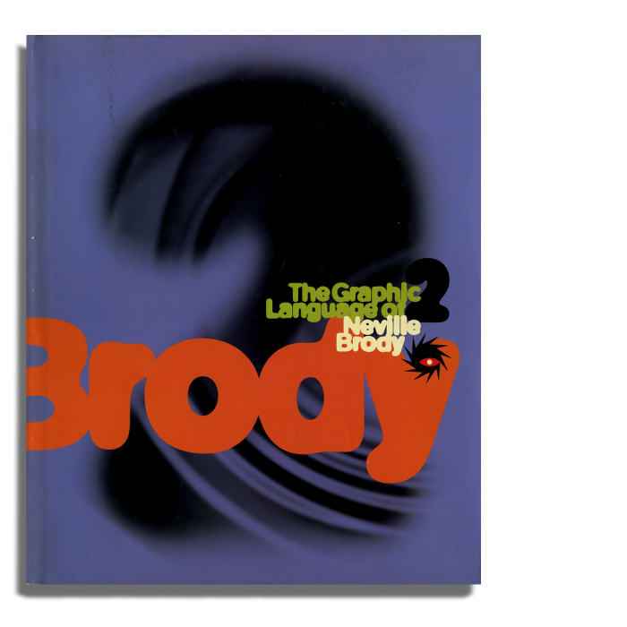
The Graphic Language of Neville Brody 2
I was tempted to go for Muller-Brockmann's 'Grid Systems' - but in truth - Brody was my first real influence in graphic design. I just loved what he did with type and the way he worked an image. Before the grid was my master, free-flowing type and the power of a deftly cropped image were my biggest inspiration.
I've always been a magazine fanatic - and when I first started buying mags - Brody was king. The Face, Arena - his type and image layouts were like nothing I'd ever seen before. Big, bold, graphic - the iconic covers, the spreads, the Nike ads too… He was way ahead of his time, mixing up type weights, pushing the boundaries with new font formats, color palettes - It all carried such indelible impact.
Looking back on some of the spreads from 'Graphic Language 2', they still resonate today. I believe strongly in the combination of type and cropped-image to make simple, but powerful, graphic statements.
