Tweets, whether you’re commenting on a political event, gushing over your latest flight of fancy, promoting a piece of work, seeking advice or recommending a book, they’re good fun. A few characters sent into the world aimed at anybody who will listen.
But once in a while, somebody replies and asks you to write a few more words than the requisite one hundred and forty characters. Which, coincidently, is why I find myself writing this on a Saturday afternoon, wind outside blowing a gale, cup of tea on the table and a stream of constant mumbled updates from Sky Sports in the background (even though they only have about three games to discuss on a Saturday now). I remember when the football league had a full schedule of games being played on a Saturday. There was also at least one on the box, but not anymore, those days are long gone. It doesn’t seem that long ago and yet it seems lifetime ago. Dublin was a little different then, not just the football, but the arts, cultural and of course retail landscape of the city. You had the army shops on Little Mary Street, Temple Bar for vintage jeans and granddad shirts, Cleary’s, Boyer’s, and Switzer’s for the mammy’s and of course Makullas on Suffolk Street for everything that was cool in Dublin. The reason for this coolness? That’s simple, Niall Sweeney and Frank Stanley.

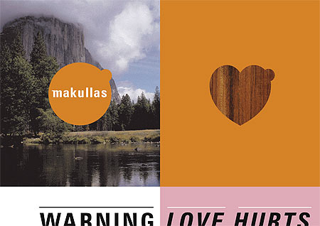
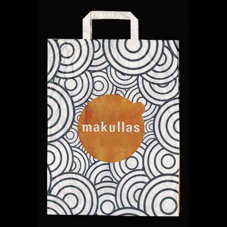
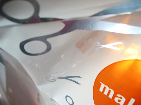
The design the lads created for the shop rocked, the signage, bags, vouchers, posters, magazines, everything about it was cool, with echoes of RayGun and the Face. I have especially distinctive memories of both the bags and the vouchers. The bags looked like a mixture of pop art and dance graphics and the vouchers had an almost an Asian aesthetic to them. Of course nothing was complete until it had that big orange dot, smack bang in the middle. It was design application at its best, well considered and filled with humour and purpose.

Now to be honest I was nervous when I received ‘that’ twittered reply asking me to write something about my recommendation for placing the Makulla’s identity in the archive. Not because I had to write about it, that’s fine, I’m alright with my below average wordsmithery. My anxiety centred more on whether or not the design would stand the test of time (unlike Saturday football). It had been quite some time since I last looked at any of the design materials. Was it as good as I remembered? Well, I shouldn’t have worried. I admit the typography looks of an era, but it works, the sense of play, freedom and energy is still as distinctive and as cool as ever.
