This is our second OFFSET Inspiration Chain! To start a conversation about the role of inspiration in design we asked four young designers to tell us who among their peers has inspired them with their work. We then asked that person the same question, and so on.
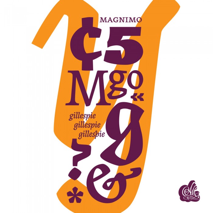
Cian McKenna chose Aoife Mooney / Magnimo Typeface
I’m fascinated by the field of type design and was really fortunate to have come into contact with Aoife who was studying at the time on the internationally regarded Type Design MA in Reading. Aoife’s work is quite important in terms of Irish design, specifically Irish type design, a facet of the creative industries that, until very recently, we almost completely lacked nationally. Magnimo, the typeface she designed whilst in Reading, is a very interesting text face intended for editorial / magazine settings, it has a huge amount of personality whilst remaining highly efficient, a very fine balancing act for a text face. I remember being so impressed by the amount of craft, attention to detail and sheer effort that went into the project, which you can see in the reflection on practice document available on the MATD 2010 website — it’s a fascinating peek into the process of creating a typeface at a commercial level. Whilst I’m not a type designer I would like to aim for similar levels of care, craft (and graft) in my own practice. Aoife currently works in New York with Hoefler and Frere Jones, one of the most highly regarded type foundries internationally.
Aoife Mooney chose Stephen McNally / Titles for ‘Does God hate’, RTE
I chose Stephen McNally’s opening title sequence for the RTÉ program Does God Hate? as a representative project that demonstrates a singularity of vision and consistent determination to go above and beyond the requirements of a given brief, to see beauty in the most unexpected of places, and to champion complexity and ambiguity—attitudes that are pervasive in his work. It reflects a clarity of thought, ability to get to the crux of the communication and to imbue it with integrity, meaning, and life. An ongoing inspiration for me in my design career, Stephen’s work has been a guiding example of how design is as much about how we think about the content of a message as it is about the way that content is arranged.
Stephen McNally chose Johnny Kelly / Back to the start for Chipotle
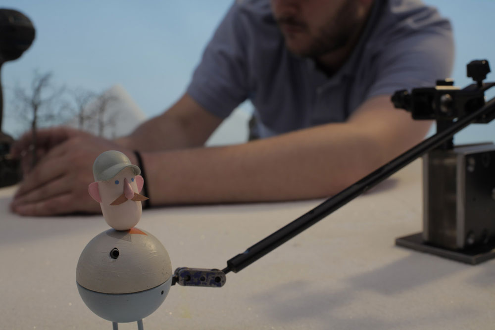
The person who springs to mind immediately as an inspiring person ahead of me would be Johnny Kelly. His style is so visually inventive and funny and at the same time personal and considered. He was also good enough to answer my inane questions and offer advice when I was preparing to go back to college (I’m on sabbatical at the moment, taking a Masters in Animation at the Royal College of Art).
Narrowing it down to one project is a bit tricky. I excessively relate to his RCA film Procrastination, and loved the feel of The Seed, but I would probably choose his Back to the Start piece for Chipotle, as it brings together all his strengths and uses them to tell a sweet and affecting story with humour and a deliberate and well judged pace. That it happens to be an ad is almost incidental.
Johnny Kelly chose M&E / Jape — I was a man cover
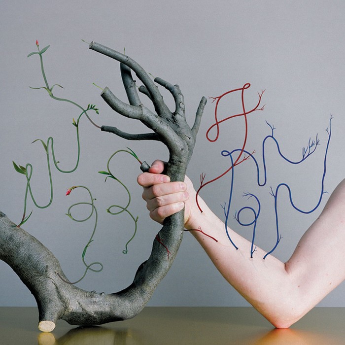
In my final year at DIT, Matthew Bolger rocked up like that cool guy from the Breakfast Club, but with less douchebaggery, and uprooted every notion I had about design and how to make it. So while the rest of us were making posters for fictional theatre festivals, Matty had real actual posters (screen-printed in metallic and fluorescent inks no less) for The Redneck Manifesto dotted all around town. He’ll make you pee with laughter and unlike some graphic designers, that humour and personality really shows through in the work he produces, with Emelie as M&E. Their work for Jape – such as this cover for I Was a Man – is a prime example. It deals with weighty topics such as death, life and loss and is somehow sad and funny at the exact same time. Did I mention I’m a fan?
M&E chose Eoin Ryan / Spheres
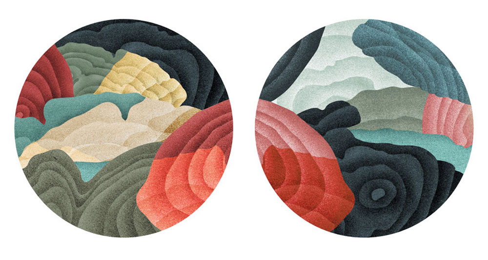
We’d like to choose Eoin Ryan’s ‘Spheres’ as our inspiration. We find it very intriguing. It feels as if you’re looking through a pair of binoculars into a different world. His use of colour and grain is really beautiful.
Eoin Ryan chose Paul O’Mahony, Set designer
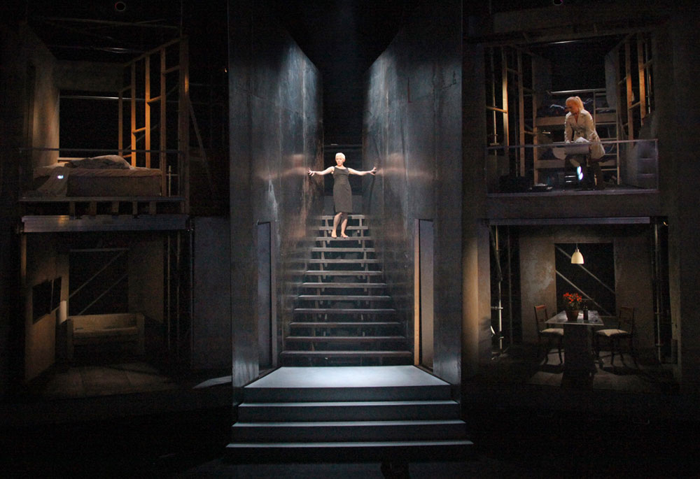
Set for Medea, produced by Siren Productions, photo by Anthony Woods
Paul O’Mahony Chose Mr Alan Clarke, Illustrator
Although I am a big fan of his creative and superbly executed work, I am as much inspired by his work ethic, passion and commitment to his profession.
Alan Clarke Chose PJ Lynch, Illustrator
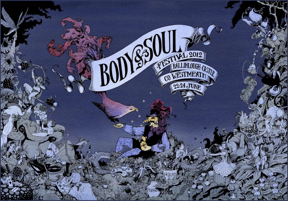
His work is beautiful, and of a consistently high quality. His mastery of his media is unrivalled nationally and to a large extent internationally. His illustrations are timeless and engaging and their virtuosity appeals on a very fundamental level, independent of the content. In addition, he is a thoroughly nice fella, and says some very wise things.
