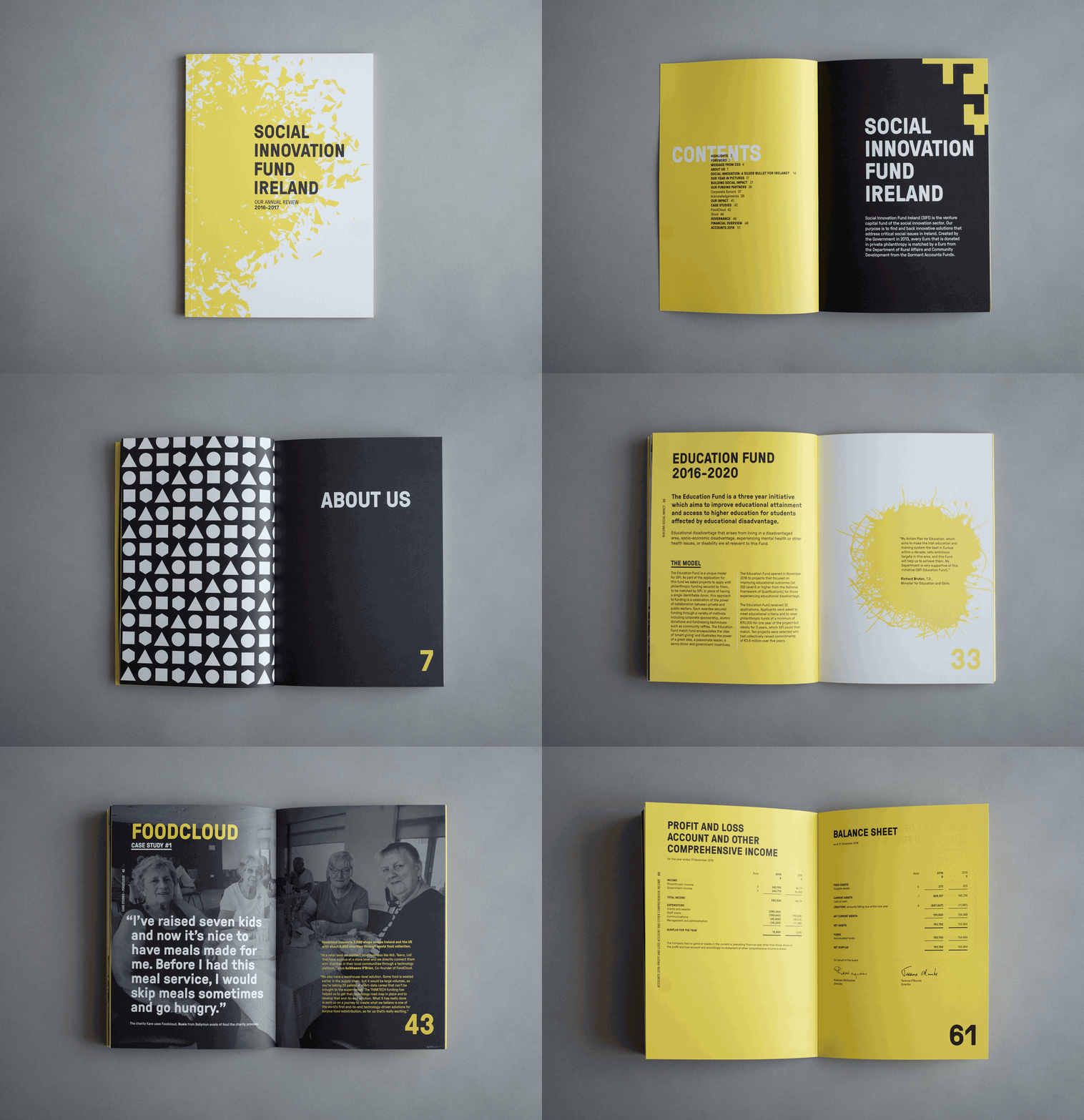
With a degree in chemistry and a PhD in glycochemistry graphic design wasn’t initially on the cards for Italian-born Alessandra Ravida. “I was born in Milan but I am not Milanese. Growing up we moved around a lot (every 2-3 years.) I hated it, but I also loved the first night in the new house – all the excitement of discovering a new place, new people, in a way a new me. I think that my life path has been strongly influenced by my nomadic childhood. I get a real kick from the unknown and I love challenges.” Alessandra moved to Dublin to further her scientific career. She worked as a post-doc researcher in DCU for seven years.
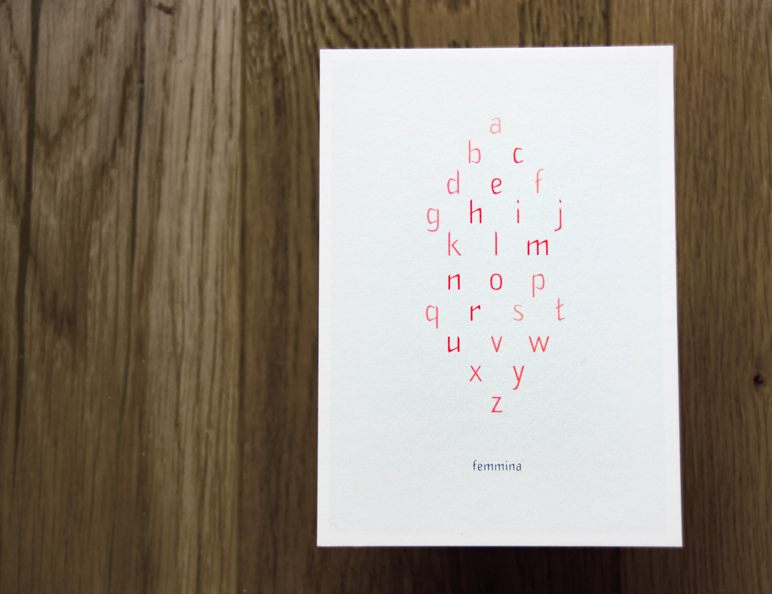
So, how and why did Alessandra go from a career in science to a career in graphic design? “As a scientist I was fascinated by infographics. I wanted to learn how to visually communicate my research in the most compelling way. I decided to study graphic design in the evenings. I completed a part-time course in graphic design and image processing at Coláiste Dhúlaigh.” Design came naturally to Alessandra and she advanced straight into final year of Visual Communication at the Dublin Institute of Design. “My first and final year in college was very intense. My contract with DCU had just finished and I decided not to look for a new job, but to pursue this new path instead. I worked really hard and it paid off.” Alessandra’s book design ‘Parallax’ earned her a membership with the prestigious ISTD and her graduate project ‘Femmina’ was the Grand Prix winner of the IDI Graduate Design Awards in 2016. “I could say that winning the IDI graduate award set me on my current path but honestly it was my lecturer and mentor, Danielle Townsend, who perfectly balanced encouragement and tough love. She squeezed me like a lemon in college, setting in motion a long chain of events.” Alessandra has been working full-time at Red Dog for almost two years now – “I love the buzz of the studio and being surrounded by so many talented designers, who are also really lovely people.”

The award-winning typeface ‘Femmina’ is a celebration of feminism, primarily inspired by the work of Dublin-based artist Jesse Jones. “Her art focuses on socio-political themes with a particular emphasis on hidden currents of dissent and feminism. It provided the conceptual foundation for the design of the typeface.” Throughout the project, Alessandra completely immersed herself in feminist art and literature. In 2016 the Hugh Lane Gallery featured an exhibition by Jesse Jones called ‘No more fun and games.’ “I went to the gallery nearly every week. I talked to her. I studied the exhibition and its publications religiously. I simplified and classified the multiple, complex themes of her work. I re-created these concepts as graphic forms, focusing on the overarching concepts of social renewal, interruption, institutional oppression, female vocalization, plurality and female co-operation. These visualisations were then used to inform the design of the various letterforms.” While designing ‘Femmina’ Alessandra put careful consideration into every compositional, structural and aesthetic decision, ensuring that it would aptly represent the multiple concepts of feminism. The typeface is made entirely of lower-case letters or miniscules. “The absence of majuscules is a metaphor for the elimination of patriarchy – a society of equal voices. To achieve a sense of movement and social change I introduced alternating angular geometries. Gestures of resistance were incorporated through the use of sharp-edged terminals. The letterforms are elongated to reflect feminine qualities, while a mild contrast was implemented to reflect strength. A further sense of movement was achieved by replacing horizontal strokes and crossbars with acute angles.” A highlight of the project for Alessandra was when ‘Femmina’ was featured in ‘No More Fun And Games – Act III,’ the third and final magazine published as part of Jesse Jones’ exhibition.

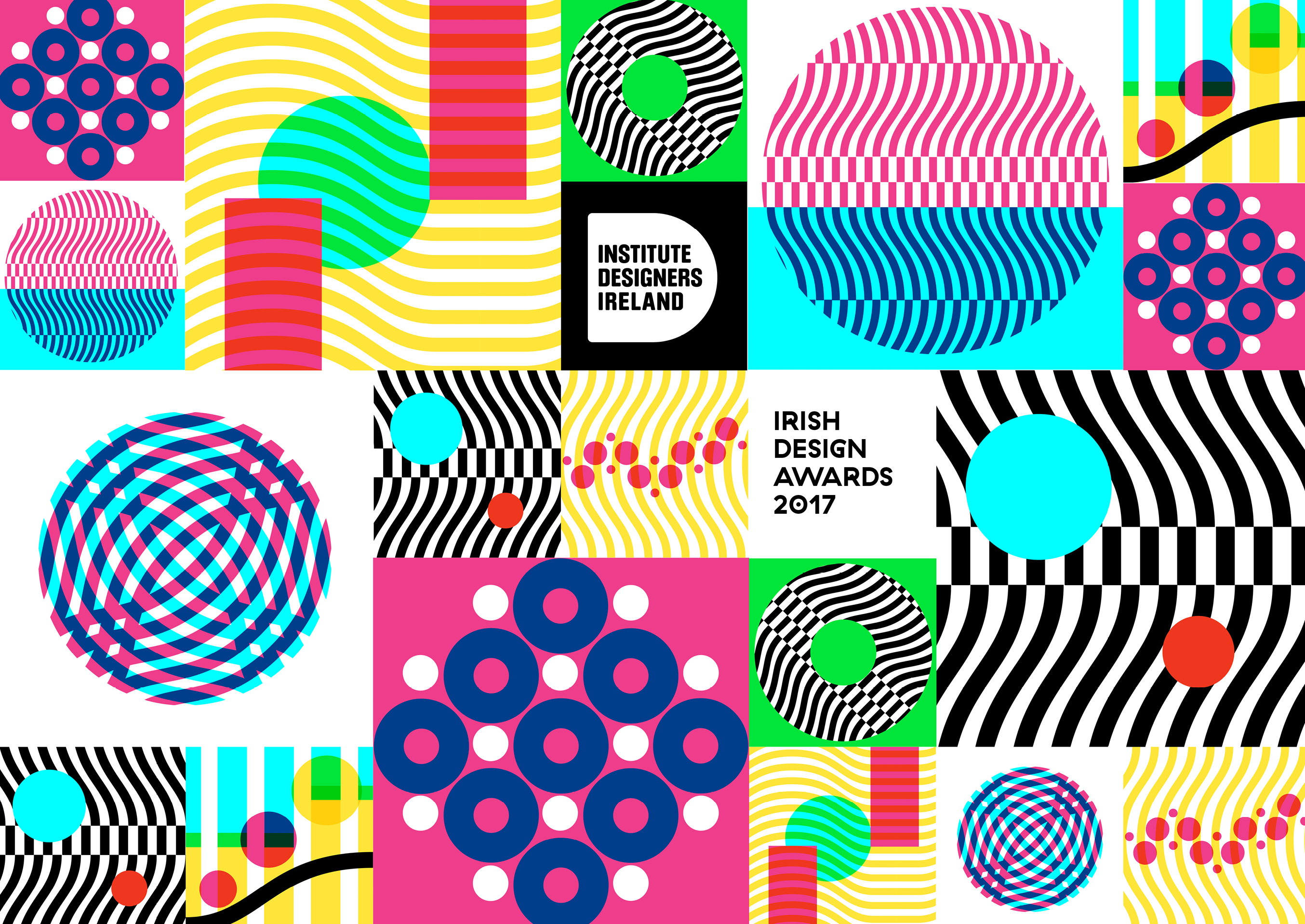
A few months after the graduate awards Alessandra was given the opportunity to create the identity for the 2017 IDI Design Awards as an intern with Red Dog. “The design of the IDI awards holds a special place in my heart because it was the first big professional brief I’d ever worked on, encompassing so many aspects: identity, web design, social media campaigns, exhibition and the gala event itself. It was incredibly challenging and exciting at the same time.” As part of the project, Alessandra got the opportunity to collaborate with a variety of other creative people who work in architecture, product design, web design, event organisation and much more. “The project was under the creative direction of the brilliant Paula McEntee, who has been teaching me a lot (mainly about design but also sporadically about cats!) In terms of design, the identity we created celebrates what is shared across all disciplines encompassed by the IDI. The iconic eye symbol of the IDI was deconstructed into basic geometric shapes. They were then reassembled to generate a series of geometric patterns – the core elements of the identity's visual language.” The project was a significant learning experience for Alessandra because the identity was implemented across a vast number of touchpoints. “I found myself involved in the design of the exhibition stands and layout, the trophies, lecterns, the lighting effects in the venue and even the colour of the table cloths.” Designing a brand identity of this scale is challenging to say the least, even more so when your end users are designers. “I felt immense pressure having designers as the target audience – a really tough crowd to please! At the same time, it was great to work on a design brief that allowed for a lot of freedom and creativity.”

Alessandra approaches design briefs in the same way she previously tackled scientific research. “I lose myself in the research and follow every weird and wonderful tangent. I write down everything and mark the promising ideas with a smiley face.” At the concept phase of a project she creates mood boards with a wide range of influences including art, architecture and photography. “I suppose like every designer, I go through cycles of falling in love and becoming obsessed with a designer, art movement or particular technique, until I discover a new one and then the cycle repeats itself. However, I’ve always loved the energy, passion and conviction of the Avant-garde movements. Futurism is one of my favourites. I am Italian and the work of Fortunato Depero has always fascinated me. His work transcends its original commercial purpose. In it you feel the energy of an era, its ideology, its trust in the future and the need to break away from the past.” Quite often she will only look at design-based references in the later stages of the design process. In this way her work is often unique and stays true to the concept she has developed in the early stages of a project. The primary cornerstone of her design process is iteration – “I don’t work with my gut. It’s my brain that makes the decisions. I need to make rules for my graphic elements. The concepts help me create the rules and the rules dictate the behaviours of my type, grid, colour and visual language. This system prevents me from having too many moving pieces, then I systematically tweak each rule/parameter and assess the result (just like I did with my experiments in the lab) ...thus infinite iterations.” Her process involves being very open and exploratory in the concept phase while being quite regimented in the implementation phase, ensuring very creative, high-quality work.

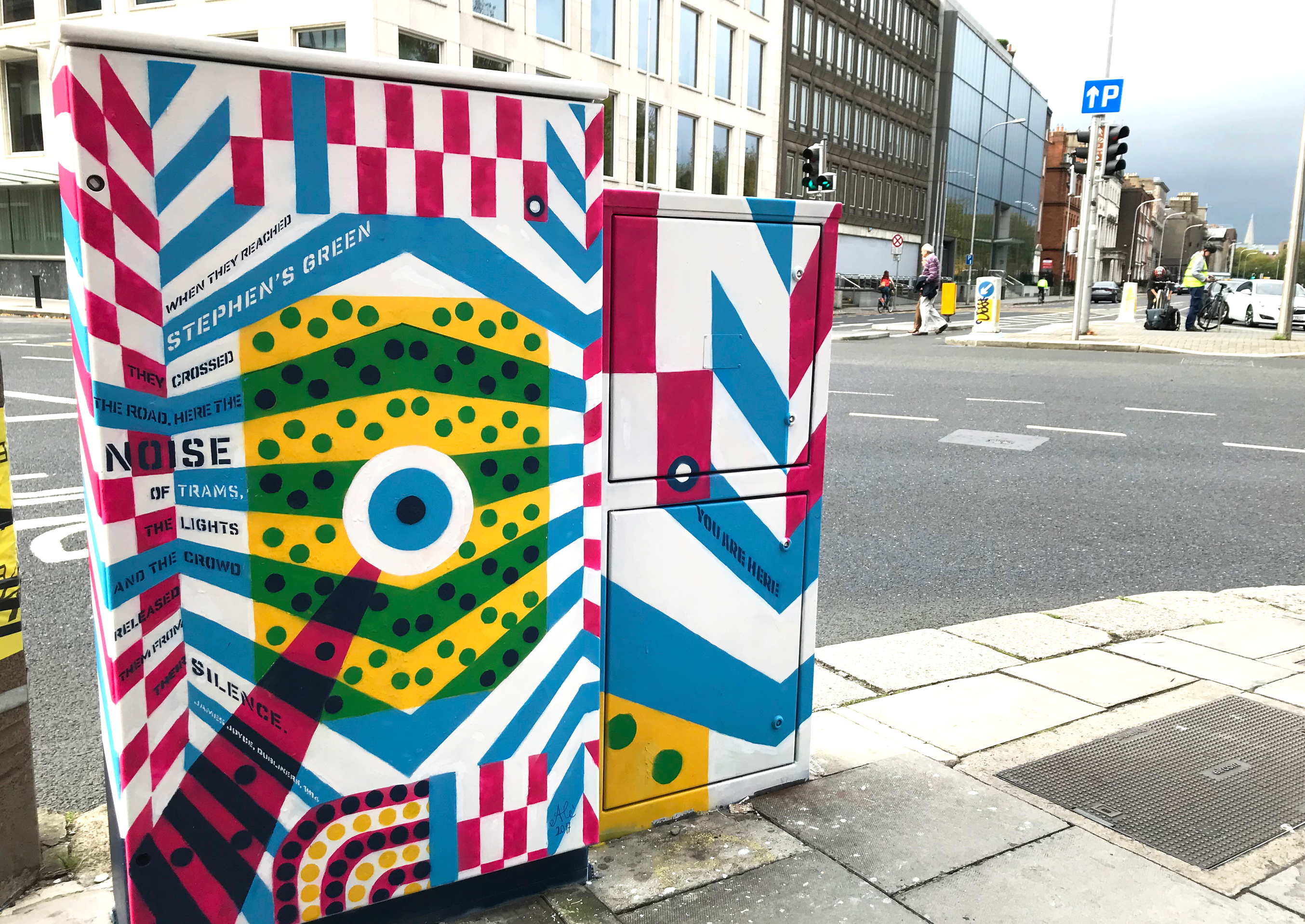
Whenever work (or life) gets too stressful Alessandra repeats the self-soothing mantra: “I’ll get there.” She says that having this frame of mind is one of the most important skills she has gained. “I’ve learnt that it is normal to hit walls and that projects will go through ups and downs. I thought it was just me and that everybody else knew exactly what to do. Now I know that the ups and downs are part of the process and even if the deadline is looming…I’ll get there!” Outside of her busy schedule in Red Dog, Alessandra finds the time to work on personal projects and also does some pro bono work. “It’s hard because after a long day in work the last thing my brain needs is to sit in front of a screen again. However, I’ve found that sometimes I need to do something for myself, even if it’s just something small.” When you work with a creative director, they make all the final decisions in a design project. Alessandra says it is important to create your own work so that you don’t lose confidence in your own decision-making. With personal work you have the opportunity to “call the shots” and develop your own voice. Alessandra has created a number of pieces for the Dublin Canvas project over the past few years. “I believe street art is where socio-political ideologies are most directly and impactfully communicated in today’s society. I am always excited to see a new piece go up and devastated if it’s defaced or removed entirely. But that’s the fragility and strength of this medium. It’s out there for everybody’s fruition. I avidly follow the work of activists such as Will St Leger, Joe Caslin and the Subset collective.”
“During college (in my naivety) I had a plan: learn the craft, write a manifesto and develop my own visual style reflective of my ideas and beliefs…a modern day Depero. I think I was born 70 years too late for that. However, I firmly believe in the power of visual communication. The ability to communicate ideas and information in a compelling way is a powerful tool. It’s a real asset in today’s insta-ready society. It’s a privilege and a duty not to waste it.” Going forward Alessandra wants to be involved in more projects that have the potential to make a positive impact on society – “to play a (little) part in the bigger picture.” Red Dog do a lot of work for non-profit organisations so she feels as though she is in the right place to achieve this. “All in all, nobody has a crystal ball to see what the future is going to bring. One thing’s for sure, I feel I am right where I want to be!”
Take a look at some more of Alessandra's great design work here. You can also find out more about the identity for the 2017 IDI Design Awards by visiting her 100 Archive profile!