Scott Burnett of Aad kicks off the series with some dewey eyed nostalgia for the days when Dublin's club flyers were ink, not pixels.
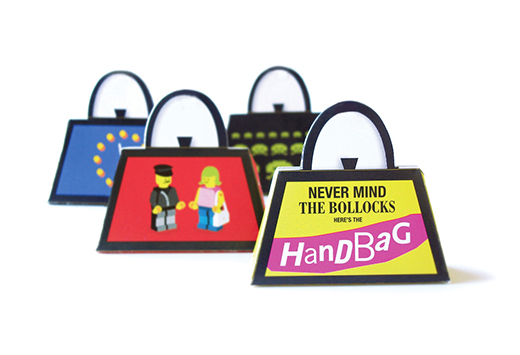
I moved to Dublin from London in October 1998. I wouldn't quite say that I moved here because the flyers were so good, but their creativity and quality certainly made me feel pretty excited about the potential of the place I'd decided to move to. There were two in particular that I picked up one a pre-move visit that were as strong, if not stronger than any I was seeing in London at that time. The first was for a Monday night club in RiRa called Strictly Handbag. Seeing them around town in their unmade form made me smile. A flyer that turns into a handbag. What a great, simple idea. And then every house I visited would have a collection of them. All made up, all in pride of place. I'd been impressed with the idea but the thing that really made them great was the endless imagination and attention to detail. The images, and how they were used. And there was a new one every week! (well at least it seemed like that).

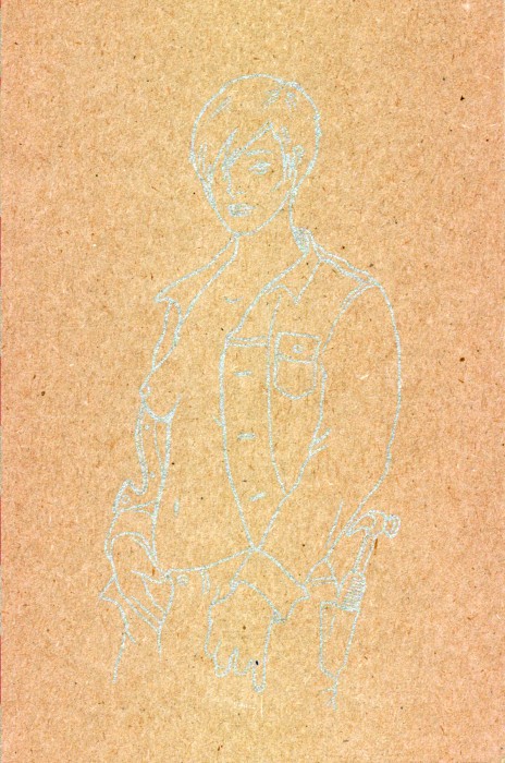
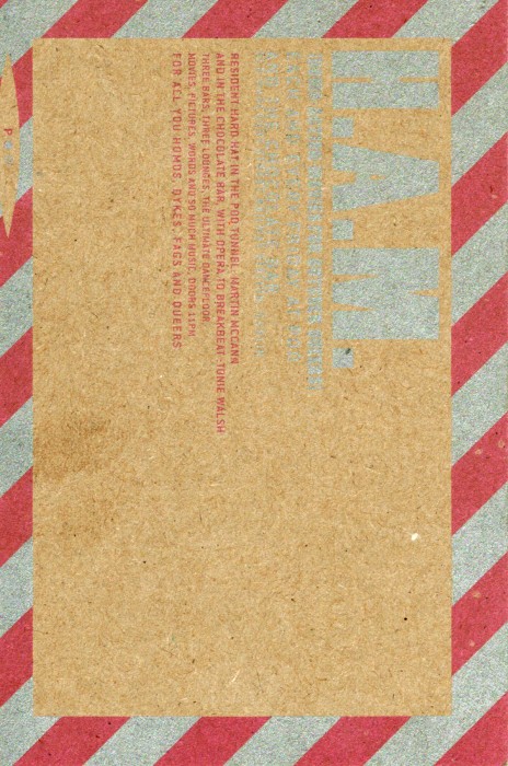
The second one I picked up that weekend (and that I still have, now in a very faded state) was for a night in the Pod called H.A.M. or Homo Action Movies. I was completely beguiled by it's bluntness on one hand, and delicate subtlety on the other. Printed in 2 colours on craft board, the front features a beautiful line illustration of a woman. Printed in silver ink it has to be twisted and turned to be properly seen. The back was a brash construction of industrial chevrons and all caps type in pink and silver.

I feel bad for the new generation of designers that this canvas doesn't really exist anymore. Designing flyers was one of the most enjoyable things I did. Simple, everyday, completely ephemeral little slices of imagination, drama, politics and intellect. So we should put flyers into the archive. All of them, from ever, and if we can't manage that, then at least the two I mentioned.

