Steve Averill is a designer and musician. His son Jon is a designer, DJ and promoter. We asked them to have a chat about the influence of music on design, design on music and of one generation on the other.

SA: At what point did you realise what I did for a living?
JA: I don't think it really registered for a long time, as you were in an advertising agency (The Helme Partnership I think) I assumed you were a Don Draper type character.
I also have memories of you being in there a lot at weekends & at the time I was more interested in the arcade machine they had than observing what you did.
I guess I got an early warning about the hours involved in the job.
SA: Was that an influence on your decision to go into graphic design?
JA: Design started out as something I could do on a very basic level and I just learned more as I went along. It was never really my ambition to be a designer. Obviously having so many design books and magazines around the house made me much more aware of it than I would have been otherwise.
I remember stealing your Blue Note Record Sleeves and 'The Graphic Language of Neville Brody' books in my early teens. Not to learn design, I just enjoyed looking at them. There was also a book about Japanese packaging design that I loved, everything in it seemed like it was from the future, those 3 books really stuck with me. I’d always have to sneak them back as you were far too precious with your stuff back then.
Do you think you would have gone in the same direction you did it if wasn't for your interest in music?
SA: Yes, I was interested in design or commercial art as it was known then. At an early age it was my ambition to work on something related to that industry. I was attracted to popular culture, especially related to music.
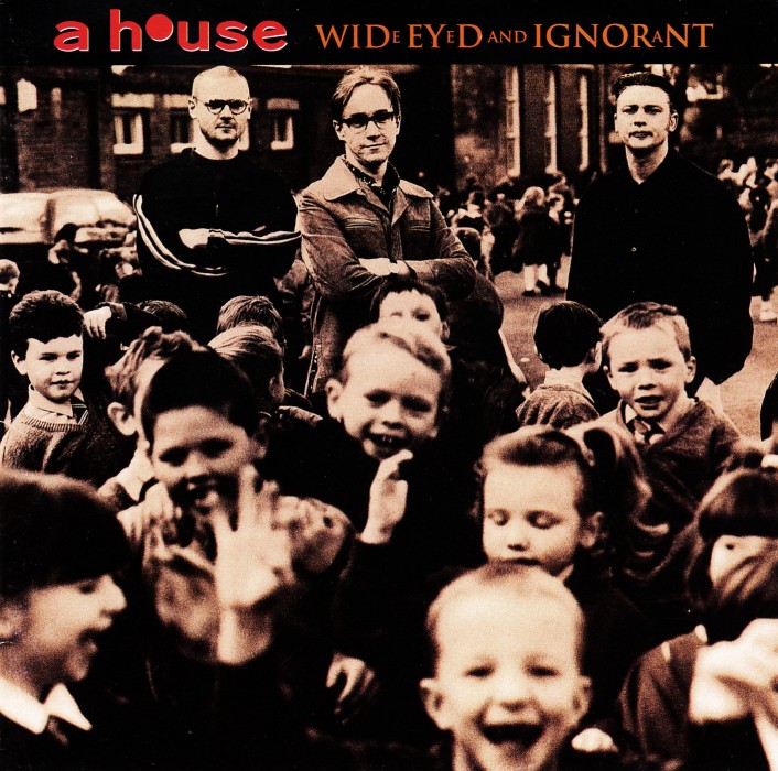
JA: What other job options did you have?
SA: I probably would have got into band management as I was offered to do that a couple of times. I worked in a shop in London in the 60s which I enjoyed, and they offered me a permanent position, so things could have turned out very differently.
JA: After stealing a lot of your records when you were at work I know you've built up a huge collection of electro, acid house, punk, post-punk & industrial. At what point did the vile scourge of country music begin to blight your life?
SA: It started in the 60s, when the Byrds made Sweethearts of the Radio and then the Flying Burrito Brothers. But it was Vivisect by Skinny Puppy that made me decide to look for something a little lighter.
I went into Freebird Records and they had a very small section of country and I bought Dwight Yoakam's first album because it looked interesting. I'd grown up on cowboy culture so I liked the look. It opened a door and I went through.
I still love lots of other music though – early punk, psyche, psychedelic, dub and world music. So my mind remains open.
You got involved with the club scene as a DJ as well as designing logos and flyers. Did the two go hand in hand to a degree?
JA: I was already working at a promoters as a designer in 1999, one day they told me I was playing the side room of the Button Factory (then called the Music Centre). I bought my first decks & spent at least €100 a week on records, and that was pretty much life for the next few years, everything else was irrelevant.
I guess knowing the scene though was important in understanding what you needed to convey visually about an artist or event, and being involved in it you would know instinctively what style was needed.
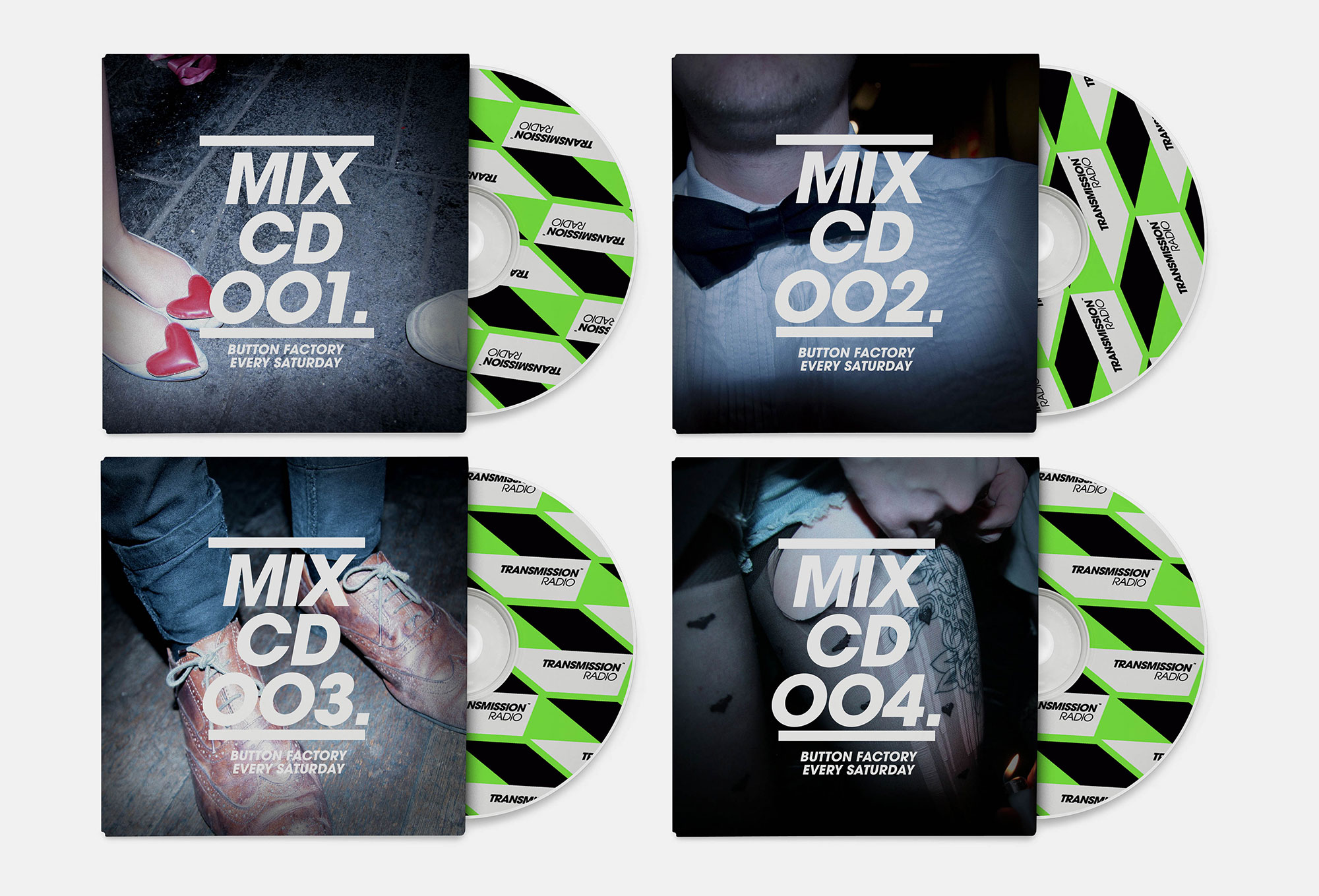
SA: You were designing posters and adverts for the promoter, right? Was that a rewarding experience?
JA: From a creative point of view no, I actually think it was very damaging in my development & would have much rather started in the relatively safe environment of a design studio. I did learn a lot of things which paid off later in life but in terms of creativity it wasn’t particularly rewarding.
You're best known work is your longstanding relationship with U2 as a designer & art director, is there anyone else in the music industry that has this kind of relationship?
SA: I don't know. The only one I'm aware of is Storm Thorgensen working with Pink Floyd. I'm surprised there's not more as it makes a lot of sense to me. Provided you're aware of graphic trends and prepared to develop the band's identity alongside the music it is, to my mind, the best way to do it. You don't rest on your laurels and each project needs to find you at the top of your game.
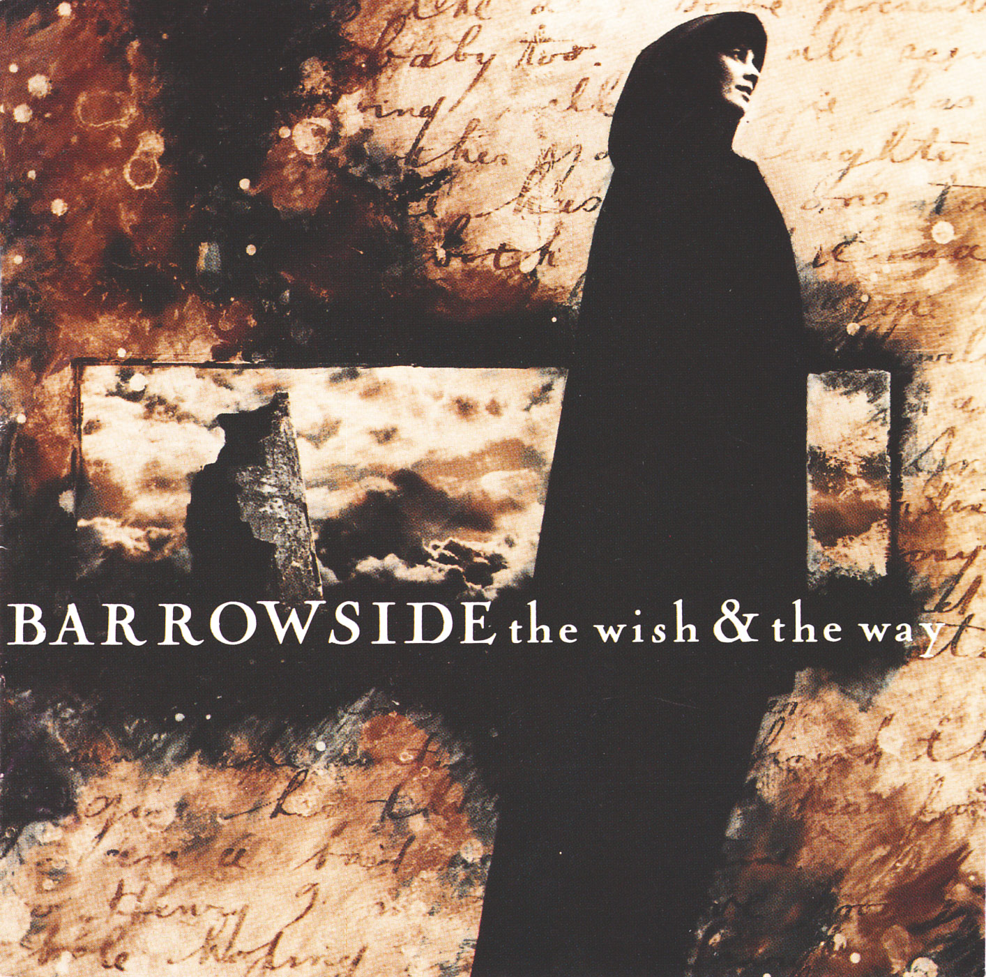
JA: Can you explain how you work? And particularly how working with a band that size means more than just delivering a piece of finished artwork.
It's a dialogue between the band and ourselves – myself and Shaughn (McGrath), and whoever else is involved. We work together until we reach a common agreement over the design concept. Each of us has a different viewpoint and would do something different. It's that common ground that the public gets to see.
The band, although they wouldn't see themselves this way, are very similar to a top brand, one that reinvents itself to some degree with each album campaign. We know them well at this stage and have an insight into what will work and what won't. They trust us to give our best and that allows us to try and push the boundaries of what's expected from one of the world's biggest bands. In doing that you have to be aware of a picture that's much larger that an album sleeve graphic.
We also get involved with all the ancillary advertising and promotion graphics and often have input to other aspects of the band's graphic identity.
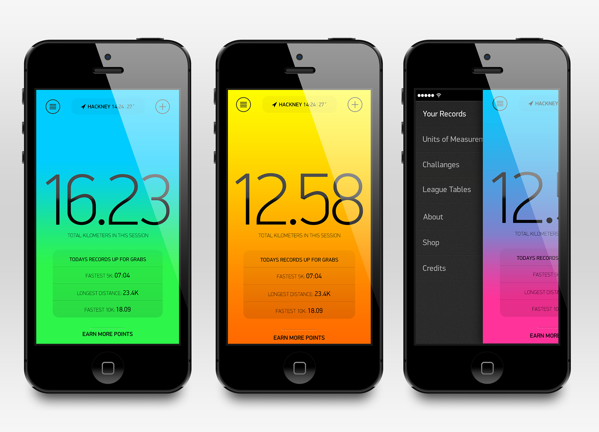
JA: Obvious question, but one I would find very hard to answer — do you have a single favourite record sleeve?
SA: This is something that I've been asked several times in the past. The one that immediately springs to mind is the sleeve and accompanying pieces for the triple vinyl album of Glastonbury Fayre, designed by Barney Bubbles. He was a big influence in the way he approached projects with humour and humility. Aside from that it's difficult, there's so many good sleeves and designers who are worthy of mention. As a body of work, what Vaughn Oliver has done for 4AD stands out.
JA: Now the CD is all but dead what do you think it's effect was on the music industry?
SA: It was a convenient format that promised much in terms of sound, and visually there have been some very interesting pieces of packaging. I know the argument rages over sound quality and the tactile feel of a vinyl cover but I think a good designer will always try to bring as much innovation to a particular sleeve as is possible given the constraints of budget, time and foresight from an artist or label.
The current resurgence of vinyl simply means that people are still interested in something more than a download. Something that enhances the experience. The music industry is often slow to move and a move away from physical product ultimately effects the industry by giving them less control of how music is distributed.
SA: What are your current inspirations in the design you do now?
JA: This is an interesting one as i’ve really changed the way I manage inspiration recently. 10 years ago it was simpler, I bought good books with good work in them, studios like Spin, The Designer’s Republic, Intro etc. Now there's just so much stuff out there, it’s impossible to keep on top of it all. So i've had to become more methodical & utilitarian about how I stay inspired. I use my Tumblr page (http://jonaverill.tumblr.com/) as a sketchpad for random images and Pinterest for more organised references.
But in answer to your original question, i'm enjoying a lot of work from independent designers these days, people like Optigram, Tom Darracott, Andreas Neophytou & David Rudnick to name just a few.
JA: In the last few years i’ve become more aware of how age changes your perspective on a lot of things. How does age effect your approach to design?
SA: That's difficult to define. There's no doubt a person in their 20s thinks differently about how they would approach a project. Their point of reference and influences are different. However, experience and a wider understanding of what's required to make a project work can be invaluable. Striking a balance between the opinions of the artist, label, management and what you feel is the right approach as the designer is easier with experience. You also know that in terms of sleeve design there's nothing new under the sun but there's always room for good design.
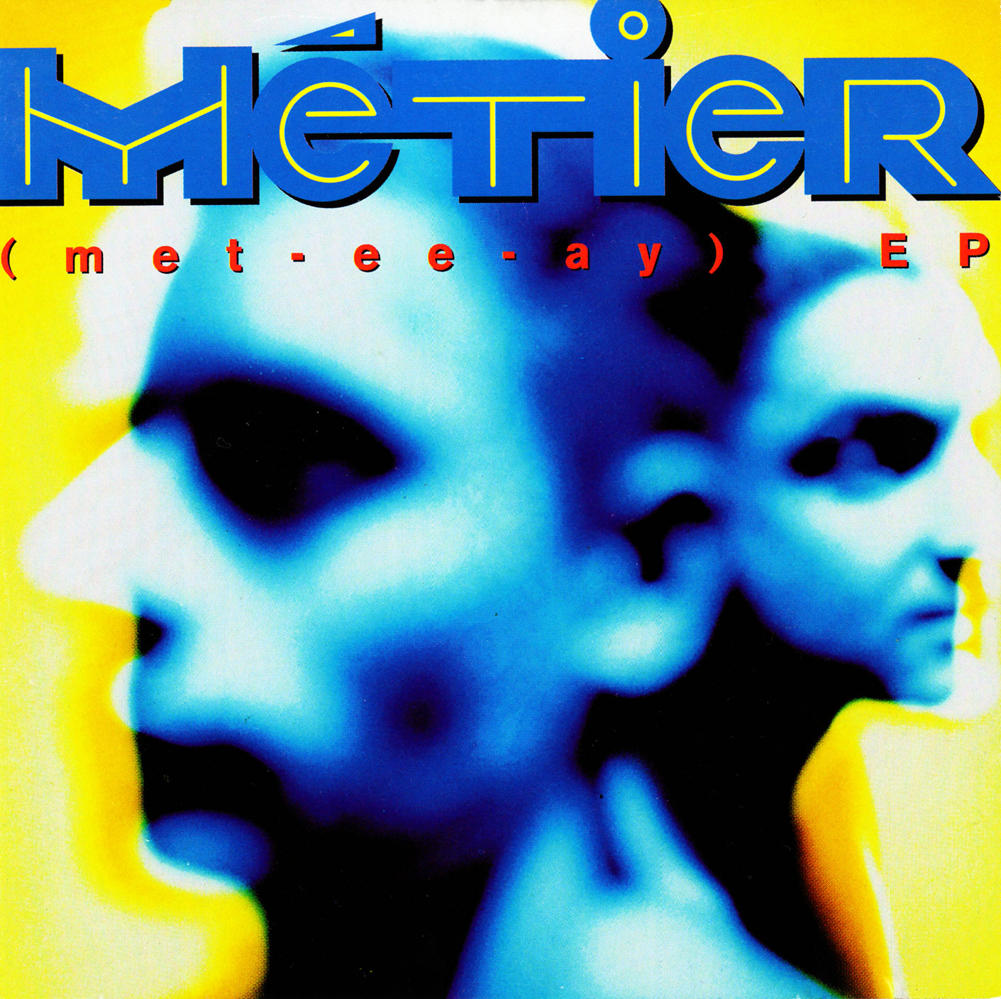
JA: Do you have a piece of work you are most proud of?
SA: Another question that often crops up. I usually say the next piece of work that achieves its aims. There are pieces of work that have found acclaim for U2 that obviously stand out, but also other sleeves for The Radiators From Space or Gavin Friday that I think stand the test of time. Especially as the means of producing artwork have changed so radically since I started working with the music industry.