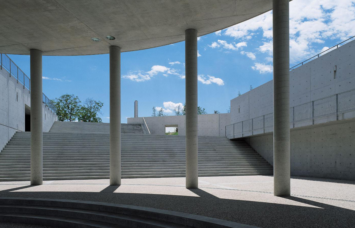
Fabrica. Image by Francesco Radino
Towards the end of his book 'Design in the Real World', Victor Papanek describes the ideal design research centre. He explains it should be a group of about 30 or 40 students of similar age who have just graduated or have a little industry experience. The unit should be devised of multidisciplinary teams. A tutor of each team should not really consider themselves tutors as they have just as much to learn from the students as they do from them. He believes the location of the research lab should be isolated and yet still adhere to the outside world. But more importantly, everyone there should have the common goal of challenging social issues and redefining those problems through design. His book was published in 1972. It wasn't until 1994 that Fabrica was set up but that's what he described.
I came to know Fabrica through writing an essay about Oliviero Toscani, its founding member. Toscani, one of the most provocative photographers of the 1990s and creator of some of Benetton's most memorable and socially challenging advertising campaigns, set up Fabrica to continue this sort of work for and with Benetton. In 2011, I was lucky enough to see him speak at Offset in Dublin and his talk convinced me to apply.
The trial
Following a couple emails and a phone call, I was invited for a two week trial in Treviso, Italy. Fabrica really is in the middle of nowhere. If you find it straight off you're one in a million because nearly every trial or resident gets lost trying to find it. However, there's very little to complain about when lost, with the clear blue skies and the Dolomites as a backdrop, it's quintessential Italian rolling countryside. And the best thing is the locals have no idea what it is or why you're asking them where a factory is (Fabrica is Italian for factory) so it's like this big kept secret. The building was designed by architect Tado Ando and on first impressions, it looks more like a home belonging to a James Bond villain. Pillars that are a tribute to classic Italian Palladian architecture contrast with towering cement block built walls that are used in all Ando's buildings. It's the perfect creative environment.
I did my trial in April last year and I found the whole set up quite strange, for the sole reason I wasn't sure if I had enjoyed it or not. I was asked to complete two projects. One, to design a poster series that described each department in Fabrica and another to create a poster for Nelson Mandela's 95th birthday. I wasn't completely convinced by all the poster design, and from what I could see this was all that visual communication team produced. Though some of the work was socially conscious campaigns which I liked, I was more interested in trying to grow as a designer and expand my skill set. So I left Italy sightly unsettled and dissatisfied, however there was one thing I was certain of, that I had met some great people. People with exciting ideas who I wanted to work with, and this would become the deciding factor on whether to accept the scholarship or not.
The studio
I started my scholarship in September last year and it wasn't the most confident of starts. Upon my arrival, the visual communication department was dissolved which left me and several other residents high and dry. However, I and others were reassured by the newly appointed CEO Dan Hill whose vision was to have studios rather then departments. Rather than being divided by skill set, each studio would be given a different 'theme' and equipped with a team of designers (visual, product, architect, interactive etc.). He encouraged multidisciplinary teams and this resulted in some really interesting work being done. For me, and like Victor Papanek, it was just as exciting learning from your peers as from your tutors.
Having arrived in Italy, to be part of a research communications unit in a department that no longer existed, I now had to choose a studio to join. The studio which appealed to me was called Being and Dying. Run by Ivor Williams it was concerned with challenging the current approaches to life and death. This was something I had never considered from a design perspective. How could design help to improve our lives? This statement immediately consumed me and I began researching potential projects that investigated our health and wellbeing.
With regards to Italian lifestyle, there wasn't too much to complain about. Brioches (croissants) for breakfast, pasta for lunch, pizza for dinner and plenty of prosecco to drown it all down with. What can I say? Italians know how to live! In retrospect it was a good that I took up a new hobby – cycling. The nearest town is Treviso which is 10km away and is where all the residents live, so cycling a sizable distance through the italian countryside kept body and mind in check.
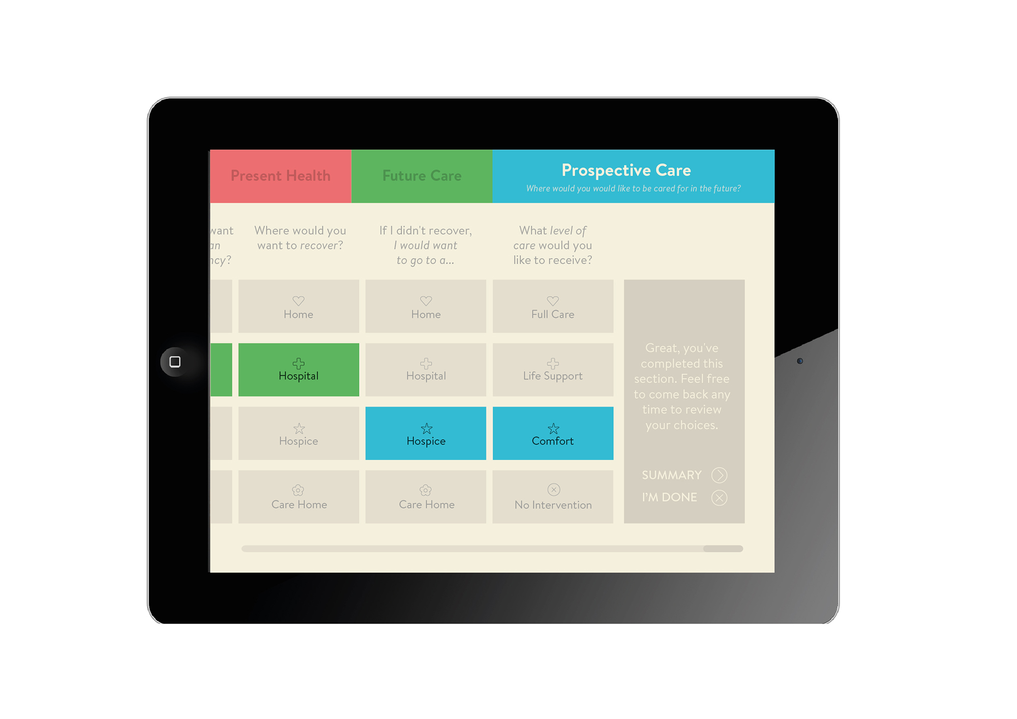
A screenshot of the Advanced Care Planning prototype app.
The projects
One of the first projects I worked on was a prototype app; a guide to understanding Advanced Care Planning for the NHS (planning ahead when you have a terminal illness, or are approaching the end of your life.) It involves thinking and talking about your wishes as to how you'll be cared for in the final months of your life. The current system of Advance Care Planning presents problems such as cold language, choices that are hard to amend once they've been made, and difficulty comprehending the consequences of some decisions. The app allowed the user to see and make a range of decisions for present and future care, stopping at any point and pick up easily later. It also helped to notify everyone (doctors and family) when the user had made their final decisions. Working with Ivor Williams and Jonathan Chomko, an interactive designer, we tried to solve the issue of how the user could see all their decisions at once while making the app so simple that there was no need for instructions. Concept video for the Ericsson Research & Development workshop.
In November, I participated in a workshop with Ericsson Research & Development. Centered around designing new technologies, our group concentrated on the idea of creating action as a currency. We wanted to encourage individuals to live better lifestyles by linking their access to a modern need – network connection – with their community involvement. Public activity and gathering becomes a currency, incentivising communities to form in the tradition of a marketplace 'agora'. We designed a physical key that acted as both the network receiver and emitter, as well as displaying a visual indicator of signal strength and charge. The design was parallel to a key because its an unobtrusive object thats carried everywhere and allowed the device to be integrated easily into everyday life.
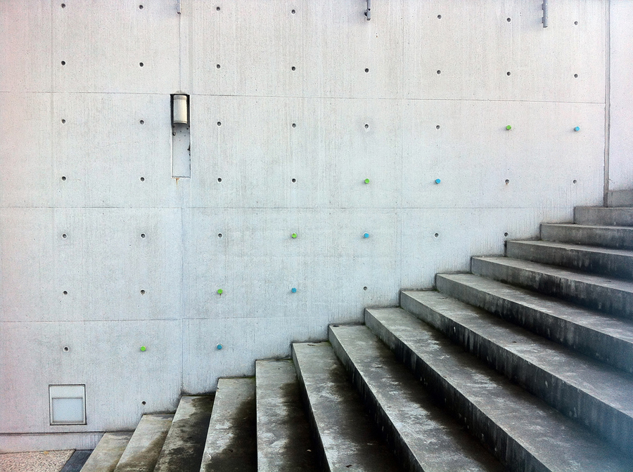
Watch a video showing our 3 day health workshop with Jamie Robson and Ivor Williams.
In December, we worked with health practitioner Jamie Robson and Being and Dying studio leader Ivor Williams. The workshop was about how design could improve our mental and physical health, using Fabrica as a hotbed for testing. The first day involved learning to breath properly and correcting our posture and movement. The following two days allowed us to put these practices into use through design. I concentrated on the different breathing techniques and developed a visual language to communicate them. We also felt it was important to explore how we could use the building to remind people how to breath correctly. I created a traffic light system and some icons to communicate the meaning of the colours. Coloured corks slotted into pre-existing holes in the concrete blocks of the building. The distance between each cork would signify a step and a breath. We put these installation at the two entrances to help people enter the building relaxed and prepared for the day. Other residents focused on creating a chair that kept you moving all day rather then in a fixed position and a program that was used for testing the general mood in the building everyday.
Lectures and workshops punctuate the year. Before I arrived, Google and Berg undertook workshops. While I was there I was lucky enough to see great talks from Gestalten Creative Director Sven Ehmann, War Photographer Giles Duley and Interactive Designer Jonathan Harris. These talks and workshops help inspire and provoke deeper research, new ideas and better work.
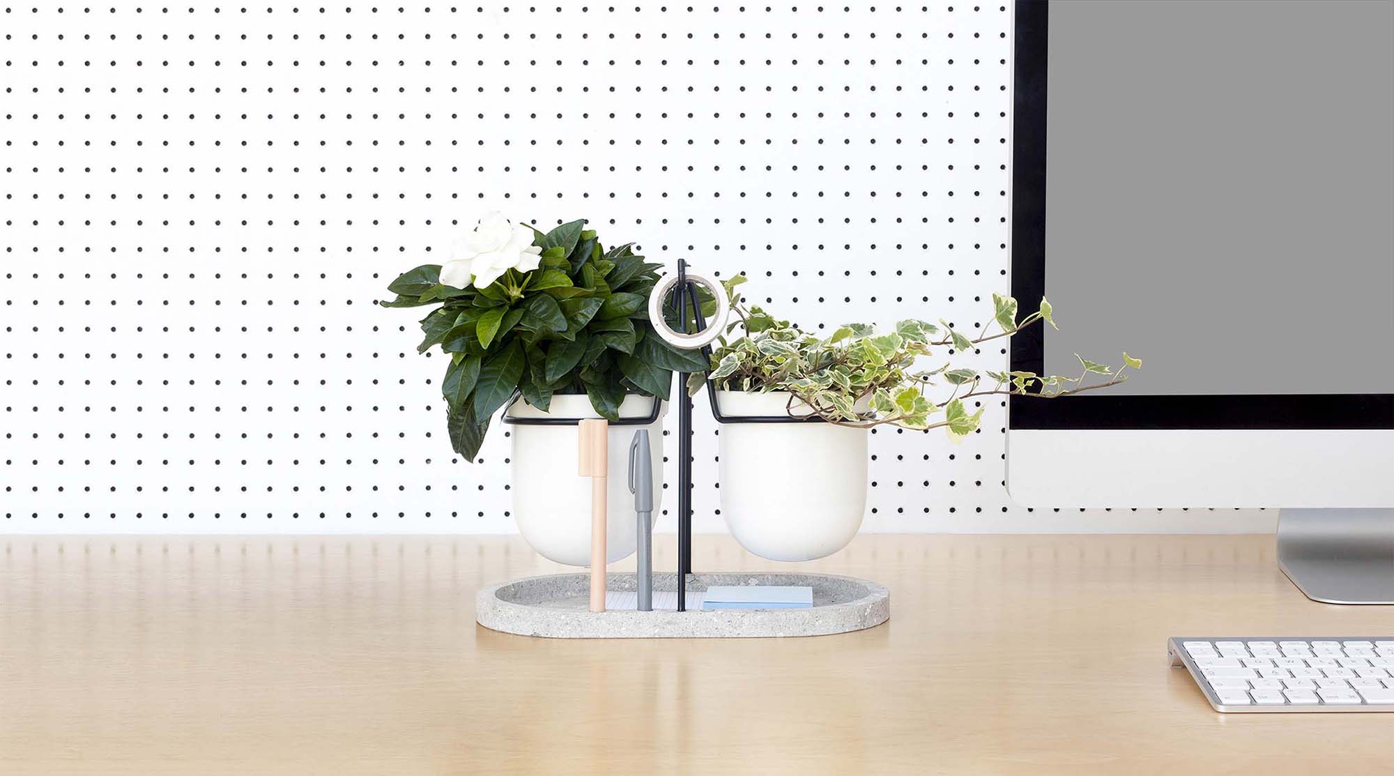
While it was hard to find the time, we were also encouraged to undertake personal projects. Personal work is important in Fabrica and for me it helped me focus on the kind of work I wanted to do. My first research project looked at how plants can help to make you more productive in the office environment. I found that there are mental and physical health benefits to having plants in the workplace. Working with product designer Giorgia Zanellato, we designed a desktop object called Statera that helped combine different plants that would benefit your health and also your work (www.stateraplants.com). I also designed a device that helped people living with dementia be independent in the kitchen. The everyday danger posed to people living with dementia from kitchen appliances is one of those simple truths that can be easily overlooked, but that make a big impact on people's lives. My idea was to create a device that notifies the person with dementia that an appliance is still on and if no action is taken within 30 minutes, the carer is notified through a similar device using wifi.
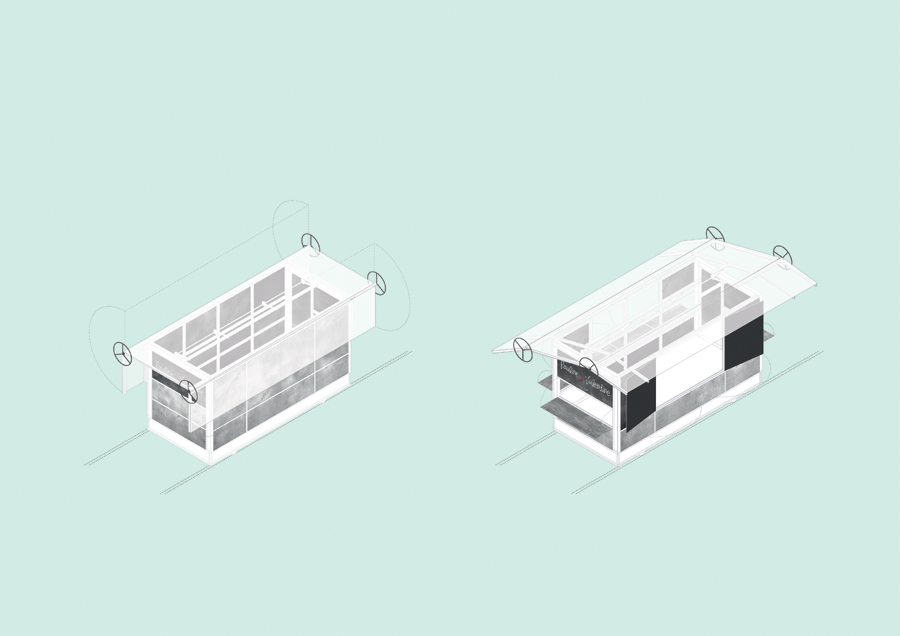
An illustration of the food cart designed for railways. Illustration: Matthew Rosier
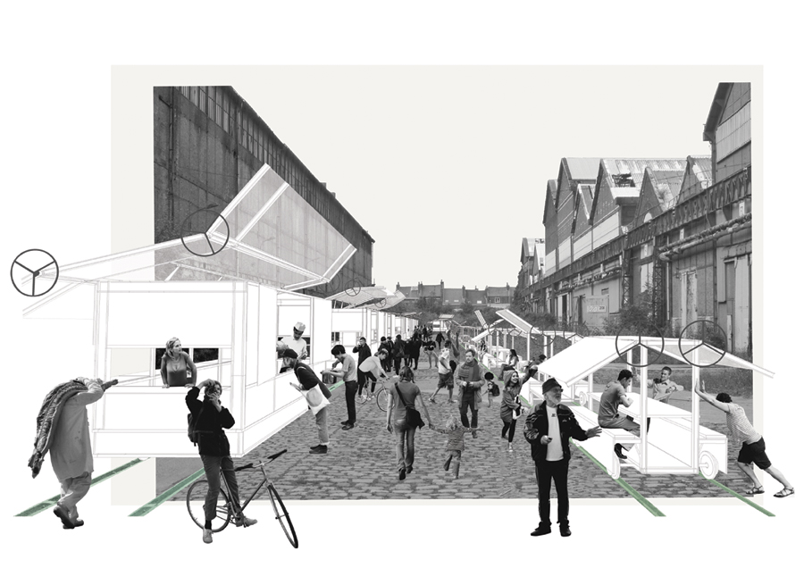
A visual of the residents of Lille enjoying their street food in Fives Cail Babcock. Illustration: Matthew Rosier
From October to March, I worked on an architecture competition. This involved proposals to develop three urban spaces in Lille, France. The proposals varied from exploring how to bring bordering communities together using a shared playground to rehabilitating a city centre with a modular, pod-like office system and transforming an old railway infrastructure for street food vendors while nurturing Lille's growing street food industry. There was only four of us on the team but between our backgrounds we had an interactive designer, an architect, an urbanist and a graphic designer. It was immensely enjoyable working within a small team with such varying disciplines. It was liberating to think big ideas that influenced the way people lived their lives and not to be limited by the medium. It was also refreshing to go to these sites and see did the concepts fit the social context.
To summarise
Fabrica as an institution is difficult to define because of the sheer breadth of work that is done there. It is neither a school nor a studio and one resident's experience may contradict another's. However, as Victor Papanek described, it envisions the perfect learning research environment. I feel it also teaches you how to discover what type of designer you are and what ideas are important to you. At the beginning of 'Design for the Real World', Victor Papanek describes the meaning of design and for me sums up how I want to continue as a designer: 'design is the conscious effort to impose meaningful effort'. I feel Fabrica has taught me the meaning of that quote and started me on a path to continue this way of thinking.
